Resources in education
Attention conservation notice: I have to write this post because I’ve spent too much time on it otherwise. You don’t have to read it.
There was an episode of “Yes, Prime Minister” where the term “Human Resource Rich Countries” was being posed as a replacement for “Less Developed Countries”, meaning “poor”. “Resources” is a word that can mean lots of different things, which is why I spent more time than was strictly sensible investigating the following graph
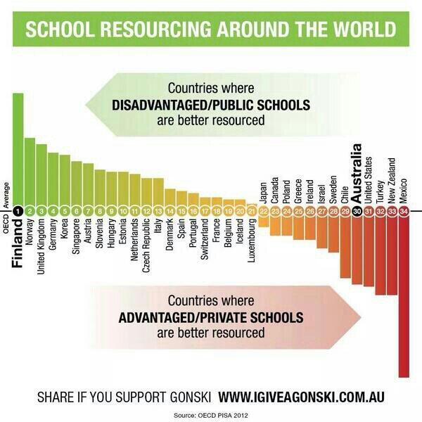
The graph appeared in my Twitter feed last Monday. It’s originally from a campaign to give Australia a school funding model a bit more like NZ’s decile system, as recommended by a national review panel, so it is disturbing to see New Zealand almost at the bottom of the world.
The source given is “OECD PISA 2012”, but that’s not very specific. I assumed the data would be from the PISA document on equity (Excellence through Equity: Giving Every Student the Chance to Succeed) , which does contain tables and graphs comparing resources in advantaged and disadvantaged schools, but not anything similar to these numbers and not comparing private and public schools. Google Reverse Image Search didn’t find anything helpful, but that would be explained by the colour scheme not matching what PISA uses. I emailed the campaign (politely, indicating my basic sympathy with their goals) to ask for more detail. That was a week ago. They did not reply. I then looked at the campaign’s Twitter feed, and found a similar graph (with a milder colour scheme) that actually had a reference to Figure IV.3.8 in a different PISA document entitled What Makes schools successful? Resources, Policies and Practices.
The graph is based on the proportion of school principals who think the quality of education is constrained “not at all” or “only a little” by six things:
- Shortage or inadequacy of science laboratory equipment
- Shortage or inadequacy of instructional materials (e.g. textbooks)
- Shortage or inadequacy of computers for instruction
- Lack or inadequacy of Internet connectivity
- Shortage or inadequacy of computer software for instruction
- Shortage or inadequacy of library materials
These are combined and rescaled into an index that has mean zero over the OECD. The PISA report gives both the difference in this index between private and public schools (which it seems to get backwards) and the difference between “advantaged” and “disadvantaged” schools. The socio-economic advantage grouping is based on average student socioeconomic status, which is defined in some complicated way that I’m prepared to believe is sensible. The campaign graph is the difference in the principals’ opinions index, with the OECD average difference subtracted, or at least it looks visually similar to that.
So, the graph doesn’t compare public and private schools, but it does compare advantaged and disadvantaged schools. It doesn’t compare resources provided to the schools, but it does compare the extent to which the schools think they are short of resources.
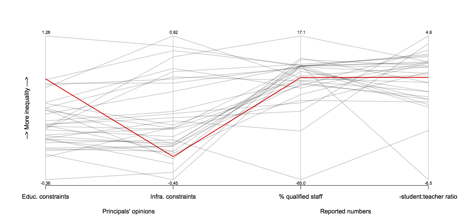
There are at least three other sets of data that might equally well be used, spread over the PISA report. There’s another index of principals’ opinions, this time about constraints due to shortage of physical infrastructure. There are also two objective resource questions, based on student:teacher ratio and on percentage of teachers with tertiary qualifications.
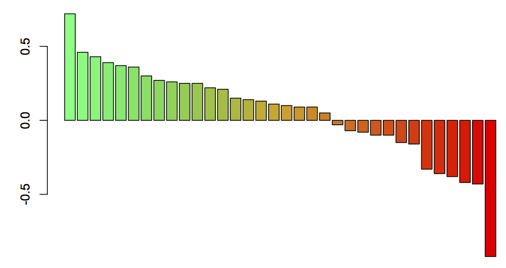
Here’s a plot of differences between advantaged and disadvantaged schools on all four of these resource questions, for the OECD countries, with NZ in red.
And here’s the same plot for all the PISA countries that have all four of the variables. The OECD countries are in greenish; the others in bluish.
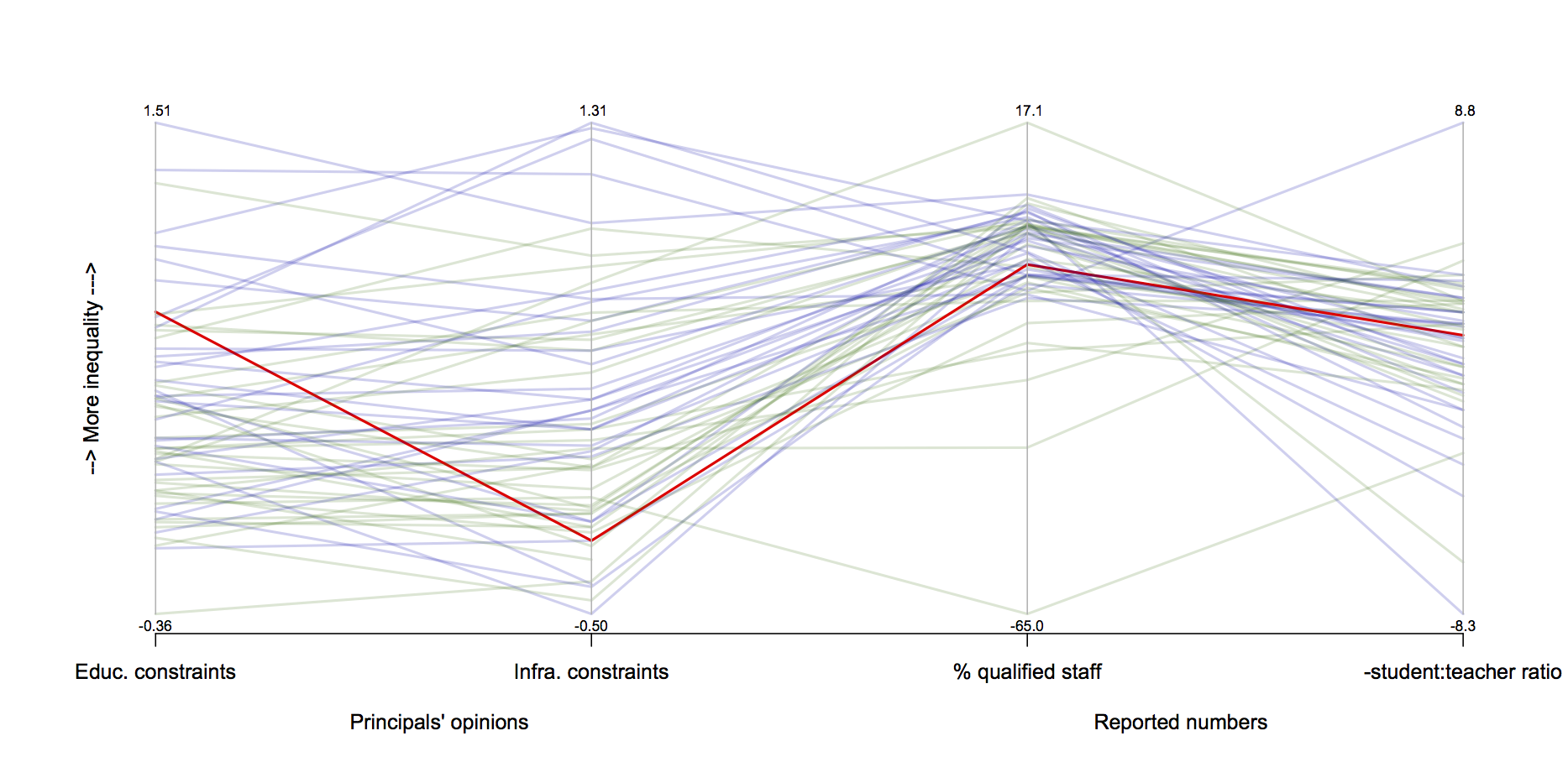
New Zealand is not dramatically unusual when you consider all four variables. More importantly, though, none of this is “resources” in the sense of the campaign. The campaign is about improving Government funding, and on that scale New Zealand’s decile system is already relatively progressive. What’s surprising about New Zealand is the relatively large socioeconomic differences in education outcomes given both the good average quality of education and the relatively progressive state funding scheme.
Thomas Lumley (@tslumley) is Professor of Biostatistics at the University of Auckland. His research interests include semiparametric models, survey sampling, statistical computing, foundations of statistics, and whatever methodological problems his medical collaborators come up with. He also blogs at Biased and Inefficient See all posts by Thomas Lumley »
One of the things about our school system is that it is significantly more mixed than in other countries. So far more “low decile kids” go to high decile schools and vice versa. That might explain why we have a less extreme funding rate — it mirrors the less extreme sorting of kids.
12 years ago