Gun deaths visualisation
Periscopic, a “socially conscious data visualization firm” has produced an interactive display of the years of life lost due to gun violence in the US, based on national life expectancy data. Each victim appears as a dot moving along the arc of their life, and then dropping at the age of death. More and more accumulate as you watch.
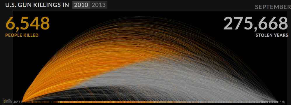
Of course, it’s important to remember that this display gets a lot of its power from two facts: the USA is very big, and we know the names and ages of death of gun victims. You couldn’t do the same thing as dramatically for smoking deaths, and it would look much less impressive in a small country.
Also, Alberto Cairo has a nice post using this as an example to talk about the display of uncertainty.
(via @hildabast)
Thomas Lumley (@tslumley) is Professor of Biostatistics at the University of Auckland. His research interests include semiparametric models, survey sampling, statistical computing, foundations of statistics, and whatever methodological problems his medical collaborators come up with. He also blogs at Biased and Inefficient See all posts by Thomas Lumley »