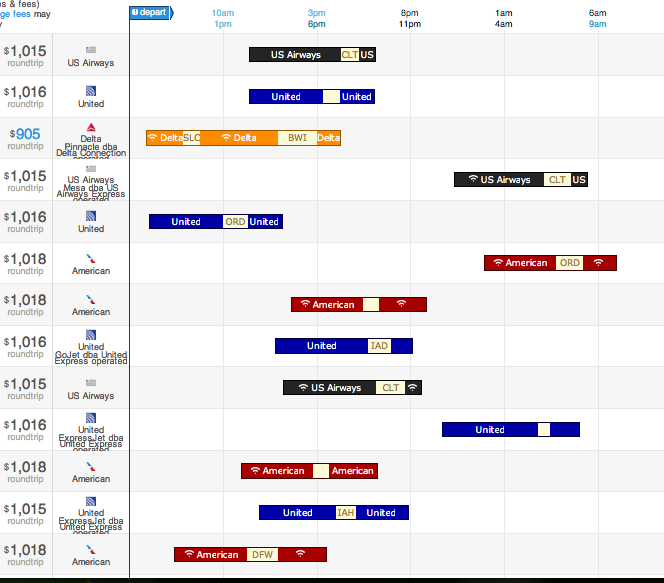
Posts from May 2013 (75)

May 30, 2013

NRL Predictions, Round 12

Team Ratings for Round 12

Here are the team ratings prior to Round 12, along with the ratings at the start of the season. I have created a brief description of the method I use for predicting rugby games. Go to my Department home page to see this.

Current Rating Rating at Season Start Difference
Rabbitohs 10.20 5.23 5.00
Storm 7.39 9.73 -2.30
Roosters 6.08 -5.68 11.80
Sea Eagles 5.55 4.78 0.80
Panthers 2.25 -6.58 8.80
Broncos 1.45 -1.55 3.00
Knights 1.13 0.44 0.70
Sharks 1.05 -1.78 2.80
Cowboys 0.99 7.05 -6.10
Bulldogs 0.87 7.33 -6.50
Raiders 0.43 2.03 -1.60
Titans -1.49 -1.85 0.40
Dragons -3.87 -0.33 -3.50
Warriors -10.12 -10.01 -0.10
Wests Tigers -11.21 -3.71 -7.50
Eels -14.44 -8.82 -5.60


Performance So Far

So far there have been 88 matches played, 54 of which were correctly predicted, a success rate of 61.36%.

Here are the predictions for last week’s games.

Game Date Score Prediction Correct
1 Wests Tigers vs. Cowboys May 24 22 – 20 -10.12 FALSE
2 Bulldogs vs. Broncos May 24 24 – 14 2.40 TRUE
3 Dragons vs. Panthers May 25 0 – 19 2.72 FALSE
4 Roosters vs. Storm May 25 18 – 26 5.99 FALSE
5 Sea Eagles vs. Raiders May 25 16 – 10 10.53 TRUE
6 Warriors vs. Knights May 26 28 – 12 -12.43 FALSE
7 Eels vs. Titans May 26 4 – 42 -1.07 TRUE
8 Sharks vs. Rabbitohs May 27 14 – 12 -6.32 FALSE


Predictions for Round 12

Here are the predictions for Round 12. The prediction is my estimated expected points difference with a positive margin being a win to the home team, and a negative margin a win to the away team.

Game Date Winner Prediction
1 Bulldogs vs. Dragons May 31 Bulldogs 9.20
2 Rabbitohs vs. Knights Jun 01 Rabbitohs 13.60
3 Titans vs. Cowboys Jun 02 Titans 2.00
4 Broncos vs. Warriors Jun 03 Broncos 16.10


Super 15 Predictions, Round 16

Team Ratings for Round 16

This year the predictions have been slightly changed with the help of a student, Joshua Dale. The home ground advantage now is different when both teams are from the same country to when the teams are from different countries. The basic method is described on my Department home page.

Here are the team ratings prior to Round 16, along with the ratings at the start of the season.

Current Rating Rating at Season Start Difference
Crusaders 6.79 9.03 -2.20
Bulls 5.96 2.55 3.40
Chiefs 4.64 6.98 -2.30
Brumbies 3.74 -1.06 4.80
Sharks 2.26 4.57 -2.30
Stormers 1.92 3.34 -1.40
Waratahs 0.20 -4.10 4.30
Reds -0.05 0.46 -0.50
Blues -0.55 -3.02 2.50
Cheetahs -1.64 -4.16 2.50
Hurricanes -1.75 4.40 -6.10
Highlanders -6.41 -3.41 -3.00
Rebels -7.79 -10.64 2.90
Force -8.38 -9.73 1.40
Kings -13.74 -10.00 -3.70


Performance So Far

So far there have been 95 matches played, 63 of which were correctly predicted, a success rate of 66.3%.

Here are the predictions for last week’s games.

Game Date Score Prediction Correct
1 Chiefs vs. Crusaders May 24 28 – 19 -1.30 FALSE
2 Rebels vs. Waratahs May 24 24 – 22 -6.90 FALSE
3 Blues vs. Brumbies May 25 13 – 20 1.00 FALSE
4 Force vs. Highlanders May 25 19 – 18 2.20 TRUE
5 Kings vs. Cheetahs May 25 22 – 24 -11.00 TRUE
6 Stormers vs. Reds May 25 20 – 15 6.20 TRUE
7 Sharks vs. Bulls May 25 16 – 18 -1.10 TRUE


Predictions for Round 16

Here are the predictions for Round 16. The prediction is my estimated expected points difference with a positive margin being a win to the home team, and a negative margin a win to the away team.

Game Date Winner Prediction
1 Crusaders vs. Waratahs May 31 Crusaders 10.60
2 Brumbies vs. Hurricanes May 31 Brumbies 9.50
3 Highlanders vs. Blues Jun 01 Blues -3.40
4 Reds vs. Rebels Jun 01 Reds 10.20
5 Stormers vs. Kings Jun 01 Stormers 18.20
6 Cheetahs vs. Bulls Jun 01 Bulls -5.10

<
 

May 29, 2013

More on design of graphics

Since it’s clearly Night of the Living Data here, another link on data visualisation (via @zentree), a long essay from Bret Victor  “Magic Ink: information software and the graphical interface”

A person experiences modern software almost exclusively through two channels:

  • She reads and interprets pictures on a screen.
  • She points and pushes at things represented on the screen, using a mouse as a proxy finger.

Thus, software design involves the design of two types of artifact:

  • Pictures.
  • Things to push.

These are not brave new realms of human endeavor. We share the blood of cavemen who pushed spears into mammoths and drew pictures of them in the living room. By now, these two activities have evolved into well-established design disciplines: graphic design and industrial design.

The software designer can thus approach her art as a fusion of graphic design and industrial design. Now, let’s consider how a user approaches software, and more importantly, why.

(and even if you aren’t a dataviz enthusiast, someone whose hypothetical example books are called ‘Waiting for Good Dough”, “The Bun Also Rises”, and “Yeast of Eden”, is definitely worth reading)

Good information display

Recommended by Noah Iliinsky (@noahi), via @keith_ng, a display from the US travel-booking site Hipmunk (click to embiggen)

hip


The bars display options for, in this case, a flight from Seattle (where I used to live) to Raleigh, NC, where the Environmental Protection Agency lives.  The coloured segments are flights; the pale segments are layovers (labelled with the airport).  The colour indicates the airline, and there are also symbols indicating availability of WiFi on the plane.

From the graph you can see at a glance that there’s no good way to get from Seattle to Raleigh, but also what all the options are.

Noah Iliinsky also has relatively sparse blog (Complex Diagrams) and gives a lot of talks.  A good short one is “Data Visualizations Done Wrong”, where he does a lot of the easy pointing and laughing, but also talks about the relationship between the structure of information and its display.

Best place to live

The Herald has a big spread on the OECD Better Life Index today — the graphics don’t show up in the online version, so I didn’t notice initially.

As long-time readers will remember from two years ago, the best thing about the OECD data is that their website lets you see what rankings result from giving different importance to different parts of their survey.  For example, New Zealand does well overall, but does relatively poorly on income, so its ranking is quite sensitive to how important you think income is.

This year’s interactive website is here (the Herald, sadly, doesn’t link). Go play.

daisies

Two graphs, three trends

First, the serious one.  Nature News has a story about new immune-based cancer treatments (like Herceptin for breast cancer), some of which are very effective, but which are increasingly expensive.  In contrast to previous `small molecule’ drugs, these won’t necessarily get cheap when the patent runs out, since generic  (technically, `biosimilar’) versions are harder to make and test.

ASCO-cancer-graph


Now for something completely different

iemurder


By @altonncf — via various people on Twitter who don’t cite original sources. Pro tip: Google Image Search is quite good at finding originals.

More on communicating with journalists

Two physicists (and long-time bloggers) responding to Ed Yong’s post on how to talk to journalists:

Chad Orzel

As a physicist, I’m fond of simple universal principles from which all other results are derived. When a journalist is interviewing a scientist for a story, I think the important underlying idea is that each is doing the other a favor. A quote from a prominent scientist will make a story better, but it’s not an absolute requirement, and there’s certainly no obligation to deal with any particular scientist. Being quoted in a media report about some new discovery incrementally raises a scientist’s profile, but the only concrete benefit is providing a clipping that your parents might read.

..

The temptation for each party in this situation is to try to push as much of the work to the other as possible, and that’s where most advice from journalists to scientists (or vice versa) fails. Each side treats the conventions of their particular profession as immutable laws of nature that the other must adjust to accommodate. Even when offered with the best of intentions, as with Ed Yong’s post last week, the advice ends up sounding one-sided: “Here’s what you need to do to work with me.”

Tim Swanson:

There’s a reason you should take some of the advice in Ed Yong’s post with a grain of salt (as I’ve come to realize over several years of hearing or reading advice from Ed): because it comes from Ed Yong. Now, let me explain — this isn’t a dig at Ed. Quite the opposite. He’s an excellent science journalist, and the tips he gives other science journalists about journalism is quite good. But this is a different subject, and given that there are a lot of journalists out there, you probably aren’t going to be asked for commentary from Ed Yong.


May 28, 2013

Analytics is beating statistics

icrunchdata, which is a data-related jobs site, has introduced what it is calling the Big Data Jobs Index

crunchy


If you believe the numbers, it looks as though analytics is way ahead in the synonym game, followed by data science, but at least statistics is still ahead of business intelligence. And at least this is a bar chart, though not an index in any usual sense of the term.

The company describes Big Data as having ‘fueled one of the most hyper-growth niches of employment in a century’, but since their projection is for the sector to grow to nearly 1% of the US job market by 2015, we clearly need to be careful of the definition of fast growth

May 27, 2013

Kills cancer cells

A spiffy, professional look

Helpful data visualisation advice from Microsoft:

Using Microsoft Office Excel 2007, you can quickly turn your data into a pie chart, and then give that pie chart a spiffy, professional look.

 micropie


After you create a pie chart, you can rotate the slices for different perspectives. You can also focus on specific slices by pulling them out of the pie chart, or by changing the chart type to a pie of pie or bar of pie chart to draw attention to very small slices.

This strategy is especially useful when the data are meaningless but you need something to put on a slide to distract attention from what you are saying.