A spiffy, professional look
Helpful data visualisation advice from Microsoft:
Using Microsoft Office Excel 2007, you can quickly turn your data into a pie chart, and then give that pie chart a spiffy, professional look.
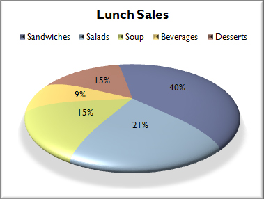
After you create a pie chart, you can rotate the slices for different perspectives. You can also focus on specific slices by pulling them out of the pie chart, or by changing the chart type to a pie of pie or bar of pie chart to draw attention to very small slices.
This strategy is especially useful when the data are meaningless but you need something to put on a slide to distract attention from what you are saying.
Thomas Lumley (@tslumley) is Professor of Biostatistics at the University of Auckland. His research interests include semiparametric models, survey sampling, statistical computing, foundations of statistics, and whatever methodological problems his medical collaborators come up with. He also blogs at Biased and Inefficient See all posts by Thomas Lumley »
Twenty plus steps? Have they not a downloadable template like this one:
http://office.microsoft.com/en-nz/templates/results.aspx?qu=sales&CTT=1&client=1#ai:TC101877339|
13 years ago
Hmm, link doesn’t go to the actual template (fifth column, second row).
13 years ago
Comment editing would require logins, which in our case we have not got.
13 years ago