Frontiers in pie-charts
The `pie’ in pie-chart is a metaphor — the charts are divided into slices in the way that certain kinds of pie are, and the slices add up to the whole pie.
Or, at least, that’s usually the idea. One of StatChats’s foreign correspondents sent in this effort from the BBC
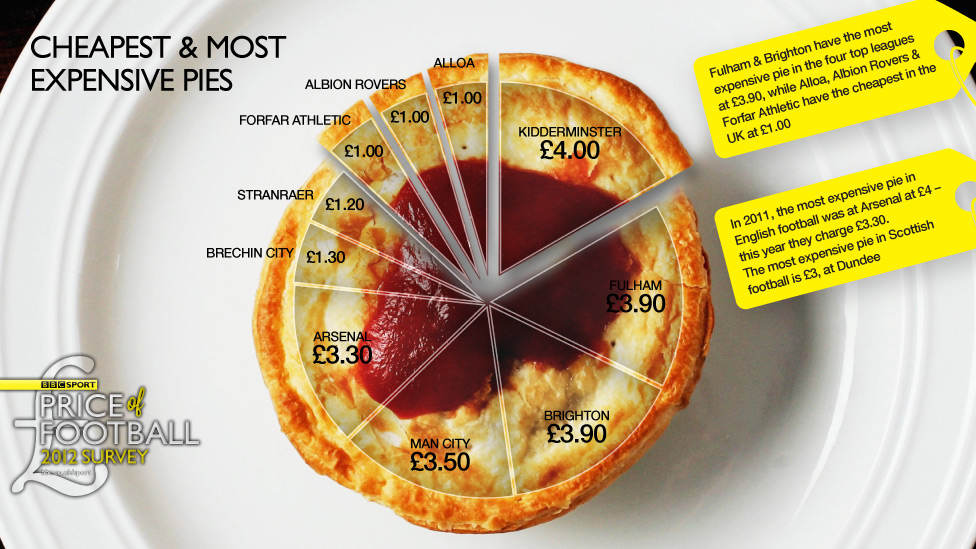
This kind of pie doesn’t get divided into slices — it would just fall apart. And in this graph the slices don’t add up to anything meaningful — for those of you not up on the British sports scene: there are actually more than ten football clubs. In the graphic we have Premier League teams such as Arsenal and Manchester City mixed in with Albion Rovers and Brechin City from the Scottish 2nd division.
The pie price pie exemplifies a general rule, if you have to write all the data values on your graph, the graph isn’t doing its share of the work.
Thomas Lumley (@tslumley) is Professor of Biostatistics at the University of Auckland. His research interests include semiparametric models, survey sampling, statistical computing, foundations of statistics, and whatever methodological problems his medical collaborators come up with. He also blogs at Biased and Inefficient See all posts by Thomas Lumley »
A very silly graphic, largely explained by its cultural context. The chant “who ate all the pies” regularly greats slow or overweight footballers and the pie is a traditional half-time snack. They generally do look this unappetising.
13 years ago