Posts from September 2013 (69)

September 25, 2013

ITM Cup Predictions for Round 7

Team Ratings for Round 7

Here are the team ratings prior to Round 7, along with the ratings at the start of the season. I have created a brief description of the method I use for predicting rugby games. Go to my Department home page to see this.

Here are the team ratings prior to this week’s games, along with the ratings at the start of the season.

Current Rating Rating at Season Start Difference
Canterbury 21.19 23.14 -2.00
Wellington 11.88 6.93 4.90
Auckland 8.41 9.02 -0.60
Counties Manukau 4.44 4.36 0.10
Waikato 2.10 5.25 -3.20
Tasman -1.11 -6.29 5.20
Taranaki -2.13 3.92 -6.10
Otago -3.54 -4.44 0.90
Hawke’s Bay -5.05 -6.72 1.70
Bay of Plenty -5.56 -1.96 -3.60
North Harbour -6.61 -7.43 0.80
Northland -8.74 -8.26 -0.50
Southland -9.06 -11.86 2.80
Manawatu -9.50 -8.97 -0.50


Performance So Far

So far there have been 46 matches played, 36 of which were correctly predicted, a success rate of 78.3%.

Here are the predictions for last week’s games.

Game Date Score Prediction Correct
1 Bay of Plenty vs. Southland Sep 18 25 – 33 12.30 FALSE
2 Auckland vs. Northland Sep 19 41 – 10 19.90 TRUE
3 Otago vs. Manawatu Sep 20 52 – 41 10.40 TRUE
4 Counties Manukau vs. Waikato Sep 21 37 – 25 5.90 TRUE
5 Wellington vs. Canterbury Sep 21 25 – 19 -6.90 FALSE
6 Taranaki vs. Bay of Plenty Sep 21 21 – 3 6.00 TRUE
7 Tasman vs. Hawke’s Bay Sep 22 18 – 9 8.30 TRUE
8 Southland vs. North Harbour Sep 22 34 – 31 1.90 TRUE


Predictions for Round 7

Here are the predictions for Round 7. The prediction is my estimated expected points difference with a positive margin being a win to the home team, and a negative margin a win to the away team.

Game Date Winner Prediction
1 Canterbury vs. Manawatu Sep 25 Canterbury 35.20
2 Northland vs. Tasman Sep 26 Tasman -3.10
3 Waikato vs. Wellington Sep 27 Wellington -5.30
4 Otago vs. Southland Sep 28 Otago 10.00
5 Manawatu vs. Taranaki Sep 28 Taranaki -2.90
6 Auckland vs. Canterbury Sep 28 Canterbury -8.30
7 Hawke’s Bay vs. North Harbour Sep 29 Hawke’s Bay 6.10
8 Bay of Plenty vs. Counties Manukau Sep 29 Counties Manukau -5.50


Currie Cup Predictions for Round 8

Team Ratings for Round 8

Here are the team ratings prior to Round 8, along with the ratings at the start of the season. I have created a brief description of the method I use for predicting rugby games. Go to my Department home page to see this.

Here are the team ratings prior to this week’s games, along with the ratings at the start of the season.

Current Rating Rating at Season Start Difference
Sharks 3.61 3.24 0.40
Western Province 3.15 4.47 -1.30
Lions 2.08 -1.22 3.30
Cheetahs -2.84 -2.74 -0.10
Blue Bulls -3.45 0.59 -4.00
Griquas -4.70 -6.48 1.80


Performance So Far

So far there have been 21 matches played, 12 of which were correctly predicted, a success rate of 57.1%.

Here are the predictions for last week’s games.

Game Date Score Prediction Correct
1 Western Province vs. Griquas Sep 20 19 – 13 17.40 TRUE
2 Sharks vs. Cheetahs Sep 21 50 – 26 11.70 TRUE
3 Lions vs. Blue Bulls Sep 21 35 – 26 13.90 TRUE


Predictions for Round 8

Here are the predictions for Round 8. The prediction is my estimated expected points difference with a positive margin being a win to the home team, and a negative margin a win to the away team.

Game Date Winner Prediction
1 Cheetahs vs. Western Province Sep 27 Cheetahs 1.50
2 Lions vs. Sharks Sep 27 Lions 6.00
3 Griquas vs. Blue Bulls Sep 28 Griquas 6.20


NRL Predictions for the Preliminary Finals

Team Ratings for the Preliminary Finals

Here are the team ratings prior to this week’s games, along with the ratings at the start of the season. I have created a brief description of the method I use for predicting rugby games. Go to my Department home page to see this.

Current Rating Rating at Season Start Difference
Roosters 11.32 -5.68 17.00
Storm 8.36 9.73 -1.40
Sea Eagles 7.72 4.78 2.90
Knights 7.31 0.44 6.90
Rabbitohs 7.05 5.23 1.80
Cowboys 6.60 7.05 -0.40
Bulldogs 2.16 7.33 -5.20
Titans 2.11 -1.85 4.00
Sharks 1.87 -1.78 3.70
Warriors -0.89 -10.01 9.10
Panthers -2.57 -6.58 4.00
Broncos -5.15 -1.55 -3.60
Dragons -8.18 -0.33 -7.90
Raiders -10.23 2.03 -12.30
Wests Tigers -11.37 -3.71 -7.70
Eels -19.87 -8.82 -11.00


Performance So Far

So far there have been 198 matches played, 119 of which were correctly predicted, a success rate of 60.1%.

Here are the predictions for last week’s games.

Game Date Score Prediction Correct
1 Sea Eagles vs. Sharks Sep 20 24 – 18 5.82 TRUE
2 Storm vs. Knights Sep 21 16 – 18 7.44 FALSE


Predictions for the Preliminary Finals

Here are the predictions for the Preliminary Finals. The prediction is my estimated expected points difference with a positive margin being a win to the home team, and a negative margin a win to the away team.

Game Date Winner Prediction
1 Rabbitohs vs. Sea Eagles Sep 27 Sea Eagles -0.70
2 Roosters vs. Knights Sep 28 Roosters 4.00


September 24, 2013

Student-friendly radar charts

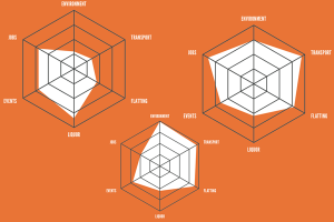
The Critic, the student magazine of Otago, has an interesting feature on the council elections, rating the candidates on six issues determined by polling to be important to students. One of the ways they present the candidate ratings is with radar plots

radar-critic


These show the rating for each of the issues on six radial axes, connected to form the white polygon.  Candidates who are more ‘student-friendly’ on these issues will end up with larger polygons, and the different shapes show that there are significant tradeoffs between, say, a candidate who is in favour of drinking and (quality) loud music, and one who is sound on environment and transport.

This is a pretty good use of radar plots. Their main limitations are that the ordering of the axes can have a big effect on the visual impression, and that evaluating tradeoffs quantitatively is hard. Neither is a really serious limitation here, and both are problems common to many ways of displaying multivariate data.

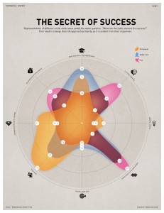
Here’s another radar chart, originally from INFOGRAPHIKA magazine, rescued from its unfair banishment to wtfviz.net.

radio-success


This one shows how people rated the importance of eight factors in success, split up by their income.  It’s interesting to see how much higher  connections, initial capital, and cheating were rated as important by the poor, and how the rich thought hard work was the key factor, not being very impressed even by education.   It’s clear that each group likes the story that makes them look good; less clear who is more correct.  What’s a bit depressing is how small a role anyone thinks is played by luck.

September 23, 2013

Unclear on the pie chart concept

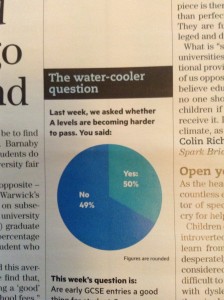
The pie-chart problems that Melbourne’s Herald-Sun had with their bogus polls appear to be spreading. This one is from wtfviz.net (via @TimHarford), and apparently comes from Britain’s TES magazine.

tespie

I suppose it’s encouraging that this sort of thing seems only to happen for bogus polls, not for actual data.


Real estate data visualisation

Det Mackey suggested we look at Grieg’s Hamilton and their graphs.

Some of these are quite good.

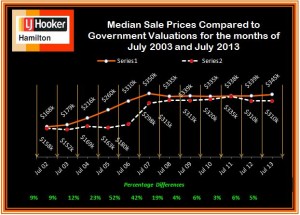
For example, this one shows how median sale price and CV change over time. The increase of sale price relative to government valuation in the boom is clear, as is the lack of increase since then.  Also, the variations in the median CV would give some idea of the extent to which differences in median price are due to changes in which houses are selling, versus changes in how much they are selling for.  The lack of a legend on the two series is a bit unfortunate, but it’s pretty obvious which is which. A graph like this would improve a lot of the newspaper stories about real estate prices.

CV-v-MS-July-2002-2013-3

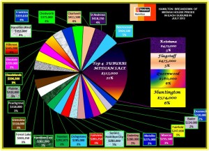
This graph, on the other hand, I think is supposed to show a comparison of median sale price across suburbs.  Apart from aesthetic objections, it doesn’t really work because median sale prices by suburb are not components of a total in any meaningful way, so the ‘pie’ metaphor isn’t doing any useful work.

Suburban-Median-Prices-July-2013


The other graphs on the site fall somewhere in between: they convey information, but often in ways that could have been more effective.


Stat of the Week Competition Winner: September 14 – 20 2013

Thank you for your nominations in this week’s Stat of the Week Competition.

Two of the nominations were about arithmetic – percentage increase and closing speed calculations – and two were more interesting examples about coffee and beer drinking. Thomas had posted earlier about the coffee drinking example (although Dave Tattersfield added some more useful information to his nomination).

So, this week we’ve chosen Nick Iversen’s curious sample-size-of-one beer-drinking nomination to be our Stat of the Week:

Under limit after 13 beers in 2 hours

This statistic doesn’t ring true and defies common sense.

The article says that a police officer who drank 13 beers in two hours remained under the legal drink-driving limit of 80. That’s incredible and I don’t believe it.

If we consult the tables at http://www.moderation.org/bac/bac-men.shtml we see that if a heavy 109kg man drinks 12 beers then after 2 hours his BAC would be 148 or roughly twice the limit.

The story can only be true if the police officer is much heavier than 109kg (say twice that) or if the beer is low alcohol and in either case the story is dishonestly misleading.

There appears to be a photograph of the policer office in question back in 2010 here (second from the left).

Congratulations Nick and thanks for all the nominations!

Stat of the Week Competition: September 21 – 27 2013

Each week, we would like to invite readers of Stats Chat to submit nominations for our Stat of the Week competition and be in with the chance to win an iTunes voucher.

Here’s how it works:

  • Anyone may add a comment on this post to nominate their Stat of the Week candidate before midday Friday September 27 2013.
  • Statistics can be bad, exemplary or fascinating.
  • The statistic must be in the NZ media during the period of September 21 – 27 2013 inclusive.
  • Quote the statistic, when and where it was published and tell us why it should be our Stat of the Week.

Next Monday at midday we’ll announce the winner of this week’s Stat of the Week competition, and start a new one.

(more…)

Stat of the Week Competition Discussion: September 21 – 27 2013

If you’d like to comment on or debate any of this week’s Stat of the Week nominations, please do so below!

September 22, 2013

Briefly

  • Careers: The number of people getting statistics degrees in the US has doubled in the past five years (and they’re still able to get jobs)
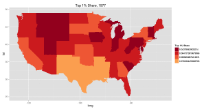
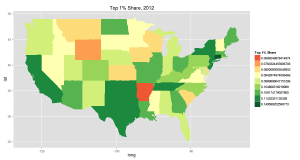
  • Increasing inequality in the US from 1977 to 2012 (it happens in other places too): top 1% share of income.  The colour choice is a bit unfortunate (red: more equal, green:less equal). There are animated pictures and more inequality measures in the original

aqzaxe9-1aqzaxe9

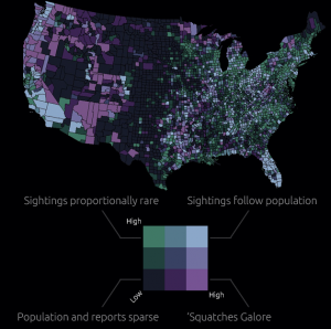
  • Map of sasquatch sightings in the US. The original has all the sightings as well as this map cross-referenced with population density. Remember, just because you can measure it doesn’t mean it exists

sasquatch

  • Software for drawing data-based maps: CartoDB. Has both free and paid versions.  Worth a look if you do maps.