Good graph/bad graph
- The Herald has a nice display of how the percentage of first-home buyers varies across Auckland. I think (though the text could be clearer) that this is data since the start of 2012. I don’t know exactly how they define first-home buyers: quite a few immigrants, like me, will have been home owners outside NZ before buying a home here.
- From wtfiz.net, originally a section of an infographic from graphs.net

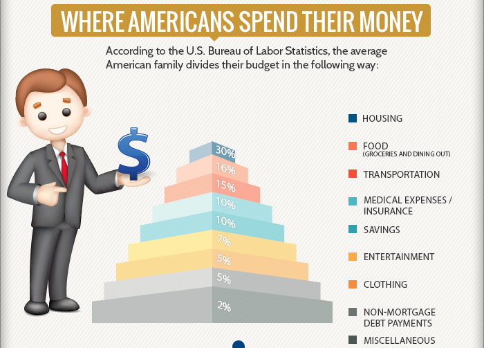
To start with, the noseless guy doesn’t cast a shadow, although the almighty dollar he is holding casts a shadow on the empty air. Perhaps he’s a vampire. Also, the colours in the legend don’t actually match the colours in the graph. And, the graph manages to misrepresent not only the magnitude of the numbers but even their ordering, with the largest layer of the pyramid representing the smallest category. To top it all off, the numbers aren’t even right (or are seriously outdated) — for example, the US Bureau of Labor Statistics Consumer Expenditure Survey reports food expenditure between 12.5% and 13% of household expenditure every year from 2006 to 2012, not the 15% in the graph
Thomas Lumley (@tslumley) is Professor of Biostatistics at the University of Auckland. His research interests include semiparametric models, survey sampling, statistical computing, foundations of statistics, and whatever methodological problems his medical collaborators come up with. He also blogs at Biased and Inefficient See all posts by Thomas Lumley »
I think it is in the industries interest to be as inaccurate and as vague as possible when communicating home buying data.
For example here in the UK a ‘first time buyer’ is actually anyone taking out a mortgage that is not moving from an existing property, so second home owners or people who have left the housing market to rent, or as you mention move abroad, end up counting.
So for example headlines like this are a bit of a nonsense: http://bit.ly/1euwo2g
13 years ago