It’s warm out there
We’re seeing a lot of international news stories about cold weather in the US, and here in NZ we’re also seeing a lot of stories about hot weather locally and in Australia. You might think from the news coverage that the northern hemisphere is currently colder than usual and the southern hemisphere is currently warmer than usual.
This map (from) shows ‘temperature anomaly’, that is, the difference between the temperature today and the 1979-2000 average for the time of year.
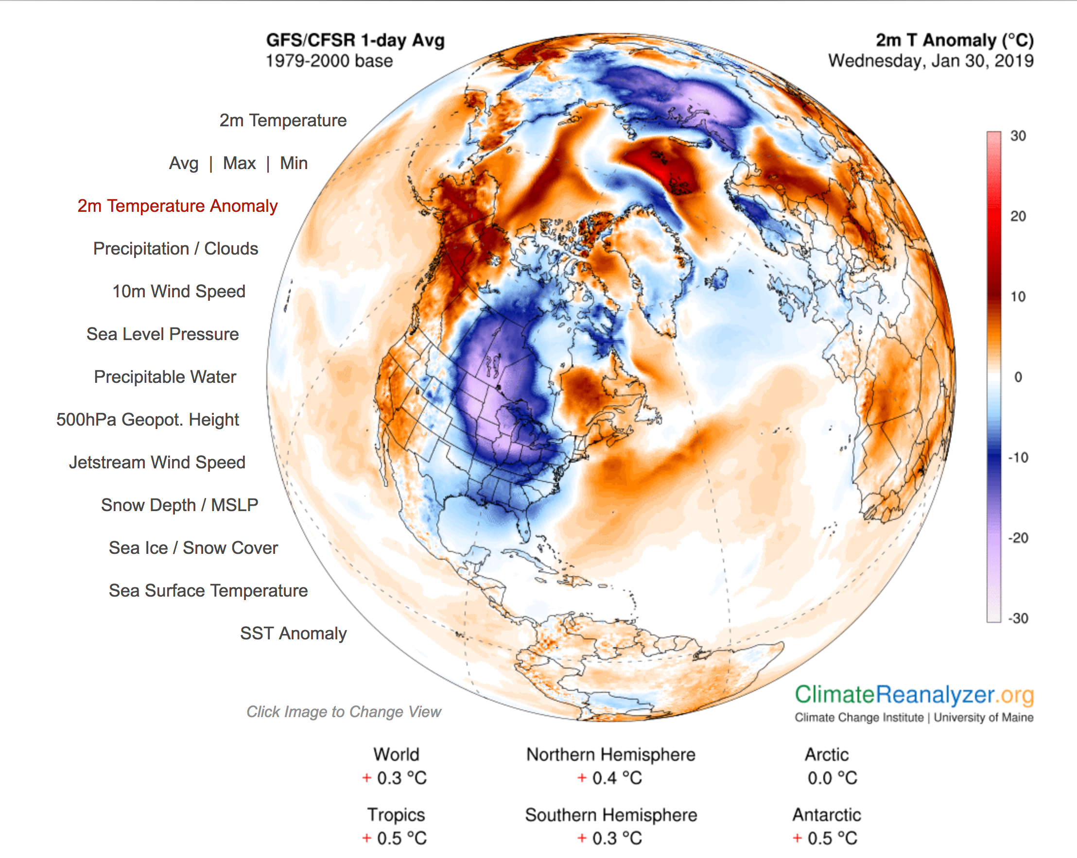
There are some cold spots on the map: the north-east of North America and parts of northern Russia are much colder than usual. There are also hot spots, in Alaska and in the Arctic Sea. And as the summaries under the map show, the northern hemisphere is more unusually hot (on average) than the southern hemisphere.
Weather is what matters to us day to day: especially the weather around us and the weather in places with English-speaking television stations. That can give a very misleading view of the state and trend of global climate.
Thomas Lumley (@tslumley) is Professor of Biostatistics at the University of Auckland. His research interests include semiparametric models, survey sampling, statistical computing, foundations of statistics, and whatever methodological problems his medical collaborators come up with. He also blogs at Biased and Inefficient See all posts by Thomas Lumley »
Seems to be another of those ‘globes’ which put US at the centre of the world.
The anomaly mentioned doesnt seem to actual temperatures but from their climate model but with corrections.
” Here, we use 0.25°x0.25° (~30 km) output grids available from NOMADS, and calculate daily averages from eight 3-hourly timeslices” and then a different method for the SST or sea surface, and then theres the older baseline to 2000 instead of the one to
1981-2010. Not sure how this is useful when real data is available.
7 years ago
It turns out to be quite hard to show the whole globe in a single picture, so I concentrated on the areas that are currently in the news. The linked website lets you see the whole thing.
In order to get a grid over the globe you need to smooth out the data from weather stations, and it obviously makes sense to do this in a way that respects the basic physics of air flow. So I think it’s more informative than just showing raw temperature measurements at individual weather stations around the world. But those data are easily available if you want them.
7 years ago
Niwa has recent period- ‘last 15 days’- maps of temperature and rainfall anomaly’s, with the maps computer generated from observations and they use the more recent 30 yr period 81-2010
https://www.niwa.co.nz/static/climate/last15daystemp.png?1234
Thats what I was referring to, it seems a waste of resources to generate the daily temperatures from climate models, when the input could be actual temps to create their temperature gradient maps.
7 years ago