Posts from February 2015 (33)

February 27, 2015

Quake prediction: how good does it need to be?

From a detailed story in the ChCh Press, (via Eric Crampton) about various earthquake-prediction approaches

About 40 minutes before the quake began, the TEC in the ionosphere rose by about 8 per cent above expected levels. Somewhat perplexed, he looked back at the trend for other recent giant quakes, including the February 2010 magnitude 8.8 event in Chile and the December 2004 magnitude 9.1 quake in Sumatra. He found the same increase about the same time before the quakes occurred.

Heki says there has been considerable academic debate both supporting and opposing his research.

To have 40 minutes warning of a massive quake would be very useful indeed and could help save many lives. “So, why 40 minutes?” he says. “I just don’t know.”

He says if the link were to be proved more firmly in the future it could be a useful warning tool. However, there are drawbacks in that the correlation only appears to exist for the largest earthquakes, whereas big quakes of less than magnitude 8.0 are far more frequent and still cause death and devastation. Geomagnetic storms can also render the system impotent, with fluctuations in the total electron count masking any pre-quake signal.

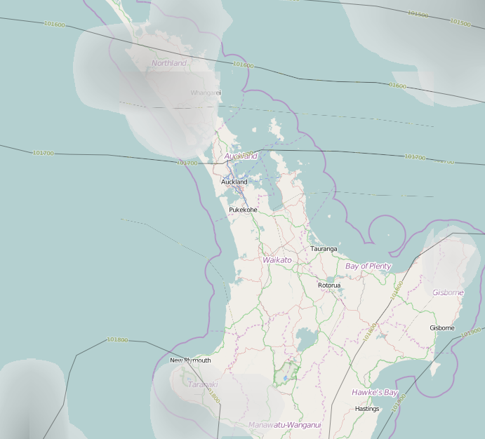
Let’s suppose that with more research everything works out, and there is a rise in this TEC before all very large quakes. How much would this help in New Zealand? The obvious place is Wellington. A quake over 8.0 magnitude has been observed in the area in 1855, when it triggered a tsunami. A repeat would also shatter many of the earthquake-prone buildings. A 40-minute warning could save many lives. It appears that TEC shouldn’t be that expensive to measure: it’s based on observing the time delays in GPS satellite transmissions as they pass through the ionosphere, so it mostly needs a very accurate clock (in fact, NASA publishes TEC maps every five minutes). Also, it looks like it would be very hard to hack the ionosphere to force the alarm to go off. The real problem is accuracy.

The system will have false positives and false negatives. False negatives (missing a quake) aren’t too bad, since that’s where you are without the system. False positives are more of a problem. They come in two forms: when the alarm goes off completely in the absence of a quake, and when there is a quake but no tsunami or catastrophic damage.

Complete false predictions would need to be very rare. If you tell everyone to run for the hills and it turns out to be sunspots or the wrong kind of snow, they will not be happy: the cost in lost work (and theft?) would be substantial, and there would probably be injuries.  Partial false predictions, where there was a large quake but it was too far away or in the wrong direction to cause a tsunami, would be just as expensive but probably wouldn’t cause as much ill-feeling or skepticism about future warnings.

Now for the disappointment. The story says “there has been considerable academic debate”. There has. For example, in a (paywalled) paper from 2013 looking at the Japanese quake that prompted Heki’s idea

A detailed analysis of the ionospheric variability in the 3 days before the earthquake is then undertaken, where a simultaneous increase in foF2 and the Es layer peak plasma frequency, foEs, relative to the 30-day median was observed within 1 h before the earthquake. A statistical search for similar simultaneous foF2 and foEs increases in 6 years of data revealed that this feature has been observed on many other occasions without related seismic activity. Therefore, it is concluded that one cannot confidently use this type of ionospheric perturbation to predict an impending earthquake.

In translation: you need to look just right to see this anomaly, and there are often anomalies like this one without quakes. Over four years they saw 24 anomalies, only one shortly before a quake.  Six complete false positives per year is obviously too many.  Suppose future research could refine what the signal looks like and reduce the false positives by a factor of ten: that’s still evacuation alarms with no quake more than once every two years. I’m pretty sure that’s still too many.


Siberian hamsters or Asian gerbils

Every year or so there is a news story along the lines of”Everything you know about the Black Death is Wrong”. I’ve just been reading a couple of excellent posts  by Alison Atkin on this year’s one.

The Herald’s version of the story (which they got from the Independent) is typical (but she has captured a large set of headlines)

The Black Death has always been bad publicity for rats, with the rodent widely blamed for killing millions of people across Europe by spreading the bubonic plague.

But it seems that the creature, in this case at least, has been unfairly maligned, as new research points the finger of blame at gerbils.

and

The scientists switched the blame from rat to gerbil after comparing tree-ring records from Europe with 7711 historical plague outbreaks.

That isn’t what the research paper (in PNAS) says. And it would be surprising if it did: could it really be true that Asian gerbils were spreading across Europe for centuries without anyone noticing?

The abstract of the paper says

The second plague pandemic in medieval Europe started with the Black Death epidemic of 1347–1353 and killed millions of people over a time span of four centuries. It is commonly thought that after its initial introduction from Asia, the disease persisted in Europe in rodent reservoirs until it eventually disappeared. Here, we show that climate-driven outbreaks of Yersinia pestis in Asian rodent plague reservoirs are significantly associated with new waves of plague arriving into Europe through its maritime trade network with Asia. This association strongly suggests that the bacterium was continuously reimported into Europe during the second plague pandemic, and offers an alternative explanation to putative European rodent reservoirs for how the disease could have persisted in Europe for so long.

If the researchers had found repeated, prevously unsuspected, invasions of Europe by hordes of gerbils, they would have said so in the abstract. They don’t. Not a gerbil to be seen.

The hypothesis is that plague was repeatedly re-imported from Asia (where affected a lots of species, including, yes, gerbils) to European rats, rather than persisting at low levels in European rats between the epidemics. Either way, once the epidemic got to Europe, it’s all about the rats [update: and other non-novel forms of transmission]

In this example, for a change, it doesn’t seem that the press release is responsible. Instead, it looks like progressive mutations in the story as it’s transmitted, with the great gerbil gradually going from an illustrative example of a plague host in Asia to the rodent version of Attila the Hun.

Two final remarks. First, the erroneous story is now in the Wikipedia entry for the great gerbil (with a citation to the PNAS paper, so it looks as if it’s real). Second, when the story is allegedly about the confusion between two species of rodent, it’s a pity the Herald stock photo isn’t the right species.


[Update: Wikipedia has been fixed.]

CensusAtSchool 2015 launches soon!

It’s nearly CensusAtSchool time again!  CAS is a biennial educational project in te reo Māori and English that turns school students into data detectives, using real-world, anonymised data about them, their peers, and their world.123_UoAStats_6May13 -low res

This is how it works: In the classroom, using any sort of internet-enabled digital device, and under the supervision of teachers, students fill in a confidential questionnaire in English or te reo Māori.

Some questions involve practical skills, such as weighing their schoolbags and measuring their arm span. Some questions ask about their day-to-day lives: How do they get to school? Where did they eat their dinners the night before? Do they think bullying is a problem in their school? And, given that this is a major sporting year: Which two teams will contest the Rugby World Cup final?

The database is then made available for students and their teachers to undertake statistical investigations, which is an important part of the statistics strand of the curriculum.

Teachers, this year’s Census starts on March 16, and can be completed any time this year. It’s free and you can register at www.censusatschool.org.nz. For everyone else, CAS always attracts great mainstream media interest – we’ll post the best stories here as they crop up.081_UoAStats_6May13low res

CensusAtSchool is an international educational project that began in the UK in 2000, based on a 1990 trial project by Dr Sharleen Forbes, then of Statistics New Zealand. It is now run in the UK, Ireland, Australia, Canada, South Africa, Japan and the US, as well as  New Zealand.

What are you trying to do?


There’s a new ‘perspectives’ piece (paywall) in the journal Science, by Jeff Leek and Roger Peng (of Simply Statistics), arguing that the most common mistake in data analysis is misunderstanding the type of question. Here’s their flowchart

F1.large

The reason this is relevant to StatsChat is that you can use the flowchart on stories in the media. If there’s enough information in the story to follow the flowchart you can see how the claims match up to the type of analysis. If there isn’t enough information in the story, well, you know that.


February 25, 2015

Super 15 Predictions for Round 3

Team Ratings for Round 3

The basic method is described on my Department home page.

Here are the team ratings prior to this week’s games, along with the ratings at the start of the season.

Current Rating Rating at Season Start Difference
Crusaders 8.49 10.42 -1.90
Waratahs 8.16 10.00 -1.80
Hurricanes 4.10 2.89 1.20
Brumbies 4.07 2.20 1.90
Sharks 3.21 3.91 -0.70
Stormers 3.03 1.68 1.30
Chiefs 2.65 2.23 0.40
Bulls 1.41 2.88 -1.50
Blues 0.56 1.44 -0.90
Highlanders -2.43 -2.54 0.10
Force -3.75 -4.67 0.90
Cheetahs -4.42 -5.55 1.10
Lions -4.56 -3.39 -1.20
Reds -6.00 -4.98 -1.00
Rebels -7.52 -9.53 2.00


Performance So Far

So far there have been 14 matches played, 8 of which were correctly predicted, a success rate of 57.1%.

Here are the predictions for last week’s games.

Game Date Score Prediction Correct
1 Chiefs vs. Brumbies Feb 20 19 – 17 3.30 TRUE
2 Rebels vs. Waratahs Feb 20 28 – 38 -12.10 TRUE
3 Bulls vs. Hurricanes Feb 20 13 – 17 2.70 FALSE
4 Highlanders vs. Crusaders Feb 21 20 – 26 -7.10 TRUE
5 Reds vs. Force Feb 21 18 – 6 0.30 TRUE
6 Stormers vs. Blues Feb 21 27 – 16 6.30 TRUE
7 Sharks vs. Lions Feb 21 29 – 12 10.90 TRUE


Predictions for Round 3

Here are the predictions for Round 3. The prediction is my estimated expected points difference with a positive margin being a win to the home team, and a negative margin a win to the away team.

Game Date Winner Prediction
1 Highlanders vs. Reds Feb 27 Highlanders 8.10
2 Force vs. Hurricanes Feb 27 Hurricanes -3.40
3 Cheetahs vs. Blues Feb 27 Blues -0.50
4 Chiefs vs. Crusaders Feb 28 Crusaders -1.80
5 Rebels vs. Brumbies Feb 28 Brumbies -7.60
6 Bulls vs. Sharks Feb 28 Bulls 2.20
7 Lions vs. Stormers Feb 28 Stormers -3.60


Measuring what you care about

If cannabis is safer than thought (as the Washington Post says), that might explain why the reporting is careful to stay away from thought.

thought


The problem with this new research is that it’s looking at the acute toxicity of drugs — how does the dose people usually take compare to the dose needed to kill you right away.  It’s hard to overstate how unimportant this is in debates over regulation of alcohol, tobacco, and cannabis.  There’s some concern about alcohol poisoning (in kids, mostly), but as far as I can remember I have literally never seen anti-tobacco campaigns mentioning acute nicotine poisoning as a risk, and even the looniest drug warriors don’t push fatal THC overdoses as the rationale for banning marijuana.

Alcohol is dangerous not primarily because of acute poisoning, but because of car crashes, violence, cancer, liver failure, and heart damage. Tobacco is dangerous not primarily because of acute poisoning, but because of lung cancer, COPD, heart disease, stroke, and other chronic diseases.

It’s hard to tell how dangerous marijuana is. It certainly causes dependence in some users, and there are reasons to think it might have psychological and neurological effects. If smoked, it probably damages the lungs. In all these cases, though, the data on frequency and severity of long-term effects are limited.  We really don’t know, and the researchers didn’t even try to estimate.

The conclusions of the researchers — that cannabis is over-regulated and over-panicked-about relative to other drugs — are reasonable, but the data provide very little support for them.  If the researchers had used the same methodology on caffeine, it would have looked much more dangerous than cannabis, and probably more dangerous than methamphetamine. That would have been a bit harder to sell, even with a pretty graph.


[story now in Herald, too]

Briefly

  • NZ papers have sensible coverage of the new peanuts/kids research (Herald, Stuff). NHS Behind The Headlines has a summary and takes some UK papers to task.
  • “Rich Data, Poor Data”: Nate Silver writes about why sports statistics works. Unfair summary: it’s an artificial problem in a controlled environment that people care about more than they should.
  • “the vast majority of health sites, from the for-profit WebMD.com to the government-run CDC.gov, are loaded with tracking elements that are sending records of your health inquiries to the likes of web giants like Google, Facebook, and Pinterest, and data brokers like Experian and Acxiom.” Story at vice.com, video summary from the researcher:
  • “A memo to the American people from US Chief Data Scientist Dr DJ Patil”.  More informative than you might expect given the source.
  • “the biggest problem facing the world of public opinion research isn’t that online opt-in polls, but rather the temptation to troll twitter to “see what people are thinkingand other thoughts from Cathy O’Neil, based on the new report on Big Data from the American Association for Public Opinion Research.
  • Openweathermap.org: another part of the increasing supply of open data
    weathermap

Wiki New Zealand site revamped

We’ve written before about Wiki New Zealand, which aims to ‘democractise data’. WNZ has revamped its website to make things clearer and cleaner, and you can browse here.

As I’m a postgraduate scarfie this year, the table on domestic students in tertiary education interested me – it shows that women (grey) are enrolled in greater numbers than men at every single level. Click the graph to embiggen.

Founder Lillian Grace talks about the genesis of Wiki New Zealand here, and for those who love the techy  side, here’s a video about the backend.


png


February 21, 2015

Another interesting thing about petrol prices

or What I Did At Open Data Day.

The government monitoring data on petrol prices go back to 2004, and while they show their data as time series, there are other ways to look at it.

petroltrend

The horizontal axis is the estimated cost of imported petrol plus all the taxes and levies. The vertical axis is the rest of the petrol price: it covers the cost hauling the stuff around the country, the cost of running petrol stations, and profit for both petrol stations and companies.

There’s an obvious change in 2012. From 2005 to 2012, the importer margin varied around 15c/litre, more or less independent of the costs. From 2012, the importer margin started rising, without any big changes in costs.

Very recently, things changed again: the price of crude oil fell, with the importer margin staying roughly constant and the savings being passed on to consumers. Then the New Zealand dollar fell, and the importer margin has fallen — either the increased costs from the lower dollar are being absorbed by the vendors, or they have been hedged somehow.


If it seems too good to be true

The Herald (from the Daily Telegraph) has a story about a new high-antioxidant chocolate

Its makers claim it can change the underlying skin of a 50 to 60-year-old into that of someone in their 20s or 30s.

Actually, in an uncontrolled short-term trial in 400 people they say

“We used people in their 50s and 60s and in terms of skin biomarkers we found it had brought skin back to the levels of a 20 or 30-year-old

The target market is

“elegant, educated and affluent” city-dwelling women in their 30s and businessmen “to support their appearance in a stressful environment and on their business travels”.

or, in other words, people who would be willing to bore on about how young and beautiful their skin biomarkers are, in case you can’t tell by looking.

To be fair, there is independent expert comment (which is not entirely convinced). If you read right to the last sentence you get the real highlight:

Nutrition experts at UCL also warned that previous trials showed that astaxanthin worked better when applied directly to the face rather than ingested.


Updated to add: the story was also on Prime News, where they made explicit the point that this really has nothing to do with the chocolate. They could have put the astaxanthin in a pill, but they thought it would be more attractive if they put it in chocolate. A spoonful of sugar makes the medicine go down, etc,