June 1, 2015
Graph of the week
Yes, it’s only Monday, but this one will be hard to beat (from CNN on Twitter, via @albertocairo)
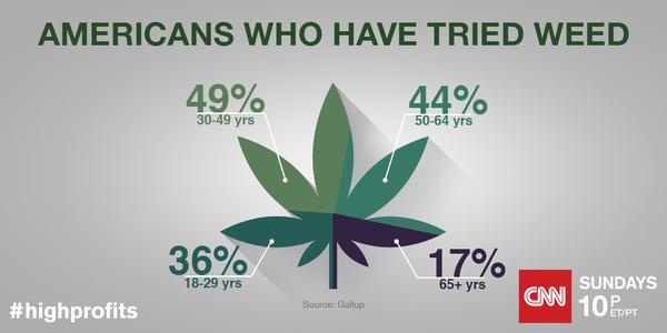
The off-square dividing make this look as if it’s trying to be a pie chart, but it isn’t. Not only are these not percentages of the same thing and so make no sense as a pie, the colour sections aren’t even scaled in proportion to the numbers (whether you look at angle or area).
Thomas Lumley (@tslumley) is Professor of Biostatistics at the University of Auckland. His research interests include semiparametric models, survey sampling, statistical computing, foundations of statistics, and whatever methodological problems his medical collaborators come up with. He also blogs at Biased and Inefficient See all posts by Thomas Lumley »