Accurate graphical rhetoric
This graph comes from the Twitter account of Jill Hennessy, Victoria’s Minister for Health. It’s obviously intended to make a particular point — and one that’s politically supportive to her. However, it’s actually a pretty good graph.
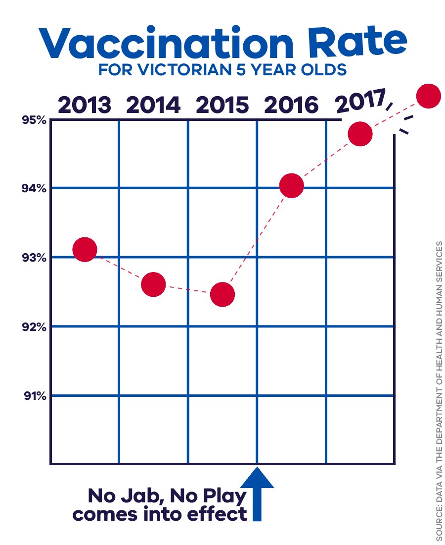
The baseline isn’t zero, but this is clearly an example where a zero baseline would be silly: zero is not a relevant value of the vaccination rate. The 95% top line is also not arbitrary: it’s the government target for vaccination, chosen because it’s thought to be high enough for herd immunity even to measles. Having the line break out of the box is done without distorting the numerical values. I might want some earlier data than 2013 to see the trends under the previous government, but that’s not a terrible omission.
The causal attribution of the increase to the “No Jab No Play” laws — restricting kindergarten, preschool, and daycare attendance for kids who are missing vaccinations — is obviously less solid, but it’s not implausible. And there are some regions of Victoria where rates are still low. And there’s obviously room to argue about whether the laws denying benefits and restricting preschool/kindergarten/daycare enrolment are worth it even if they were responsible. But the graph itself, unusually for something from a minister, isn’t bad.
Thomas Lumley (@tslumley) is Professor of Biostatistics at the University of Auckland. His research interests include semiparametric models, survey sampling, statistical computing, foundations of statistics, and whatever methodological problems his medical collaborators come up with. He also blogs at Biased and Inefficient See all posts by Thomas Lumley »
The point for 2018 is a little disconcerting – I guess vaccinations happen before age 5 so the rate at age 5 is not much different for the rate at age 4.
8 years ago