April 15, 2019
Graphic of the week
From 1News, via Richard Hills on Twitter, a graphic accompanying their latest opinion poll results.
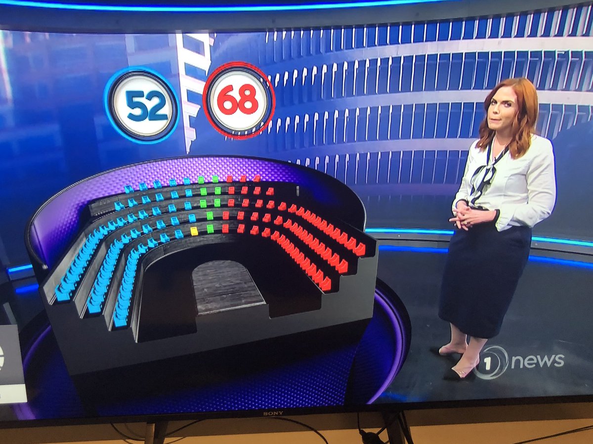
If the picture of Parliament isn’t supposed to have some quantitative relationship to the opinion figures, it shouldn’t be in party colours.
Thomas Lumley (@tslumley) is Professor of Biostatistics at the University of Auckland. His research interests include semiparametric models, survey sampling, statistical computing, foundations of statistics, and whatever methodological problems his medical collaborators come up with. He also blogs at Biased and Inefficient See all posts by Thomas Lumley »
It looks to me like they have coloured blue 52% of the seats, got green and yellow correct and then filled the rest red.
5 years ago
I didn’t think of that as an explanation, but it’s the first one I’ve seen that makes sense (for sufficiently small values of ‘sense’)
5 years ago
So, I counted them. There are 59 blue + 1 yellow for 60 to the Right, 52 red + 8 green for 60 to the left.
seems like they’ve assigned half to the left & right, gotten the minor parties right and coloured the rest red or blue.
5 years ago