Graphs don’t matter?
Back in early December, I wrote about a political ad authorised by Simon Bridges, showing the price of fuel.
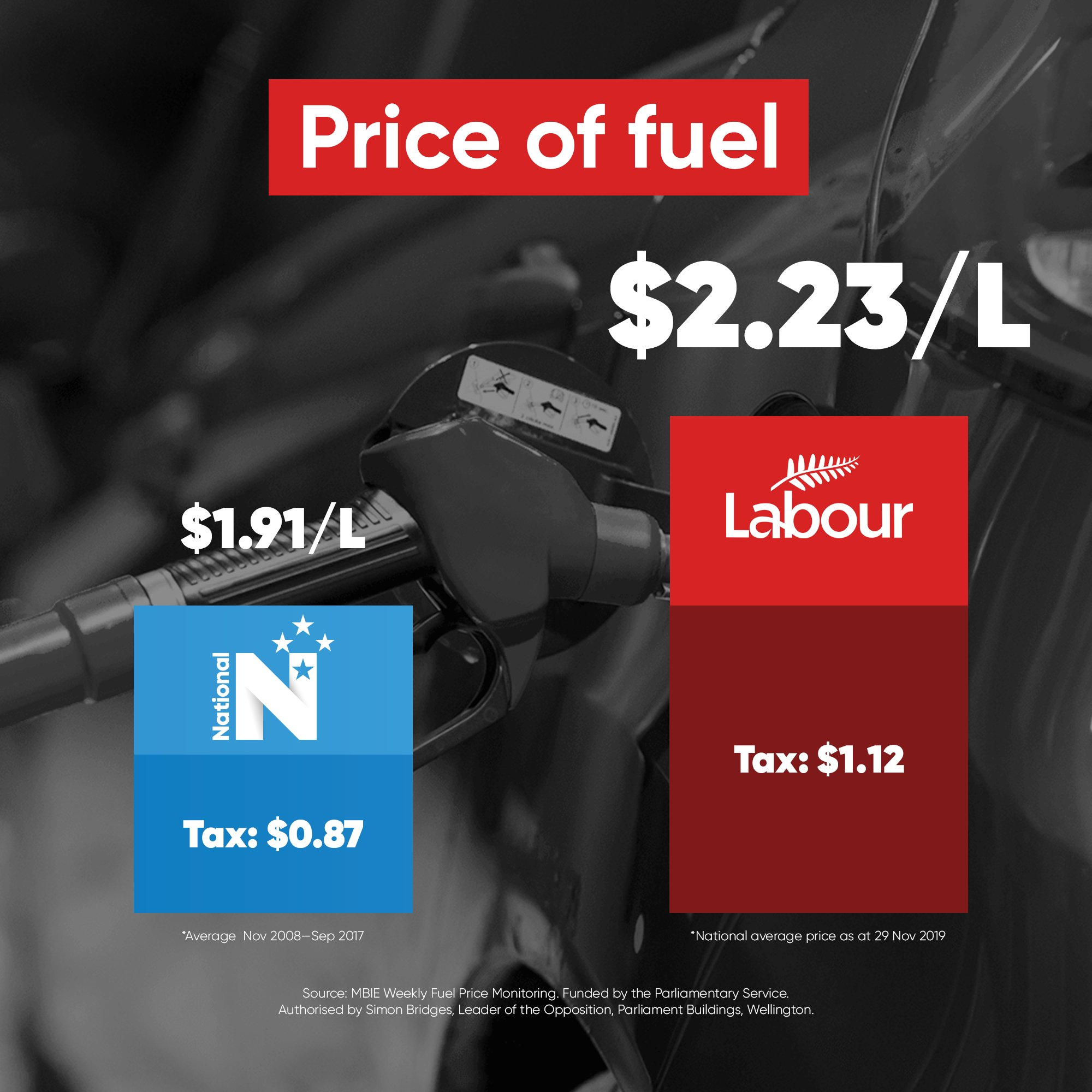
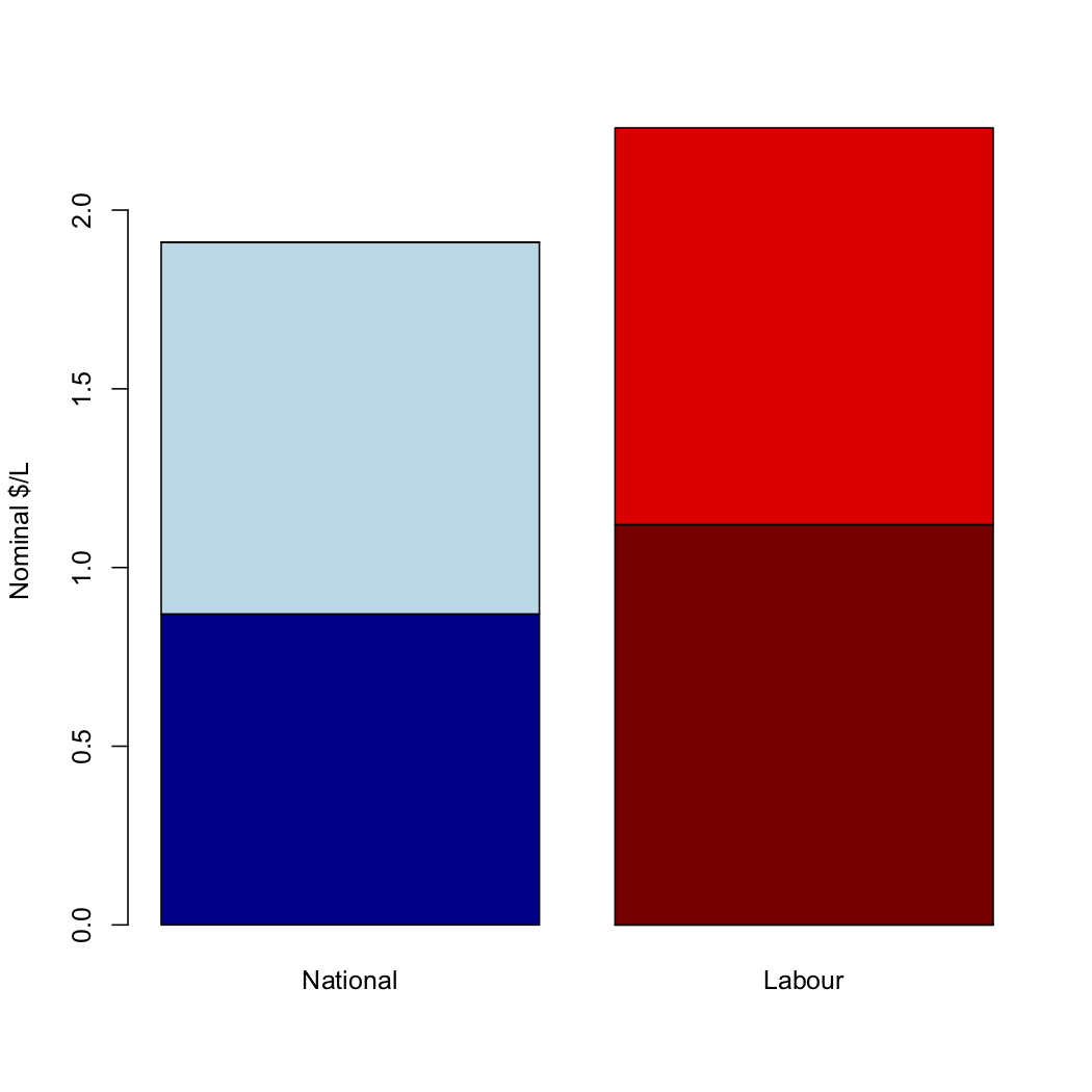
As I said the, the numbers do not remotely match the graph. A graph using those numbers would look more like
Dylan Reeve and other people complained to the Advertising Standards Authority, both about the graph itself and about the choice of numbers, which (in his opinion and mine) was cherrypicked in a misleading way.
The ASA decided (in a split decision) that the graphic was not misleading
The majority said the data displayed was correct which saved the hyperbolic graphic from being misleading, given the political medium used and the principles of advocacy advertising.
I believe this is decision is bad in terms of norms for mainstream political advertising, and that it’s likely to be factually incorrect as to the impact of the graphic.
The cherrypicked numbers are misleading, but they are misleading in a way that is, sadly, routine in political advertising. I’ve written about examples from both parties here since StatsChat started. My starting point for any political advocacy involving numerical comparisons is always that the numbers are likely to be correct as quoted, but chosen to mislead. Given the established norms, I can understand the ASA not wanting to get involved.
The distorted graph, on the other hand, seems to be new. I was genuinely surprised at the extent of the distortion — well beyond common tricks of perspective or false baseline.
If writing the numbers on a misleading graph was enough to stop it being misleading, there would be no point having data graphics. The whole point of data graphics is that they provide a clearer and more forceful impression of the data than just tabulating the numbers. Misleading graphs are misleading.
Thomas Lumley (@tslumley) is Professor of Biostatistics at the University of Auckland. His research interests include semiparametric models, survey sampling, statistical computing, foundations of statistics, and whatever methodological problems his medical collaborators come up with. He also blogs at Biased and Inefficient See all posts by Thomas Lumley »
The ASA is not a government agency but a creation of the advertising industry players. Not surprising in a way that the levels of hyperbole and puffery that can used to advertise potato chips they would see as appropriate for political advertising. Maybe the standards for
non prescription medical and pharmaceutical products should be used instead.
6 years ago
As someone who’s made over 60 complaints to the ASA about misleading health claims in ads, you might be surprised how much they give a free pass to in that sphere as well.
6 years ago
Cherry picking aside, the numbers are true BUT their visual representation is not. The visual representation is a lie and the ASA judgment is astounding. National might as well divide a pie graph into thirds and label them 20, 30 and 50%
6 years ago
I think choice of which numbers to present can be dishonest, too. But I can definitely understand the ASA not wanting to go there.
6 years ago
Maybe they think they’ll get inundated with complaints about minutiae of graphics and they don’t have the expertise or time to deal with it.
6 years ago
Political advertisements should be factual in all respects. BSA should not allow misleading manipulation
6 years ago
the ASA board seems to be some capable people and not just advertising Hooray henrys so I dont see the technical details being a problem
https://www.asa.co.nz/about-us/complaints-board-ascb-members/
There is also an appeals process, so maybe the complainants will take it further.
Interesting in reading the decision, they made reference to previous decision on a Bank using graphs in a tricky way.
“The Complaints Board was of the view that the high standard of social responsibility required by the Code for Financial Advertising meant that it was not appropriate to use a graph which did not accurately reflect the data points it was representing. The Complaints Board ruled there was no room for hyperbole within financial advertising.” Decision 08/201
No room for hyperbole there.
6 years ago
I think the ASA decision is misguided. I teach an HCI class and I would fail students who abuse graphs in this way. But that is because we are part of an engineering faculty rather than marketing or business.
I think perhaps I will have to engage with the ASA in a professional capacity to discuss the role of visualisation in the psychological impression of numbers. Having the correct numbers does not save the graph and anyone defending that position does not understand human psychology.
6 years ago