Graphical inflation
Multiple people have pointed me to this picture, authorised by Simon Bridges.
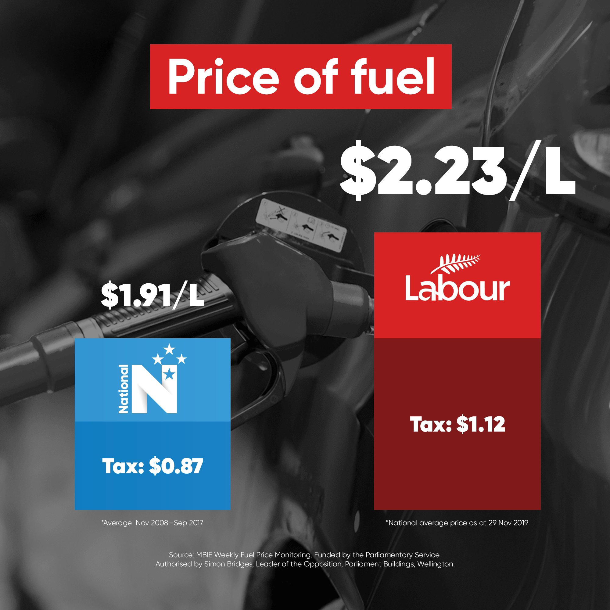
It’s designed to look like a barchart, but if it were a barchart the dimensions of the colored bits would have a closer quantitative relation to the numbers being displayed. I’m going to assume the numbers are correct, because that’s the sort of thing people are more careful about. The bars aren’t.
To start with, the red bar is wider than the blue bar, which is a well-known graphical exaggeration technique. But that’s not the real problem. The real problem is the heights.
On my laptop screen, I measured the red bar as 61% higher than the blue bar. But $2.23/L is only 16% higher than $1.91/L: that’s nearly a four-fold exaggeration of the difference
The dark red ‘Tax’ section of the red bar is 92% higher than the dark blue ‘Tax’ section of the blue bar, but $1.12 is only 29% higher than $0.87: more than a three-fold exaggeration.
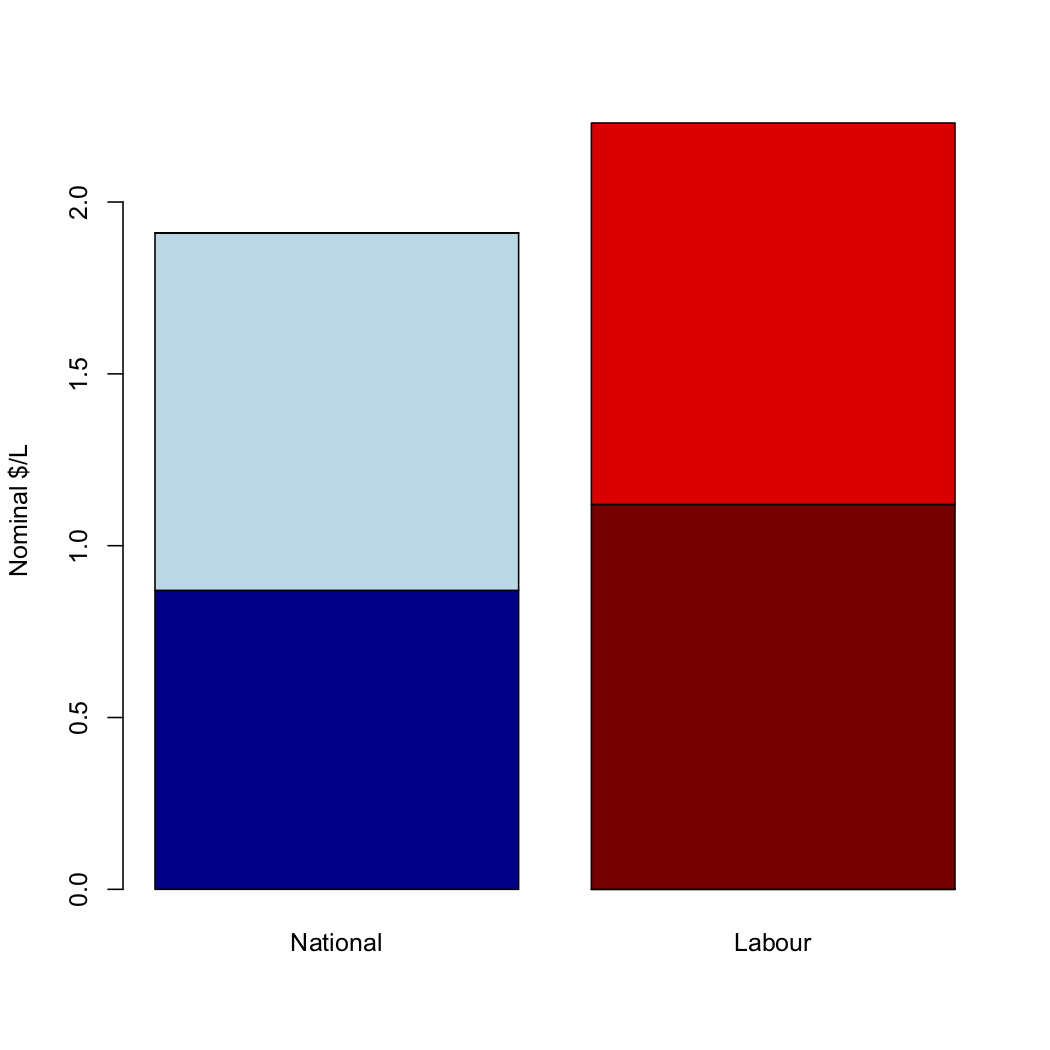
If the heights were proportional to the numbers, as in a real barchart, it would look like this:
But wait, there’s more! The blue bar is averaged over nine years of National government; the red bar is from last week. That means the difference between the blue and red bars is partly inflation. Over the time since September 2008, the RBNZ calculator says there has been 18% inflation. We could say, as a rough approximation, that the data spread over nine years should get half the inflation applied. Doing this would wipe out about half the difference between the blue and red bars, to give a comparison like this one:
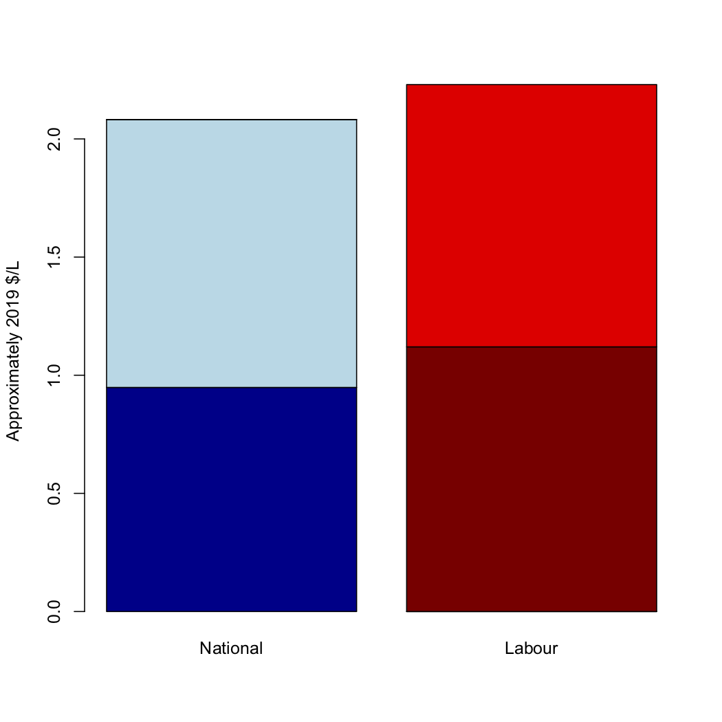
There has been an increase in petrol prices due to tax increases under Labour. It’s not anywhere near as big as National’s graphic implies.
Thomas Lumley (@tslumley) is Professor of Biostatistics at the University of Auckland. His research interests include semiparametric models, survey sampling, statistical computing, foundations of statistics, and whatever methodological problems his medical collaborators come up with. He also blogs at Biased and Inefficient See all posts by Thomas Lumley »
Our summer is the Northern Hemisphere winter so prices jump at this time of year as the Northern Hemisphere demand rises. Using last weeks prices is just plain dumb.
[ My relations in North Bay, Canada are in for a -4/-12 °C day today and next Wednesday it’s predicted to be -13/-19 °C.]
7 years ago
Demand rises for driving on ice covered roads ?
The US actually has an Energy Information Administration, or as some might have called it ‘The Swamp’
‘In 2000 through 2018, the average monthly price of U.S. retail regular-grade gasoline in August was about 35 cents per gallon higher than the average price in January.’
https://www.eia.gov/energyexplained/gasoline/price-fluctuations.php
California’s prices are higher than everyone elses because of stuff they put in it.
7 years ago