More misleading trends
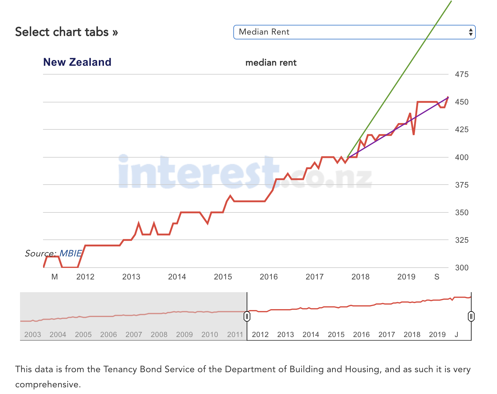
There’s another badly-distorted bar chart being circulated, approved by Simon Bridges. It purports to show median rents in September 2017 and now. I’m not actually going to reproduce the chart. Instead, look at this chart from interest.co.nz for the period covering the time since the 2011 election (the red line).
Over this time, rents have increased. The trend is reasonably consistent, not far from 5.5%/year; it might be accelerating a bit.
The purple line shows the trend from September 2017 to now; you can see for yourself how it compares to the previous trend, and decide whether that’s good or bad, and who is to blame. Presenting just the purple line, without the context, would clearly be a bit misleading.
The green line shows the trend from September 2017 to now more as the latest National Party bar chart depicts it: the bar corresponding to current rents is 39% longer than the bar corresponding to 2017 rents, which would be correct if the current median rent were $556. Presenting the green line as the trend is more than a bit misleading.
(PS: I don’t want to get heavily into the political fact-checking business, but if the other parties are circulating graphs like these ones I’d be happy annoyed enough to write about them, too)
Thomas Lumley (@tslumley) is Professor of Biostatistics at the University of Auckland. His research interests include semiparametric models, survey sampling, statistical computing, foundations of statistics, and whatever methodological problems his medical collaborators come up with. He also blogs at Biased and Inefficient See all posts by Thomas Lumley »

Frankly, I”d pay for an independent fact checking service that’s apolitical. Maybe a GoFundMe or kickstarter to pay for some christmas cheer?
6 years ago