Axes of evil
A graph from Fox31 news, via various people on Twitter.
Look at the y-axis: the divisions vary from 10 to 50!
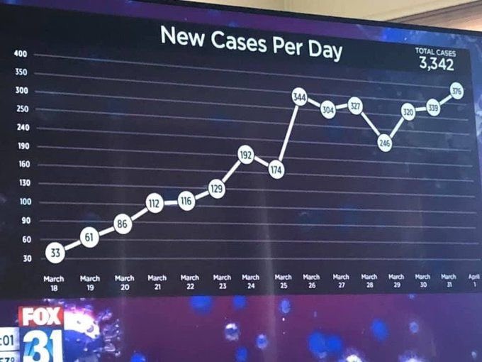
The natural suspicion is that the y-axis has been fiddled to make the graph look more linear — to ‘flatten the curve’.
So, I tried drawing it right, to show the actual trend. It looks
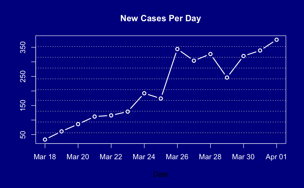
…. pretty much the same, actually.
So, on the one hand, no real distortion of the data. But on the other hand, why bother?
Thomas Lumley (@tslumley) is Professor of Biostatistics at the University of Auckland. His research interests include semiparametric models, survey sampling, statistical computing, foundations of statistics, and whatever methodological problems his medical collaborators come up with. He also blogs at Biased and Inefficient See all posts by Thomas Lumley »
Please explain. I don’t get the big deal about this at all? Been a while since I’ve had statistics.
6 years ago
The equally-spaced grid in the vertical direction does not correspond to equal numbers of cases. For example, there are lines at 240, 250, 300, giving the same vertical spacing to differences of 10 cases as 50 cases. I was surprised to find this didn’t distort the visual impression much.
6 years ago
I think the reason it doesn’t distort the data too much is that some of the y axis values are actually in the right place. 30, 60, 90 are consistent with 240 and 300. They have just changed some of the ones in between to make them “nice” numbers like 100 and 250 and moved some of the points around.
Explaining why they have done it I will leave to others.
6 years ago
Is it somewhat, something to do with MISLEADING graph? Apparently look? Apparently, looks small, but ‘reality’ perhaps well and truly ‘B-I-G’?
6 years ago
Interns..
6 years ago
Probably not. I had previously heard from data journalists, and someone on Twitter confirmed, that graphics are often drawn freehand. In this case I think someone made an honest and pretty successful attempt to draw the graph, and then backfilled the y-axis to match.
6 years ago