Posts written by Thomas Lumley (2645)

avatar

Thomas Lumley (@tslumley) is Professor of Biostatistics at the University of Auckland. His research interests include semiparametric models, survey sampling, statistical computing, foundations of statistics, and whatever methodological problems his medical collaborators come up with. He also blogs at Biased and Inefficient

December 23, 2015

Pre-attentive perception and pandas

The University has closed until the New Year and we are on compulsory holiday, so from my point of view it’s the StatsChat Silly Season.

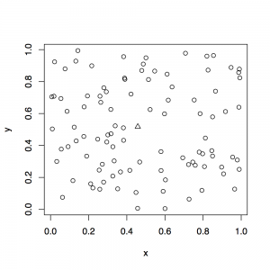
An important scientific issue in designing graphics is preattentive perception: for example, it’s easy to see the one different point in this plot
preattentive1

The circle vs triangle distinction is pre-attentively perceived: your visual system annotates it before you get to see the picture.  More complicated distinctions aren’t pre-attentive, and so don’t make as good plotting characters.

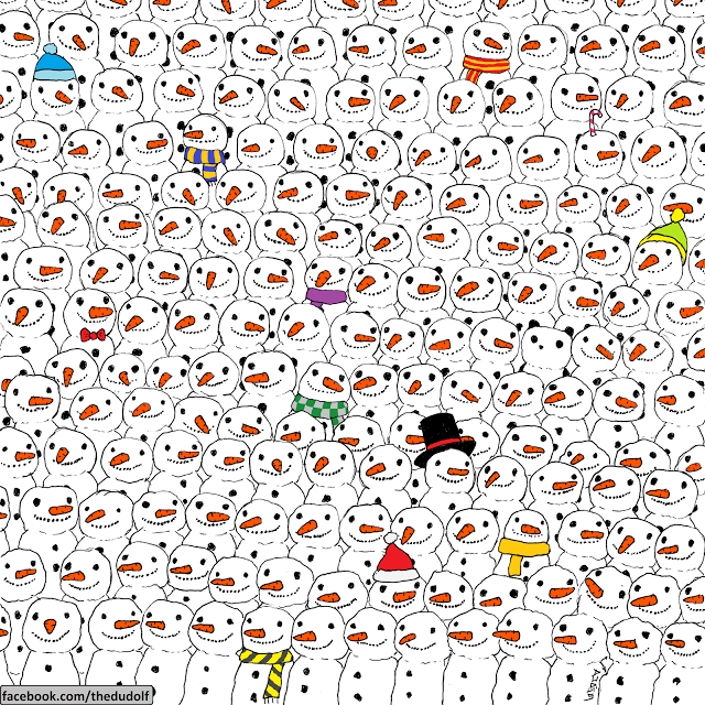
Here, as a Christmas card, is a picture from Hungarian cartoonist Gergely Dudás. One of the snowmen is a panda. Pandas are not pre-attentively perceived.

snowmen_1

(update: yes, I saw the Herald has it too.)

Above average

From the person most likely to be the next President of those United States:

“Now, I wouldn’t keep any school open that wasn’t doing a better than average job. If a school’s not doing a good job, then you know it may not be good for the kids.”

This, as you’d expect, has occasioned some discussion on the internets.

There’s nothing mathematically impossible about the idea of nearly all schools being above average.  Nearly everyone has more than the average number of legs.  Darwin, Australia, has had better than average Christmas weather on 49 of the last 50 years — in 1974, Cyclone Tracy destroyed 80% of houses in the city, which tends to pull the average down.

In other settings, it’s not even an unreasonable idea that you’d routinely close a large fraction of establishments.  It’s roughly what happens to restaurants, for example: lots of them are started, most fail, the remaining ones tend to be pretty close to the optimal price:quality tradeoff line.

In this quote, though, neither explanation really flies: it’s not that nearly all schools are the same except for a few really bad ones, and it doesn’t really make sense to close half the schools in the country, because even if you’re in favour of free competition between schools, most schools are too far apart to compete effectively.

What we’re seeing here is the broadening of ‘average’ to mean ‘ok’, which is one of the reasons it’s less useful as a technical term than it used to be.  If you want to be precise, ‘mean’ is better.

December 22, 2015

Briefly

  • From a Press Council decision (via Matt Nippert)
    Press releases are a useful way for newspapers to receive information and comment from interested parties. However, as the senior editor concedes, using a release almost verbatim falls well below best practice. Newspapers risk losing the trust of their readership if they print material that is not independent and objective (or otherwise clearly labelled as comment).
  • Siouxsie Wiles and Kate Hannah have a crowdfunding appeal to send copies of Nicola Gaston’s book on sexism in science to people who need to read it.
December 20, 2015

Return of the cheese addiction beatup

Remember cheese addiction? It’s back (in the Independent)

Using the Yale Food Addiction Scale, designed to measure a person’s dependence on, scientists found that cheese is particularly potent because it contains casein. 

The substance, which is present in all dairy products, can trigger the brain’s opioid receptors which are linked to addiction.

This time there’s enough circumstantial evidence to track down the open-access research paper. It does not contain the word “casein” (or “casomorphin”).

The research paper does not make any assertions about cheese or dairy products and opioid receptors. In fact, it doesn’t single out cheese at all. It says

…we observed that highly processed foods with added levels of fat and/or refined carbohydrates (like white flour and sugar), were most likely to be associated with addictive-like eating behaviors

The cheese obsession in the media coverage is a complete fabrication. It would be interesting to know who’s behind it.


Update: the lead author, Erica Schulte is Not Happy with the cheese claim in this radio interview (at 17:30).

December 19, 2015

Punk’d

Earlier this year a current affairs program announced that they would have an interview with the man who didn’t get swallowed by a giant anaconda. Taken literally, this doesn’t restrict the options much.  There’s getting on for three billion men who haven’t been swallowed by giant anacondas; you probably know several yourself.  On the other hand, everyone knew which guy they meant.

There’s a branch of linguistics, called ‘pragmatics’, that studies how everyone knows what you mean in cases like this. The “Cooperative Principle” and Grice’s Maxims look at the assumption that everyone’s trying to move the conversation along and isn’t deliberately trolling.

One of the US opinion polling companies, Public Policy Polling, seems to make a habit of trolling its respondents.  This time, they asked whether people were in favour of bombing Agrabah.  30% of Republican supporters were. So were 19% of Democratic supporters, though for some reason this has been less widely reported. As you know, of course, since you are extremely well-read, Agrabah is not a town or region in Syria, nor is it held by Da’esh. It is, in fact, the fictional location of Disney’s Aladdin movie, starring among others the late, great Robin Williams.

I’m pretty sure that less than 30% even of Republican voters really support bombing a fictional country. In fact, I’d guess it’s probably less than 5%. But think about how the question was asked.  You’re a stereotypical Republican voter dragged away from quiet dinner with your stereotypical spouse and 2.3 stereotypical kids by this nice, earnest person on the phone who wants your opinion about important national issues.  You know there’s been argument about whether to bomb this place in the Middle East. You can’t remember if the name matches, but obviously if they’re asking a serious question that must be the place they mean. And it seemed like a good idea when it was explained on the news. Even the British are doing it. So you say “Support”.

The 30% (or 19%) doesn’t mean Republicans (or Democrats) want to bomb Aladdin. It doesn’t even mean they want to bomb arbitrary places they’ve never heard of. It means they were asked a question carefully phrased to sound as if it was about a genuine geopolitical controversy and they answered it that way.

When Ali G does this sort of thing to political figures, it’s comedy. When Borat does it to unsuspecting Americans it’s a bit dubious. When it’s mixed in with serious opinion polling, it risks further damaging what’s already a very limited channel for gauging popular opinion.

December 18, 2015

Cutting down on the supply. Not.

XKCD today:

cold_medicine

There’s another story today about seizing large quantities of methamphetamine, this time hidden in a coffee table.  The border people also catch at lot of imports of ephedrine or pseudoephedrine. From January 1 to October 31, the authorities seized 293kg of meth and the equivalent of 3 million tablets of pseudoephedrine. And, of course, these are  not available legally in New Zealand. We have phenylephrine instead, which is on the Nice List because it can’t be turned into methamphetamine

Recently, a study in the US compared phenylephrine to placebo for hay fever. That’s not quite the same as looking at effectiveness for colds, but it’s still notable that there was no detectable difference. There were also no detectable side effects, which the researchers attribute to the drug all being zapped by the liver before it gets into general circulation.

At least the ban on pseudoephedrine is making us safe, though? Well, the government is tracking the effectiveness of its strategies. Here’s the summary from the October 2015 report, which is robustly disappointing.
meth

There has been a decrease in use of methamphetamine, but it doesn’t look like the war on cold medicine can explain it.


Update: Before anyone else posts it, the famous joke synthesis

Because the hours of availability of such pharmacies are often limited, it would be of great interest to have a simple synthesis of pseudoephedrine from reagents which can be more readily procured.

A quick search of several neighborhoods of the United States revealed that while pseudoephedrine is difficult to obtain, N-methylamphetamine can be procured at almost any time on short notice and in quantities sufficient for synthesis of useful amounts of the desired material.

December 17, 2015

Lettuce and global warming

Sometimes things are more complicated than they seem.

From the Herald

It might seem like a virtuous choice – but munching lettuce is worse for the planet than eating bacon, a study claims.

Researchers say the amount of energy and water used – and the level of greenhouse gases produced – is far greater per calorie for lettuce than pork.

The second sentence doesn’t look as if it can carry the weight of the first sentence. I mean, yes, maybe per calorie, but who gets most of their calories from lettuce? Not even rabbits.

Later on, the story points this out:

Richard Bennett, dean of food research at Reading University, said: “The calorie is not the most sensible functional unit of comparison.”

and ends

But the study conceded that eating fewer calories would lead to better public health, benefiting the environment and cutting energy use.

That seems to settle it: Study 0, lettuce 1. Until you go and look at the research.

The research isn’t actually about working out the relative impacts of bacon and lettuce, it’s about a much less trivial question. It would probably be a good thing for the US population, on average, to lose weight. It would probably also be a good thing for the US population to eat more fruit and vegetables. What does that imply about food production and resource use?

In the research, they considered three scenarios:  keep eating unhealthy stuff, just less of it to reduce obesity; eat healthier food without reducing calorie intake; and eat healthier food at a lower total calorie intake to reduce obesity. The per-calorie resource demands for various foods are an input to this calculation; they aren’t conclusions in themselves.

The second scenario is the worst environmentally, but that’s not really surprising.  What’s interesting, and basically missed in the reporting is that the third scenario is worse than the first.  If people in the US changed their diets to eat less and to follow dietary recommendations, the result would be an increase in greenhouse-gas emissions, in water use, and in energy use.  Reducing meat consumption, especially beef, would help the environment, but reducing use of cheap fats, sugars, and starches wouldn’t, and increasing consumption of the current mix of fruit and vegetables definitely wouldn’t

To some extent, the conclusions are US-specific. NZ fruit and vegetable production uses less irrigation, and the produce is shipped shorter distances, in milder climates, than in the US. The conclusions also assume business as usual in food production. With cheap petrol and cheap water, it made sense to grow everything in the Imperial Valley and truck it or fly it across the country; in the future, that may not be efficient and the mix of fruits and vegetables consumed may change.

Carbon pricing and water shortages are going to increase the cost of food. The interesting part of this analysis is that they will increase the cost of healthier diets (at least in the US) even more, at least until the industry works out ways to adapt.

Briefly

  • “Polls Suggest Trump Will Win Between 8 Percent And 64 Percent Of The Vote”: on the actual predictive accuracy of polls this far in advance, from 538.
  • A social-network analysis to find which European Union staff members are most worth influencing
  •  

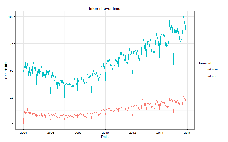
  • Google trends for “data is” vs “data are”. The red line is people correctly treating ‘data’ as plural; the blue line is people correctly treating ‘data’ as a mass noun. (via David Smith)

    6a010534b1db25970b01b7c7f7cbc8970b

December 15, 2015

Graphs: when zero is not a relevant value

Bar charts have a filled area tying the axis to the plotted value, and this only makes sense when the axis is at a true zero.  Scatterplots and line plot don’t have the same limitations, and can be useful even when there isn’t a true zero or it isn’t a relevant value.

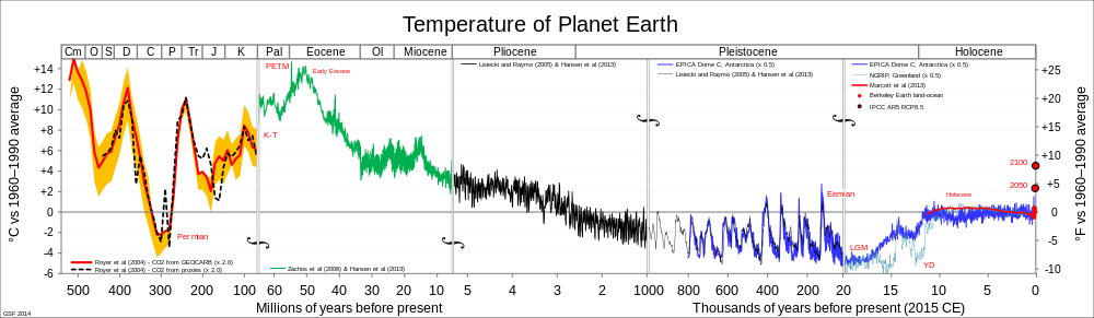
Here’s the Wikipedia compilation of world average temperature estimates back into deep time:

All_palaeotemps.svg

The zero on the graph is the 1960-1990 average, because that’s a reasonable point of comparison. It’s not a true zero; you couldn’t use barcharts.

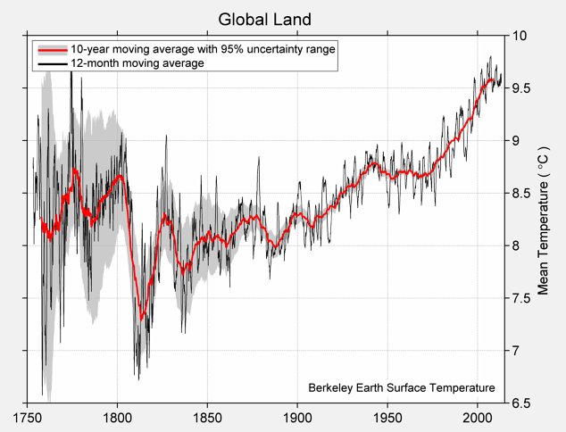
Here’s the Berkeley Earth estimate of average land temperatures, based on actual thermometer readings at weather stations, using all the data, with open code, data and methods.

global-land-TAVG-Trend

They could have put a zero on the graph by using differences from the average for some period — their data output is difference from the 1951-1980 average — but they presumably thought it was clearer to just label in degrees Celsius and not make everyone do the conversion.

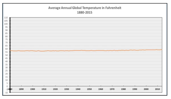
We had a comment suggesting that zero Celsius should be on this sort of graph, and there’s a graph circulating on Twitter that has its baseline at zero Fahrenheit.

CWN3D6nWUAUmQWW

These looks like a deliberately uninformative choice: there’s nothing special about zero Fahrenheit and nothing special about zero Celsius as temperatures either in any absolute sense or as mean global temperatures.

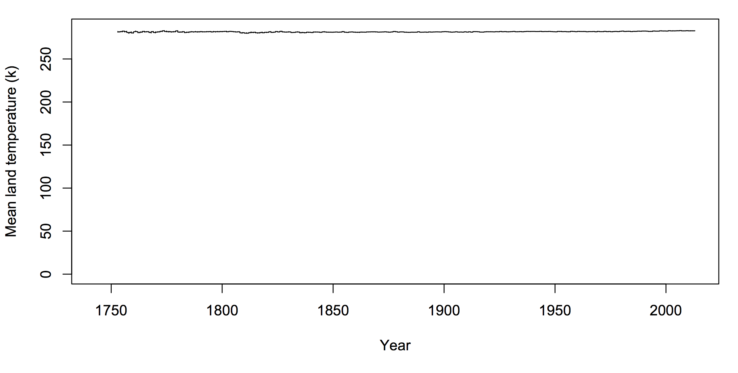
The only natural zero for temperature is zero kelvin. If you want to argue there has to be a zero on climate graphs, it should be that one. But you’d look silly.
temp-zero

If you want to use graphs of temperature history to make a point about policy, the graph needs to be one where differences that would matter for policy are clearly visible. As far as I know, no-one denies that a rapid 4C (7F) change in global temperature would be important. If your graph would make it look unimportant, your graph is wrong.


December 14, 2015

A sense of scale

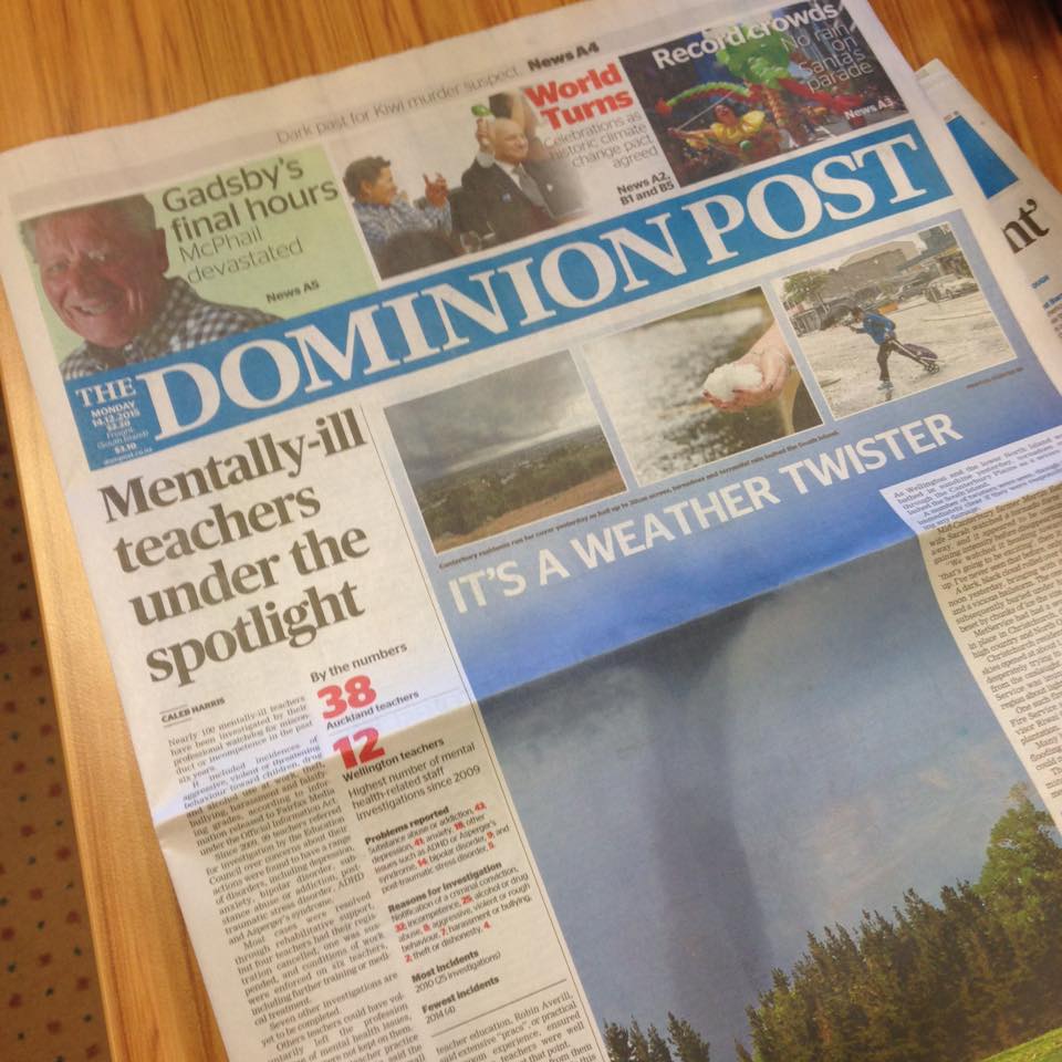
It was front page news in the Dominion Post today that about 0.1% of registered teachers had been investigated for “possible misconduct or incompetence in which their psychological state may have been a factor.”  Over a six year period. And 5% of them (that is, 0.005% of all teachers) were struck off or suspended as a result.

Actually, the front page news was even worse than that:CWKJ22nUwAEguz2


but since the “mentally-ill” bit wasn’t even true, the online version has been edited.

Given the high prevalence of some of these psychological and neurological conditions and the lack of a comparison group, it’s not even clear that they increase the risk of being investigated or struck off . After all, an early StatsChat story was about a Dom Post claim that “hundreds of unfit teachers” were working in our schools, based on 664 complaints over two years.

It would be interesting to compare figures for, say, rugby players or journalists. Except that would be missing the other point.  As Jess McAllen writes at The Spinoff, the phrasing and placement of the story, especially the original one, is a clear message to anyone with depression, or anxiety, or ADHD. Anyone who wants to think about the children might think about what that message does for rather more than 0.1% of them.

(via @publicaddress)