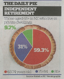
Pie chart of the day
From the Herald (squashed-trees version, via @economissive)
For comparison, a pie of those aged 65+ in NZ regardless of where they live, based on national population estimates:
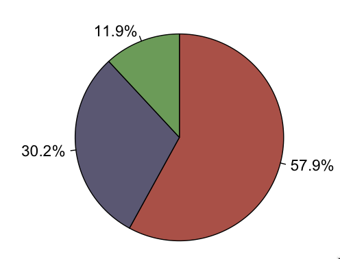
Almost all the information in the pie is about population size; almost none is about where people live.
A pie chart isn’t a wonderful way to display any data, but it’s especially bad as a way to show relationships between variables. In this case, if you divide by the size of the population group, you find that the proportion in private dwellings is almost identical for 65-74 and 75-84, but about 20% lower for 85+. That’s the real story in the data.
Thomas Lumley (@tslumley) is Professor of Biostatistics at the University of Auckland. His research interests include semiparametric models, survey sampling, statistical computing, foundations of statistics, and whatever methodological problems his medical collaborators come up with. He also blogs at Biased and Inefficient See all posts by Thomas Lumley »
Its these data journalists !
The editor wants click bait and make it snappy
11 years ago