Posts written by Thomas Lumley (2645)

avatar

Thomas Lumley (@tslumley) is Professor of Biostatistics at the University of Auckland. His research interests include semiparametric models, survey sampling, statistical computing, foundations of statistics, and whatever methodological problems his medical collaborators come up with. He also blogs at Biased and Inefficient

January 17, 2013

Think of a number and multiply by four.

The ACC gives people money, and so has to balance the risks of fraud, rejection of valid claims, and red tape.  We get a lot of stories claiming that ACC isn’t paying people it should pay, but today’s story is about the cost of fraud.

The cost is variously described as

  • $10 million (over four years)
  • $1.8 million-$3.5 million (per year)
  • $35.9 million (actuarial cost)
  • $131 million (total future cost if it isn’t stopped)

The $131 million and $10 million numbers don’t have much going for them.  There’s no particular reason to give a total over four years; an average of $2.5 million/year would have been more helpful.  The $131 million includes costs into the indefinite future, but makes them look as if they are just like costs incurred now.  That’s the point of the actuarial estimate, to say something sensible about the current equivalent value of future expenses.

By an interesting coincidence, the $131 million figure exceeds the actuarial estimate by about the same ratio as the headline total exceeds the annual average.

Briefly

  • An illustration of what happens to promising new medical treatments: the first randomized trial of fish oil found a 70% reduction in rate of deaths, though the study was too small to be reliable.  After the second study, the estimate was down to 20%.  It’s now 4%, with a margin-of-error of 6%. 
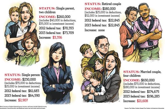
  • A Wall Street Journal infographic that’s doing the rounds, on the impact of the ‘fiscal cliff’.  Includes a representative solo mother with two children, who faces a $3300 tax increase. On her income of US$260,000.  The median household income for families with female householder and no husband is US$32978 (that also includes a subset of the unmarried couples with children, but there’s fewer of them in the US than here).
  • Roger Peng writes about the Beijing air pollution. It is indeed ‘crazy bad’, but the Great London Fog was substantially worse.  Similarly, when you read about developing-country water pollution, remember that the Cuyahoga River, in Cleveland, caught fire several times.
January 15, 2013

Cannabis, teenagers, and poverty

You may have heard some under-rehearsed radio wittering from me on this topic, so I thought I should write something more coherent.

Last August, researchers from the Dunedin Cohort Study published a paper showing that people who had been heavy cannabis users as teenagers performed worse on cognitive function tests later in life, where this wasn’t true of people who started using cannabis as adults. One natural interpretation of these associations is that cannabis has toxic effects during brain development.  As I pointed out at the time, the evidence isn’t overwhelming (since it’s a relatively small study and we know environmental factors can lead to differences as big as those observed) but was somewhat persuasive and is probably better than other studies on this topic.

Now, a Norwegian economist has argued that the results could be explained by purely sociological factors: that people from low-socioeconomic status backgrounds are more likely to use cannabis, and to perform worse on cognitive function tests, and that the difference in cognitive function tests tends to increase over time after school.  He is correct; this could explain the published results.  However, the Dunedin Cohort Study researchers have done further analyses in response, and while the socioeconomic explanation was reasonable, it seems to not be true.  Both the relationship between socioeconomic status and cannabis use, and the relationship between low socioeconomic status and change over time in cognitive function test results were weak in this particular data set.

Even if the association is real and causal there could still be explanations that don’t involve brain toxicity.  For example, imagine that people who enjoy being stoned are less likely to choose jobs and recreational activities that are cognitively demanding.  They would then to some extent tend to end up scoring lower on cognitive function tests in later life.  This, if it were true, would be an explanation that does depend on the properties of cannabis, but not on toxic effects.

Over all, this result doesn’t have huge implications for drug policy.  It doesn’t change the basic fact that cannabis is far from innocuous but is also much safer than alcohol or tobacco.  It doesn’t affect the relevant international treaties and probably won’t shift domestic public opinion.  Differences of opinion on cannabis policy questions depend mostly on different preferences, and partly on other uncertainties. For example, would legal cannabis lead to more or less alcohol consumption?

I’d recommend the book “Marijuana legalization: what everyone needs to know”.  This is written by a group of public-policy academics, who have varying policy preferences, but looked at what evidence they could agree on. It gives a series of questions and what is known about their answers. Unfortunately it’s not (yet?) in the Auckland city library.

Links: Stuff, Science Media Centre


January 14, 2013

20% of what?

The stories about the 20% cut in prices for international bandwidth from Southern Cross would be a lot more informative if they included some idea of how much it costs before and after, or, even better, roughly what fraction of the consumer price goes to international bandwidth.  Even to the nearest 20% would be nice.

Otherwise we’re not getting much value added over the press release.

January 13, 2013

Open Data activist dies.

If you know who Aaron Swartz was, you’ve probably already heard that he died yesterday.

Swartz was a computer prodigy and internet activist, who was focused on providing access to information, especially information that was theoretically already public but not readily available.

As a high-school kid, he was one of the developers of the RSS standard for web newsfeeds, which make it easy to integrate updates from many web sites.  He played a major role in the RECAP database, which allows people who pay for (public-domain) US court transcripts to make them available to others.

More recently, he downloaded millions of old academic articles from the JSTOR database, presumably intending to make some of them available in some form, though he never did. The Herald says

In 2011, he was arrested in Boston and charged with stealing millions of scientific journals from a computer archive at the Massachusetts Institute of Technology.

but he was actually charged with the very flexible offences of wire fraud and computer misuse, not with anything to do with theft or copyright violation.

If you want to read more about his life and death, it seems appropriate to suggest searching the Internet. It’s all there.


January 12, 2013

Some kind of bizarre coincidence?

The current H3N2 flu strain is causing serious illness in the US.

From the journalism blog heads-up, two adjacent headlines at Fox News


Dream jobs and reality

The Herald story starts out

If you’re dreading returning to work on Monday, don’t despair – at least you’re not alone.

A new study has found only one in four Kiwis believes they are in their dream job, a percentage lower than in most major countries.

As usual, we can ask: who did the survey, how did they do it, and what are they selling?

The numbers come from LinkedIn, the well-known spam job-search company. They say

As part of its “Dream Jobs” study, LinkedIn surveyed more than 8,000 professionals globally to find out the most common childhood career aspirations and how many professionals currently have their dream job.

So, for a start, it’s not 25% of Kiwis, it’s restricted to ‘professionals’, however they were defined. That might well explain the high satisfaction reported in India and Indonesia, where getting into the ‘professional’ classification is harder and you’d expect more professionals to be happy with their jobs.

Other news sites have different versions of the information. For example, Mashable says that LinkedIn only sampled from their members, and that only 9% world-wide were in their dream jobs, with another 21% in a career that relates to their dream job, Huffington Post concurs, and this matches the LinkedIn press release.

The 8000 respondents were spread across at least 17 countries, and there’s no indication given of how many are from New Zealand.   More importantly, there’s no indication of how they were sampled. I can’t find any evidence that the survey was done in a way that makes the sample size matter.

14-dimensional graphics

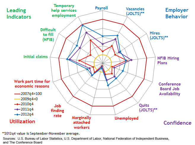
An interesting attempt to graph the recovery from the Great Recession, from the Atlanta Federal Reserve Bank (via)

Atlanta Fed.


The outer circle shows 13 economic indicators at the peak of the boom, and the inner yellow circle shows the bottom of the recession.   You can see that the ‘leading indicators’, that is, things that tend to move ahead of the rest of the economy, are improving quite a lot.  Employer behaviour and confidence indicators are up a bit, but the employment indicators are still stuck at recession levels.   If the leading indicators really are ‘leading’, the rest of the circle should be expanding relatively soon.

This graph will get confusing when there are many time periods or when the patterns are not strong.  You could probably handle a larger number of time periods by having the older ones fade to grey or some such, but it still won’t be clear unless there’s a dramatic pattern.

Also, the 13 economic variables are in a particular order around the circle, and with some graphs like this, the visual effect can be quite sensitive to the order; clearly a bad thing.

January 11, 2013

With friends like these…

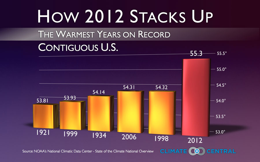
One of the worst graphs of the year, from Climate Central, via Andrew Gelman

Conclusively proving that hotter years are further to the right


More temperature graphics

There has been a lot of coverage of Australian weather recently, and people who haven’t been to southeastern Australia in summer may have been struck by how big the reported temperature variations are.  There’s a data set of daily maximum temperatures in Melbourne over ten years that has been used as an example in time series research because of the unusual patterns — a bimodal distribution in day-to-day temperature change.

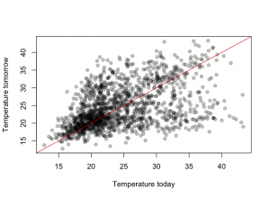
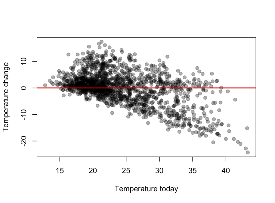
The graph shows Melbourne maximum temperatures from November through March for ten years.  The basic pattern is that tomorrow’s maximum is either slightly higher than today’s, or is about 21C.  The temperature keeps increasing day to day as long as the wind is from the land, then you get a cold front and people can sleep for a few nights.

It looks even more dramatic (why?) when the change in temperature is plotted against today’s temperature