Posts written by Thomas Lumley (2645)

avatar

Thomas Lumley (@tslumley) is Professor of Biostatistics at the University of Auckland. His research interests include semiparametric models, survey sampling, statistical computing, foundations of statistics, and whatever methodological problems his medical collaborators come up with. He also blogs at Biased and Inefficient

June 13, 2019

Percentage not in care

From Newsroom, via Giovanni Tiso on Twitter

Oranga Tamariki chief executive Gráinne Moss defended her agency’s actions around uplifts to Parliament’s social services committee on Wednesday morning, saying 98.5 percent of Māori children were not in care.

First, that’s a really unnatural way to describe a small percent…

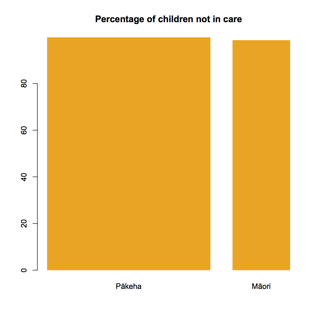
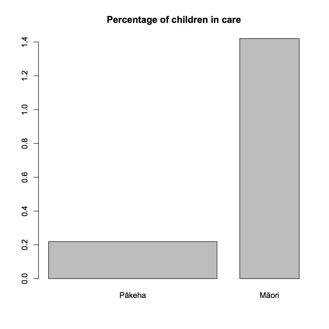
No, first, 1.5% is not a small percentage when you’re talking about proportion of “children and young people in the care of the Chief Executive”. It is, or should be, a shockingly large percentage.  I went and checked it against the June 2017 figures, the most recent I could find with an ethnicity breakdown: the spreadsheet said 3518 Māori, 1538 Pākehā.  Comparing that to 2013 census figures of about 270,000 children and young people reporting Māori ethnicity we get 1.3%, and the total number in care has gone up from 5708 in June 2017 to 6350 in the most recent annual report, so 1.5% is plausible.  Graeme Edgeler was similarly motivated to check.

Given that, though, describing the figure as 98.5% not in care rather than 1.5% in care is really unnatural.  While zero kids in care is unrealistically optimistic, it’s at least a meaningful reference point; zero kids not in care is a dystopian nightmare. It makes more sense to use the percentage in care if you’re trying to communicate accurately.

Here are two barplots:


Of course, these figures alone can’t answer questions about racism at Oranga Tamariki. Someone would need to talk to their staff, children in their care, families who have been separated from those children, and so on.  Newsroom has been doing that.


Update: I have been pointed to this OIA response, which gives numbers by ethnicity (for yet another different breakdown of ethnicities).  I had apportioned the increase since 2017 in proportion to the 2017 numbers, but it has mostly been an increase in tamariki Māori in the care of OT.  The graphs are basically right, but reality is slightly worse than they show.

June 6, 2019

Trouble and strife

Q: Did you see that married people only pretend to be happier than single people?

A: Where’s that?

Q: Newshub. Or the USA, depending on what you’re asking.

A: Yeah nah

Q: “Married people are happier than other population subgroups, but only when their spouse is in the room when they’re asked how happy they are. When the spouse is not present: f**king miserable,” Dolan said while speaking at a book festival in Wales.

A: I’m not sure we’re allowed to say “f**king” on StatsChat.

Q: But the survey data are right?

A: Up to a point

Q: That means no, doesn’t it?

A: The survey data are right, but the question wasn’t anything like what he thought

Q: How do you get a simple question about happiness wrong?

A: The question about the spouse being in the room

Q: Ok, how do you get that wrong?

A: The question was about marital status and living arrangements, and it wasn’t about a particular point in time when happiness was being measured (or even from the same survey).  The possible values included “Never Married”, “Married – Spouse Present”, “Married -Spouse Absent”, “Divorced”, “Separated”.

Q: Wait, so married people are actually f**king miserable if they’re not living with their spouse? A long-distance relationship, or going through a bad patch or something?

A: Yes, only “f**king miserable” is a bit of an exaggeration.  They’re still happier than divorced or never married people.

Q: Well, that’s f**king unsatisfactory

A: Indeed.  After the problem was pointed out to him, Professor Dolan has withdrawn that part of his claim

Q: But not Newshub

A: No.

Briefly

  • Data is Personal. What We Learned from 42 Interviews in Rural America. at Medium (via Andrew Gelman)
  • Two posts on ways people display uncertainty in graphics (via Alberto Cairo)
  • From Casey Fiesler Scientists Like Me Are Studying Your Tweets—Are You OK With That?
  • Animated visualisation of what diseases were most studied over the past 70 years
  • Story from the Sydney Morning Herald about weather forecasting, including new 3-week weather outlook predictions that the Bureau of Meteorology is planning to produce
  • “Cancer drugs that speed onto the market based on encouraging preliminary studies often don’t show clear benefits when more careful follow-up trials are done,” from NPR
  • Pharmac’s top-20 expenditures from last year.  For anyone who wants to have an opinion on how Pharmac should spend its budget.
May 31, 2019

And I would walk 500 more

From Stuff

Ten thousand is often touted as the golden number of steps required in a day to live a healthy life.

It’s a goal many Kiwis don’t reach, with one survey from the Ministry of Transport highlighting 80 per cent of respondents don’t walk more than 100 metres a day.

But new research has found the sweet spot to be significantly lower, especially for older women wanting to live longer.

The study – published in JAMA Internal Medicine by researchers from Harvard Medical School – found just 7500 steps a day, for women aged over 70, could cut their risk of death.

This is a good description of the study — and it even links to the research.  There are two aspects that are not really clear in the story, but they’re not really clear in the text of the research paper either.

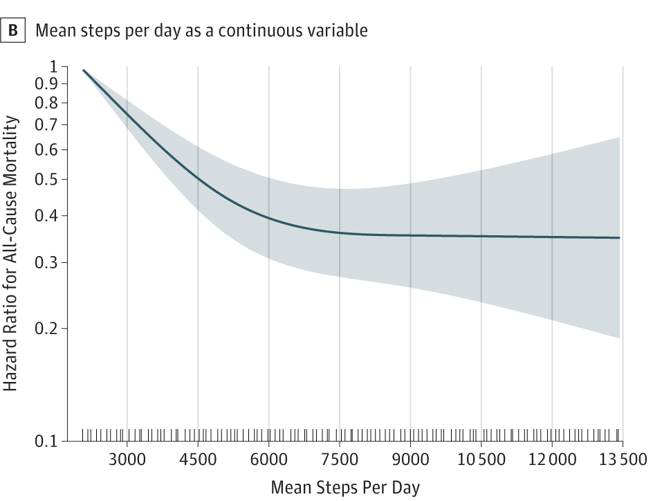
The researchers asked 18000 women over 60 to wear accelerometers (like Fitbits, but less cool) for a week, to measure how much they walked, and then waited for a bit more than four years to see who died.  Women who walked more were less likely to die during that period. Here’s the graph comparing rates of death by amount of walking.  The blue curve is the study estimate of the reduction in rate of death, but the shaded area is an uncertainty interval — the data are consistent with the curve being basically anywhere in the shaded region

As you can see, the estimated curve flattens out at about 7500 steps per day.  If we just looked at the blue line we’d say any women who walks less than 7500 steps per day could cut her risk of death by walking even a bit more, but that 7500 is the maximum that’s worthwhile. Looking at the shaded area shows that we really don’t have much idea about what happened to women who walked more than 7500 steps. Their risk could have been quite a bit lower, or about the same, or higher.  The problem is that only 49 of the women who walked more than 7500 steps per day ended up dying during the study; that’s great for them, but it’s a real limitation for the statistical analysis.

Also, you might worry (you should worry) which way cause and effect goes.  The headline would sound less interesting if it said women within four years of dying walked less than women with a longer life expectancy, but the correlation is the same either way. I’d guess it’s mixture of both: walking does make you healthier, but being healthier also makes you walk more.

PS: I should note that the Stuff journalist, Brittney Deguara, also got the story on WHO classification of ‘burnout’ correct (it’s not being listed as a medical condition), vs the somewhat misleading story in the Herald that begins “Burnout” is officially a disease, according to the World Health Organisation.

Pie chart of the week

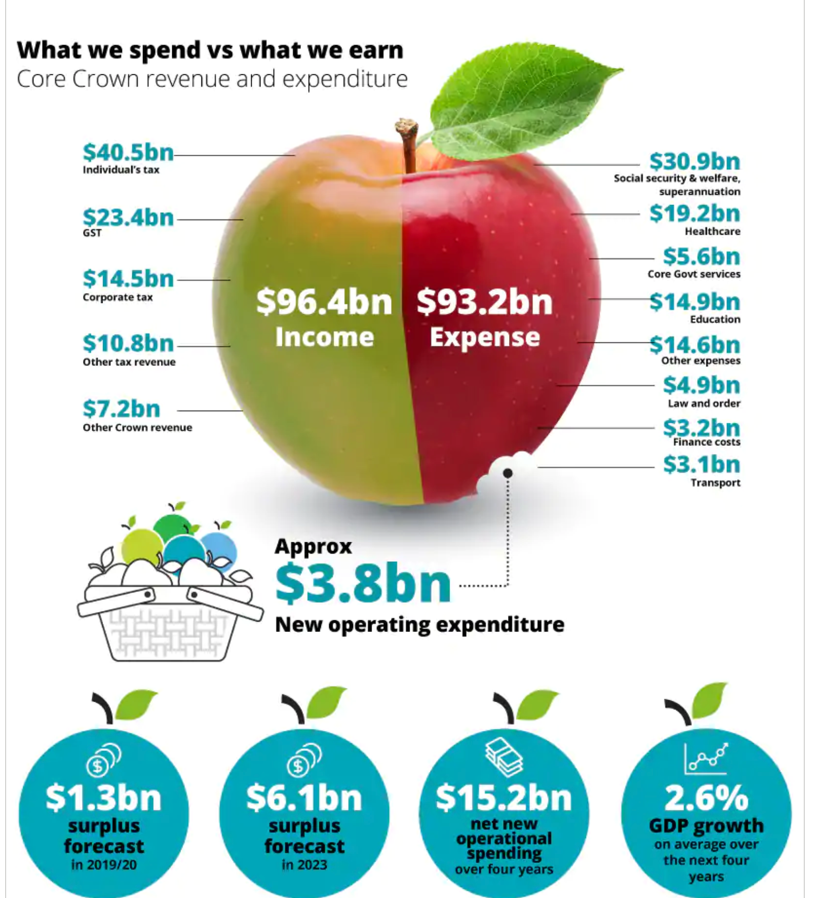
From Deloitte’s NZ budget infographic, via Siouxsie Wiles

This is weird as a pie chart because the two sections aren’t components of a whole (which is how pies, or Camembert, work). It’s also strange that the new operating expenditure is shown as a bite out of expenses, when it actually makes expenses larger than they would be without it.

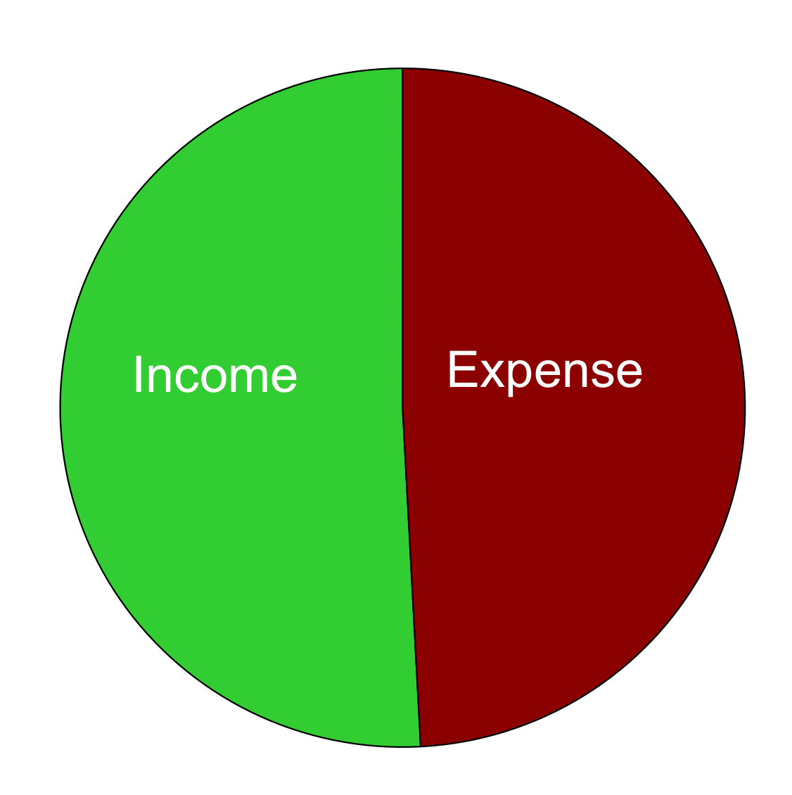
On top of all that, the divisions of the apple aren’t actually in proportion to the numbers.  This is what a pie chart with those numbers would look like: the difference between the halves is nearly invisible.

NZ Budget graphics

Any more?

May 17, 2019

Briefly

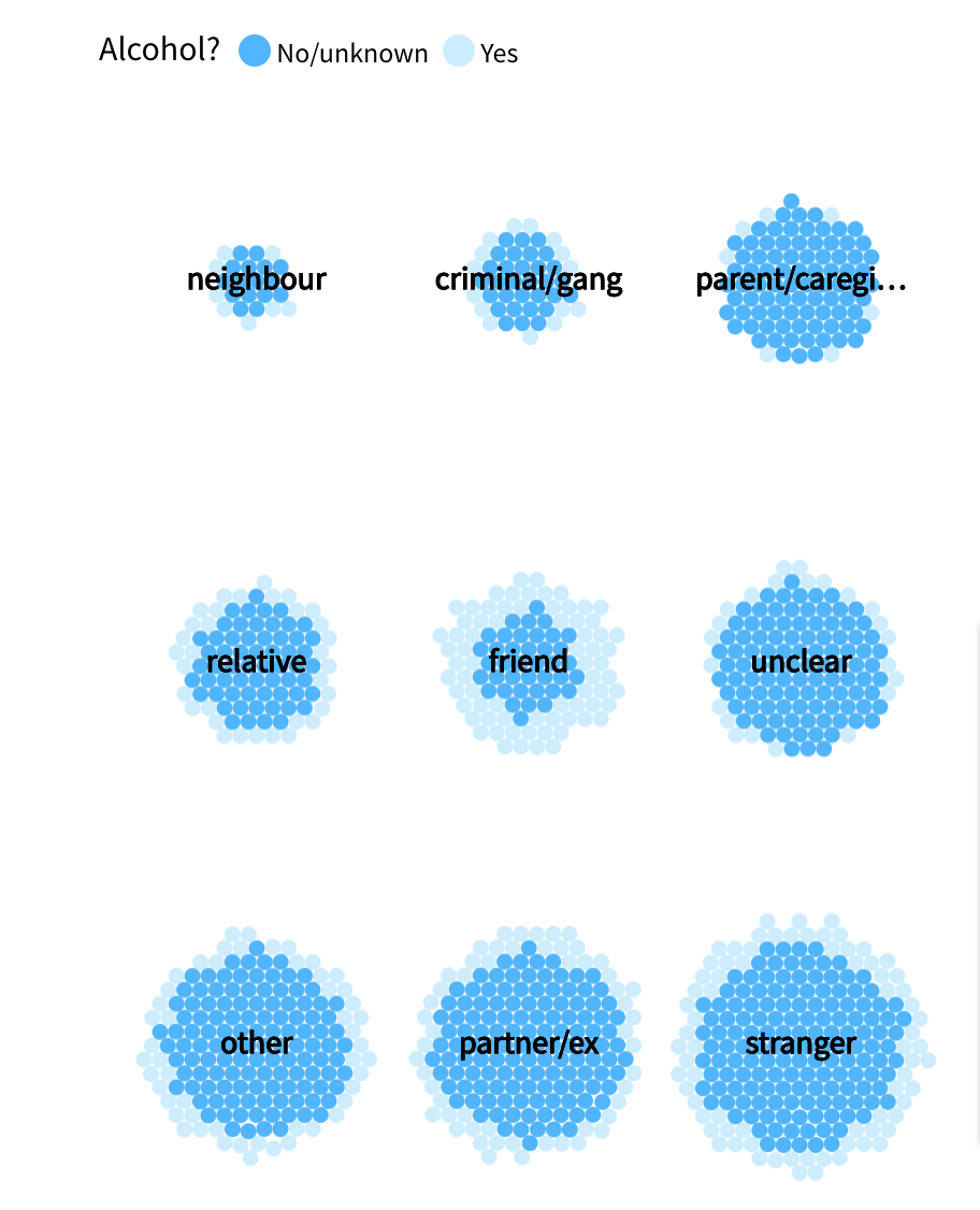
  • From Stuff, an interactive visualisation of homicides in New Zealand, which also lets you do your own comparisons. For example, this one shows that alcohol is most often involved when people are killed by a friend
  • From the LA Times, a visualisation mapping the settlements of the Tongva, who lived in Los Angeles before it was colonised.
  • Previously the questions raised about mining in Foulden Maar haven’t been StatsChat-relevant, but this from Newsroom is. It says animal nutrition specialists are skeptical that the diatomaceous earth is actually of any benefit as an animal food, and there doesn’t appear to be any published research supporting its use. The story also says one of the selling points of the earth is that it contains fulvic acid, which I can recognise as a popular pseudoscience topic (when consumed; it’s a perfectly good soil component).
  • Sometimes researchers do try to fight back when their work is exaggerated in the media: here’s an example on Twitter
  • A well-sourced Twitter thread from Russell Brown, on how saliva testing to see if drivers are impaired by cannabis is nowhere near ready for use. Note that it’s not even fit for purpose if you’re trying to detect cannabis use, let alone for detecting impairment.
  • Epidemic simulations on a network, letting you fiddle with various characteristics of the disease/meme/whatever
May 13, 2019

Briefly

  • Some very good science reporting from Dylan Cleaver (traditionally a sports reporter) in the NZ$ Herald, on what’s known and what’s controversial in sports brain injury. The last of the three-part series is here.
  • And explaining colds and flu and the immune system in The Age (Melbourne), co-written by a PhD student and the newspaper’s science reporter.
  • Twitter bot @BeehiveBanter gives daily summaries of the most common words used in Parliament
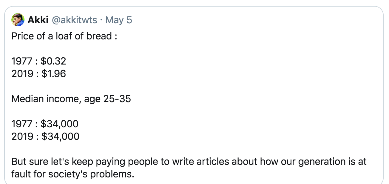
  • This went moderately viral on Twitter

    There’s obviously something wrong with these numbers — in fact, food is one of the things that’s gotten cheaper in real terms.  Some follow-up shows that the income is inflation-adjusted and the bread prices aren’t.
  • From StatsNZ How wealthy are you compared with households like you? Find out with our new app: statisticsnz.shinyapps.io/wealth/
  • Good explanation from the Grattan Institute on a misleading Australian housing statistic that keeps recurring
May 12, 2019

Other uses for wine

Q: Did you see that drinking wine could prevent colds?

A: <skeptical look>

Q: It’s on Newshub. Feel a winter cold coming? News study shows wine could be antibacterial

A: And how would it help if wine was antibacterial?

Q: It could kill the bacteria that….. oh… viruses?

A: Viruses. And where do you think the cold viruses live?

Q: Um. In your nose?

A: Ever got wine up your nose?

Q: Ok. Point. But later in the story it says “it’s not the alcohol or the acid that kill the bugs but rather the antibacterial properties of both red and white wine that help fight off both tooth plaque and sore throats.” So at least they’ve shown it works for plaque and sore throats

A: Not exactly

Q: In mice?

A: Not even.

Q: It’s bacteria in a dish in the lab, then?

A: Yes.

Q: Do bacteria even have teeth? And where did you find the research?

A: Basically same story was in the Edinburgh News and Maxim and Metro UK, and they all linked. Compounds in the wine kill some of the same bacteria that cause plaque and sore throats.

Q: That could be useful. How long did it take?

A: An hour.

Q: That’s a long time to gargle wine. Do they know what compounds in the wine have the effect? Is it these polyphenols and antioxidants we keep hearing about

A: They say it’s succinic, malic, lactic, tartaric, citric, and acetic acids, and that the polyphenols didn’t show any effect.

Q: But wasn’t it supposed to not be the acids?

A: It’s not just the acidity: the equivalent acidity from hydrochloric acid didn’t kill the bacteria.

Q: So it might not be directly useful, and it’s not a good reason to drink wine, but it’s still interesting new research?

A: The research was published in 2007. I’ve got no idea why it has resurfaced. Maybe that’s why the Newshub headline says “news study”, not “new study”

Q: Seems to reinforce the official StatsChat policy on wine, though.

A: If you’re drinking it primarily for the health benefits, you’re doing it wrong.

May 9, 2019

Do the numbers make sense?

From USA Today, via Twitter

These figures don’t make a lot of sense.

Firstly, that’s a really high proportion of median income.  You can easily find median household income in the US as just over $60,000.  If a typical household had two members who each spent $18,000 on “nonessentials”, that’s more than half their total income, which is hard to believe.  [We’re just doing obvious credibility checks here, but from more detailed data (table H-15)  the median per-person household income is $34,000]

It’s still possible that the figures are true, but really are means and have nothing to do with the “typical American”.  But consider the numbers for subscription boxes and rideshares. If these are means for adults in the US, we can multiply by 250 million to get the corresponding totals of just under and just over $290 billion per year. A quick Google search finds that Uber’s gross income from bookings was about $14 billion last year (which I think includes Uber Eats as well as rideshare). Uber is the largest rideshare company, and there’s no way it’s only 5% of the total market.

It’s harder to find data for e-commerce subscription boxes, but McKinsey says total revenue for the companies in that category that are on a list of the top 500 internet retailers was $2.6 billion in 2016, and whatever people say about long-tail e-commerce, I don’t believe those top companies have less than 1% of the market.

If you click through to look for the data source, there’s nothing there that gives any information. Nothing about the questions asked; nothing about how the people were selected; nothing about how representative the sample ended up being.

Chris Knox (of the NZ Herald) pointed me to a twitter thread where Kate Rabinowitz (of the Washington Post) compared the numbers to the Bureau of Labor Statistics’ Consumer Expenditure (CE) Survey.  Clearly some reporters understand the issue.  But it shouldn’t be possible for a life insurance company to report a dubious survey as a way to get advertising in a major newspaper. Make them buy an ad instead.