Posts written by Thomas Lumley (2645)

avatar

Thomas Lumley (@tslumley) is Professor of Biostatistics at the University of Auckland. His research interests include semiparametric models, survey sampling, statistical computing, foundations of statistics, and whatever methodological problems his medical collaborators come up with. He also blogs at Biased and Inefficient

April 5, 2019

Briefly

  • Newshub headline: Massive earthquake, tsunami in New Zealand inevitable in our lifetime – experts.  In the story “We know a large earthquake and tsunami is something we will face in our lifetime, or that of our children and grandchildren.”
  • From Stuff. Understatement watch: “Census general manager Kathy Connolly said 60 court cases were being lodged in relation to people not completing the census. That was not everyone who failed to fill out the census”
  • The New York Times has an analysis of online links between white extremist terrorists.
  • NZ statistician Peter Ellis has moved to Melbourne and is now predicting AFL results
  • CNBC story about artificial intelligence in the criminal justice system.
March 23, 2019

The breakthough narrative

Clinical science stories are the opposite of most current events coverage: the good news is dramatic and has an army of publicists; the bad is slow and boring.

In September 2016 there was a flurry of news articles about a new candidate treatment for Alzheimer’s

In the Herald (from the Telegraph)

(from the Washington Post)

  • A glimmer of hope for an Alzheimer’s drug. An initial trial of an antibody therapy that targets Alzheimer’s disease has shown promising results and could signal a long-awaited breakthrough in treating the devastating brain disorder that affects millions.

Stuff (from the Telegraph)

TVNZ

Radio NZ

Now, in 2019, two large clinical trials were just stopped because the treatment didn’t work.  This sort of thing happens a lot; drug development is hard, especially when we don’t actually understand the disease very well.

The coverage of Alzheimer’s treatment candidates has two big problems, though. First, promising initial results are almost always oversold. Second, the failures usually aren’t covered, except perhaps in the business pages.

February 25, 2019

How many crashes are caused by alcohol?

Back in June, the AA put out a press release claiming that road deaths caused by (illegal) drugs now exceeded those caused by alcohol.  As I wrote at the time, (a) this was largely an artefact of increased testing, and (b) it’s a dodgy definition of ’cause’.

Roger Brooking, a drug and alcohol counsellor, has recently been pointing out that the definition of ’cause’ wasn’t comparable between alcohol and illegal drugs.  He’s right. Unfortunately, I think he wants the definitions changed in the wrong way.

The definition of ’caused by alcohol’ was ‘blood alcohol over the legal limit’, and the definition for illegal drugs was ‘detectable amount’.  There’s a sense in which these are comparable — they both indicate that violations of the law have occurred — but that’s not a useful sense if we’re talking about attributing risk.

Roger Brooking’s suggestion is to set both definitions at ‘any detectable’, and to set the legal alcohol limit for drivers to zero, and to do a lot more testing. I’m one of the minority of New Zealanders who wouldn’t be directly affected by any of these changes, but I still think it’s a terrible idea.

Focusing on statistical questions, though, describing as ’caused by’ drugs or alcohol all road deaths where the driver had detectable amounts in their blood is unambiguously wrong.  If you have alcohol in your system, your risk of being in a crash increases. It increases a moderate amount for moderate levels of alcohol, and by a lot for high levels of alcohol.  At very low levels the direct evidence is limited, but your risk probably increases a little bit. And with no alcohol or drugs in your system, the risk isn’t zero.  We know that from common sense, but also because some drivers do have crashes and tests don’t show any alcohol or drugs.

So, how much? The most recent research cited by a WHO report (PDF) is from the US, carried out in the late 1990s (PDF). The researchers monitored crashes in two US cities, and a week after each crash picked two random drivers at the time and place of the crash to measure their blood alcohol.  After adjusting for differences in, eg, age and adjusting for refusal to participate, they have estimates of the increase in risk for a range of blood alcohol concentrations. It’s worth noting that these are estimates rather than definitive truth, and that they are higher than previous estimates.    At 0.03% blood alcohol the estimated risk is 1.06 times higher; at 0.05% it’s 1.38 times higher; at 0.08% it’s 2.69 times higher; at 0.10% it’s 3.79 times higher.

That is, at 0.03% blood alcohol the estimate is 100 crashes that would have happened with no alcohol for every 6 influenced by alcohol. At 0.05% it’s 100 crashes that would have happened with no alcohol for every 38 influenced by alcohol. At 0.08%, it’s 100 crashes that would have happened with no alcohol for every 169 influenced by alcohol.  By the time you get to 0.10%, about three-quarters of the crashes are caused by alcohol, and at 0.15%, with a relative rate of 22 it’s damn near all of them. But at the legal limit it’s about a third, and at lower blood alcohol concentrations it’s a small fraction. If there were 80 fatal crashes where the driver had a blood alcohol above zero but below the legal limit, most of those crashes were not caused by alcohol in either a usual or a technical meaning of the word ’cause’.

Given the way risk decreases at lower levels of exposure to drugs, how should the numbers be reported? It makes sense to report both alcohol >0 and alcohol > legal limit. If there were consensus on the excess risk relationship it would be helpful to report crashes attributable to alcohol, taking the risk relationship into account.  It’s hard to do that for other drugs, though.  We’ve got very little empirical data relating forensic measures to risk for other drugs, and in some cases (eg cannabis) we know that the easily measurable concentration doesn’t pick up impairment well.  On top of that, use of multiple drugs is probably a substantial component of the problem.   It’s a good idea to increase measurements after serious crashes (to gather data). It’s a good idea to report alcohol + other drugs separately from alcohol alone and other drugs alone. And in the absence of any better criteria it’s probably unavoidable to just report any detectable level of other drugs, but we should resist (as ESR, notably, does) the temptation to call those crashes ’caused by’ the drug.

February 19, 2019

Summer polling?

From RadioNZ this morning, Ben Thomas on the latest polling results

I think there’s a bit of a caution. Both of these polls came very shortly after the summer break, and when you look at polls over a year, the government of the day does best when people feel best about themselves. When do people feel best about themselves? Well, it’s when they’re on holiday, when they’re looking at barbeques… when the sun is shining.

That’s certainly reasonable. You could also think of other regions summer might be different, too. For example, with schools on holiday, you might get a different range of people being at home and answering the phone. In any case I wanted to see how much it shows up in the published opinion polls.

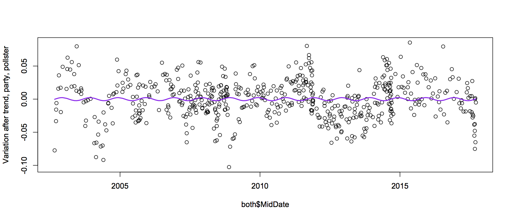
Peter Ellis has collected polling data from September 2002 right through to the last election, so I used that. Now, popularity of the government of the day has varied over this time, so I subtracted off a party difference, differences between polling companies, and a long-term time trend. Here’s the left-over variation when the long-term trend was averaged over about 5 years

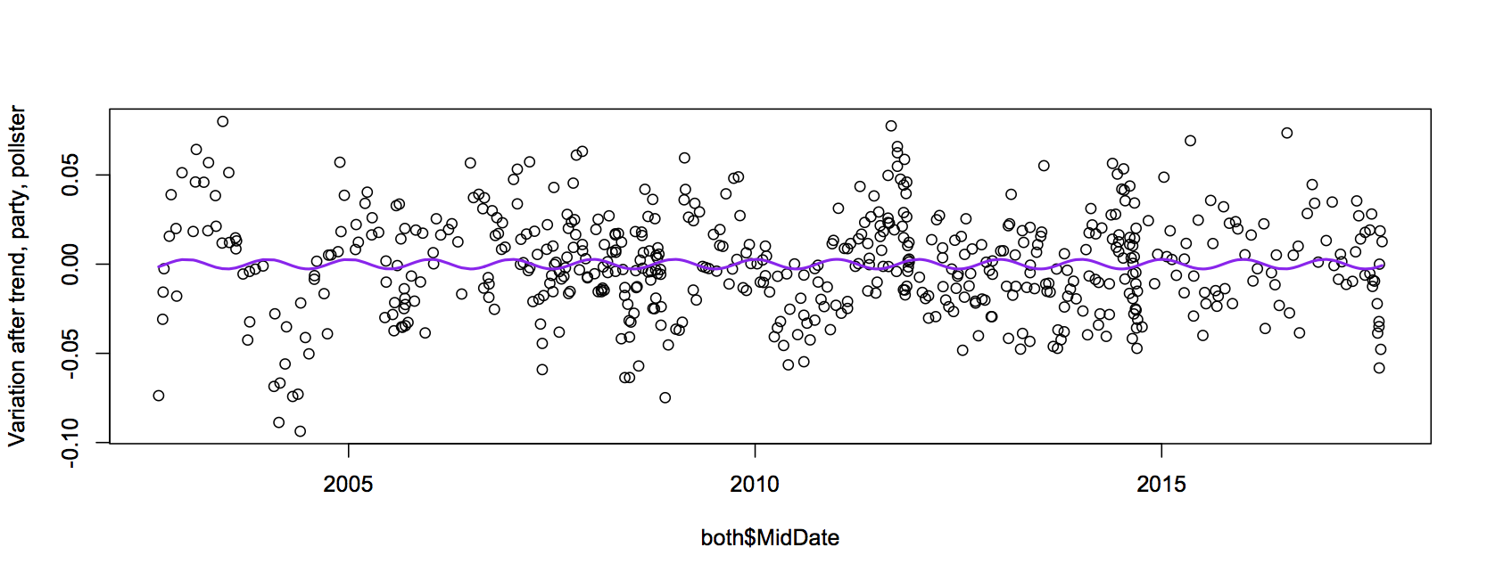
and here’s when the long-term trend was over more like one year

The purple line estimates the seasonal variation, from a linear regression model.  Polls do seem more favorable to the incumbent during summer, but it’s a very small effect. The summer to winter difference is about half a percentage point, and there’s only fairly weak evidence that it’s in that direction rather than some other direction.

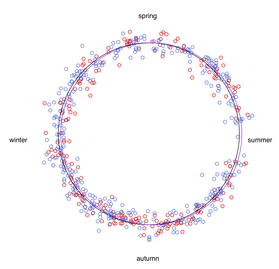
Here’s the same information, but wrapped around a yearly circle, with the points coloured according to whether Labour or National was in government at the time.  The black line is a circle corresponding to zero on the graphs above; the purple line shows the seasonal difference. If you look closely, you can see the purple sticks out to the sides more than the black: summer is more positive, winter is more negative. The labels are at January 1 for summer and then regularly spaced through the year.

What you do see clearly in this format is that people don’t do many polls around the new year. But the seasonal difference in results (for party intention, in publicly-released opinion polls) seems pretty small.


February 18, 2019

No, where are you really from?

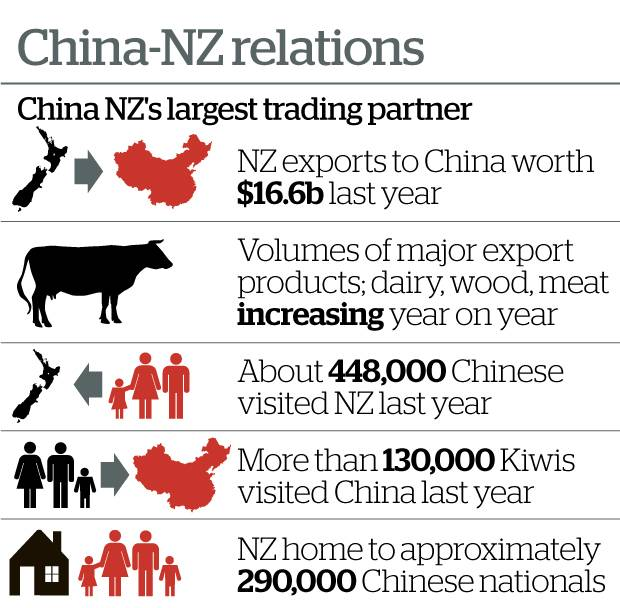
From the Herald today:

That last number doesn’t look right.  At the 2013 Census, there were just under 90,000 people ordinarily resident in NZ who were born in the People’s Republic of China. Since then, there have been a net 46000 permanent or long-term migrants, according to a Stats NZ app — and recent research from Stats NZ has found that these figures overstate net migration a bit, because they misclassify some people returning home.  So, there are maybe 135,000 people living in NZ who were born in the PRC. Not all of these will think of NZ as home — some of them will be just here to study, for example — but it’s a reasonable group to consider. It’s not 290,000, and I don’t see how you can get that number.

On Twitter this morning, Tze Ming Mok speculated that the number might be people of Chinese ethnicity, but as she said, even that is hard to get as high as 290,000. And, very importantly, other people of Chinese ethnicity don’t necessarily have favourable views of the PRC — though they (and other people of East and Southeast Asian ethnicity) do get the spillover from both anti-PRC sentiment and traditional racism.


Briefly

  • “Often these studies are not found out to be inaccurate until there’s another real big dataset that someone applies these techniques to and says ‘oh my goodness, the results of these two studies don’t overlap‘,” she said. Genevra Allen (who gave one of the inaugural Ihaka Lectures here in Auckland) on machine learning in science.
  • Good piece by Jenny Nicholls from North and South on algorithm risks (based around a new book, Hello World, by Hannah Fry)
  • From the open AI blog, about a new neural network algorithm for generating realistic text: “Due to concerns about large language models being used to generate deceptive, biased, or abusive language at scale, we are only releasing a much smaller version of GPT-2 along with sampling code. We are not releasing the dataset, training code, or GPT-2 model weights.” Exercise for the reader: does this feel like a good idea? Would it feel like a good idea if Facebook were saying it?
  • PredPol claims to use an algorithm to predict crime in specific 500-foot by 500-foot sections of a city, so that police can patrol or surveil specific areas more heavily.” And they say that when police go to these areas they really do find crimes occurring there. Which…is less reassuring than PredPol seems to think.
  • ” For example, a tench (a very big fish) is typically recognized by fingers on top of a greenish background. Why? Because most images in this category feature a fisherman holding up the tench like a trophy. About how neural networks work (a bit technical).
  • Julian Sanchez argues that, yes, online click-through agreements are bad for data privacy, but partly because data consent is genuinely a hard problem
January 31, 2019

It’s warm out there

We’re seeing a lot of international news stories about cold weather in the US, and here in NZ we’re also seeing a lot of stories about hot weather locally and in Australia. You might think from the news coverage that the northern hemisphere is currently colder than usual and the southern hemisphere is currently warmer than usual.

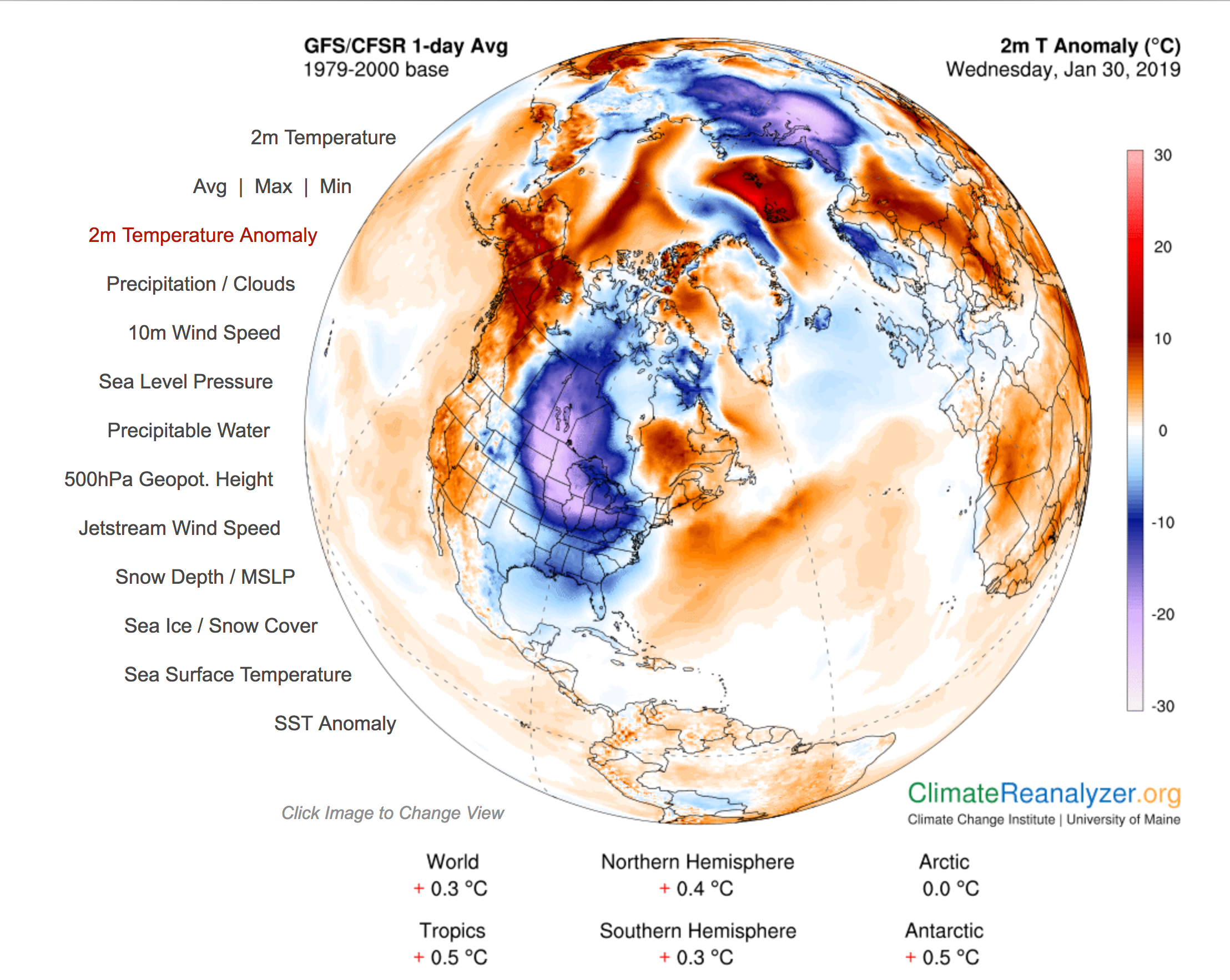
This map (from) shows ‘temperature anomaly’, that is, the difference between the temperature today and the 1979-2000 average for the time of year.

There are some cold spots on the map: the north-east of North America and parts of northern Russia are much colder than usual. There are also hot spots, in Alaska and in the Arctic Sea.   And as the summaries under the map show, the northern hemisphere is more unusually hot (on average) than the southern hemisphere.

Weather is what matters to us day to day: especially the weather around us and the weather in places with English-speaking television stations.  That can give a very misleading view of the state and trend of global climate.


January 15, 2019

eScooter costs

There’s a story at Stuff saying the ACC have paid out more than $200,000 across 655 e-scooter related injuries.  If you don’t regularly work with ACC data it’s hard to get a feel for whether that’s a lot or not.

Two comparisons I saw on Twitter, and a bonus one

  • From Stuff: in the 2016/7 year, “[s]ome 3517 horse-injury claims added up to $6,867,869”,  a decrease from previous years
  • From the Herald: “The number of injuries involving avocados has increased over the past three years, with the nutritious fruit costing ACC just over $800,000.”
  • From the Herald: “Last year more than 4000 New Zealanders were injured on Christmas Day alone, accounting for $3,628,574 worth of ACC claims.”

First we need to look at time frames: the e-scooter data are over three months; the horse and Christmas data over a year; the avocados over three years. Annualised, we’d have $0.6 million/year for scooters, $3.6 million/year for Christmas, $6.9 million/year for horses, and $0.26 million/year for avocados.   Avocados aren’t in the running, but horses are looking strong.

There are a lot of horses in New Zealand, though. Apparently, over 100,000! They won’t each be ridden with the same frequency as the average Lime e-scooter, but it wouldn’t take that high a usage rate for scooters to be more dangerous than horses.  What we can see, though, is that horse injuries are more severe on average: the headline statistic gave five times as many injuries from horses and over 30 times the cost.   (Avocados look even safer if you count number of injuries rather than cost).

Since e-scooters are new and only cost a few dollars to try, there will be a lot of inexperienced users right now.  You’d assume that over time the typical user will become more experienced and probably more risk-averse, and so the risks should go down a bit. Also, there will probably be an increasing number of people who have their own scooter and are a bit more careful with it.

The obvious comparison, though, isn’t horses or avocados or Christmas: it’s cars.  ACC paid out $264 million for driving-related injuries in 2017-18. Spread out over 3 million cars or 4 million motor vehicles that’s still less than half the cost per vehicle that we’re seeing for e-scooters (assuming most e-scooter use is the Lime rentals). However, the ACC figure doesn’t attempt to count the cost of 378 road deaths last year.  At the Ministry of Transport’s cost-of-life valuation of just over $4 million, that’s another $1.5 billion.

Cars, um, win?


January 14, 2019

Briefly

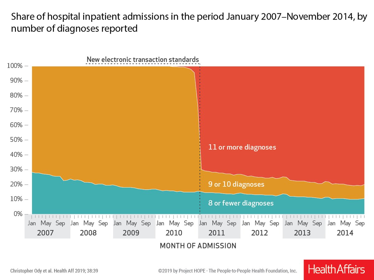
  • Data definition drift: the impact of interventions to reduce hospital readmissions has been overestimated because of changes in how admissions are coded.  When systems change to allow more than 10 diagnoses to be entered, more than 10 are entered for a lot of people (Twitter thread)
  • Public transport data visualisation, from Twitter.  Sara Weber says (in translation) “My mother is a commuter in the Munich area. And avid knitter. She knitted a “rail delay scarf” in 2018. Two rows per day: Grey at under 5 minutes, pink at 5 to 30 minutes delay, red if delayed on both trips or once over 30 minutes.”
  • Pew Research, whose fault “millennial” is, remind us that they define millennials as born 1981-1996. The youngest millennials are now 22.  (via @drob)
  • Some years ago, there were stories about a young woman who was outed as pregnant by Target’s targeted advertising before she’d decided to tell people.  There’s a new ad for a firm called Zulily that is pushing this as a good thing. (via Amie Stepanovich)
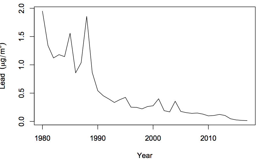
  • There’s a story on Stuff about lead in eggs from backyard chickens.  The story ends with a quote from someone who keeps chickens “you’re breathing in more lead living next to a busy road more than the chickens going to lay in its lifetime.”. That might have been true forty years ago, but it isn’t true now — getting rid of unleaded petrol has resulted in lead air pollution from traffic largely going away.   Lead is the big success story of pollution reduction. Here’s a graph of average lead concentrations in the air across US air pollution monitoring stations (the trend would be similar in NZ)

Reeferendum polling

The Herald reports 60 per cent support for legal cannabis – new poll. There’s going to be a lot of this over the next couple of years, so here are some points to consider

  1. As the Herald says, the poll found a substantially higher number of daily cannabis users than other research: about three times higher than the NZ Drug Use Survey from the Ministry of Health and four or five times higher than a 2010 survey sponsored by NORML.  This has got to reduce our confidence in the results: either because it indicates the sample is unrepresentative or because it indicates that surveys on drugs are intrinsically unreliable.
  2. We don’t know what the question on the referendum will be, so the survey obviously wasn’t asking that question. I hope the actual question will be a choice between a specific proposed set of legislation and the status quo, though the Government will have to move quickly to get the legislation drafted, released for public comment, and revised in time. In any case, you’d expect (as with Brexit) more support for a generic ‘change’ proposal as in this survey than for any concrete and specific proposal.  Some people will support private growing but oppose commercialisation; others will argue that you can only get rid of the illegal market if the legal market is fairly open.  And so on.
  3. The poll results were weighted to agree demographically with the 2013 Census population.  That’s a standard thing to do with surveys, but in this case it would be more useful to weight them to look like the 2017 voting population.  The age groups who support legalisation more strongly are also historically less likely to vote.