Posts written by Thomas Lumley (2645)

avatar

Thomas Lumley (@tslumley) is Professor of Biostatistics at the University of Auckland. His research interests include semiparametric models, survey sampling, statistical computing, foundations of statistics, and whatever methodological problems his medical collaborators come up with. He also blogs at Biased and Inefficient

January 10, 2019

“Induced demand” meets “One less car”

When peak-hour traffic congestion gets unbearable and new roads are built, there’s an initial reduction in congestion and everyone is happy.  The congestion comes back surprisingly fast — a phenomenon known as induced demand.  Before the new roads were built, people would have been avoiding them at peak times: they might have travelled at non-peak times, or car-pooled, or taken the bus, or gone somewhere closer instead, or just made fewer trips.  With the new space, these people can now drive. That’s good for them: they must benefit from being able to drive or they would still be doing whatever they were doing before.  It’s bad news for people who were already driving in peak traffic; their new lanes are being filled up and they’ve lost most of the benefit of the new road capacity. Car unenthusiasts such as Greater Auckland (and, um, me) love to tell you all about induced demand, but even car enthusiasts will often admit it’s a thing.

On the other hand, Auckland is going through an expansion in bus services, bike paths, and near-city housing.  As more people bus, walk, and cycle, pressure on congested urban streets will decrease, as will carbon emissions from transport.  Every mass transit or active transport user is One Less Car.  Studies of short-term disruptions such as transit strikes confirm that public transport, and probably bikes, really do reduce congestion.

There’s a bit of a contradiction here, though.

If extra space on the roads provided by new construction is quickly filled up by new demand, you’d expect extra space on the roads provided by One Less Car to be filled up in the same way.  Just as the short-term congestion effects of adding or subtracting new road lanes overestimate the long-term congestion effects, the short-term congestion harms of taking away buses for a day would overestimate the long-term congestion benefits they provide.  People adapt.

For example, Seattle, in the US, has made a big effort to increase public transport in recent years, with some success. The proportion of households with fewer than two cars is increasing (in contrast to similar cities).   On the other hand, congestion (as measured by TomTom) and  vehicle miles driven are both slightly up.  The policies have been successful — there are more non-car trips than before and the stable congestion and driving statistics are for an increasing population — but congestion hasn’t decreased.  In Auckland, more people now work in or near the city and many more people get to those jobs without driving. A lot of cars have, in some sense, been taken off the roads, but congestion hasn’t decreased and motorway traffic volumes are stable.

Now, there was a recent research paper from the University of Otago (press release) looking at new cycling and walking paths in New Plymouth and Hastings, which estimated a small but persistent decrease in car use (about 1%).  But these aren’t cities where car use is strongly limited by congestion, so you wouldn’t expect much induced car traffic demand.

Even with induced demand there are real, important, benefits when people use alternatives to cars. The people who switch to bike or bus will benefit (or they wouldn’t do it). The people who weren’t previously driving in peak traffic and who now get to supply the induced demand will benefit.  Some people who would otherwise have been forced out of peak driving will be able to continue, and they, too, will benefit. But people who are in peak-hour traffic anyway don’t really benefit.  To them, it’s not One Less Car. It’s One Different Car.

January 3, 2019

Briefly

  • Dumb extrapolation watch:  An opinion piece in the NY Times says that if you gave up your smartphone for a year “you would have time to make love about 16,000 times”.  As various people including Elle Hunt worked out, that’s about 44 times per day. There are also some assumptions in there about priorities — has “sorry dear, I need to check Twitter” really replaced the canonical headache? And assumptions about definitions — “not counting foreplay“.
  • From Justin Falcone on Twitter: Google Trends shows how the spelling of ‘impostor syndrome’ has changed  over the past few years
  • Bad data watch: Katie Langin write“It’s not every day that you realize you’re a data point in a scientific study—and a misrepresented data point at that. But that’s what happened to a number of current and former scientists—including me—while reading a study reporting that scientific careers have become significantly shorter in the past 50 years”
  • Interesting piece in Stuff by Charlie Mitchell: “The ark, the algorithm,  and our conservation conundrum” on how species are prioritised for conservation efforts.  In particular, there’s more acknowledgement than usual that rejecting ‘algorithms’ doesn’t actually make anything better.
  • Chris Knox at Herald Insights has a visualisation of holiday road deaths — in particular, the problem of New Year’s Day morning.

Placebo genes?

From Ars Technica

Some psychologists at Stanford wondered if the perception of genetic risk could actually increase people’s risk, independent of their actual genetic risk. In other words, could simply learning that you have a genetic propensity for something elicit physiological changes akin to really having that propensity, regardless of whether you have it? The team designed experiments to find out.

That is, they were looking for a placebo effect of genetic information.  It’s not a ridiculous idea that there could be one. The placebo effect is a real phenomenon (at least in some settings) and there’s no obvious reason why it should work with pills and injections but not genetic information.  And I’m in favour of the principle that giving people health information (that they didn’t ask for) is an intervention that should be evaluated like any other. However, I’m not entirely convinced.

There were two experiments. One saw that people told they had a bad-at-exercise gene variant were worse at exercise.  The other saw that people told they had a staying-hungry gene variant stayed more hungry after drinking a nutrition shake. What the story (and the research paper) makes a lot of, though, is that physiological measurements changed too. It wasn’t all in the participants’ minds (or even all in their brains).

One issue is that the evidence isn’t all that strong (especially given the publication filtering it takes to get into the media) — even though the observed differences were surprisingly large. That makes it likely more that chance contributed to the results. Also, to the extent we’re seeing random variation in exercise or in hungriness we’d expect to see the same variation in biochemical measurements. If the explanation isn’t a placebo effect, the physiological differences are exactly what you’d expect.

It’s also worth noting that the biochemical difference seen in the hunger experiment (in something called glucagon-like-peptide-1) isn’t one of the differences that have been reported for the gene in question (at least in the references given). The researchers looked for a biochemical difference that had been seen for the gene (in ghrelin), and didn’t see it.  It would have been interesting to see whether information about the hunger-related gene affected exercise capacity — if there’s something there, is it somewhat specific or is it general to being told ‘bad genes’?

Even without necessarily believing the specific conclusions of the research, though, it’s another reminder that the evidence for health benefits of most sorts of genetic information is surprisingly weak.

December 14, 2018

Briefly

  • I wrote about the babysitter dystopia of automated social media analysis from a Herald story. Gizmodo has a longer and more detailed piece, including what the automated system thought about the writer’s babysitter and why that’s interesting.
  • Cathy O’Neil has a short animated video about why predictive algorithms aren’t objective in the ‘value-free’ sense
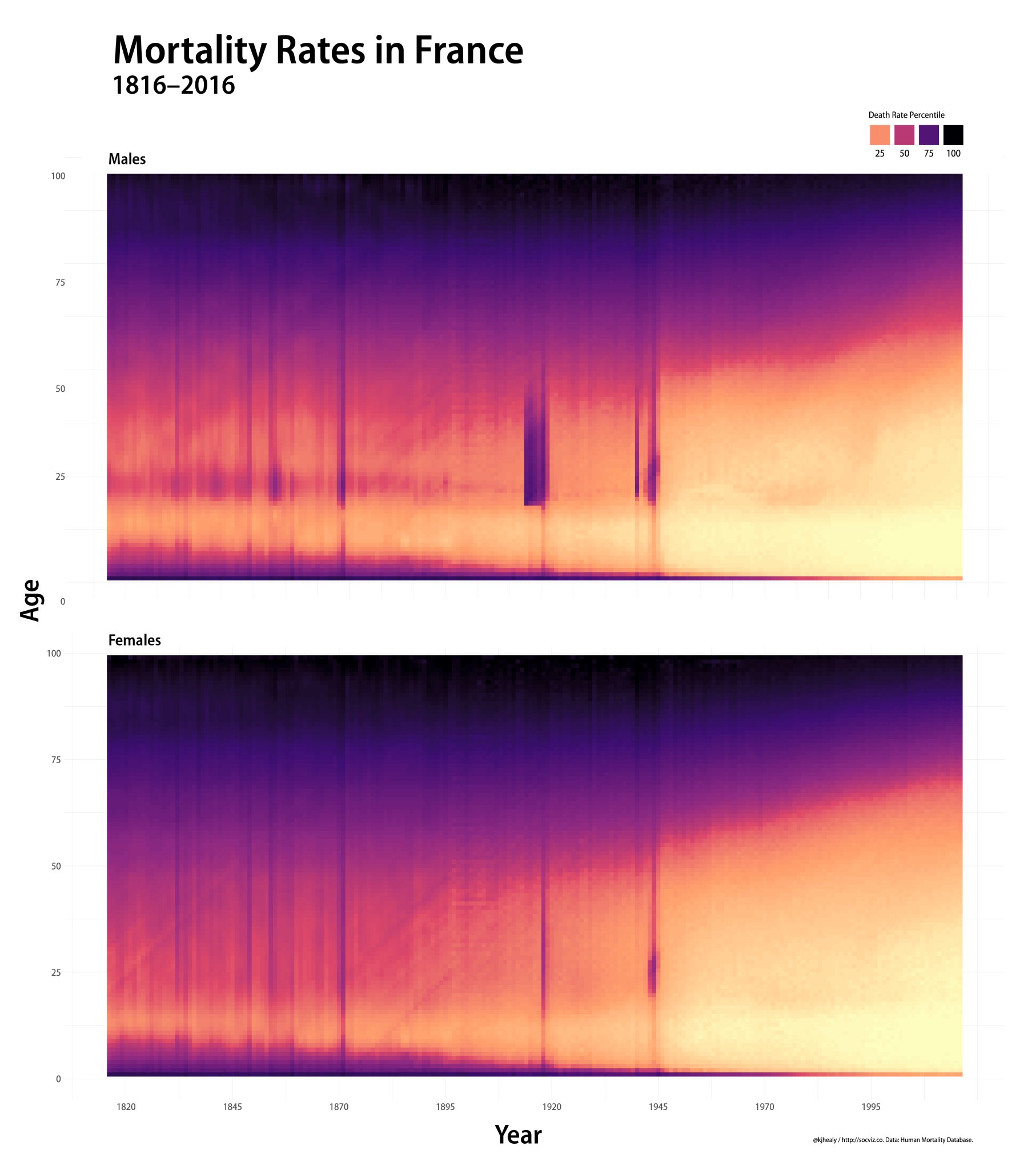
  • Beautiful pictures of mortality rates over time in France, by Kieran Healy (who also has a new book on data visualisation). The vertical lines show event such as wars and pandemics; the general lightening shows improved life expectancy over time; and the subtle diagonal lines follow people born in certain specific years and show they had a shorter life expectancy than those a little older or younger.

Beginning to look a lot like Christmas

In particular, the Christmas issue of the medical journal BMJ, which traditionally includes some research and commentary making serious points in a somewhat non-standard way.

As you may know, a famous BMJ Christmas research paper from 2003 summarised all the existing randomised trials of parachute use when jumping from a plane. There were none.  The paper concluded

 We think that everyone might benefit if the most radical protagonists of evidence based medicine organised and participated in a double blind, randomised, placebo controlled, crossover trial of the parachute.

The paper was pushing the idea that a lot of interventions are so obviously beneficial as to not need evaluation. This idea hasn’t gained much ground since then; probably the reverse. So, it’s appropriate that the highlight of this year’s Christmas issue is a randomised controlled trial of parachute use when jumping from a plane, measuring the effect (impact?) on the risk of being dead or seriously injured, both immediately after the jump and 30 days later.

The trial found no suggestion of a difference between the participants who used a parachute and the ones who used an ordinary North Face backpack. As the researchers note, however,

the trial was only able to enroll participants on small stationary aircraft on the ground, suggesting cautious extrapolation to high altitude jumps.

That is, the paper is making the point that randomised trials often recruit very non-representative sets of people, and this especially true when the medical community, rightly or wrongly, thinks it knows the treatment is effective.


December 13, 2018

Or you’ll go blind?

Almost exactly one year ago, my glasses got broken. I went to a nice optometrist, had an eye exam, and got new glasses.  Apart from my recurring surprise that the lenses have to come all the way from Australia everything was fine. I’ve now had five emails telling me that my next eye exam is “due”, that this sort of regular checkup is “very important” and that it enables the “early detection of a number of eye health problems … making successful treatment more likely”.

The New Zealand medical guidelines for someone in my situation suggest that I need an eye exam at least once every five years, primarily to detect glaucoma. The Australian guidelines (PDF) are similar, but recommend starting at 50. In the US, where they really like screening, the American Academy of Ophthalmology says eye exams every 2-4 years.

That’s a bit different from what optometrists will tell you. The American Optometric Association says ‘at least every two years’ — though they don’t explain their evidence base for this — and the main NZ chains agree. One interesting exception is the College of Optometrists, in the UK, which recommends that you wait a minimum of two years if there isn’t any special reason for more frequent examination.

It’s quite hard to work out optimal screening frequency, but it does look here as though the people who describe how have they tried to consider costs and benefits carefully come up with longer intervals than people who don’t.

December 9, 2018

Is 90% accuracy a lot?

There’s a headline in the Guardian Scientists develop 10-minute universal cancer test. As you’d probably expect by now, that’s overstating things quite a bit. Let’s see what we can find.

The Guardian story doesn’t link to the open-access research paper, but there’s a piece by the researchers themselves in The Conversation. It doesn’t link, either. However, Google finds the science news website phys.org, and it does link.

The idea is that the C of the DNA A, C, T, G bases exists in two versions (C and Ç, say). The modified (methylated) version  is involved in turning genes off, so successful tumours have often managed to get rid of the modifications near genes important for cell growth.  The clever idea is that the changes in methylation can affect how the DNA sticks to itself and to other things — such as gold nanoparticles, where it’s detectable because it changes the colour of the particles in solution.

The research paper shows how this sort of science works. There’s a lot of effort put into measuring how DNA sticks to things, and then showing that it’s really methylation that the test is measuring, including tests with DNA that’s had methylation added or removed artificially.   Then, there are tests with DNA extracted from a selection of real tumours and non-tumours, seeing how well the decisions correlate with cancer. All of this is important as a foundation for the science.

Finally, there’s the data that is directly related to testing for cancer: running the test on DNA found floating free in the blood of people with and without diagnosed cancer

Statistical diagnostic efficacy test at cutoff value %ir = 35.7 shows that our method has high accuracy (83.45%) with high positive and negative predictive values (Table-Fig. 3d, PPV = 91.30%, NPV = 69.81%, see more details at Supplementary Table 3). 

The positive way to put this is that it’s pretty impressive for a first effort, and that optimising the test might make it really useful.  The less positive way to put it is that the positive predictive value of 91.3% (meaning that 91.3% of the people who test positive actually have cancer) happened when two-thirds of all the people tested had cancer.

In that example, roughly one in four of the people without cancer tested positive. Suppose instead you’re using it for screening and that 1 in 100 people really have detectable cancer.   You probably pick up that one person, but you also pick up about 25 people without cancer. And since the other attribute of the test is that it’s supposed to be sensitive to any type of cancer anywhere in the body, you’re going to need to do a lot of further investigation to reassure those 25 people.

December 6, 2018

Six chips a serving

Q: Did you see there’s an exact number of chips that’s healthy?

A: Doesn’t it depend on how big they are?

Q: Apparently not. It’s from a Harvard professor!

A: You know, the more Harvard professors you meet, the less you think they’re automatically right about everything.

Q: It’s based on research! In the American Journal of Clinical Nutrition!

A: That’s more promising.  Link?

Q: 🤣

A: <sigh>. Ok, the story is originally from the New York Times, and they link

Q: Is it in people?

A: Yes

Q: Not randomised, probably.

A: No

Q: So they compared people who ordinarily eat just 6 chips in a serving with normal people and there were health differences? Where did they find the six-chip people?

A: It wasn’t a comparison of six chips to more than six.

Q: Ok, but still larger servings vs smaller servings?

A: No. People who eat fried potatoes more often (like 2-3 times per week) had a higher rate of death than people who ate them less often.

Q: I suppose that makes sense. Especially if you consider what sorts of meals you usually eat with fries.

A: They’d prefer you  focus your attention on the actual fries, not on anything else you eat.

Q: So that gives the message ‘fries are bad’. Why six?

A:  It’s not specified

Q: 🙄

Q: So he’s really saying NO SAFE LEVEL and RISK OF DEATH WITH EVEN ONE just like with bacon and alcohol and driving?

A: To be fair, he’s actually trying not to say that. Or even that normal servings of chips should be BANNED!!.  In fact,  he said later that he just wanted the option of a six-chip serving.

Q: And how popular is that likely to be?

A: Well, here’s the other result I got from searching for “six chips”

December 4, 2018

Briefly

December 3, 2018

Margin of error

From Scoop.co.nz, the latest Colmar Brunton poll results

National 46 percent up three points 
Labour 43 percent down two points
Greens 5 percent down two points
NZ First 4 percent down one point
Maori Party unchanged on 4 one percent
ACT up one point to one percent

Question: which of these changes are greater than the ‘margin of error’ for polls of this size?

The maximum margin of error in these polls  is 3% (the maximum margin of error is for parties polling not too far from 50%). That makes the maximum margin of error for changes between two polls about 4.5% — there are two polls involved, and that multiplies the likely error by the square root of two.  For any given party, about one poll in six should show a change of three or more points if the underlying support is stable.  That’s in a perfect mathematical world — in the real world, the likely sample errors are larger because the polls aren’t an ideal random sample.

If the 3-point increase in National’s support were real, it would be interesting. But a single poll is a very blunt instrument and the grounds for calling this a “surge” are very weak.

The maximum margin of error doesn’t apply to the Greens, though.  When you get to smaller parties, the likely sampling error is smaller in absolute terms, though larger as a proportion of their support.  I’ve posted before on this topic, and you can look up the table there to find that the margin of error at 5% is a bit under 1.5 percentage points, so a change of two points is borderline interesting — depending on whether it was rounded up to two or down to two.

You might also wonder if the same applied to ACT. There we’re completely at the mercy of the rounding — it will be possible to tell more when Colmar Brunton releases their detailed report, which (going from past versions) gives an extra decimal place for parties below 5%