Posts written by Thomas Lumley (2645)

avatar

Thomas Lumley (@tslumley) is Professor of Biostatistics at the University of Auckland. His research interests include semiparametric models, survey sampling, statistical computing, foundations of statistics, and whatever methodological problems his medical collaborators come up with. He also blogs at Biased and Inefficient

June 7, 2018

Looking at the numbers

The new QS university rankings are out, and there’s a story in the Herald.  It starts

Staff cuts despite growing student numbers have dragged most New Zealand universities down in the latest world rankings.

The biggest six of the country’s eight universities have all tumbled in the London-based QS rankings, which are regarded as the most important for attracting international students.

“Tumbled” is an exaggeration — for example, the University of Auckland has ‘tumbled’ from 82nd to 85th in the rankings. But the message that it’s staff numbers does seem to be backed up with a quote from QS

“The increase in enrolments – and the decrease in faculty numbers – reported by the country’s universities sees all eight receive a lower score for faculty/student ratio,”

QS don’t make it easy to find older numbers, but an archive of their webpage in March last year said there were 29,930 students and 2025 academic staff, and a ranking of 81. The current figures are  29,641  students (ie, fewer) and 2,047 academic staff (ie, more), for an improvement in staff:student ratio from 14.8 to 14.5. 

That’s over a two year period, but last year, the story at Stuff said

New Zealand universities performed well in research outputs – Waikato ranked 133rd, Otago 174th and Canterbury 178th – but showed “uniformly deteriorating” faculty to student ratios. The exception was Lincoln University, which featured among the top 200 universities globally in that measure.

So, cumulatively over this two year period the staff:student ratio at UoA (as measured by QS) improved, but the reporting said it worsened in both years.

My guess as to what’s going on is that these rankings are rankings. What they mean by “lower score for faculty/student ratio” isn’t that the ratio got worse here, but that it got better here by less than it did at some competing universities.

The other strange thing in the Herald story is this:

The worsening staff/student ratio in NZ universities was entirely due to cuts of 203 academics at Massey and 74 at Lincoln.

It could be true that these are the only NZ universities with a worsening staff/student ratio — the other universities could be seeing the same sort of change that UoA did — but if it is, the apparent contradiction with the lead should have been noticed.

June 6, 2018

Briefly

    • According to the Daily Mail “Brisk ten-minute walk, around 1,000 steps, can increase mortality by 15 per cent.”  They mean decrease.
    • Wikipedia thinks Amanda Cox, the data visualisation expert from the New York Times, isn’t “notable”. They are wrong and they should feel bad. But also, published evidence that she is notable would be useful.
    • The FDA has issued guidance on how to include pregnant women in clinical trials.
    • A monthly collection of the best data visualisation from around the web
    • Black cats are less popular

Methamphetamine testing

The report from Dr Anne Bardsley and Dr Felicia Low for the Office of the Chief Science Adviser makes clear that testing of houses for methamphetamine has been a complete failure for the sort of evidence-based risk-benefit analysis the NZ governments are claiming to care about.

It’s not just that Housing NZ used an Australian guideline for how clean a former meth lab should be after you’ve cleaned it as a screening threshold. Or that there’s an explicit 300-fold safety factor underlying that threshold even for the most susceptible people (toddlers crawling around and putting things in their mouths). Or that they not only evicted people but sometimes took away their personal belongings as too unclean to touch.  

In a situation where Housing NZ now claims they knew their standard was not very well founded, they didn’t try to do any better.  Faced with a huge testing and remediation bill, whose necessity was — at the most generous evaluation — unclear, they didn’t spend the relatively small amounts that would be needed to find out whether they were wasting public money. They didn’t even ask for help from, say,  the Chief Science Adviser, or the Royal Society Te Apārangi.

More importantly, though, they ignored the harm done by evicting vulnerable people.  The fundamental assumption of any cost-benefit or risk-benefit analysis is that you’ve got the costs and risks and benefits right, or at least that you’ve made an honest effort to get them right and been explicit about your uncertainty.  There are difficult second-order questions of whose costs and benefits you include, and how you account for hard-to-quantify factors like cultural preferences and reputational costs. But if you don’t even put in some of the major costs of a policy, you’re admitting up front that you don’t care about the right answer.

There currently seems pretty broad consensus among people who don’t work there that Housing NZ needs to be remediated. But the ability of the meth screening policies to last that long will — and should — raise doubts about evidence-based decision-making across the NZ public sector. Which is a pity.


May 29, 2018

Briefly

  • “It is important that guidelines for mitigation measures are proportionate to the risk posed, and that remediation strategies should be informed by a risk-based approach.” That’s not the money quote from Sir Peter Gluckman’s report on methamphetamine testing for houses (PDF), but it’s the generic StatsChat message.  For more, see Russell Brown’s story; he has been a consistent journalistic voice against panic-based testing.
  • From an NY Times oped “Knowing a person’s political leanings should not affect your assessment of how good a doctor she is — or whether she is likely to be a good accountant or a talented architect. But in practice, does it?  Recently we conducted an experiment to answer that question”.  As Andrew Gelman explains, they totally didn’t.
  • A new UK Parliament report “Algorithms in Decision Making”
  • “Why Government needs sustainable [statistical] software, too”
May 25, 2018

Tweet dreams

Q: Did you see using a mobile phone after 10pm leads to depression and loneliness, depression, bipolar disorder and neuroticism?

A: Where?

Q: The Independent, the Daily Mail, news.com.au, the Geelong Advertiser, Student Problems, …

A: So, what are we supposed to check first?

Q: Mice. It isn’t mice, it’s people.  “However, now a study of more than 91,000 people has found that scrolling through your Instagram and Twitter feeds from the comfort of your pillow in the wee hours could increase the likelihood of developing a number of psychological problems such as depression, bipolar disorder and neuroticism.”

A: Ok, ok.  Do any of them link?

Q: The Independent does. But it’s behind a paywall

A: <sighs> Ok. Here’s the press release. 

Q: But that doesn’t mention mobile phones. Or Twitter or Instagram.

A: No, it doesn’t.

Q: It looks like they used fitbits, though

A: Yes, or near offer.

Q: Could they tell from those when someone was using their phone?

A: I don’t know if they could, but they didn’t. They just looked at how much people’s physical activity differed between night and day.

Q: What’s that got to do with mobile phones?

A: If using your phone late at night stops you sleeping, then you might have less difference in activity between night and day.

Q: I suppose. Did they look at actual sleep?

A: Not in this study

Q: So, the people with less day-night difference in physical activity ended up with more mental health problems?

A: No, they started off with more mental health problems.  As the comment at the bottom of the press release says “The study population (median age at baseline of 62 years, IQR 54-68 years) is not ideal to examine the causes of mental health, given that 75% of disorders start before the age of 24 years.”

Q: These were 60-year olds?

A: Yes. In 2013-14.

Q: Did British 60-year-olds even use Twitter and Instagram in 2013-14? Instagram was only on iPhones back then, wasn’t it?

A: About a third of Brits between 55-64 had a smartphone then, and about 10% of older people.

Does bacon prevent cancer?

No.

This isn’t even supposed to be new research: it’s just a new set of guidelines based on all the same existing research. Since it’s a new set of public guidelines, you’d think a link would be appropriate: here it is.

The story says “”No level of intake” of processed meats will reduce cancer risks.”  and the quote from the report is The data show that no level of intake can confidently be associated with a lack of risk.  I don’t think that will surprise many people, and it’s what we’ve been told for a long time. There isn’t a magic threshold where bacon switches from being a health food to being bad for you. If you want something more quantitative, the figures we had last bacon panic haven’t changed: eating an extra serving of bacon every day is estimated to increase your lifetime bowel cancer risk by a factor of 1.2, or a bit under two extra cases per hundred people.

For alcohol, the focus on cancer is a bit misleading.  Low levels of alcohol consumption increase cancer risk but reduce heart disease risk, and there’s a range where it’s pretty much a wash — there isn’t a ‘safe level’ from a cancer viewpoint, but there probably is from a not-dying viewpoint. Still, there are lots of people who’d be healthier if they drank less alcohol — and that’s probably not the first time they’ve heard the message.

May 24, 2018

Reading the fine print

From Toby Manhire at The Spinoffquoting Reuters

“New Zealand’s dairy-fuelled economy has for several years been the envy of the rich world, yet despite the rise in prosperity tens of thousands of residents are sleeping in cars, shop entrances and alleyways.”

There was something similar in the Guardian, too. As Toby says

The juxtaposition is compelling and well made. The number is compelling and nonsense.

I’ve posted about this issue before. The OECD report that people use (directly or indirectly) as source, says

Australia, the Czech Republic and New Zealand report a relatively large incidence of homelessness, and this is partly explained by the fact that these countries adopt a broad definition of homelessness…..In New Zealand homelessness is defined as “living situations where people with no other options to acquire safe and secure housing: are without shelter, in temporary accommodation, sharing accommodation with a household or living in uninhabitable housing.

That’s much broader than ‘sleeping in cars, shop entrances and alleyways.” One of the researchers behind the NZ figure said, in a Herald interview in 2016

“If the homeless population were a hundred people, 70 are staying with extended family or friends in severely crowded houses, 20 are in a motel, boarding house or camping ground, and 10 are living on the street, in cars, or in other improvised dwellings.”

Homelessness is a real problem in New Zealand. Because it’s a real problem, it’s important to focus on what the problem actually is, and not to make up a different problem.

Reuters has corrected the figure but hasn’t otherwise changed the story.  The fact that reducing the figure by a factor of ten doesn’t otherwise change the story might tell you something about the story.


(update: ok, now I’ve actually read all of Toby’s post, not just the first few paragraphs, he basically says all this already)

May 23, 2018

Graph of the week

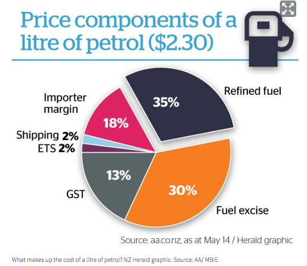
From the Herald (via @aw_nz on Twitter)

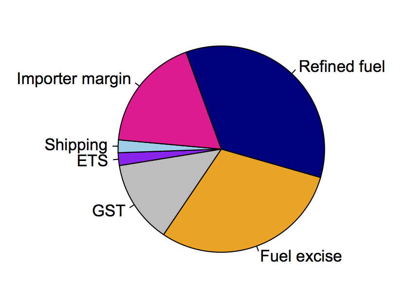
One of the features of pie charts is that it’s relatively hard to judge angles and compare segments. Still, if you get them wrong enough, people can tell.   For example, the taxes — the grey and orange wedges — are clearly more than half the circle, but the numbers add to only 43%.  Less dramatically, the 13% wedge for GST is larger than the 18% wedge for importer margin, and the 30% wedge for fuel excise is larger than the 35% wedge for refined fuel.  You don’t have to be very cynical to wonder whether it’s a coincidence that the tax components are being exaggerated. [update: you don’t, but you’d probably be wrong — see comments]

Here’s an accurate piechart, assuming the numbers are correct:

May 21, 2018

Briefly

  • David Fisher in the HeraldGarrett appeared unaware both Edgeler and Lumley had since withdrawn their comments, having found they were based on bad data from the Ministry of Justice.
  • “Why Is It So Hard to Figure Out When the Bus Is Coming?” From Citylab. At least Auckland Transport doesn’t seem to have the problem of inaccurate maps that the story focuses on.  Prediction is still hard, especially when it comes to the future.
  • There was a story in the more-excitable media about alien influences on Earth species. Some species of lizards in New Guinea have toxic, bright-green blood, and they aren’t even each others closest relatives. That wasn’t the alien story, though. The alien story was about octopuses. Here’s the story the Herald republished, and here’s a more sensible one from Buzzfeed. Not only is there no evidence for it, there’s evidence against it. New Zealand has plenty of scientists who know enough evolutionary biology to say the story is crap; it wouldn’t have been hard to ask one of them.
  • A tweet about toothpaste with an unusual ingredient that “increases the defenses of teeth and gums…cells are loaded with new life energy, the destroying effect of bacteria is hindered… it gently polishes the dental enamel and turns it white and shiny.” Fairly typical non-quite-therapeutic claims, but this toothpaste is from the early 20th century and the unusual ingredient is radium
  • A Guardian story with a nice animated chart showing the uncertainty in global warming predictions.
  • From Quartz, “Satellite images reveal which countries cheat on their economic statistics”
May 18, 2018

Doing the maths

From Science

Brooks then said that erosion plays a significant role in sea-level rise, which is not an idea embraced by mainstream climate researchers. He said the California coastline and the White Cliffs of Dover tumble into the sea every year, and that contributes to sea-level rise. He also said that silt washing into the ocean from the world’s major rivers, including the Mississippi, the Amazon and the Nile, is contributing to sea-level rise.

It’s true that this idea is not embraced by mainstream researchers. But there’s more than that. Unlike some of the more complex and subtle uncertainties in the rate and causes of sea level rise, this argument is not embraced by people who can use Google and a calculator.

The main contribution of the land to the sea floor is the 20 billion tons or so of silt from the world’s rivers.  Soil weighs in at between 1 and 2 tons per cubic meter; rock mostly between 2 and 3. Let’s be generous and call it 20 billion cubic metres. Not all of that ends up in the ocean — lots of it goes to coastal wetlands and deltas — but we’re messing them up too, so again let’s be generous and say it all ends up underwater.

The ocean area is 360 billion square kilometres, so about 360 million billion square metres. It would take 360 million billion cubic metres of added stuff to raise sea levels 1 metre — actually more, since the ocean area would expand, which is actually the main issue with sea level rise, but again we’ll be generous and say only 360 million billion. Dividing by 20 billion gives 0.000055 metres or 0.05 millimetres.  Actual sea level rise over the whole 20th century averaged 1.8mm/year, about 30 times more.