Posts written by Thomas Lumley (2645)

avatar

Thomas Lumley (@tslumley) is Professor of Biostatistics at the University of Auckland. His research interests include semiparametric models, survey sampling, statistical computing, foundations of statistics, and whatever methodological problems his medical collaborators come up with. He also blogs at Biased and Inefficient

July 14, 2025

Counting homelessness

We’ve seen in the past that NZ has very high estimated numbers of homeless people by international standards, and that this is at least in part because we have a very broad definition of “homeless”.

In this podcast, journalist Elizabeth Spiers talks to Brian Goldstone about his new book on homelessness in the US, and in part about how the problem is a lot broader than the official homelessness statistics.  His book takes into account the same sorts of people without a home that the NZ statistics do, and his estimate that the true number is about six times the official number would rate the USA as a little worse than NZ.

July 8, 2025

A fine line

As you probably know, there are four sorts of horizontal line separating symbols in text: the minus sign, −; the hyphen, -; the en-dash, –; and the em-dash, —.  Some people use just hyphens — or perhaps paired hyphens to indicate an em-dash — because that’s what a standard English keyboard provides.

Recently, the em-dash has been touted as an outward and visible sign of ChatGPT output.  This annoys people who deliberately use the full variety of English punctuation marks. The em-dash is in LLM output, they retort, because LLM output is trained on English writing and so will extrude em-dashes and semicolons, just as it will extrude metaphor and metonymy, zeugma and syllepsis.

On the other hand, there do seem to be a lot of em-dashes in ChatGPT output nowadays.

An analysis by Maria Sukhareva suggests a compromise explanation. Yes, the stretch hyphens come from the training data, and yes, they are somewhat new, but there are also too many of them.  We’re seeing a combination of two factors: addition of older books— with more em-dashes— to the training materials, and the fact that an em-dash is fewer tokens than other ways of setting off parenthetical comments.

July 7, 2025

Just one hot dog a day!

Q: Did you see there’s no safe level of processed meat!

A: I saw the New York Post

Q: <side eye>Really?

A: Via Google. And RNZ and Stuff

Q: Didn’t we have this story a couple of months ago?

A: Not quite. That was ultra-processed. This is only processed.  And just meat.

Q: Is it true?

A: What did we say last time?

Q: “But think about it. How do they measure people’s consumption of ultraprocessed food down to the single bite level? How do they find a comparison group with just one bite less consumption? What does it even mean?”

A:  Exactly. Even though it’s not “one bite” this time, there’s still the question of what levels they actually compared

Q: So, um, what levels did they actually compare? And is there a research paper?

A: The paper is here.  They said (for diabetes, colorectal cancer was similar)

The mean relative risk (RR) of developing type 2 diabetes was 1.30 (1.12–1.52) at a daily intake of 50 g of processed meat compared with the theoretical minimum risk exposure level (TMREL; equal here to 0 g d−1 or no consumption)… consuming processed meat in the range of the 15th to 85th percentiles of exposure (0.6–57 g d−1), compared with consuming no processed meat, was associated on average with at least an 11% higher risk of type 2 diabetes.

Q: Is 50g a lot

A; About one hot dog

Q: So eating one hot dog will increase your risk of diabetes by 26%

A: One hot dog per day

Q: And they’re comparing to a “theoretical minimum risk” at zero hot dogs per day?

A: Yes

Q: Doesn’t that kind of assume there is no safe level

A: Pretty much.  They’d be able to see if moderate levels of consumption are actually protective, though if you think about how long people argued over that with alcohol, they obviously can’t tell very clearly

Q: So it’s not harmful at lower levels of consumption?

A: It’s correlated with diabetes (and cancer) at lower levels, too. Here’s the picture. The blue line is their estimate relative risk

Q: It gets a bit noisy down near 10 or 20g/day. Hard to tell the shape of the curve.

A: It is.

Q: And the red crosses?

A: The bluish dots are data; the red crosses are data they didn’t use

Q: So what does it actually mean that there’s no safe level?

A: If you’re eating hot dogs primarily for the health benefits, you’re doing it wrong.

July 4, 2025

Briefly

  • Health Nerd else has similar views about coffee as me last week
  • Royal Statistical Society blog post on the future of the British Office of National Statistics
  • Graeme Edgeler argues that getting rid of the Census may require amending entrenched provisions of the Electoral Act, which takes a 75% supermajority of Parliament
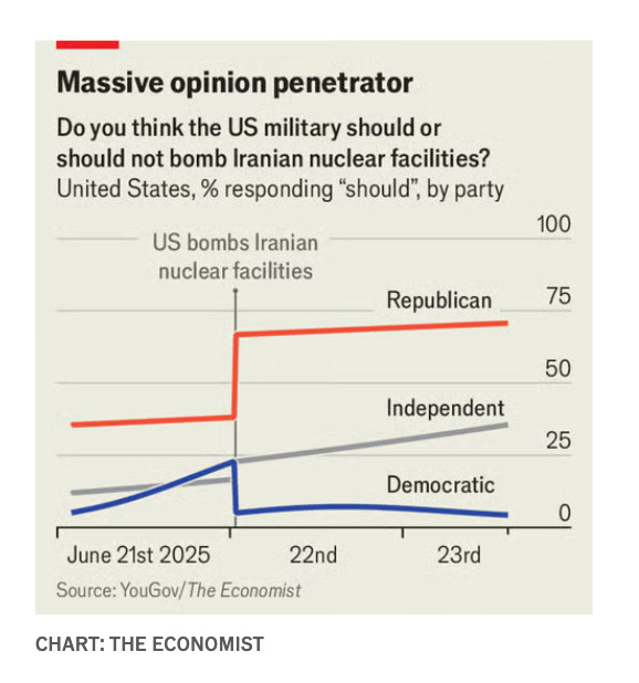
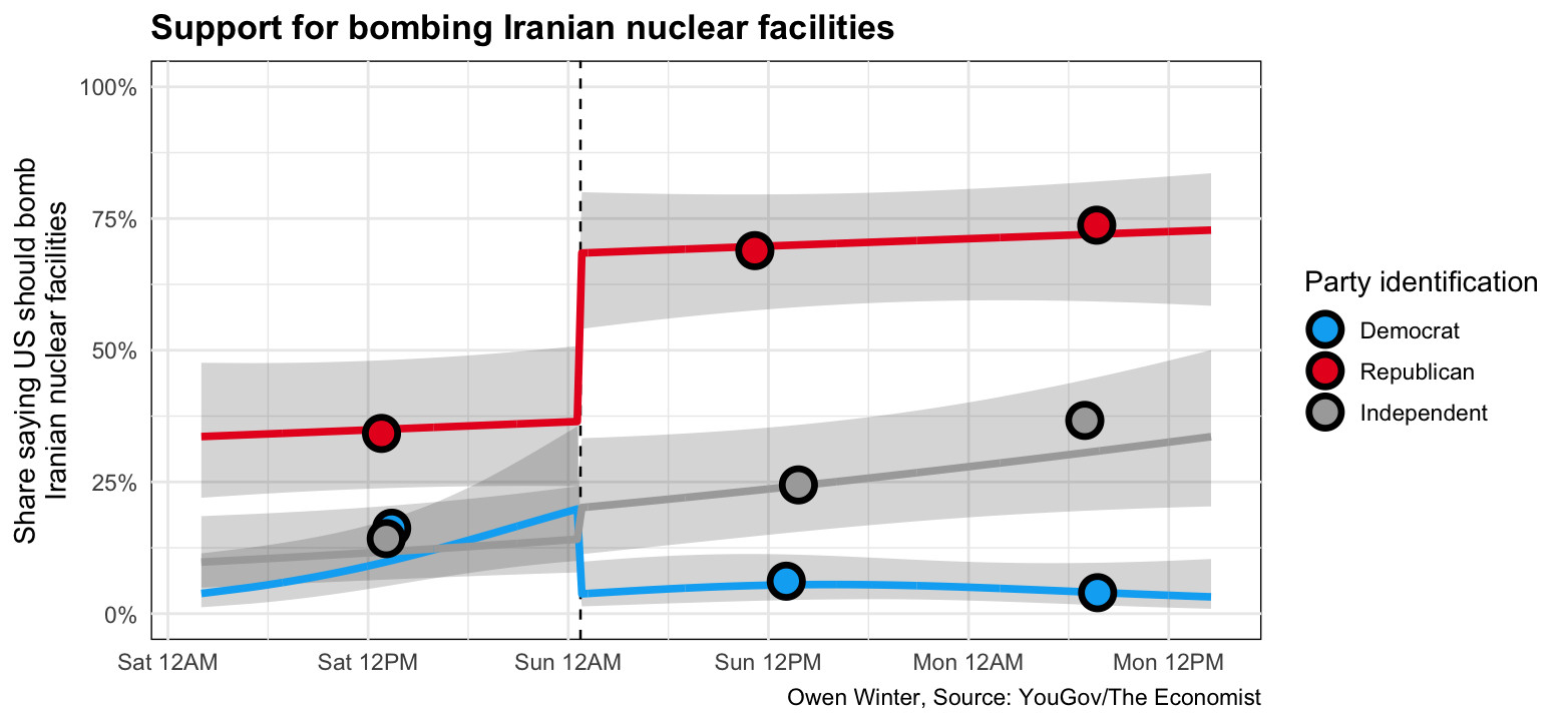
  • The Economist/YouGov had a poll being run on bombing Iran at the time the US did it, and reported this interesting shift in opinions: republicans approved more; democrats approved less.
  • As a StatsChat reader you should be looking at this and wondering where the uncertainty estimates. Owen Winter responded to my BlueSky query with this. If you take into account model uncertainty it’s a bit less impressive, but it’s not nothing
June 23, 2025

Briefly

  • ‘Kids in sport stay out of court’ – Sport NZ to help curb youth offending from RNZ.  This is another one of these cause and effect ones. Is it that being pushed into sport makes kids less likely to offend? Is it that kids with the qualities — self-control, work ethic, parents who drive you to games — to engage with sport are less likely to commit dumb crimes? Or (as anonymous law commenter @StrictlyObiter suggests) is it that “promising young sportsmen” are more likely to get a discharge without conviction?  Or, more likely, all of the above in some complicated mixture
  • From the Bennett Institute for Applied Data Science at Oxford, another example of counting being hard. They wanted to find out how much of each medication was used across the National Health Service
  • On pizza as a leading indicator of US military activity
  • It’s twenty years since XKCD did a big colour survey, showing people coloured patches and asking for colour names.  Nicola Rennie made this poster of the top (ie, most agreed on) colour names — click to embiggen.

Evidence of things not seen

A couple of studies out recently look at coffee and health.  One from Harvard(and reported by CNBC)  says coffee (but not decaf or tea) increases the chance of healthy aging in women. Another, from Tufts, (and reported by Newsweek and The Independent) says that unsweetened black coffee, or coffee with very small amounts of sugar or normal coffee amounts of milk, reduces death rates slightly, but not coffee with more sugar or milk (as in everything from a Kiwi small flat white to American-style lattes)

There are two problems with these studies.  The first is that I can’t see them.  One is an abstract from a conference presentation; the other is a paper in an academic journal, but not one the University of Auckland gives me access to.

Compounding this, the two abstracts only give information for their preferred beverages. It’s not possible to tell whether “Decaffeinated coffee and tea intake were not significantly associated with odds of HA nor any domains” means that there’s evidence the correlations were different for tea and decaf or whether there was just a bit more uncertainty around plausibly the same correlation.  Similarly, “However, the mortality benefits were restricted to black coffee [HR (95% CI): 0.86 (0.77, 0.97)] and coffee with low added sugar and saturated fat content [HR (95% CI): 0.86 (0.75, 0.99)]” doesn’t tell us what they found for other coffee types. Nor is the information in the press releases I could find. Since the difference between ways of drinking coffee was the main news tag for these studies, that’s a bit unsatisfactory.

I’ll also note that the Tufts team published an abstract in 2020 with a slightly smaller version of the data from the same survey series, and concluded “Adding milk/cream, alone or with sugar/sweetener, did not significantly change the results.”

A basic principle for studies like these is that conclusions about difference require evidence of difference.  This applies to conclusions in the paper, and even more so to conclusions you want the press to report.

June 21, 2025

Census roundup

Not necessarily endorsed by me, but many of these people do know what they are talking about.

I do also want to emphasize that no-one expert thinks this is a proposal to stop collecting data for the government. Administrative data already marks when you are born or die, when you enter or leave New Zealand, when you pay taxes or go to school or get health care.  This information is more reliably and rapidly collected administratively than in the Census. What we risk losing is not that, but other things.

Reeling them in

Q:  One News says fishing can improve your mental health!

A: That sounds fairly plausible, actually. Did they say how they know?

Q: “research from the UK”

A: A bit non-specific, innit?

Q:

A: I think it’s this paper. The number matches (“Almost 17% less likely”) and it’s from the UK and there doesn’t seem to be a better match

Q: And people who fished more had less mental illness?

A: People who fished more often had less history of depression, suicidal thoughts, and self-harm. People who fished longer had more suicidal thoughts.

Q: How often did people have to fish to be in the “17% less likely” group

A: It’s not clearly described.  The model in the paper actually has 17% more likely, so maybe it’s a model for “not mental health problem”.  If the 17% is for a one-step difference in the survey question then it’s a surprisingly large effect of a very small difference: 5-6 times a week is a different category from 3-4 times; once every two weeks is different from once per month.

Q: Could the anglers just be healthier anyway, or richer or something? Did they collect that information?

A: They did collect it, but they didn’t use it in the analysis, at least in this paper.

Q:

A:

Q: How did they recruit the people?

A: “an online survey  that was advertised through the Instagram, Facebook, and Twitter accounts of Angling Direct and Tackling Minds. Angling Direct also sent the survey link to their mailing list, and the link was distributed via the Anglia Ruskin University Twitter account, as well as the authors’ own networks.”

Q: That … sounds like it might not be perfectly representative

A: 98% of the respondents were men, for example. And 40% were in the top 20% of household income nationally.

Q: Would I be right in guessing that Angling Direct is some sort of fishing magazine?

A: It’s actually a chain of fishing supply stores in the UK.  Claims to be the UK’s leading fishing-tackle retailer

Q: Ok, and Tackling Minds is maybe some sort of fishing education thing?

A: It’s a charity that uses fishing as a mental health intervention.

Q: Couldn’t that have some impact on the correlations between fishing and mental health in the sample?

A: Indeed it could

June 19, 2025

Compared to what?

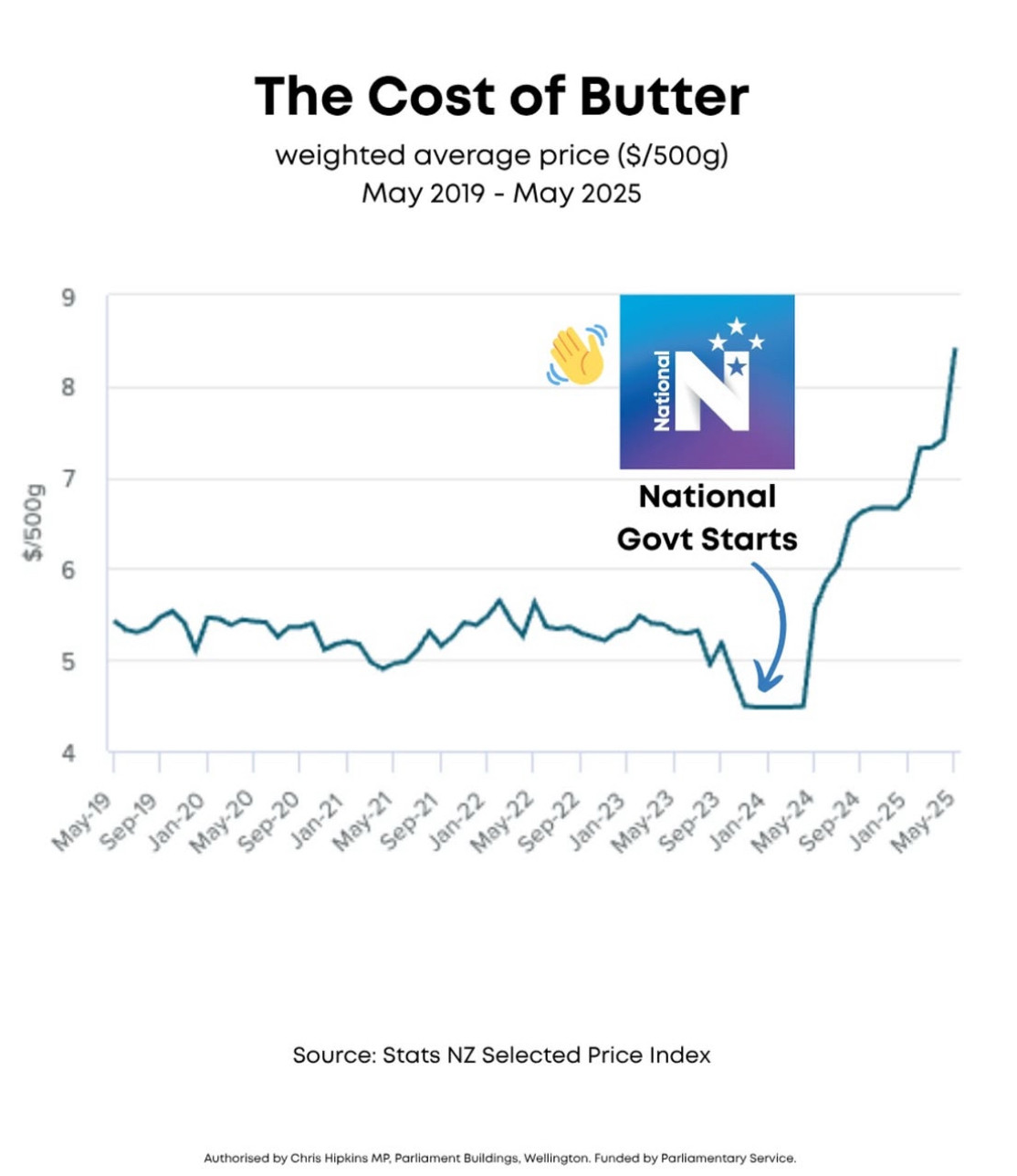
Via Bluesky from Instagram, and attributed to Chris Hipkins

When StatsNZ produces the data here, it was purely descriptive: number go sideways, number go down, number go up. The use on @nzlabour’s Instagram and with a Chris Hipkins electoral authorisation obviously intends a comparison, even without the annotations.  A simple comparison to the past — butter is more expensive now — is true, but it’s not what’s implied. We can tell it isn’t, because it would have no political implications and so wouldn’t be worth marketing.

The implied comparison here is to a scenario where the price of butter stays const (or keeps decreasing?) in 2024. The comparison is clearly bogus (which is why the graph is such an effective way to present it).  You might approve or disapprove of NZ butter prices following global trends, and of the NZ supermarket duopoly having substantial pricing power, but these are ongoing issues and neither one is the fault of the current government. A Labour government that committed to not increasing taxes  isn’t going to introduce price caps or government subsidies for butter!

The graph has the opposite problem to a lot of Covid comparisons.  Here, the problem is comparing to a hypothetical world that is unrealistically different. For Covid, it’s comparing to a hypothetical world that’s unrealistically similar: talking as if we could have skipped lockdowns and just had a normal economy, when the real alternative is lots of illness and death and a much worse economic problem.  The usefulness of counterfactual comparisons relies on making realistic choices about what would have been the same or different.

June 18, 2025

Tatau tātou, eh?

According to the Herald, the government has decided to stop doing the Census after the next (2028) round and switch to yearly administrative data from 2030.  The press release is here, and StatsNZ’s page is here.  There’s no commitment so far to get the necessary legislative changes passed before the election, but that may come.

This was inevitable at some point.  Door-to-door enumeration is getting less effective and administrative data are getting more complete: eventually the two lines will cross. There are quite a few countries that have more detailed and thorough government data collection than us and don’t bother with censuses. They get on fine. I’m not sure we’re there yet, but maybe we will be in 2030?

At the crude level of “how many people are there and roughly where do they live and what work do they do?”, administrative data is great.  The use of administrative data in the 2018 and 2023 Censuses improved the counts of people by region, and especially improved the counts for Māori.  There are some important weaknesses, though.

First, the `administrative’ data used to augment the 2018 and 2023 Censuses included past Census data, not just routinely-collected government data.  In 2018, the first-priority source for additional data was the 2013 Census, and it was often important. For example, when creating the “Māori descent for electoral purposes” variable, StatsNZ found 15% of the “Yes” values and 7.7% of the “No” values in 2013 Census data. [Table 4.2, Initial report of Census data quality panel].  If we stop doing Censuses, the existing Census data will rapidly become less useful.

Second, administrative data is much less effective for household statistics than for individual statistics.  Most routine government data collection is about individuals.  If Chris reported a particular Auckland address in March 2025 and Pat reported that address in December 2024 and Sandy reported it in July 2024 and Alex in June 2024, how do you work out which subset of these folks were ever living there together? And that’s before you get to situations like if you’ve just started flatting but your doctor has your Mum’s address and your boss has your Dad’s address.   In 2018, household data were a big weakness of the Census — nearly 8% of the census population didn’t have an assigned household. StatsNZ did a lot of work on this subsequently, but it’s hard.

Third, there are data that just aren’t collected routinely. Iwi affiliation, disabilities, and housing quality variables were examples from 2018. If these variables are wanted, they will have to be collected in other surveys, and there’s no clear reason to expect the other surveys to be more accurate than the Census. In particular, they may have worse non-response rates for Māori and for minority groups.

There’s also a potential social license issue.  People understand the Census and have some idea of what it’s for, and mostly approve.  The IDI is much less well understood, and I think is less popular. Replacing the Census with surveys and vacuuming up of data collected for other purposes could well have a negative effect on public willingness to give up their data and public trust in the results.

Good sources if you want to read about this include the StatsNZ page, whatever Len Cook writes, and also the reports of the 2018 Census Data Quality Panel (there’s a 2023 report, but it’s much smaller and mostly talks about minor improvements in methods).