3-d graphics
Most ‘3-dimensional’ graphics that you see are using fake perspective and don’t actually provide much additional information. The Australian Bureau of Meteorology maximum temperature forecasts are a genuine 3-d data display, illustrating that you really, really don’t want to be in eastern central Australia this week. Notice how the coolest parts of Australia are the same temperature as here.
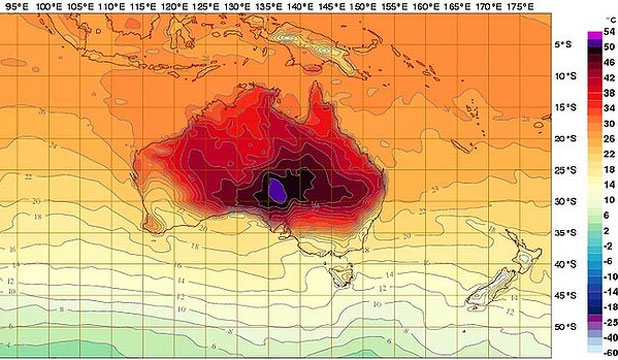
The purple colour at the top of the scale doesn’t fit in well with the rest of the spectrum, and stands out on the map. Normally this would a bad thing, but 50C deserves to stand out.
Thomas Lumley (@tslumley) is Professor of Biostatistics at the University of Auckland. His research interests include semiparametric models, survey sampling, statistical computing, foundations of statistics, and whatever methodological problems his medical collaborators come up with. He also blogs at Biased and Inefficient See all posts by Thomas Lumley »
I think the purple is also due to the fact that the top two colours were added after all the others due to the actual readings moving beyond the existing scale. Given the previous top of the scale was black they didn’t really have anywhere to go that wouldn’t have stood out.
If they had completely redesigned the thing they may well have chosen to fit the top two into the scale a bit better.
11 years ago
Also, although places like Melbourne and Hobart are currently at temperatures that are similar to those in parts of NZ, they both experienced temperatures of around 40 in the last few days.
11 years ago