Different sorts of graphs
This bar chart from Figure.NZ was in Stuff today, with the lead
Working-age people receiving benefits are mostly in the prime of our working life – the ages of 25 to 54.
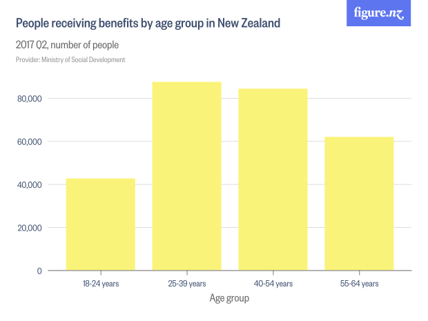
The numbers are correct, but the extent to which the graph fits the story is a bit misleading. The main reason the two bars in the middle are higher is that they are 15-year age groups, when the first bar is a 7-year group and the last is a ten-year group.
Another way to show the data is to scale the bar widths proportional to the number of years and then scale the height so that the bar area matches the count of people. The bar height is now counts of people per year of age
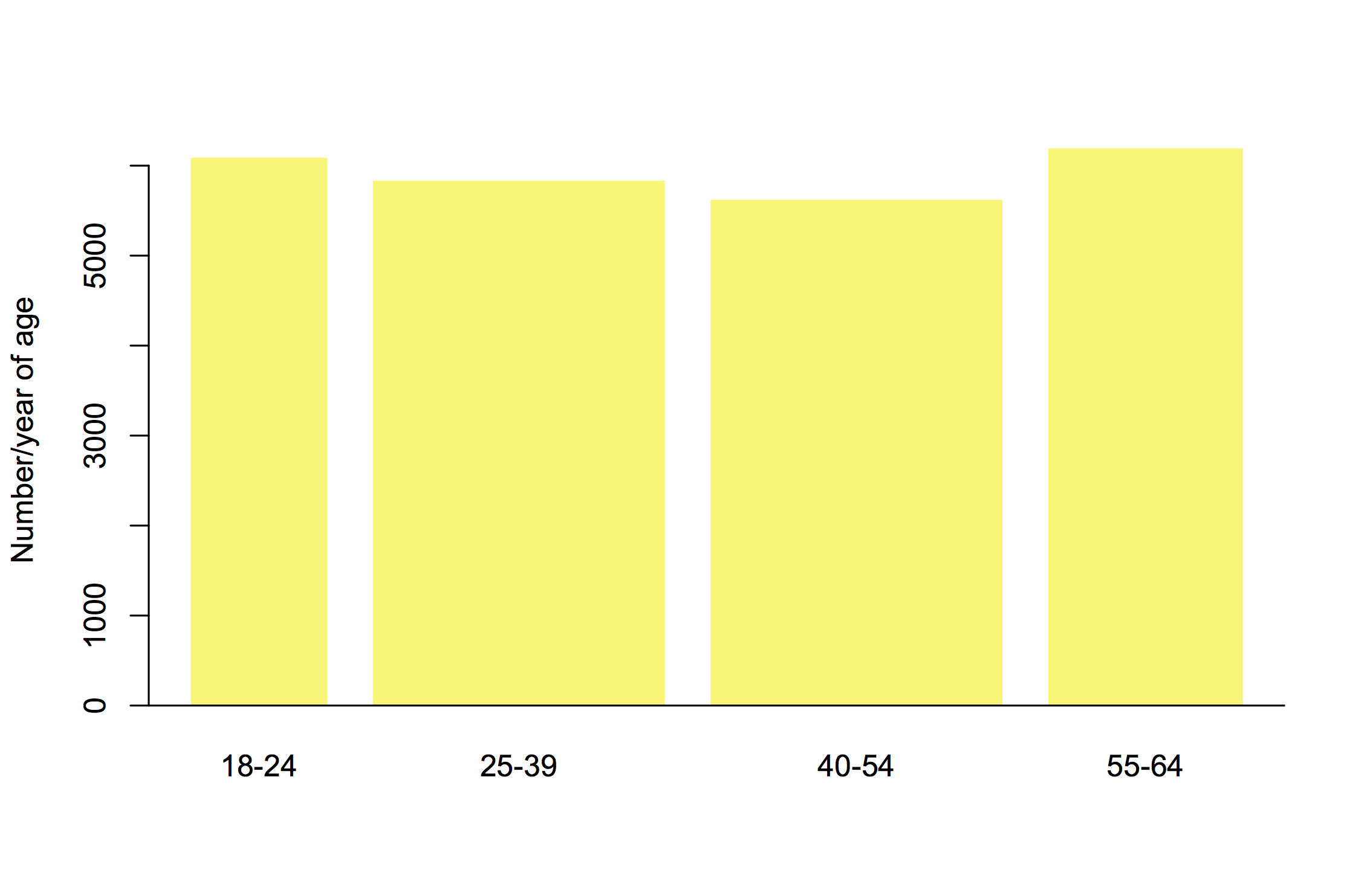
This is harder to read for people who aren’t used to it, but arguably more informative. It suggests the 25-54 year groups may be the largest just because the groups are wider.
We really need population size data, since the number of people in NZ also varies by age group. Showing the percentage receiving benefits in each age group gives a different picture again
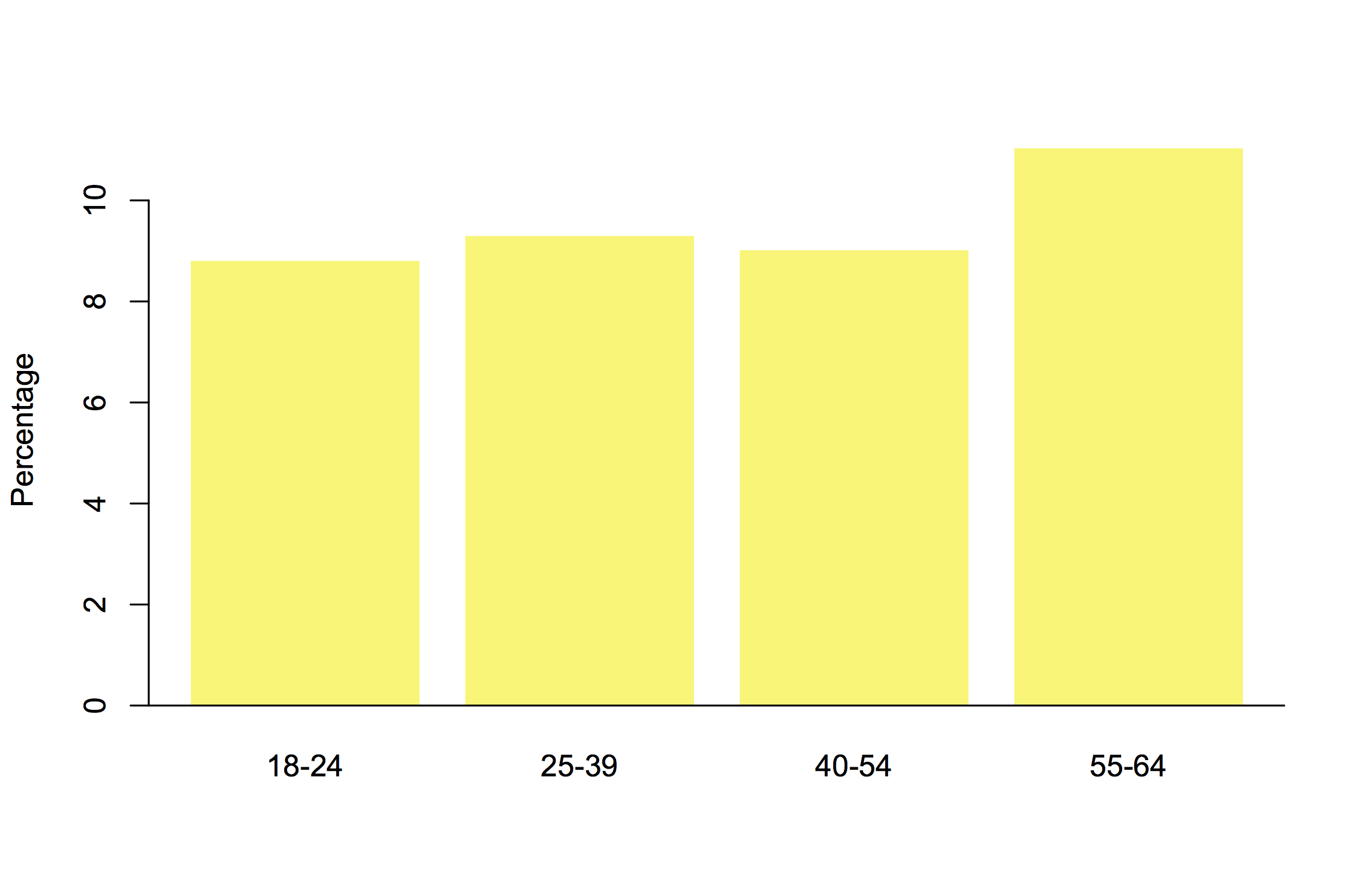
It looks as though
- “working age” people 25-39 and 40-54 make up a larger fraction of those receiving benefits than people 18-24 or 55-64
- a person receiving benefits is more likely to be, say, 20 or 60 than 35 or 45.
- the proportion of people receiving benefits increases with age
These can all be true; they’re subtly different questions. Part of the job of a statistician is to help you think about which one you wanted to ask.
Thomas Lumley (@tslumley) is Professor of Biostatistics at the University of Auckland. His research interests include semiparametric models, survey sampling, statistical computing, foundations of statistics, and whatever methodological problems his medical collaborators come up with. He also blogs at Biased and Inefficient See all posts by Thomas Lumley »
People 25-54 are in their prime parenting years as well so they get access to paid parental leave and the working for families benefit.
So the story is silly on so many levels.
9 years ago
Barcharts can be subtler than you might think at first glance and it is always worth looking at more than one graphic for any dataset.
A spineplot would be a good alternative to your last barchart.
9 years ago
Yes, a spineplot would probably have been better.
9 years ago
The graphs come directly from an interesting group who call themselves ‘Figure NZ’
http://tohu.figure.nz/external/what_we_do/#how-are-you-funded
They seem to do some high powered stuff with data-
“Hosted on Amazon EC2 in Sydney, the stack comprises two main components. One system is a sophisticated tool for extracting data from documents, systems such as CKAN and APIs such as SDMX, while the second system delivers the public web presence for Figure.NZ.”
So they are not just interns cobbling up a story for a newspaper website.
Yet they get a simple graphical representation wrong?
9 years ago
The graph isn’t wrong, it just doesn’t fit the message in the story. The graph wasn’t produced for the story; Stuff picks graphs from Figure.NZ and writes out them.
9 years ago