Better or worse?
There was some controversy about the difficulty of the NCEA level 1 maths and stats exam last year. As Stuff reports
It prompted the NZQA to release the exam to the public, and now the authority is taking the extra step to share the exam outcome before the consolidated results are released in April.
“NZQA has taken the unusual step of announcing these provisional results early so we can respond to the concerns teachers raised with us in the open letter,” said NZQA deputy chief executive Kristine Kilkelly.
“Provisional results for the NCEA Level 1 Mathematics and Statistics examinations in November show the majority of students who sat the examinations gained an Achieved or better grade for each standard.”
There’s a graph with the story, which is always nice:
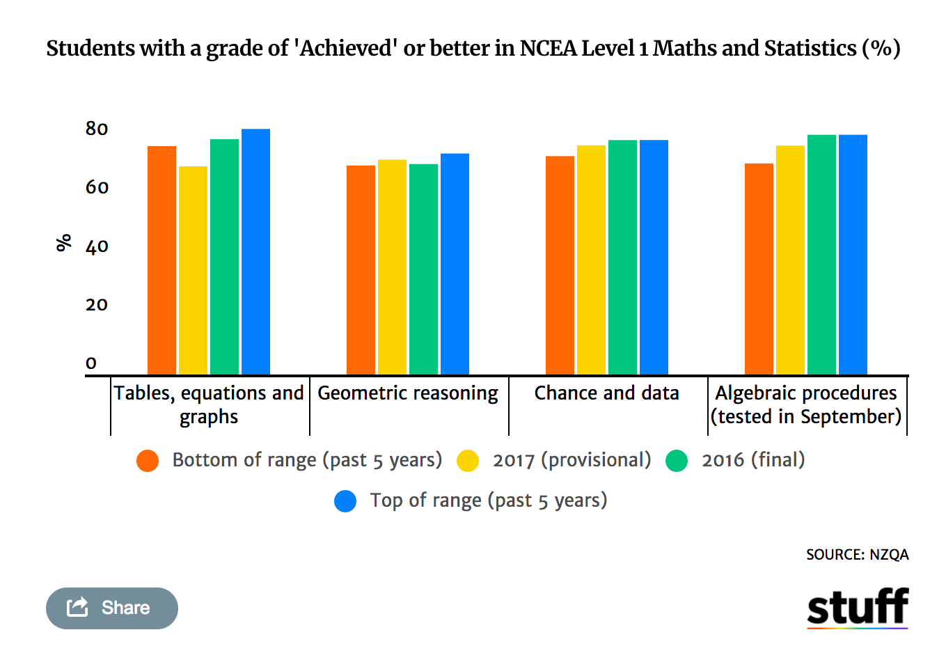
I’m not convinced this graph is a great way of showing how the 2017 results differed from previous years: it’s better for showing that, yes, the majority of people passed.
Here’s my attempt at showing the 2017 differences: the arrows show the change from last year and the bars show the five-year range. I think it would have been better to just plot the four six-year time series, but that data wasn’t in the NCEA press release. It would also have been better to look at the ‘Merit’ and ‘Excellence’ percentages, but again that’s not given.
![]()
I think it’s clearer from this graph that the pass rate for “91028 Investigate Relationships Between Tables, Equations and Graphs” was lower last year, and lower by quite a large amount relative to previous the year-to-year variation. Two of the units have no sign of that sort of drop, and the fourth has a similar drop but from a high point to a value still within the recent range.
So, maybe there was an issue with the ‘tables, equations and graphs’ test.
Update: another redesign by Andrew P. Wheeler
Thomas Lumley (@tslumley) is Professor of Biostatistics at the University of Auckland. His research interests include semiparametric models, survey sampling, statistical computing, foundations of statistics, and whatever methodological problems his medical collaborators come up with. He also blogs at Biased and Inefficient See all posts by Thomas Lumley »
My first thought was that TE&G and GR have been mis-labeled by NZQA.
But I’m assuming these aren’t the raw marks but marks after NZQA have matched them to their “profiles of performance”. So it doesn’t really say anything about whether the exam was harder or easier than usual.
8 years ago
And I am assuming the data is just for the people who put pen to paper. It doesn’t include (in the denominator) those who read the paper decided that they were not going to pass and walked away.
8 years ago
The cut score for getting achievement in TE&G was 7 (out of 24) while it was 8 for Geometric Reasoning.
TE&G was testing all the same skills as previous years in a similar way so it doesn’t make sense that achievement should suddenly drop between 2016 and 2017*. On the other hand many people reported being shocked at the changes to GR yet achievement improved between 2016 and 2017.
To my mind this makes my suggestion of mis-labelling even stronger.
*OK, there are some reasons (changing pool of candidates towards weaker students etc) but it doesn’t seem enough for around 10 percentage point change.
8 years ago
OK, it bothered me enough to go directly to the source.
FYI
https://fyi.org.nz/request/7180-number-of-candidates-for-level-1-mathematics-external-achievement-standards-and-achievement
8 years ago
In terms of the issue arousing concern – last year’s exam difficulty relative to previous years – your graph is a vast improvement. NCEA’ s graph is just too cluttered with information to read easily and the scale makes the changes hard to read precisely.
8 years ago