Pie charts, Oz edition
From The Australian (via Luke Wihone on Twitter)
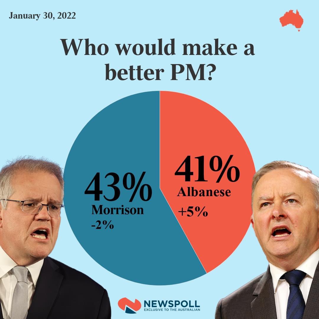
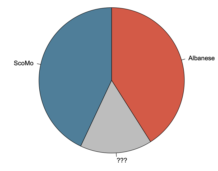
There’s two issues here. First, they are called percentages for a reason — they should add up to 100. This is what it looks like with the missing 16%
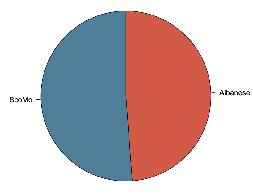
Even if you decided to rescale the percentages to give a two-candidate pie, though, the graph is wrong. This is what it would actually look like
That’s Australia. A graph like this one used in New Zealand politics would seem to come under the Advertising Standards Authority decision saying misleading graphs are not actually misleading if they have the numbers written on them. As I said at the time, I think this is bad as a matter of political norms and factually incorrect as to the impact of graphics. Maybe we can get it changed.
Thomas Lumley (@tslumley) is Professor of Biostatistics at the University of Auckland. His research interests include semiparametric models, survey sampling, statistical computing, foundations of statistics, and whatever methodological problems his medical collaborators come up with. He also blogs at Biased and Inefficient See all posts by Thomas Lumley »
Its ‘the Australian’ newspaper, the prototype for its owners later product, Fox news.
4 years ago