Posts written by Thomas Lumley (2645)

avatar

Thomas Lumley (@tslumley) is Professor of Biostatistics at the University of Auckland. His research interests include semiparametric models, survey sampling, statistical computing, foundations of statistics, and whatever methodological problems his medical collaborators come up with. He also blogs at Biased and Inefficient

July 30, 2013

Always ask for the margin of error

The Herald now has picked up this morning’s UK story from the London Fire Brigade, that calls from people handcuffed or otherwise stuck in embarassing circumstances are on the rise.  The Fire Brigade only said

“I don’t know whether it’s the Fifty Shades effect, but the number of incidents involving items like handcuffs seems to have gone up.

The Herald has the relatively sedate headline “‘Fifty Shades of Grey effect’ plagues London“, but the British papers go further (as usual).   For example, the Mirror’s headline was “Fifty Shades of Grey sex leads to soaring 999 calls“.  This is the sort of story that’s too good to check, so no-one seems to have asked how much evidence there is of an increase.

The actual numbers quoted by the fire brigade for calls to people stuck in what could loosely be called household items were: 416 in 2010/11, 441 in 2011/12, and 453in 2012/13. If you get out your Poisson distribution and do some computations, it turns out this is well within the expected random variation — for example the p-value for a test of trend is 0.22 (or for the Bayesians, the likelihood ratio is also very unimpressive). Much more shades of grey than black and white.

So, if you don’t have hot and cold running statisticians at your newspaper, how can you check this sort of thing?  There’s a simple trick for the margin of error for a count of things on a hand calculator: take the square root, add and subtract 1 to get upper and lower  limits, then square them again.  Conveniently, in this case, 441 is exactly 21 squared, so an uncertainty interval around the 441 value would go from 20 squared (400) to 22 squared (484).
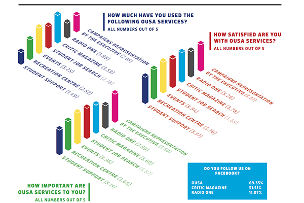
 

3d bar graphs: just say no.

Or perhaps “OMG NO!!!”

article-3178

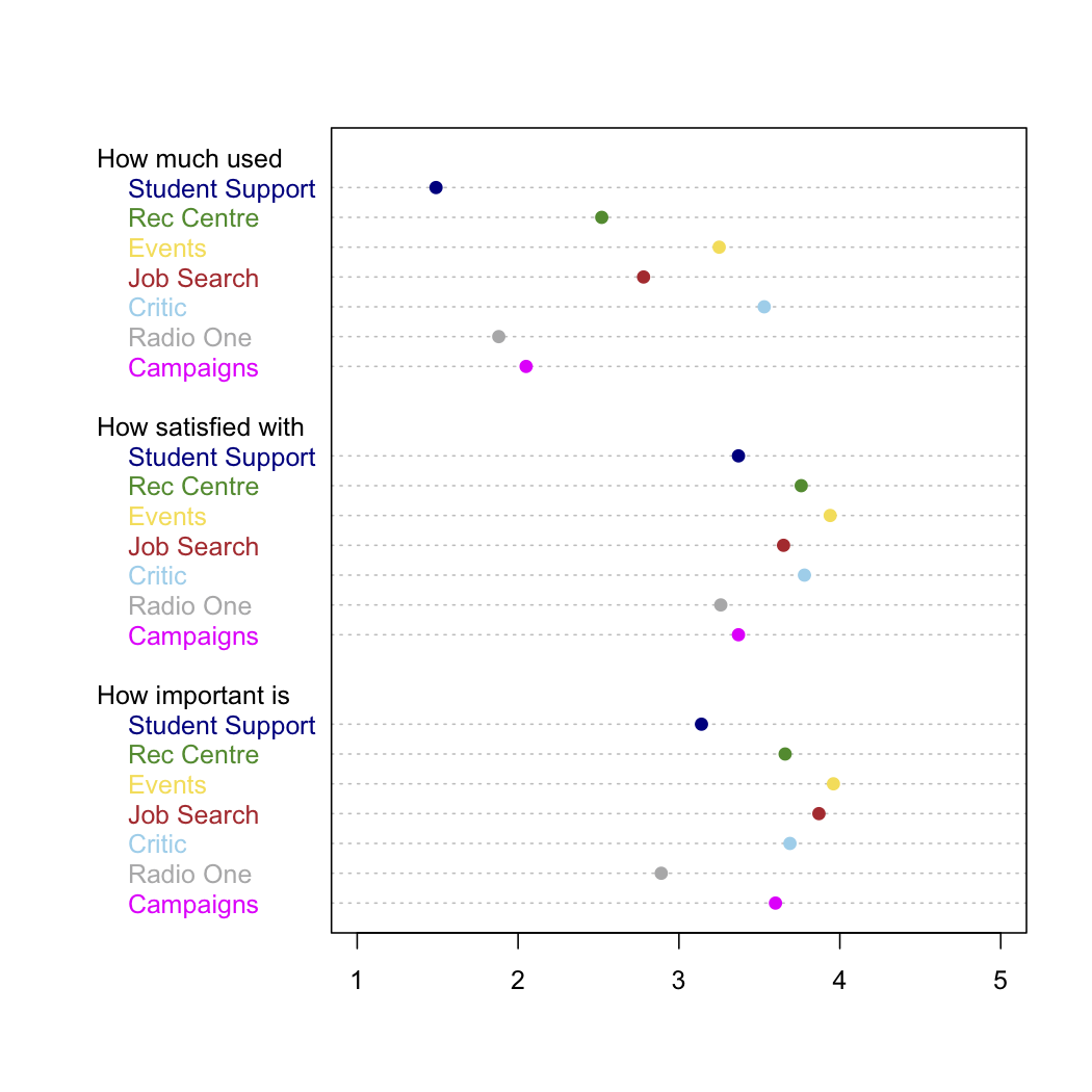
This example (click to embiggen) comes from The Critic, the magazine of Otago University Students Association and has been nominated for Stat of the Week.  It accompanies a reasonable story about satisfaction with services provided by OUSA.   There are some good points: for example, the colour coding means that you can easily tell which bars in the three graphs refer to the same OUSA service.  What you can’t easily do is compare services for levels of satisfaction. For example, in the right-hand set of bars, is the magenta bar taller than, shorter than, or the same as the  dark blue bar? Are you sure? How about the light blue and green bars? Also, if the questions were on a 1 to 5 scale, the bars should start at one, not at zero.

Here’s a version that’s less pretty but actually lets you compare the numeric values. I kept the same colour-coding, although more sedate colours would have been easier to read

ousa-survey


Transit maps: moving further from geography

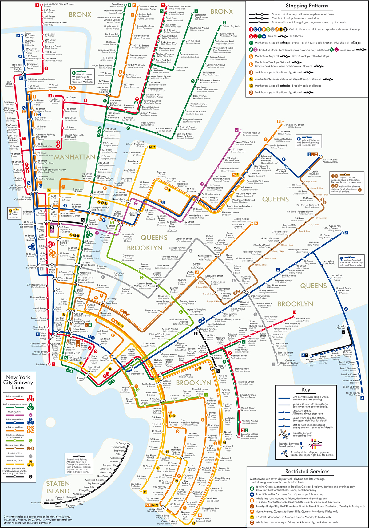
The famous London Transport map showed that a train map didn’t have to represent where the trains went, just how they related to each other.  A new example from New York uses concentric circles. The designer says

 “These circles maps score poorly for simplicity: the line trajectories have lots of twists and turns, but score well for coherence: the city is forced into an unprecedented level of organization

1682692-inline-1200svpq


(via @juhasaarinen)

July 28, 2013

Briefly

  • “Drawing conclusions from data”: a lecture and examples from Jonathan Stray at a Science Immersion Workshop for journalists
  • Why we believe stuff — in this case high-dose vitamins.  Paul Offit in the Atlantic blames it mostly on Linus Pauling
  • Using Big Data to oppress a subset of the population (vampires, via Keith Ng)
  • A Herald story on meth-lab damage mentioned meth alarms, which are apparently a thing. The vendor’s website says “A silent alarm system guaranteed to detect the manufacture of methamphetamine (‘P’) in your property.” That could be valuable, but unfortunately there’s no information given on the false positive or false negative error rates, and if you read the detailed terms and conditions, the alarm system doesn’t actually seem to be guaranteed to do anything except bill you monthly.
July 26, 2013

Variation matters (royal baby life tables)

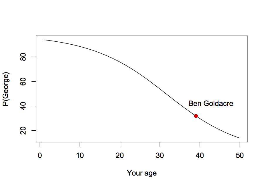
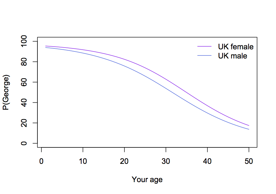
In yesterday’s coronation lifetables post, it turned out that a 39-yr old UK male had about a 32% chance of outliving a 31-yr old UK male.  That’s because there is quite a lot of variation around the mean life expectancy.

One might try estimating Ben Goldacre’s chance of seeing King George by working out Prince William’s life expectancy and then seeing how likely Ben is to be alive at that expected date.  The calculation ignores the uncertainty in Prince William’s lifespan, and it ends up with a serious underestimate of 20%.   If Ben Goldacre is still alive at baby George’s coronation, it is could well be because the coronation happens earlier than expected, and just using the mean life expectancy ignores this possibility.

The same issue arises in some of the tweets reacting to the StatsChat post, eg from James Shield “For me, about 70%, which seems high. My guess is I’ll be 86.”  The 70% probability is so high precisely because the event could happen before he is 86.


Interesting maps

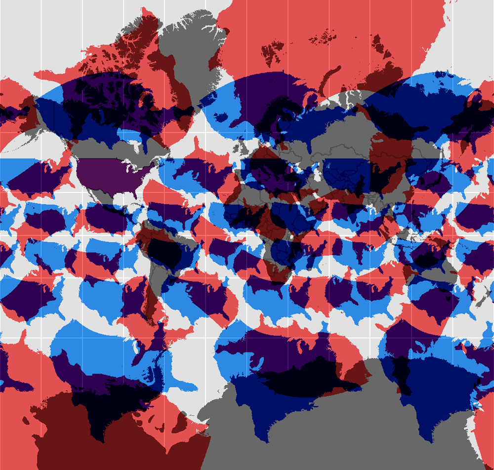
Two selections from radicalcartography (via Noah Illinsky on Twitter)

The Mercator projection (and other projections) with copies of the US superimposed for reference

wandering_merc


(the Mercator projection has the unique property, vital for pre-modern navigation, that compass bearings are straight lines.  It shouldn’t be used where this property isn’t needed).


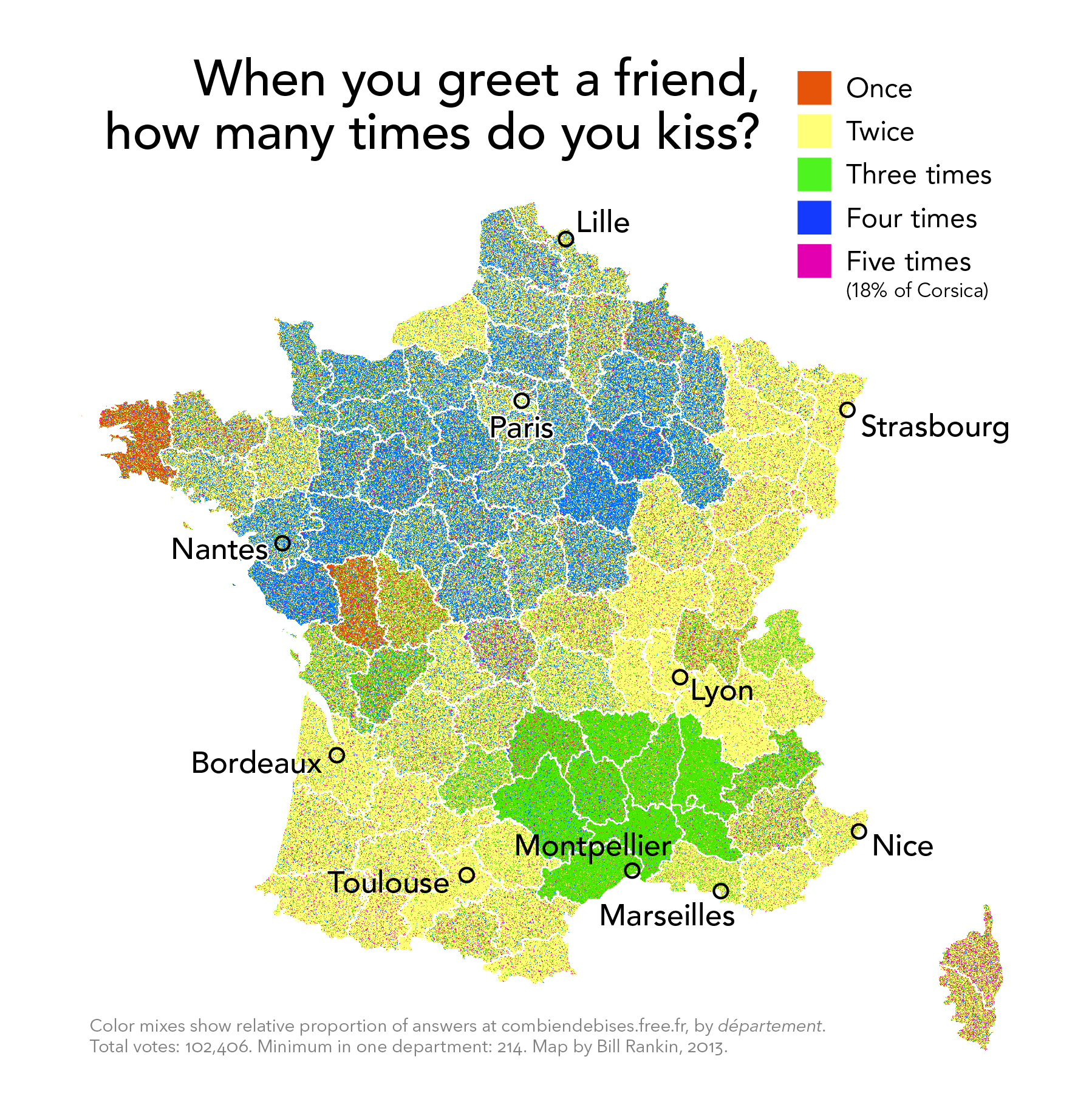
And social survey data on how people greet friends in France

frenchkisses


(as the cartographer notes, the data come from a bogus poll and may be somewhat unreliable)


July 25, 2013

Royal baby coronation lifetables

Ben Goldacre asked on Twitter

As he suggests, we’re going to have to make some oversimplifications.  Both Prince William (who comes from a wealthy, long-lived family) and Ben Goldacre (who is a skinny, hyperactive medical doctor) are likely to live longer than the typical UK male, and we will ignore this.  We will also ignore the possibilities that Baby George dies before his father, or that William dies before his father or grandmother, and the possibility that there won’t be a throne for King George.

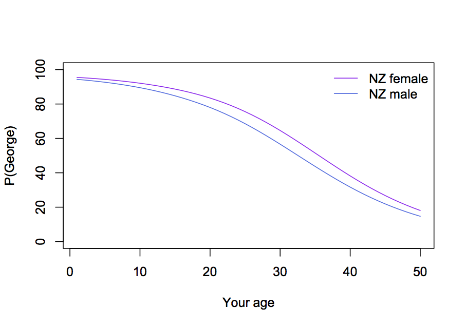
Now we need to get life tables for UK males, which give the current risk of death at each age.  For each year into the future, we multiply the chance of Prince William dying in that year by the chance that Dr Goldacre is still alive, and add these up, to get a little over 30%

ukmale


We can do the same thing for UK females and (with NZ life tables) for NZ males and females

ukboth


nzboth

July 24, 2013

And in Science…

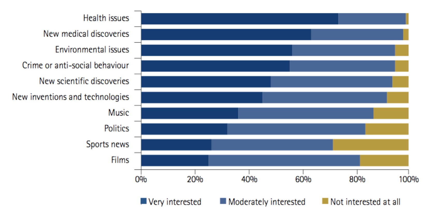
According to The Conversation, that’s the name of a group petitioning Queensland radio station Triple J to include at least 20 seconds of science news in their news updates.  They’ve got support from one of the great science journalists, Robyn Williams, and from an ANU survey that found science news was regarded as more interesting than politics or sports news

56k8d72v-1374465295


Briefly

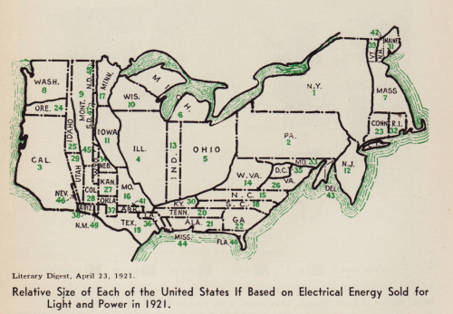
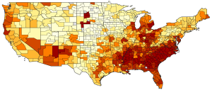
  • Some 1920-30s cartograms (distorted maps) of the USA, at Making Maps. Here’s the one based on electricity use
    brinton_gp_cartograms_1921
  • Another map: the USA has low income mobility (ie, children of the poor stay poor), but there is quite a lot of variation over the country. This is the version of the map from the original researchers, click for the shiny interactive New York Times version
    e_rank_b_hybrid_continental
  • A good story about a new randomized trial of a melanoma vaccine, based on NZ research.  The story even says that the trial is measuring specific components of immune response, not (yet) actual disease.  As should always be the case, the trial is registered and there’s more detail at the registry.
  • A post about wild extrapolation in estimating the value of marine reserves to (UK) anglers:
    Or you could look at the Celtic Deep rMPA, a site located some 70km offshore, where they estimate between 145,000 and 263,000 angling visits per year. That’s 400-720 visits a day, which translates to approx 40-70 typical sea angling boats, each full to the gunwales every single day of the year.
July 23, 2013

I learn something new every day

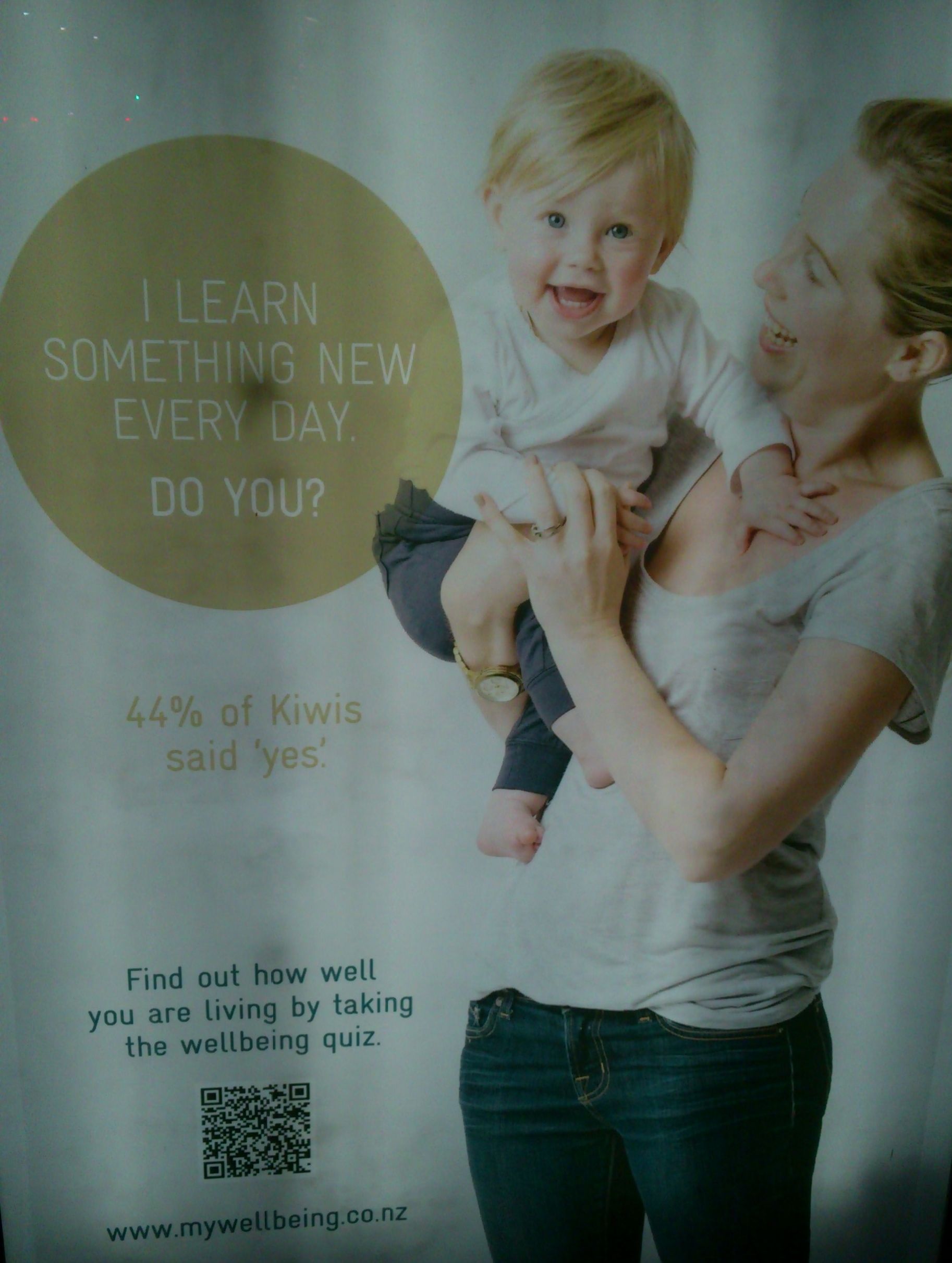
Today, for example, I found out what these ads in bus stops were for

wellbeing

Sovereign, the insurance company, has a survey of ‘wellbeing’, and wants you to participate.

The survey that produced the numbers in the ad is reasonably real research — it’s based on a random sample from an online survey panel — but

Would you like to be included in the next Sovereign Wellbeing Index results? If so take the full survey here.

together with the links on the ads suggests that they are going to augment the real survey with a bogus poll.

The survey results are interesting. They find that NZ has lower reported wellbeing than most other countries.  It’s not clear why this should be the case (and it disagrees with some other surveys), but one cynical suggestion is that a certain subset of Kiwis may have unintended reactions to questions like

I actively contribute to the happiness and wellbeing of others