Posts written by Thomas Lumley (2645)

avatar

Thomas Lumley (@tslumley) is Professor of Biostatistics at the University of Auckland. His research interests include semiparametric models, survey sampling, statistical computing, foundations of statistics, and whatever methodological problems his medical collaborators come up with. He also blogs at Biased and Inefficient

January 9, 2020

Missing data

There’s a story by Brittany Keogh at Stuff on misconduct cases at NZ universities (via Nicola Gaston).  The headline example was someone bringing a gun (unloaded, as a film prop). There were 1625 cases of cheating.

As with crime data, there are data collection biases here: whether or not things are reported to the university, and whether the university takes any action, and whether that action ends up as a misconduct record, and how that record is classified.   Notably,

Victoria University of Wellington was the only university that noted disciplinary cases for sexually harmful behaviour, with three incidents reported in 2018. 

The university defined sexually harmful behaviour as “any form of unwelcome sexual advance, request for sexual favours, and any other unwanted behaviour that is sexual in nature”, including sexual harassment or assault.

There’s no way there were only three cases at universities. Or only three cases reported to universities.

The under-reporting is not quite as bad as that: the University of Canterbury reported ‘several’ harassment cases that resulted from a Law Society review into sexual misconduct, so we’ve got a classification problem as well.  Some of the harassment cases at other universities might also be included.  And there’s no data from Otago (which hasn’t responded) or Massey (which refused).

It’s definitely possible to go too far the other way — in the US, Federal law requires reporting and investigation for all incidents, even in the absence of a complaint, which means that a victim who doesn’t want to be put through an investigation is quite limited in who they can talk to.

With these numbers, though, the big story shouldn’t be that someone once brought an unloaded gun to campus with no violent intent; it should be that the universities are managing not to notice sexual harassment and assault.

January 8, 2020

Misleading with maps

There are lots of maps going around of the Australian fires. Some of them are very good, others indicate ways you can accidentally or deliberately mislead people.

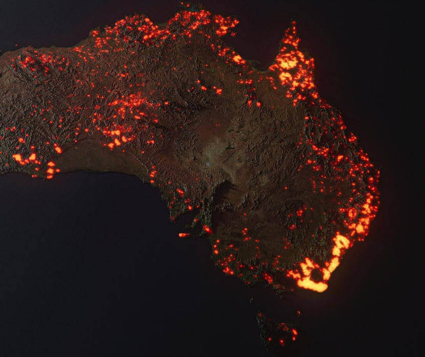
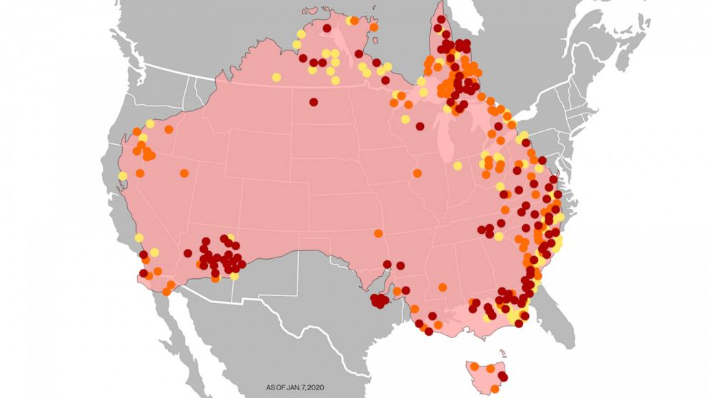
This one was created as a 3-D visualisation by Anthony Hearsey, based on infra-red hotspot data accumulated over the fire period. It has been circulated as a ‘NASA photo’, which it isn’t.

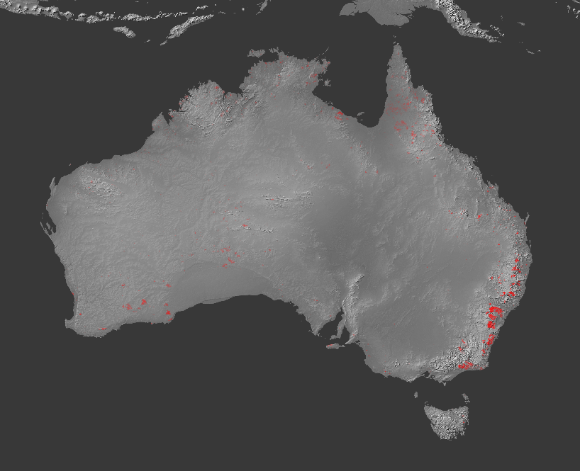
If you think of it as a map or photo, the image exaggerates the scale of the fires by accumulating burning areas over time, and by the ‘glow’ effect in the 3-d rendering.  As Nick Evershed, a Guardian data journalist, points out, it is also exaggerated because it ’rounds up’ each spot of fire into a whole map grid square.  Nick produced this version with the accumulated fires over time but without the rounding and glow.

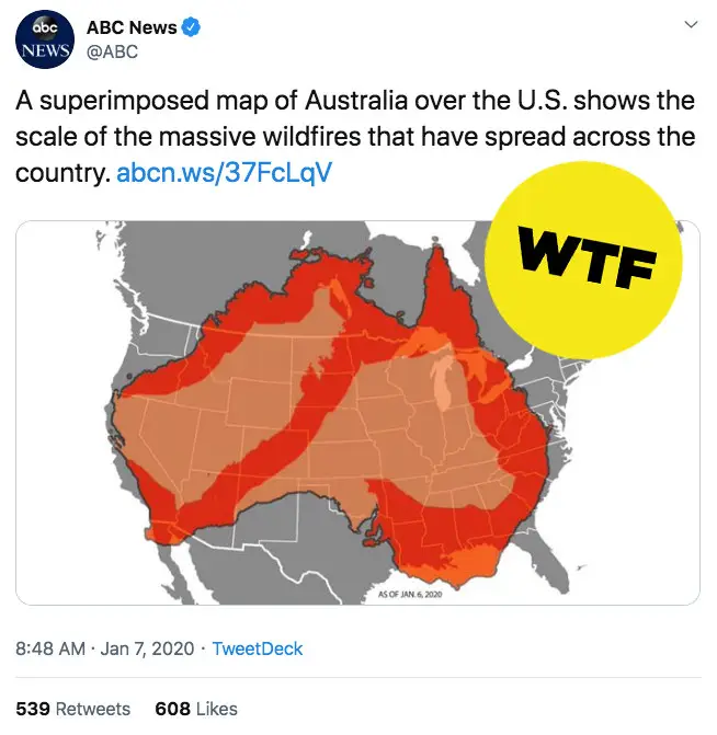
A much more effective way to mislead with maps, though, is just to make stuff up and not worry about the facts.  Yesterday, ABC News (the US one, not the Australian one) gave this map (insightful annotation from Buzzfeed)

They now have this one. It still make the fire areas look larger than they are, but in standard and hard-to-avoid ways.

A note at the end of the story now says

Editor’s note: The previous graphic in this story has been updated to reflect the hot spots around Australia.

Maybe it’s a matter of taste, but I don’t think that goes nearly far enough towards admitting what they did.

January 7, 2020

Something to do on your holiday?

Q: Did you see that going to the opera makes you live longer?

A: No, it just makes it feel longer

Q: ◔_◔

Q: This story, from the New York Times.

Now, there is evidence that simply being exposed to the arts may help people live longer.

Researchers in London who followed thousands of people 50 and older over a 14-year period discovered that those who went to a museum or attended a concert just once or twice a year were 14 percent less likely to die during that period than those who didn’t.

A: Actually, if you look at the research paper, they were just over half as likely to die during the study period: 47.5% vs 26.6%. And those who went at least monthly were only 60% less likely to die: 18.6% died.

Q: You don’t usually see the media understating research findings, do you?

A: No. And they’re not.  The 14% lower (and 31% lower for monthly or more frequent) are after attempting to adjust away the effects of other factors related to both longevity and arts/museums/etc

Q: You mean like the opera is expensive and so rich people are more likely to go?

A: Yes, although some museums are free, and so are some Shakespeare, etc,

Q: And if you can’t see or hear very well you’re less likely to go to opera or art galleries. Or if you can’t easily walk short distances or climb stairs?

A: Yes, that sort of thing.

Q: So the researchers didn’t just ignore all of that, like some people on Twitter were saying?

A: No. The BMJ has some standards.

Q: And so the 14% reduction left over after that is probably real?

A: No, it’s still probably exaggerated.  Adjusting for this sort of thing is hard.  For example, for wealth they used which fifth of the population you were in. The top fifth had half the death rate of the bottom fifth, and were five times as likely to Art more often than monthly.  For education, the top category was “has a degree”, and they were half as likely to die in the study period and 4.5 times more likely to Art frequently than people with no qualifications.

Q: “Has a degree” is a pretty wide category if you’re lumping them all together.

A: Exactly.  If you could divide these really strong predictors up more finely (and measure them better), you’d expect to be able to remove more bias.  You’d also worry about things they didn’t measure — maybe parts of the UK with more museums also have better medical care, for example.

Q: But it could be true?

A: Sure. I don’t think 14% mortality rate reduction from going a few times a year is remotely plausible, but some benefit seems quite reasonable.

Q: It might make you less lonely or less depressed, for example

A: Those are two of the variables they tried to adjust for, so if their adjustment was successful that’s not how it works.

Q: Isn’t that unfair? I mean, if it really works by making you less lonely, that still counts!

A: Yes, that’s one of the problems with statistical adjustment — it can be hard to decide whether something’s a confounding factor or part of the effect you’re looking for.

Q: But if people wanted to take their kids to the museum over the holidays, at least the evidence is positive?

A: Well, the average age of the people in this study was 65 at the start of the study, so perhaps grandkids.  Anyway, I think the StatsChat chocolate rule applies: if you’re going to a concert or visiting a museum primarily for the health effects, you’re doing it wrong.


January 6, 2020

Briefly

  • Self-selected responses: this Twitter thread by Patrick Tomlinson is about the large number of negative reviews his book has on Goodreads. The book is still being edited. It won’t be available for months.
  • From the Washington Post: “Our privacy experiment found that automakers collect data through hundreds of sensors and an always-on Internet connection. Driving surveillance is becoming hard to avoid”.
  • Via the Herald: surprising no-one, a study by the US National Institute of Standards and Technology has found that US facial-recognition algorithms are better at recognising white people.  (Algorithms developed in east Asia seem to be ok at east Asian faces.)
  • Last year I mentioned investigations at newsroom.co.nz by Eloise Gibson and others of Sir Ray Avery. Sir Ray filed a Media Council complaint about a story that alleged he had threatened a researcher with legal action. The Media Council has found in favour of newsroom
  • From Radio NZ “Plans to collect data by putting sensors in thousands of state houses could result in the information being used to cut benefit payments or even evict tenants, a charity familiar with the project says.” The goal of the sensors is to find out what the actual heating/ventilation/damp problems are with state houses, information that would generalise to many other NZ houses. That’s a valuable goal. And Kāinga Ora say they don’t want to do anything else with the data, such as identify overcrowding or check who regularly has visitors staying the night,  or other potentially creepy possibilities.  But there doesn’t seem to be any clear mechanism to stop Kāinga Ora changing their minds.   Given the potential public benefits from suitable analyses of the data, it would be worth setting up a mechanism that people could see was trustworthy, rather than ending up with crap data when too many people opt out.
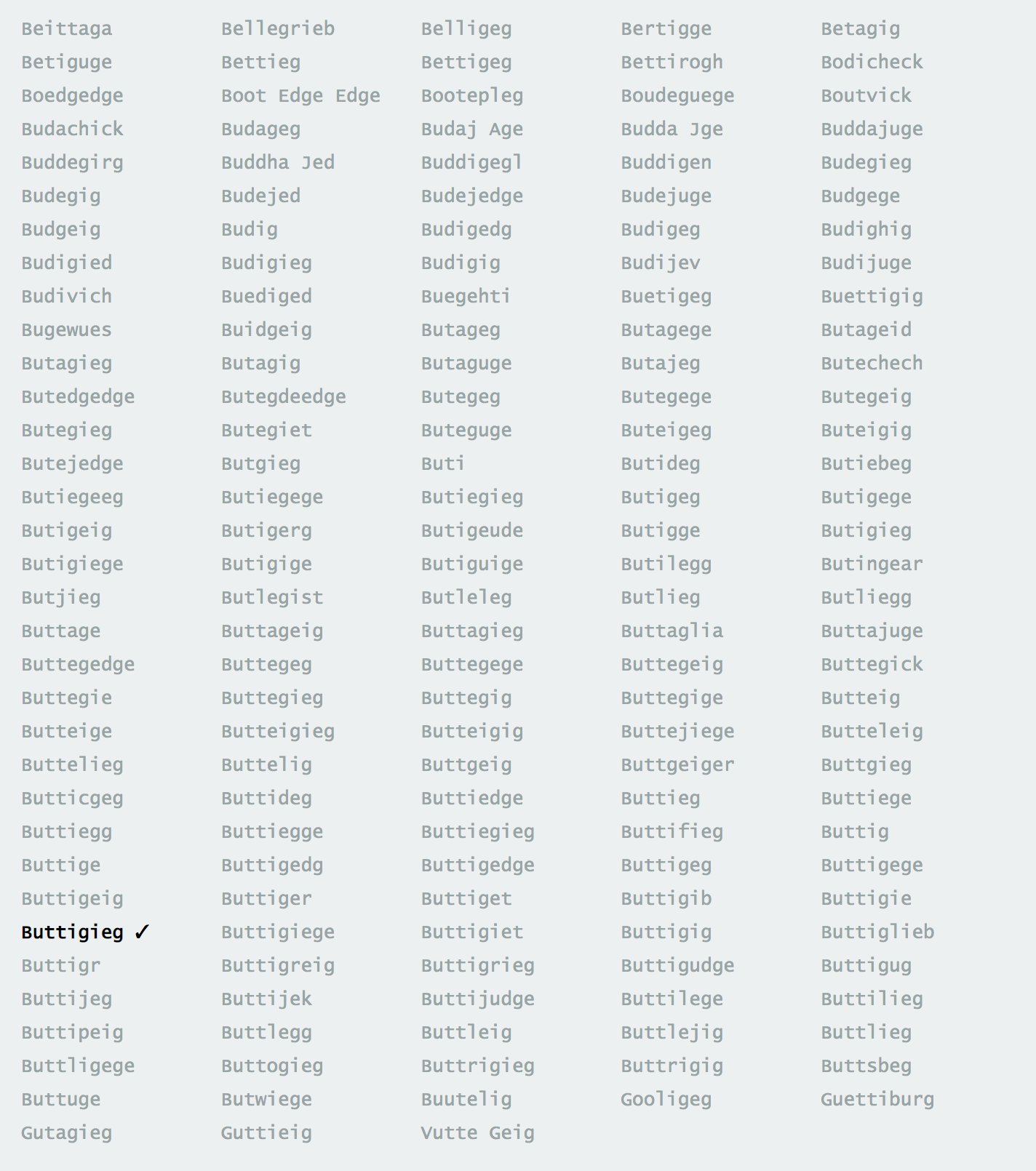
  • Interpreting survey responses: The New York Times had an interactive clicky thing asking people to identify celebrities from their photographs.  Pete Buttigieg’s name was spelt in 268 different ways (click to embiggen). Presumably these weren’t all serious, but that doesn’t actually make life any easier for the survey analyst.
January 5, 2020

Auckland in sepia

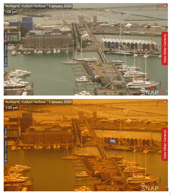
Auckland went impressively dark just before 2pm this afternoon: from Christina Hood on Twitter:

The reason is smoke from the Australian bushfires.

Fortunately for Auckland, the smoke (at the moment) is mostly at high altitude; you can tell because the lower picture is about as clear as the upper picture, just darker and more orange. Fine air pollution particles scatter light very effectively — in places with less humid summers than Auckland, light scattering is a good way to measure how much there is.

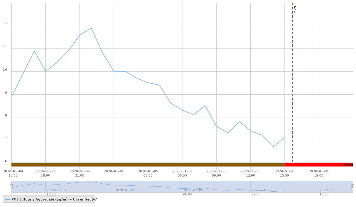
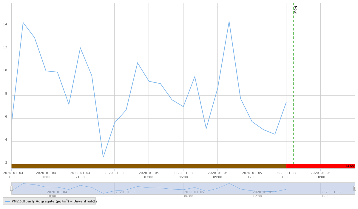
We can also look at the hourly measurements of PM2.5; fine-particle air pollution, or, basically, smoke.  Here are data from Penrose, in south central Auckland.

and Patumahoe, in far south Auckland

I chose these two because they were available and because there won’t be that much NZ-origin air pollution at those sites (on a Sunday afternoon).  At both locations there’s been an increase in fine particle air pollution, but not to any level of health concern.  It might be worth looking later in the evening, if you’re worried.  Given the placebo effect, if you don’t have specific health concerns you might be better off not checking.

(The Environment Auckland permalinks don’t work, so you need to go here and then to the AQ locations link, and then drill down.  You want “PM2.5 Hourly Aggregate unverified”)

This smoke used to be trees, 2000km away. We’ve seen particles from further than that — the Puyehue-Cordon Caulle volcano in Chile disrupted flights in 2011 — but the density of this smoke is much, much higher. WeatherWatch doesn’t know of a precedent.

December 25, 2019

Before their light / The stars grew dim

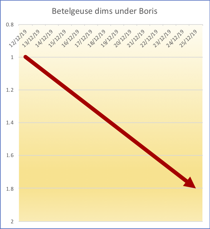
Betelgeuse, the bright red star at the base1 of Orion, has suddenly dimmed, enough that people who aren’t astronomers may be able to tell by looking at it.

Here’s a simple graph. Yes, the y-axis goes down rather than up.  Astronomers are weird that way.

Here’s a more detailed version of the same thing, from the AAVSO website, which includes all the available observations. You can see that the latest dimming did pretty much coincide with the UK election2

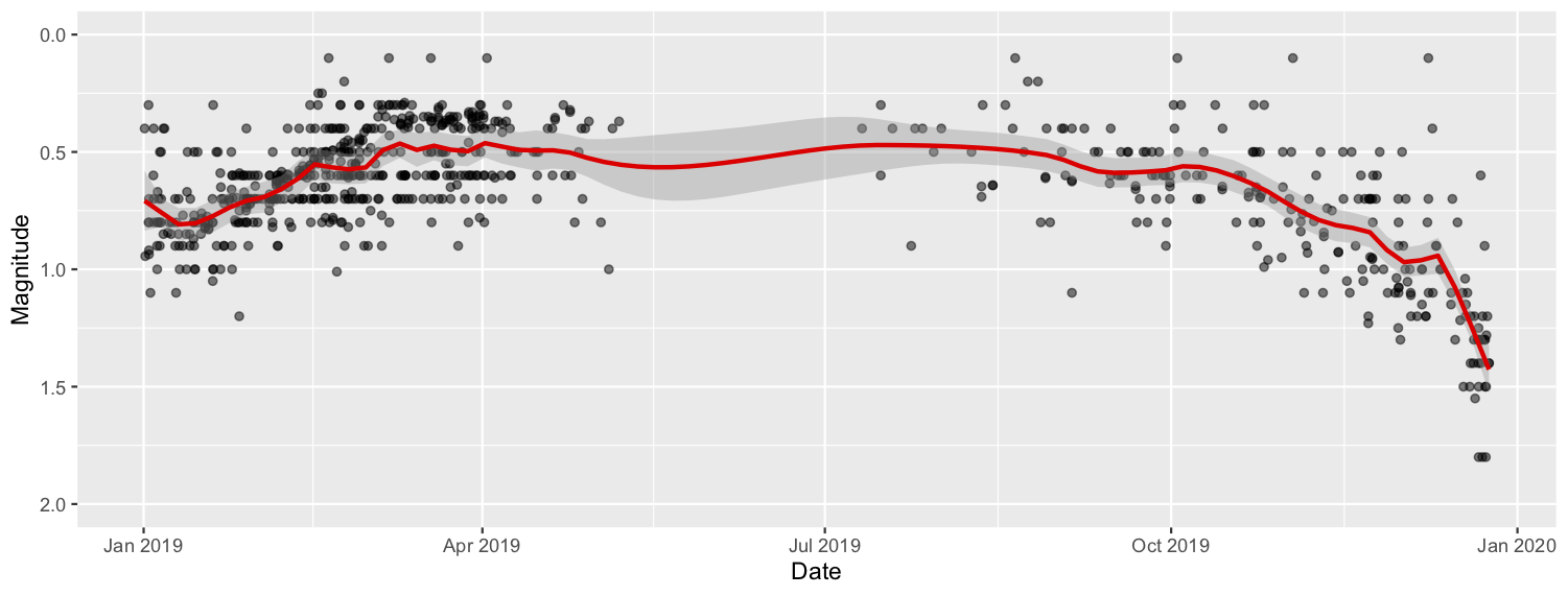
As StatsChat readers will know, it’s unwise to draw strong conclusions from a short time series if a longer one is available.  I asked the AAVSO webserver for all its Betelgeuse data. I trimmed off some clearly outlying values (if it weren’t Christmas I would have asked an astronomer first).

Here’s the graph for this year

The gap in autumn/winter is because Betelgeuse is out during the day at that time of year, and so isn’t visible except in Antarctica.

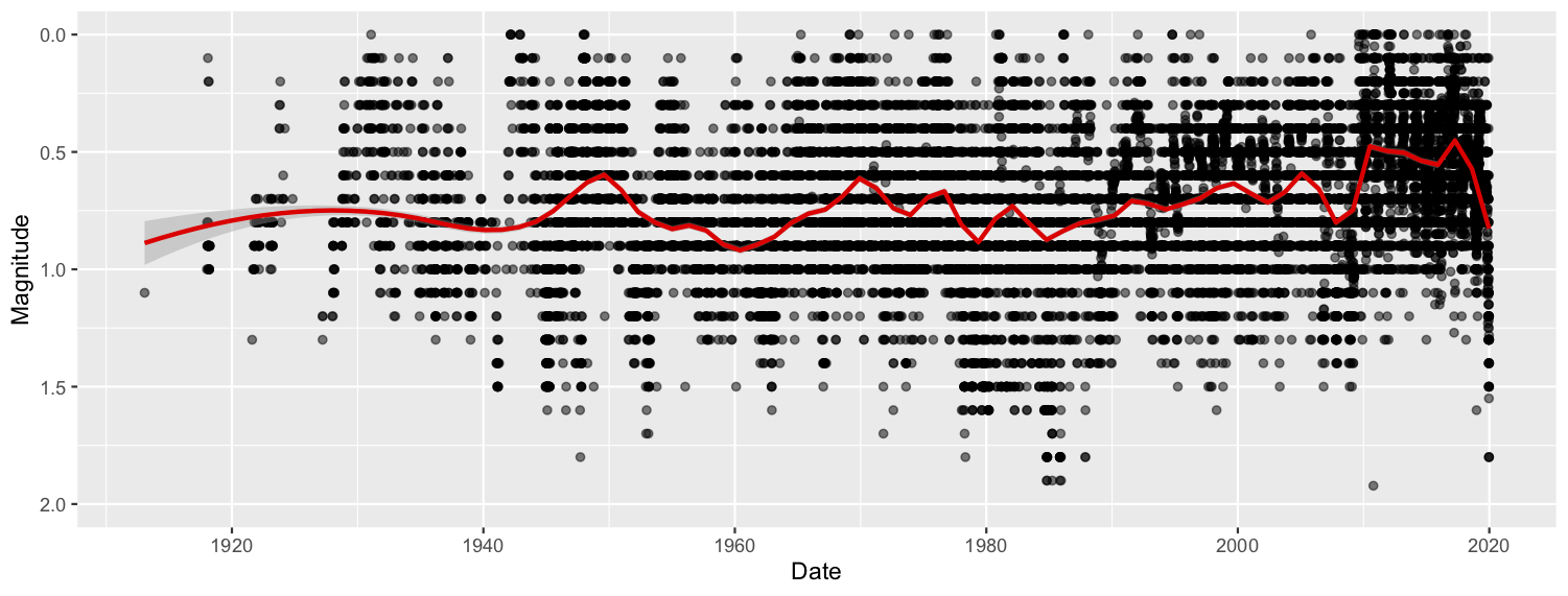
Here’s all the values between 2 and -1 magnitude, back as far as AAVSO collects. There’s been a decrease since


So, while the current dimming is extreme,  it also looks like this is a thing Betelgeuse does.  That’s what astronomy twitter is saying.

There’s been media coverage of the dimming, including speculation that the star is about to go supernova.  Mostly, the reports have been good: saying that it could go any time, but pointing out that ‘any time’ on astronomical time scales means any time between 700 years ago and 100,000 or so years in the future.


1. StatsChat is in the southern hemisphere

2. Well, except for the time lag of about 700 years in the light getting here. They must have very good long-range polling on Betelgeuse. They probably use MRP.

December 24, 2019

Grandma got run over by a reindeer

The Accident Compensation Corporation, a wonderful NZ institution, always takes advantage of the season to try to get coverage of Christmas accident risks. There are two popular angles, and this year our newspaper sites have one each.

The NZ Herald writes about the total cost of Christmas claims.  These, according to the story, are steadily increasing: $448k in 2014, $497k last year. The increase, of nearly 11%, needs to be compared to the population increase of about 8.4% (June 2014 to June 2018) and to inflation of about 5%.  Christmas accident claims have increased very slightly per capita in nominal dollars, and decreased very slightly per capita in constant dollars.  And, as the story admits, Christmas Day is not a particularly high-risk day — it’s compared there to New Year’s Day, but it actually has lower ACC costs than a typical day.

On Stuff, the story is about holiday-specific accidents. Here we’re on stronger ground.   The Christmas tree, pavlova, and turkey injuries are reliably attributable to Christmas; we’re talking causation, not just correlation.  If I were feeling pickier than is appropriate for the season, I might complain about “Turkey was a slightly safer option”  comparing turkey and ham-related injuries: we don’t know that turkey was safer, since we’d need the number of people at risk from turkey and ham to draw that conclusion.

The song referenced in the title makes clear the difference between injuries occurring at Christmas and those caused by the season — “she had hoof-prints on her forehead / And incriminating Claus marks on her back”.  Even though there are fewer injuries on Christmas Day, we can still tell that some of them are Christmas injuries. It makes sense for ACC to try to reduce these, especially given the reduced competition for news coverage at this time of year.


December 17, 2019

More political graphics

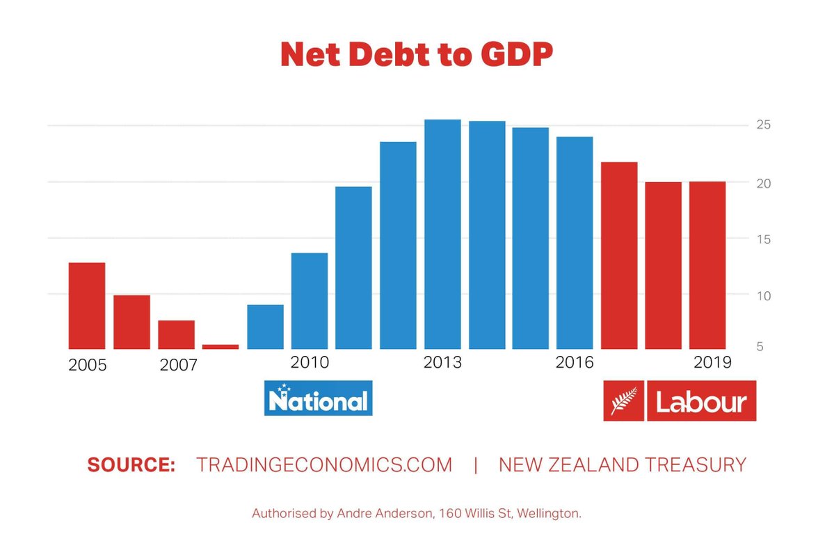
This one is from Young Labour, and as with the previous examples it was retweeted  into my Twitter feed. It’s a useful contrast to the previous, since it’s misleading only in the standard ways you expect from political graphs; it’s not an outright distortion.

Good points: there is a reasonable data range, which is important for time-series comparisons. The vertical axis is labelled, and the labels match the quantities they are supposed to match.

From an economic point of view, there’s a problem.  The increase in debt under John Key’s government was largely due to the Great Recession.  Labour, one would hope, would also have run deficits during a major recession — that’s what you do — and there’s no way that the Great Recession can be blamed on the NZ National Party.  So, as is often the case, there are important confounding factors in the time series.  The numbers are right, but they don’t really support the obvious causal conclusion.

The graphical criticism: the vertical axis begins at 5% rather than at 0.  While for line graphs there are a range of  views about when zero needs to be included and how, there really aren’t for bar graphs. The area of the bar is supposed to convey information.

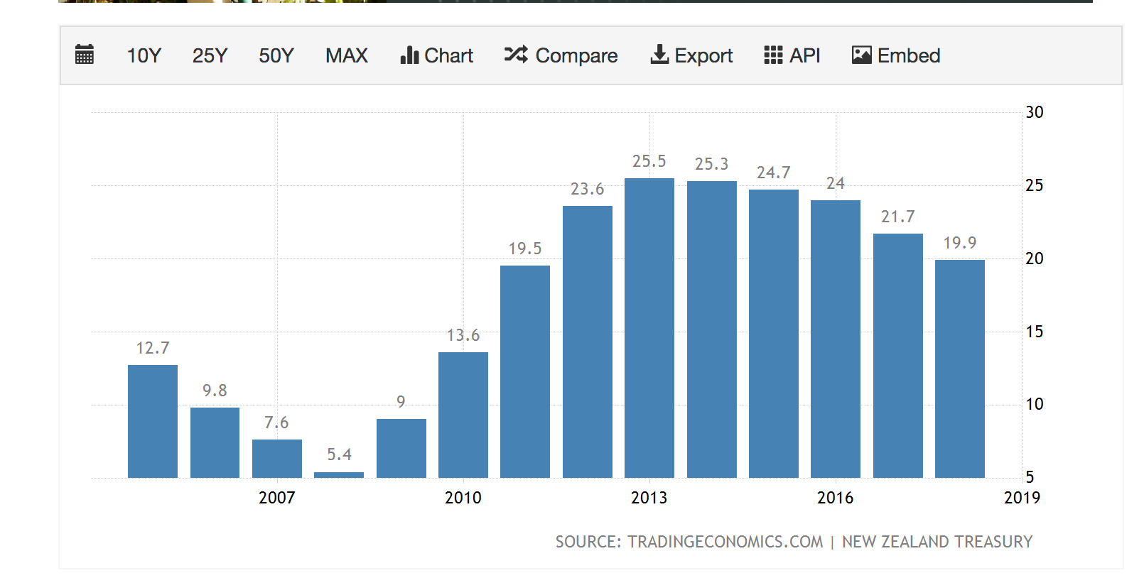
If you look up the data source, you find that it truncates the vertical axis in exactly the same way, which is presumably the reason (though hardly an excuse)

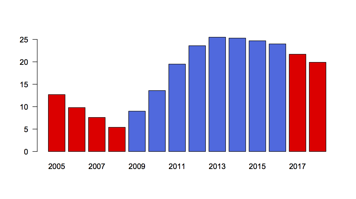
Redrawing, we can see what the graph should have looked like; I think the distorting effect is real but relatively small, especially for the last decade (which, again, not an excuse)

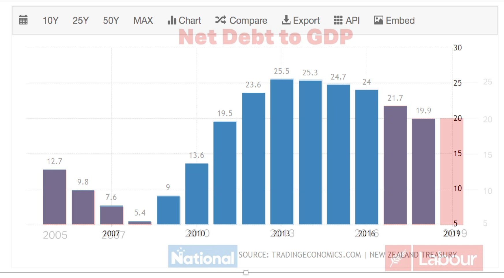
And, in fact, using the wonders of PowerPoint and image transparency, I found that the Young Labour graphic and the one from the TradingEconomics.com can be exactly superimposed — which I suppose argues against the vertical distortion being deliberate.

There’s just one more thing.

You will have noticed, perhaps, that my redrawn graphic has two red bars on the right-hand end, but Young Labour’s has three, with the last two at about the same height. If I hadn’t gone to the effort of superimposing the two versions I would have thought it was probably due to different divisions of the time axis or something.  But it’s not. An extra bar has been added. That’s a bit suspicious.

Or, it would be if it weren’t about the same height as the previous bar.  It turns out, if you go to the Treasury’s  Interim Financial Statements for the four months ending 2019-10-31, you find a figure of 20.2%, which seems to be the height for the last bar. On the one hand, that’s not precisely comparable to the rest of the graph; on the other hand, it’s probably the best that could be done, and shows a reasonable degree of care.

Briefly

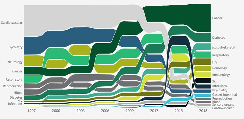
  • Bloomberg News writes about drug prices.  Their point is expensive cancer drugs, but their graph also shows how drugs for heart disease have become much, much less expensive as they go off patent (the light-grey area)
  • Census 2018 small-area data now available.  These go down to SA1, the smallest area unit for published results now.  About two-thirds of SA1s are a single meshblock, but some are multiple meshblocks to get the population size higher. Read the footnotes (always, but especially with the 2018 census)
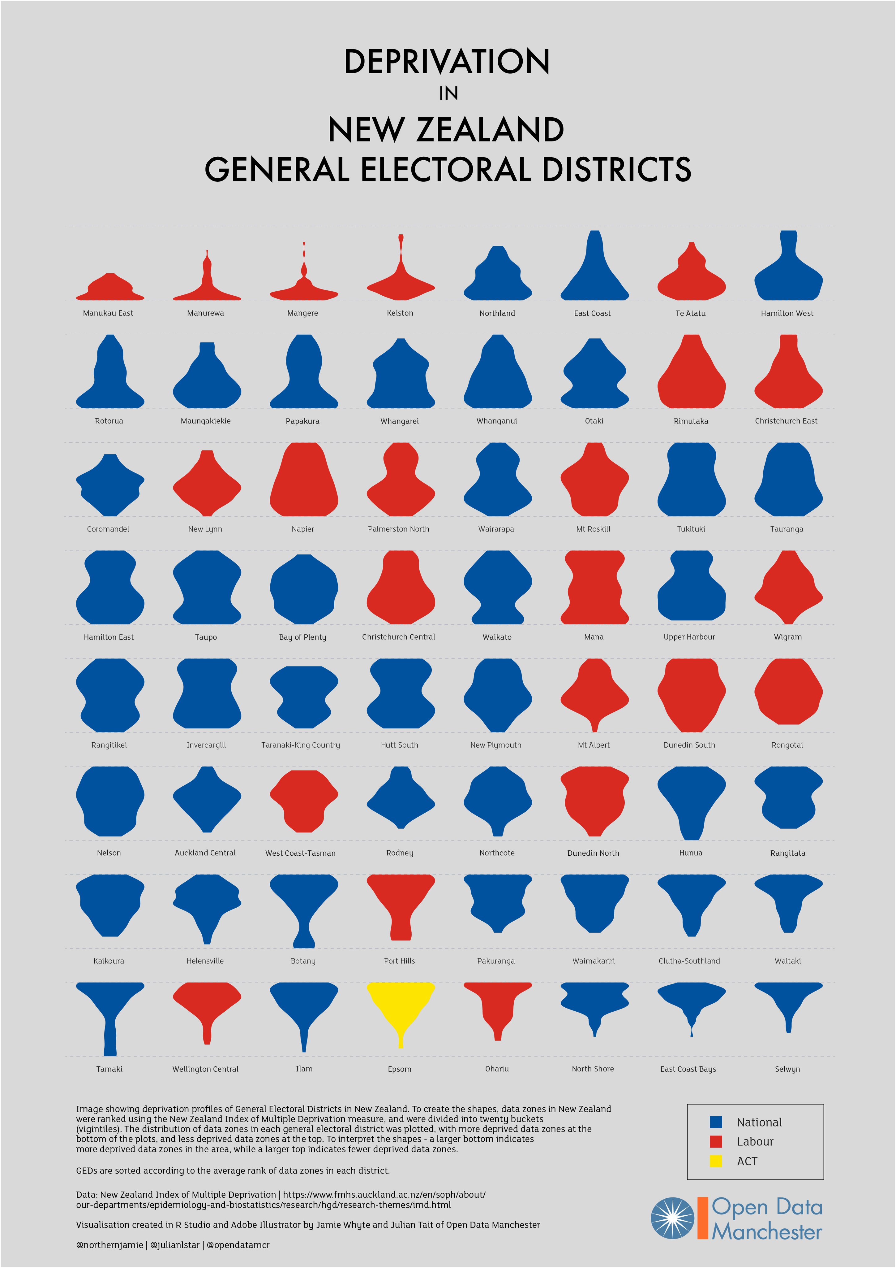
  • Jamie Whyte of Open Data Manchester has extended his inequality graphs to NZ (click to embiggen). Each blob shows a general electorate, and the width of the blob shows the proportion of people at various levels of the Index of Multiple Deprivation. So, for example, Manurewa is mostly high-deprivation, Selwyn (bottom right) is low. In the middle of the graphic, Hutt South and New Plymouth have opposite shapes: one has most people in the middle, the other has more people at the bottom and the top. There are two important caveats here compared to the UK version: this is based on everyone living in a general electorate regardless of which roll they are on, so it misses the Māori electoral roll and it misses the impact of List MPs.
  • Twitter thread from Peter Aldhous (of Buzzfeed), on DNA testing and media coverage over the past decade
  • NZ is still under-vaccinated for measles. At the moment there’s still a shortage of vaccine, but at some convenient point in the future you should make sure you’ve had your two shots.
  • Figure.NZ is seven years old — 44,000 graphs of NZ data
  • ‘Even if Kāinga Ora’s intentions were good, she was still concerned about “a creeping, increasing type of surveillance capacity being built … without mechanisms that allow communities to be really engaged in the process”‘.  Donna Cormack on the plans to put lots of sensors in state houses. There are obvious good uses of this sort of data, and bad uses, and the project would be better off with more information about how the data would be restricted to good uses (if that’s the plan).
December 12, 2019

Say something nice about a journalist

Alex Brae, who writes The Spinoff’s  daily news summary  (which you should sign up for), is having “Say something nice about a journalist” week.

As a site that mostly specialises in not saying nice things about journalists, we should probably do the same. Here’s a selection: I’ve probably forgotten some.

  • Kirsty Johnston has had a wide range of important stories this year, and is a good reason for subscribing to the Herald.
  • The Herald data journalism team: Chris Knox and Keith Ng (Keith also did some non-data-journalism in Hong Kong)
  • Jamie Morton, the Herald science reporter, has reported a lot of interesting and important science.
  • Farah Hancock has written some very good environmental and health stories for newsroom:  most recently, on the claims that a secret lab had found huge amounts of 1080 in some dead rats when Landcare didn’t, but also on pharmacies pushing homeopathic non-remedies, and on the measles outbreak
  • Eloise Gibson, also of newsroom, for her coverage of Sir Ray Avery and how some of his inventions are progressing and being evaluated, and for stories about radiata pine (big carbon sink) and about water-quality modelling
  • Joel MacManus had a very good piece at Stuff about algorithmic inputs to parole and sentencing