Posts written by Thomas Lumley (2645)

avatar

Thomas Lumley (@tslumley) is Professor of Biostatistics at the University of Auckland. His research interests include semiparametric models, survey sampling, statistical computing, foundations of statistics, and whatever methodological problems his medical collaborators come up with. He also blogs at Biased and Inefficient

August 8, 2018

Who counts?

From ABC News (the West Island one, not the US one): Australia’s population hit 25 million, newest resident likely to be young, female and Chinese

There’s a problem with this headline. Well, more than one.  First, the story actually says that about 60% of Australia’s population increase is currently from net migration and about 40% from ‘natural increase’, and that 15.8% of immigrants were from China. So, maybe 10% of the population increase is Chinese immigration, and less than 10% are young, female, Chinese immigrants.  The newest resident is definitely more likely to be a new baby than a young, female, Chinese immigrant.

More importantly, though, if you want to say something about the 25th millionth Aussie, it’s not net migration and natural increase you want, but gross migration and births. The Australian Bureau of Statistics press release says “one birth every 1 minute and 42 seconds…one person arriving to live in Australia every 1 minute and 1 second”. So, while 60% of the increase in population is immigration, there’s only about a 40% chance that the first person over the 25-million threshold was an immigrant. Which actually gives a similar ratio —  just 1.5 percentage points off — but it’s the right calculation.

And while I appreciate “natural increase” is a technical term in demography, I can’t help feeling it’s an unfortunate phrase in communicating statistics to the public.

July 30, 2018

Low-tech polling?

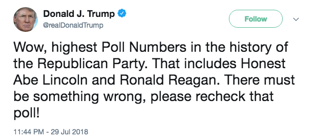
The President of the United States:

Abraham Lincoln and his policies, as you may remember if you’ve read any US history, were not universally popular with his contemporaries. He won the Electoral College in 1860 without a majority of the popular vote. He did win the 1864 election, but it helped that quite a lot of states where he wasn’t popular weren’t involved in the election, being on the other side of a war at the time.

There wasn’t any modern presidential polling at the time: the first serious attempts were by the Literary Digest early in the twentieth century. They got four in a row correct, then famously predicted that Landon would defeat Roosevelt.  Polling was hard: you couldn’t do it by dialling random telephone numbers because telephone numbers not been invented.  In fact, the advantages of random sampling weren’t widely appreciated back then: when the Literary Digest tried to predict election results they did it by taking as large a sample as possible, rather than a representative one.


Maps and votes

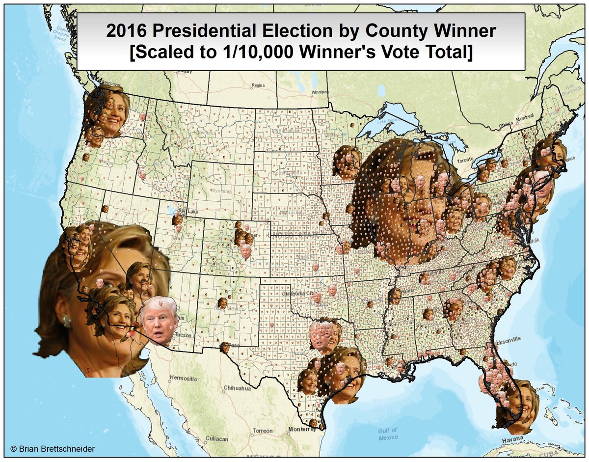
I’ve written several times about the ‘one-cow-one-vote’ problem in election maps, where low-population rural areas dominate the map. Brian Brettschneider has managed to come up with a map distorted the other way

Because the counties with the greatest number of votes are urban, the photos of Hillary Clinton tend to be larger — even in Texas. You also see that in symbol-based maps, too — eg, coloured circles for each county. What makes this map biased is that the small faces are much harder to recognise than larger ones, so that most of Donald Trump’s votes are represented by illegible symbols.  It’s a beautiful opposite of the usual map problems.

July 26, 2018

New Alzheimer’s treatment?

It hasn’t yet reached the NZ media yet, but there’s another claimed Alzheimer’s treatment out there.  Vox and Quartz have good pieces on it.

A company called Biogen is studying a compound called BAN2401, and presented results at a major scientific conference.   Like a lot of robustly unsuccessful treatments, BAN2401 attempts to remove amyloid protein before it can form plaques. However, in a Phase II (small) trial people getting BAN2401 had slower decline in cognitive symptoms than people getting placebo.

Lots of potential drugs appear successful in Phase II trials but end up washing out in larger (‘phase III’) trials. On the other hand, the results for BAN2401 are unusually promising for an Alzheimer’s treatment — mostly, these get headlines based just on biochemical improvements, not actual patient-visible benefits.

Based on the history of clinical trials, the odds that BAN2401 will really turn out useful can’t be any higher than even money.  But, for a change, they might not be all that much lower, either.

Update: actually, it appears that the placebo group randomly ended up with more patients having the main genetic risk factor for Alzheimer’s, APOE4, so that’s another reason to be less hopeful about the results being confirmed

July 25, 2018

Clinical trial context

The Herald has a headline: Babies die after their mothers took Viagra while pregnant during a medical trial.  The story is pretty informative, even though its only cited source is the Daily Mail, but there are a few things that are missing.

First, the death rates in this Amsterdam study sound huge. They are. This is a study in pregnancies with extremely poor expected outcomes. Eleven deaths are potentially attributed to the treatment; there are a further 17 deaths from other causes, split about equally between the treatment and control groups.

Second, there are two other studies mentioned, in the UK and Canada.  These are actually part of a pre-planned group of trials, since no single country has enough of these high-risk pregnancies to do the study on its own.  The UK study didn’t see any excess risk, and while we don’t know the results of the Canadian study yet, if it had seen a huge excess risk it would presumably have already stopped, too.

One other major study from this group isn’t mentioned. There’s an Australia/NZ study, which saw slightly better outcomes in the group getting Viagra. It hasn’t been formally published yet, but the results were presented to a conference and were reported in the Herald earlier this year.  It looks as though something might have been different about the Amsterdam study — although it’s also possible they were extremely unlucky.

The other important piece of context, which is in a story in the Guardian, is that Viagra treatment was already being chosen by some women and their doctors in  the hope it would help, but without any convincing information on safety or effectiveness.   A trial that shows a treatment is ineffective or harmful is a bad result for people in the trial, but it should still save lives in the future.

July 24, 2018

Attack of the killer phones

Q: Did you see mobile phones cause cancer again?

A: The story from the Observer?

Q: No, the Otago Daily Times.

A: It’s the same story, they just don’t say where they got it.

Q: So there’s peer-reviewed evidence that mobile phones are giving us cancer?

A: No.

Q: They say there is

A: They almost do say that, yes.  There’s peer-reviewed evidence that sufficiently high doses of phone-frequency radio waves cause cancer in mice — though the microwaved mice actually lived longer. However, there’s also peerreviewed evidence that mobile phones do not increase the risk of cancer much if at all in people.  For example, brain cancers in people haven’t gotten more common except due to the population being older. 

Q: Don’t you have a vested interest in this, though?

A: Huh?

Q: Well, the anti-phone story says no-one should trust any research with any commercial involvement.

A: Um, yes?

Q: And the only sensible policy in that case is to spend a lot more public money on academic medical research, which is good for you.

A: I… suppose

Q: And you don’t like phone calls.

A: But phone calls aren’t even what people use phones for nowadays.

Q: So maybe that’s why phones aren’t causing brain cancer.

A:  Sigh. Ok, go read the detailed response that the Observer published.

Q: Is that in the Otago Daily Times too?

A: Not so far.  I’m sure they’ll get to it.

Briefly

  • “More than 4,100 Illinois children were assigned a 90 percent or greater probability of death or injury, according to internal DCFS child-tracking data released to the Tribune under state public records laws.”  A data-mining program designed to predict child abuse wasn’t very good.
  • Dropbox gave out (‘anonymised’) data to researchers studying collaboration — their current terms of service allow this, but the terms of service from 2015, the start of the data, didn’t. 
  • From the Creepy and possibly Evil department: a Pro Publica/NPR report on use of non-traditional data sources (social media, shopping, TV-watching) by health insurers.
  • “Clinicians order portable x-rays because a patient is too sick to get out of bed. This practice is consistent across hospitals. The example images above suggest that CNNs may be able to learn to identify patients who received portable x-rays and assign higher rates of disease to them. Identifying portable x-rays as more likely to contain pneumonia, therefore, would likely generalize across hospitals. The portable x-ray, however, is not the cause of pneumonia.”  A post on difficulties in teaching machines to read chest x-rays.
  • Tim Dare, an ethicist from the University of Auckland, gave his Professorial Inaugural Lecture on transparency in computer algorithms. Here’s a post at Newsroom.
July 6, 2018

Showing uncertainty with colour

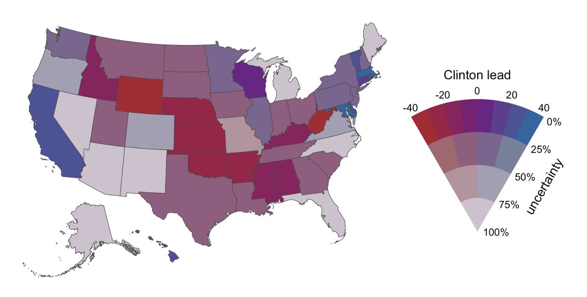
From Claus Wilke on Twitter, using color to indicate uncertainty, based on data from before the 2016 US election.

The red:blue scale indicates who is ahead, and the grey:coloured scale indicates confidence.  There was lots of discussion about whether this is graying out the differences too much or not enough, and so on, but it’s an interesting idea.

July 5, 2018

Salary distributions

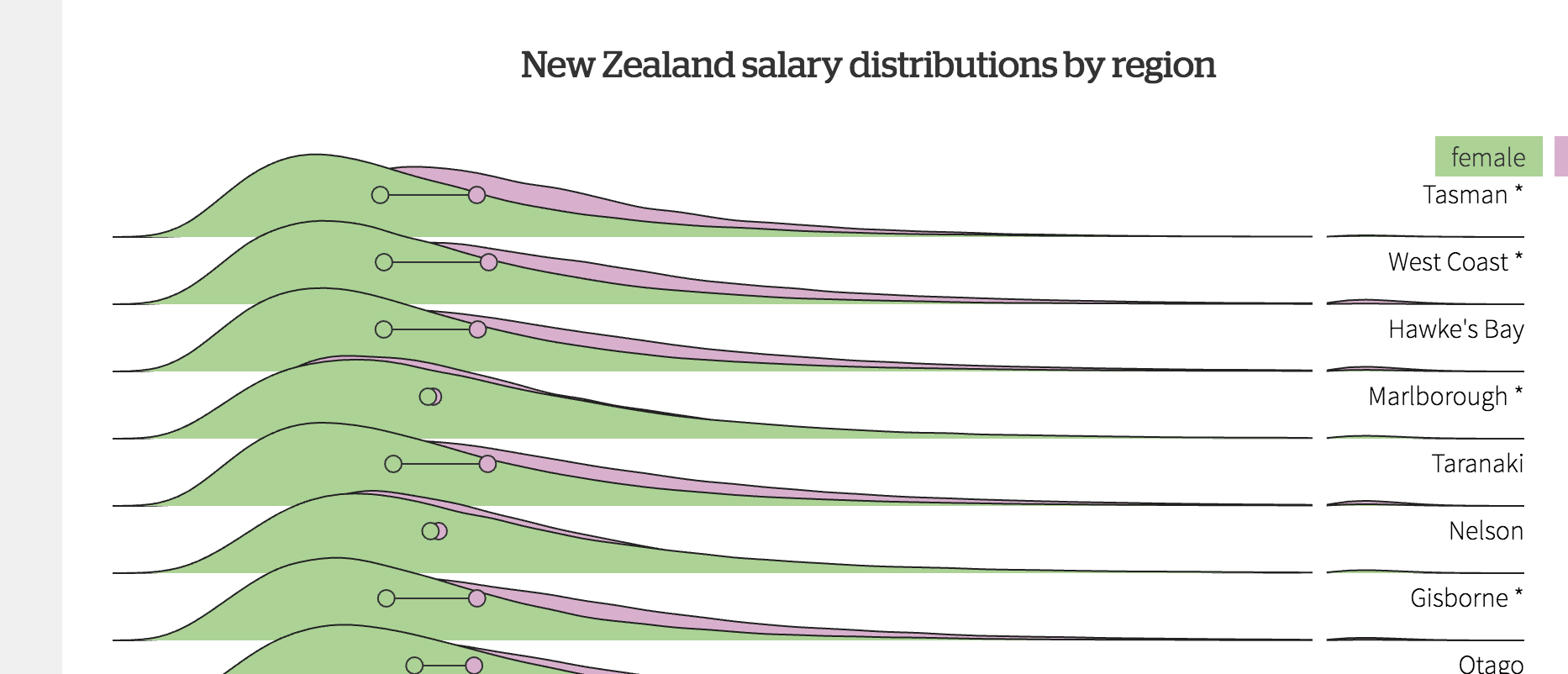
Chris Knox at the Herald has a very nice visualisation of salary distributions and gender differences by age, industry, region, and sector. 

These are tidier than you’d expect from a relatively small survey, because they are predictions from a model, rather than raw survey data.

The good thing about using a model like this is that you can get somewhat realistic pictures from a much smaller survey than you’d otherwise need. The model is expanding the real data for each individual into a smooth distribution on the graph.

The bad thing is there’s a bit of distortion: for example, a graph of a large enough set of raw data would show spikes where multiple people have the same round-number income, and probably a sharper cutoff at the bottom end rather than a smooth tail down to zero.

The graph shows very little difference between private-sector and public-sector workers.  That surprised me, because public sector employees on average have substantially higher wage/salary income — as Keith Ng separately writes in the Herald. The difference doesn’t, of course, represent higher pay for comparable jobs; it’s because the public sector is increasingly biased towards educated professionals.  Also, government bodies (like other large organisations) will often contract out their lowest-paying jobs rather than using their own employees. Keith showed, using StatsNZ data, that public-sector employees tend to earn slightly less than private-sector employees within the same occupation type.

But if it takes comparisons within an occupation to correct the misleading public-private comparison in StatsNZ data, why doesn’t it take comparisons within an occupation in the visualisation?  After some Twitter conversation we worked out that it’s because the visualisation is of salaries, and the other comparison is of salaries and wages. Restricting to salaried employees, while cruder than doing comparisons within occupation types, is enough to remove the bulk of the bias.

‘Foreign’ buyers

From the Listener this week, and now on noted.co.nz

This week, new data emerged from the ASB Bankshowing that foreign buyers are a much more significant part of the overheated housing market than had previously been established; that is, between 11% and 20% rather than the piffling 3.3% nationally – and 7.3% in the Auckland market, ground zero for our property frenzy – previously reported by Statistics New Zealand.

As I wrote last week

  1. It’s not new data – it comes from exactly the same StatsNZ report (if either the ASB report or the StatsNZ report had been linked, this would have been easier for the reader to find out)
  2. Not foreign buyers. The 11% includes 8% of New Zealand residents who aren’t citizens at the time they buy the house.  The 11-21% range includes 0-10% of buyers who are foreign commercial entities. Because ASB didn’t have any new data, they don’t know what proportion of the commercial entities are local, but they were guessing it was at the low end. So, ASB’s figure for foreign buyers is 3-13%, with a guess that it’s towards the low end.
  3. In fact, even the 3% counts people on work visas buying a house or apartment to live in as foreign buyers. You could maybe argue that people on work visas should be driving up rental costs instead, but it’s not that obvious a case.