Posts filed under Correlation vs Causation (68)

March 27, 2012

Heart disease is bad for your sleep

Another heart-disease related story in the Herald (the American College of Cardiology is having its annual meeting now) talks about a link between sleep  and heart disease.  The Herald quotes the principal investigator, Rohit Arora

We now have an indication that sleep can impact heart health, and it should be a priority.

Based on these findings, it seems getting six to eight hours of sleep everyday probably confers the least risk for cardiovascular disease over the long term.

The study actually looked backwards in time, asking people how much sleep they (currently) get per night, and whether they have previously been diagnosed with various heart conditions.  So, it really doesn’t say much about the effect of sleep on heart disease.  Other news sources used a different quote from Dr Arora

“We don’t know whether sleeping longer causes heart complications or whether the heart problems cause someone to sleep longer”

Indeed we don’t.

It’s also a bit strange that the study, based on the large US NHANES survey involved only 3019 people.  NHANES examines more than 10000 people in each two-year wave, and even restricting to people over 45 should leave more than 3000 of them.

March 21, 2012

Sugar isn’t the problem?

This week’s installment in the stream of stories that have found The Answer To Obesity says the problem isn’t just diet or exercise, it’s plastic bottles.   The Herald says

Man-made chemicals present in homes, schools, offices, cars and food are probably contributing to the sharp rise in obesity and diabetes in Western societies, according to a review of scientific literature published yesterday.

Until now lifestyle factors such as lack of exercise and poor diet were believed to be the primary causes of the increased incidence of both conditions, whose proliferation has strained global health budgets.

If you separate out diabetes, it’s not true that obesity has strained global health budgets.  The incidence of heart attacks, for example, continues to go down all over the world.  The rate of decline has slowed a bit, but increases are still theoretical and aren’t straining anything.  However, if we stipulate that obesity is bad, are bisphenol A, PCBS, and phthalates responsible?

All 240 studies they reviewed – whether in test-tubes, on animals or on humans – had been peer-reviewed and published in scientific journals.

 That’s presumably true, but the report itself has not been.  It’s the product of CHEMtrust, a British pressure group whose purpose is to make you worry about man-made chemicals.
The parts of the report that actually assess the evidence aren’t anywhere near as emphatic as the conclusions, the press release, or the stories. For example, the report says

While substantial laboratory evidence  shows chemicals can affect weight gain in animals and therefore supports the hypothesis that EDCs promote or otherwise influence obesity (see Table 1 above), the evidence in humans is still limited

They go on to say that it’s hard to assess cause and effect, since body fat absorbs and stores many of the relevant chemicals, and that the relationship between dose and effect might be complicated.   That is, they think there is an excuse for not seeing much evidence in humans at realistic doses, just in animals at high doses.

We know that increases in food sold in the US are sufficient to explain increases in average weight, and if chemicals are relevant, it must be mostly through effects on appetite rather than on metabolism.  It’s possible, based on the studies in small furry animals, that the chemicals the report worries about do have a non-zero effect on diabetes and obesity, but it does not seem plausible that it’s a substantial component of the global trends.

The Herald story said

Until now lifestyle factors such as lack of exercise and poor diet were believed to be the primary causes of the increased incidence of both conditions.

Until now. And subsequently.


March 18, 2012

The Demon Drink

On 3 News last night, we got a tour of South Auckland, just missing various drunken disturbances.   The video starts “3News has uncovered some shocking figures about the amount of alcohol some offenders are drinking” , and the webpage story says  “new research has revealed the alarming impact alcohol is having on crime“.

That’s approximately truish.  The `new research’ is a report dated December 2010 by the New Zealand Drug Use Monitoring (NZ‐ADUM) research programme at Massey University.  They surveyed 800 arrestees in Whangarei, Auckland Central, Wellington Central, and Christchurch Central, asking them about their drug and alchol use.   And there was a lot of drug and alcohol use — evidently, police arrests are selecting for people who are insufficiently risk-averse in all sorts of ways.  The figures possibly qualify as ‘shocking’, with arrestees reporting an average of 12 standard drinks both on typical days when they drink, and on the day they were arrested.  Some people reported much higher consumption, and some reported none.

3News compares this to “The average New Zealander drinks around two standard drinks a day”, which looks like this StatsNZ figure on total alcohol sales.  In addition to the problems of comparing self-reported drinking with sales data, the national average is over all days and the arrestee average is over days when they drank.  Since the arrestees reported drinking an average of about 1 day in 3, the correct comparison to 2 drinks/day is 12/3=4 drinks per day, about twice the NZ average.    The arrestees also consumed more tobacco, more cannabis, more P, more opioids, more ecstasy, and more of everything else than the average Kiwi; in fact, as far as I can tell alcohol showed a smaller difference than any of the other drugs — mostly because the average for all New Zealanders is fairly high.

The other notable statistic about drinking is that the average drinks per day that they drank was the same as the average drinks on the day they were arrested.  That is, although many of the arrestees were drunk when they were arrested, they were no drunker than they usually are on about one day in three.   The relative risk of arrest given their heavy drinking for these arrestees is thus about 3, which is a lot smaller than I would expect even without the headlines.  If you read the report, while alcohol is unquestionably a problem, it is far from the only problem that the arrestees have.


March 9, 2012

Newsflash: Auckland is larger than Wellington

The denominator problem shows up yet again, this time in a press release from AA insurance, leading to stories in the Dominion Post, the Herald, the Aucklander, and probably others, and a Stat of the Week nomination for the Groping Towards Bethlehem blog (via Eric Crampton).

There are statistical problems in the press release, but the newspapers came up with additional bonus examples.

The press release says

Between 2009 and 2011 AA Insurance received the highest number of burglary and theft from vehicle claims from Auckland, Hamilton, Wellington, and Christchurch.

and the Dominion Post amplifies this to

But Wellingtonians were far less likely to be burgled than their Auckland counterparts, with 31 per cent of all burglaries taking place in the Auckland region, compared with just under 9 per cent in Wellington.

Auckland has three times as many burglaries as Wellington, which sounds bad until you consider that Auckland is larger than Wellington, by a factor of about, um, three.  Using population at the last census, the rate of burglaries per capita is still higher in Auckland, but by only 20%.   If we compare Auckland to the whole population of New Zealand, the burglary rate per capita is slightly lower in Auckland; and since the Wellington rate is lower, if we combine Auckland and Wellington the rate is also lower than for the rest of the country. This tends to cast doubt on the comment

AA Insurance head of operations Martin Fox said daytime robberies were more common in big cities, where most people did not head home for lunch.

This could be true  if night-time burglaries[I assume he means burglaries, not robberies] were much more common outside big cities, but we aren’t given any data to support this, and the data we do have argues against it.

So far this is mostly fluff, but the interesting bit of news is

Security alarms had proven effective for preventing burglaries, with 60 per cent of claims between 2009-11 coming from homes without alarm systems.

AA Insurance presumably know how many of their customers have security alarms, so they might have evidence for this claim. Perhaps only  30% of insured homes lack alarm systems, so the 60% of claims from such homes is notable.   We can’t tell, because they don’t explicitly give any comparisons of rates, they don’t give information that we could use to compute rates, and they sure haven’t given us any reason to trust them on the handling of denominators.

If we did have rates, there would still be a problem of causation vs correlation.  A Ministry of Justice survey in 2004 did find lower rates of burglary in houses with alarms, but they also found

The security measure most strongly associated with lowered rates of burglary was ‘telling neighbours when everyone will be away’. As only a small proportion of burglaries occurred while the occupants were away (Section 6.5.1), presumably this measure was an indicator for a more general relationship, such as a lowered risk of burglary when neighbours are known and when neighbours look out for one another.
March 7, 2012

Smoking wrecks the economy

Our Stat-of-the-Summer was a miscalculation of the individual costs of smoking.  A correspondent has pointed me to an international correlation on the same topic.  Economists at ConvergEx have found a strongish correlation across countries between debt:GFP ratio and smoking.  The economists went as far as saying

“The relationship is strong enough that counting the cigarette butts in the ashtrays of street-side cafes around the world could be safely called `sovereign credit research’,” said Nicholas Colas, chief market strategist at ConvergEx.

That’s clearly nuts, but is the correlation telling us something useful or even interesting?  Could it really be true, as the correlation would suggest, that sovereign debt is the biggest factor affecting smoking rates (or, almost equally plausibly, vice versa)?

One empirical indication that ashtrays are not the best place to find national debt data comes from looking at changes over time.  Public debt is a cumulative process, so even more than usual we can quote the biologist D’Arcy ThompsonEverything is the way it is because it got that way”.

Over time, in the US, Britain, Australia, New Zealand, and many other countries, smoking reached a maximum among people born at the start of the twentieth century and has now been decreasing in popularity (because it, you know, kills you and stuff).  The pattern of public debt in those countries has been quite variable.  In Australia, debt ballooned and has now shrunk again.  In NZ, debt is increasing.  In the USA then debt:GDP ratio went down to a post-war minimum in the Clinton years and has been increasing again.  Also, the reasons for the changes are different in different countries — US debt is up largely because of tax cuts, but Australian debt is down in part because of better commodity prices.

So, over time, there is no consistent correlation between smoking and sovereign debt:GDP.  That being the case, it’s hard to see how the correlation across countries right now could be anything other than a coincidence.

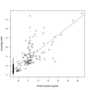
If you ask Google Correlate what is correlated with “sovereign debt” as a web search term, you find out that “html 5 browser support”, rather than “smoking” has the strongest correlation (0.82) among terms that aren’t specifically debt-related, as in the graph on the left.  That makes about as much sense.


March 6, 2012

Humans not yet obsolete

Stuff has a story on robot-assisted surgeries, claiming

Patients who have robot-assisted surgeries on their kidneys or prostate have shorter hospital stays and a lower risk of having a blood transfusion or dying – but the bill is significantly higher, a study found.

That’s not quite what the study found.  The abstract says

While robotic assisted and laparoscopic surgery are associated with fewer deaths, complications, transfusions and shorter length of hospital stay compared to open surgery, robotic assisted laparoscopic surgery is more costly than laparoscopic and open surgery.

The researchers used the Nationwide Inpatient Sample, a random subset of US hospital admissions, to compare three approaches to prostate and kidney surgery: laparoscopic (‘keyhole’) surgery by hand, robot-assisted laparoscopic surgery, and open (non-keyhole) surgery.  They found that laparoscopic surgery, whether robot-assisted or not, was safer than open surgery, but they didn’t report an advantage of robot over non-robot keyhole surgery, just an increase in cost.

Now, you might well be muttering about causation and correlation, and asking “How do we know the open surgeries weren’t just more difficult cases?” If you aren’t, then you can start now and I’ll let you pretend you were doing it all along.  Since surgeon experience makes a big difference, we should also worry whether it’s the most experienced surgeons who get the expensive and shiny new robots.

The researchers did try to cope with this problem using a technique called propensity scores.  Essentially, they tried to classify patients according to how likely they were to have an open surgery vs manual laparoscopic surgery vs a robot surgery, and match the patients so comparisons were done only between similar cases.  However, the researchers did say in the main body of the paper  “Results from unadjusted and propensity adjusted analyses were largely similar”, ie, the attempt to remove bias didn’t actually remove any bias.  The optimistic view is that this means there wasn’t any bias; the pessimistic realistic view is that it means the adjustment probably failed.

Surgical robots have been a bit of a disappointment.  It’s not that they don’t work, but they were supposed to have huge and dramatic advantages (over and above “ooh, shiny”) and these huge advantages don’t seem to have materialized.

February 20, 2012

Stats crimes – we need your help

What do you think are the biggest media/public misunderstandings around statistics? We know that some statistical concepts can be quite hard to understand (and a bit of a challenge to teach); we’d like to compile a list of the top stats misunderstandings so we can accurately focus some media education projects we are planning ….

Some examples that have already been raised:

  • Misunderstanding correlation and causality: All too often causality will be assigned where a study has merely shown a link between two variables.
  • Abuse/misuse of the term “potentially fatal”: While many activities/diseases could possibly result in death, the odds should be considered in the context of a developed country with reasonable health-care.
  • How to know when something is statistically significant and when not.
  •  How to know when you are looking at  “junk” statistics …

Please share your ideas below …

February 8, 2012

Breakfast wars

“High carb breakfasts boost brain power”.  Now, why does that sound familiar.. Oh, yes.  Last month it was the Egg Foundation pushing “Eggs may increase alertness”. This time it’s the Glycemic Index Foundation.

As the school year gets under way, new research is adding further weight to evidence that breakfast is the most important meal of the day, especially for children.

Research published last June, so it’s hardly new for the new school year. And the research only studied children who regularly eat breakfast, so it can’t really be evidence that breakfast is the most important meal of the day, or say whether this is more true for children.

Research by three British institutions 

Author names? Journal names? Institution names?  I’ve seen at least five universities in Britain with my own eyes, and am reliably informed there are several more.

has shown a strong link  between low GI, higher carbohydrate breakfasts and better academic  performance.

We can allow “strong link” as mere puffery, but the research did not include any data whatsoever about academic performance

The study, which involved 60 students, found that a low GI,  higher carbohydrate breakfast helped students do maths tasks more  quickly and accurately, and improved attentiveness.

I suppose counting backwards from 100 by 7s just about qualifies as a maths task, even for teenagers, but it’s a bit of a stretch.

The Glycemic Index (GI) is a measure of how effective  carbohydrates – sugars and starches – are on blood glucose levels.

GI is a measure of how fast or slowly carbohydrates affect blood glucose levels.  Wikipedia has it much more clearly Carbohydrates that break down quickly during digestion and release glucose rapidly into the bloodstream have a high GI; carbohydrates that break down more slowly, releasing glucose more gradually into the bloodstream, have a low GI.”

At least, by quoting Dr Alan Barclay, of the Glycemic Index Foundation, the story did make it possible to track down the real research. Dr Barclay’s blog has a link to the paper, which was published in the European Journal of Clinical Nutrition.   Unless you’re at a university, you will have to pay to read it, so I will summarise.

Of the 60 children recruited, 19 had a “High GL, low GI” breakfast. This meant they were in the lower half for GI and the upper half for glycemic load (total carbohydrates), not that their breakfasts were high or low GI on an absolute scale.  There were three other groups, from the three other combinations of high/low GI and  GL.

The children had seven cognitive function tests. Three of the seven didn’t show any differences between the breakfast groups. For the other four tests the results were mixed:

Specifically, high-GI was associated with better immediate recall (short-term memory), high-GL with better matrices performance (inductive reasoning), and low-GI and high-GL with better speed of information processing (vigilance, sustained attention) and serial sevens performance (vigilance, working memory).

And this is before we start worrying about the correlation vs causation issue, the fact that the high-GL,low-GI breakfast averaged more total calories, or the fact that 13 of the 19 teenagers in the high-GL, low-GI group were girls.

January 17, 2012

Internet eats your brains!

Stuff is telling us “internet overuse could cause brain damage”, with even less than usual in the way of referencing: no journal, no researcher names, no university (no, “Chinese” is not sufficiently specific. There’s quite a few Chinese scientists out there).  Fortunately, the Google is always there to help, and it turns out that the relevant paper is available online, free, in PLoS One.

The first thing to note is that the paper says nothing about the effects of amount of internet use. Nothing.  It’s about internet addiction, which is at least trying to be a pathological condition distinct from just using the internet a lot.   Secondly, although the paper does claim to find “changes” in brain structure,  the participants had MRI brain imaging only once, so there is no data about changes.  What the researchers found is differences in brain structure between people with and without internet addiction, similar to the differences in people addicted to other things.

This immediately raises the question of cause and effect.  Is your brain different because you are addicted, or are you addicted because your brain is different?

Interestingly, the paper claims that ” the incidence rate of internet addiction among Chinese urban youths is about 14%“.  This seems implausibly high, and it’s twice the prevalence found in a recent Hong Kong survey  published in the British Journal of Psychiatry, but I suppose if the diagnostic criteria are still a bit fuzzy you would expect overdiagnosis in a large-scale survey.

January 9, 2012

Cancer clusters

Hugo Chavez, the President of Venezuela, has publicly speculated that some secret US weapon might be responsible for several Latin American heads of government getting cancer recently, which he said was “difficult to explain using the law of probabilities.” This is a perfect example of a phenomenon that is all too familiar to public-health workers: the cancer cluster. According to the American Cancer Society, more than 1000 cancer clusters are reported to state public-health departments in the US each year. How many of them turn out to be real? Approximately none.

There are two statistical phenomena here. Firstly, although individual cancer subtypes may be rare, cancer as whole is more common than most people realize. Secondly, we are very good at seeing patterns, even patterns that aren’t there.

The picture, from David Spiegelhalter, shows four 9×9 squares. Three are coloured entirely at random; one has a pattern. Before going on, decide which one you think is non-random.

(more…)