Posts filed under Blogs (16)

October 13, 2014

Herald data blog starts

The Herald’s Data Editor, Harkanwal Singh,  announces the online site’s new ‘Data Blog’, with the first new post being a map of NZ internet affordability created by Jonathan Brewer.

This has got to be a Good Thing for data literacy in the local media.

March 18, 2014

Your gut instinct needs a balanced diet

I linked earlier to Jeff Leek’s post on fivethirtyeight.com, because I thought it talked sensibly about assessing health news stories, and how to find and read the actual research sources.

While on the bus, I had a Twitter conversation with Hilda Bastian, who had read the piece (not through StatsChat) and was Not Happy. On rereading, I think her points were good ones, so I’m going to try to explain what I like and don’t like about the piece. In the end, I think she and I had opposite initial reactions to the piece from on the same starting point, the importance of separating what you believe in advance from what the data tell you. (more…)

January 1, 2014

Pretty things

1. Xiaoji Chen (陈晓霁) has graphs of air pollution in some cities in China, spiralling to show the seasons

Urumqi


2. The Cooper-Hewitt collection at the Smithsonian lets you search by colour, with up to five representative colours for each piece

colorsearch


I found this from Chris McDowall’s page that summarises a set of photos by their dominant colours.

tomatocolourtomato


There’s a lot of information loss in reducing a photo to four or five pixels, but finding good ways to reduce information is exactly what statistics is about

December 29, 2013

Some graph links


December 28, 2013

Other blogs you should maybe read

A non-comprehensive collection of blogs on relevant topics that I read fairly regularly and you might like. These average more technical than StatsChat.

Statistics, Graphics, and Data Science

Statistics-adjacent

Other social science

Stuff about science

Journalism

Other recommendations welcome in the comments: in particular, I’m well aware that my regular technical blog reading seems to be dominated by white men.

May 16, 2013

Back to my favourite topic – beer

BeerVis Graph

Here is a site to show with a flourish when your friends tell you at the pub that studying Statistics is no use. LifeHacker reports that BeerViz attempts to use historical data collected by BeerAdvocate, and presumably a statistical model, to suggest new beers to you based on what you already like. If they’re not using a statistical model then there is a great challenge for you loyal readers!

April 8, 2013

Briefly

  • Interesting post on how extreme income inequality is. The distribution is compared to a specific probability model, a ‘power law’, with the distribution of earthquake sizes given as another example. Unfortunately, although the ‘long tail’ point is valid, the ‘power law’ explanation is more dubious.   Earthquake sizes and wealth are two of the large number of empirical examples studied by Aaron Clauset, Cosma Shalizi, and Mark Newman, who find the power law completely fails to fit the distribution of wealth, and is not all that persuasive for earthquake sizes. As Cosma writes

If you use sensible, heavy-tailed alternative distributions, like the log-normal or the Weibull (stretched exponential), you will find that it is often very, very hard to rule them out. In the two dozen data sets we looked at, all chosen because people had claimed they followed power laws, the log-normal’s fit was almost always competitive with the power law, usually insignificantly better and sometimes substantially better. (To repeat a joke: Gauss is not mocked.)


March 16, 2013

Do scientists read newspapers or blogs?

A new paper surveyed neuroscientists in Germany and the US about where they get information on science-related news stories.

Based on the response of some 250 scientists (fairly evenly divided between the countries), the researchers found that scientists tended to give more weight to the influence of traditional media. For instance, more than 90 percent of neuroscientists in both countries said they relied on traditional journalist sources – both in print and online – to follow news about scientific events compared to around 20 percent for blogs.

Not surprisingly, the internet coverage of this paper has been fairly hostile (traditional media seems not to have covered it).

There’s a good  summary of the reaction by science writer Deborah Blum, but count me on the bemused side.  I do use traditional media to learn that particular science stories exist, but rarely to find out more about them.

January 17, 2013

Briefly

  • An illustration of what happens to promising new medical treatments: the first randomized trial of fish oil found a 70% reduction in rate of deaths, though the study was too small to be reliable.  After the second study, the estimate was down to 20%.  It’s now 4%, with a margin-of-error of 6%. 
  • A Wall Street Journal infographic that’s doing the rounds, on the impact of the ‘fiscal cliff’.  Includes a representative solo mother with two children, who faces a $3300 tax increase. On her income of US$260,000.  The median household income for families with female householder and no husband is US$32978 (that also includes a subset of the unmarried couples with children, but there’s fewer of them in the US than here).
  • Roger Peng writes about the Beijing air pollution. It is indeed ‘crazy bad’, but the Great London Fog was substantially worse.  Similarly, when you read about developing-country water pollution, remember that the Cuyahoga River, in Cleveland, caught fire several times.
December 31, 2012

Duck! Here comes another year!

Our most-viewed posts in the past year, according to the Jetpack backend

  1. Tip of the icecube: on the ‘hundreds of unfit teachers’
  2. Who is really buying New Zealand: dramatically bad bubble graphs
  3. A story from last year, about the suicide rate at the Foxconn plant 
  4. David Scott’s Super 15 predictions for round 2
  5. Another one from last year, on lottery odds.

This only counts hits directly on the page (eg from Twitter or RSS feeds), not from browsing the site, so it misses about 1/3 of the traffic.

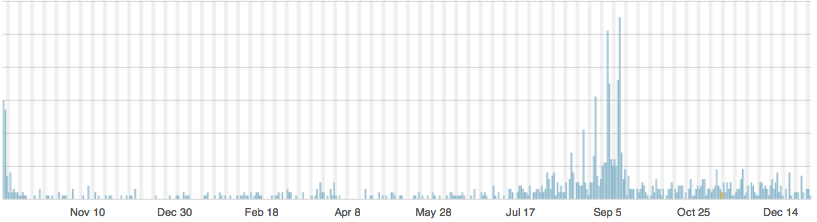
The lottery post shows an interesting pattern of hits

Big Wednesday

The second burst of popularity was a building jackpot, with the spikes on Tuesday/Wednesday each week. There’s a similar pattern on Google Trends for the phrase ‘Big Wednesday’.


There were 31 posts in the new ‘Denominator’ category, which mostly follows violations of two of the most basic numeracy principles for reporting:

  1. Auckland is bigger than the other cities, so simply having more of something in Auckland is not news
  2. If you have two years of data, either take an average or a difference. Don’t report a total.


Approximately 95% of our comments were spam, but the filters caught 99.8% of it. The 5% of real comments are much appreciated.

And finally, the title of this post is from an Ogden Nash poem.