Posts filed under Silly (68)

April 3, 2017

How big is that?

From Stuff and the Science Media Centre

Dr Sean Weaver’s start-up business has saved over 7000 hectares of native rainforest in Southland and the Pacific

So, how much is that? I wasn’t sure, either.  Here’s an official StatsChat Bogus Poll to see how good your spatial numeracy is;

October 18, 2016

Evidence-based policy chants

An old one, seen at the ‘Rally To Restore Sanity and/or Fear”

What do we want?
EVIDENCE-BASED CHANGE!

When do we want it?
AFTER PEER REVIEW!


A new one, from @zentree and @bex_stevenson on Twitter

What do we want?
RELIABLE NUMBERS!

When do we want them?
STAT!

(this sort of thing is why we have a ‘Silly’ tag on StatsChat)

October 17, 2016

Vote takahē for Bird of the Year

It’s time again for the only bogus poll that StatsChat endorses: the New Zealand Bird of the Year.

Why is Bird of the Year ok?

  • No-one pretends the result means anything real about popularity
  • The point of the poll is just publicity for the issue of bird conservation
  • Even so, it’s more work to cheat than for most bogus polls

takahe

Why takahē?

  • Endangered
  • Beautiful (if dumb)
  • Very endangered
  • Unusual even by NZ bird standards: most of their relatives (the rail family) are shy little waterbirds.

sora

(A sora, a more-typical takahē relative, by/with ecologist Auriel ‘@RallidaeRule’ Fournier)

December 23, 2015

Pre-attentive perception and pandas

The University has closed until the New Year and we are on compulsory holiday, so from my point of view it’s the StatsChat Silly Season.

An important scientific issue in designing graphics is preattentive perception: for example, it’s easy to see the one different point in this plot
preattentive1

The circle vs triangle distinction is pre-attentively perceived: your visual system annotates it before you get to see the picture.  More complicated distinctions aren’t pre-attentive, and so don’t make as good plotting characters.

Here, as a Christmas card, is a picture from Hungarian cartoonist Gergely Dudás. One of the snowmen is a panda. Pandas are not pre-attentively perceived.

snowmen_1

(update: yes, I saw the Herald has it too.)

October 30, 2015

Pie charts “a menace”, study shows

StatsChat can reveal exclusive study results showing that pie charts are a menace to over 75% of us.

Although these round, delicious, data metaphors have been maligned in the past, this is the first research of its kind, based on newly-available survey technology.

Researchers used an online, multi-wave, respondent-driven sampling scheme to reach thousands of potential respondents. 77% of responses agreed that pie charts are a menace.

threatormenace

Aren’t these new Twitter polls wonderful?

January 2, 2015

Using the right denominator

We go on and on about denominators on StatsChat: the right way to report things that happen to people is usually a rate per capita rather than a total, otherwise you end up saying that Auckland has the highest number of whatever it is in New Zealand.  You do have to use the right denominator, though.

The Vatican City has the world’s highest crime rate.

That’s because the permanent population is less than 500, but the daily tourist population is about 100 times larger. The right denominator would be the tourist population.

In most countries this isn’t really an issue. For example,  in New Zealand,which has a lot of tourism, short-term visitors are only about 5% of the population. Even in the Cook Islands, residents outnumber tourists.


Maybe not a representative sample

The Dominion Post asked motorists why they thought the road toll had climbed, and what should be done about it.

roadtoll

Interestingly, three of the five(middle-aged, white, male ,Wellington area) motorists attributed it to random variation. That’s actually possible: the evidence for a real change in risk nationally is pretty modest (and the Wellington region toll is down on last year).

(via @anderschri5 on Twitter)

Meaningless bignums

From the science journal Nature, who should know better than to quote big-sounding numbers without context.

B6R7QaNCIAI2Qsx

That’s roughly the same number of person-hours as the world spent watching the China Central Television news program Xīnwén Liánbō: estimated at 135 million people for half an hour a day.  Or about 1/3 as much time as spent watching YouTube.


December 29, 2014

Set to a possibly recognisable tune

The Risk Song: One hundred and eight hazards in 80 seconds

(via David Spiegelhalter)

December 27, 2014

The Lesser Spotted Hutt Man Drought

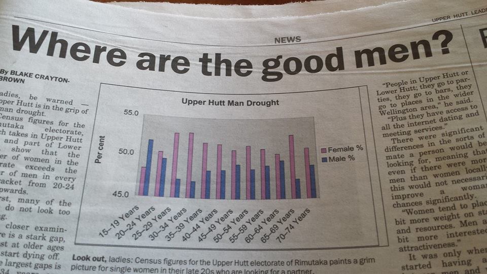
From the Christmas Eve edition of the Upper Hutt Leader, which you can read online:

Ladies, be warned — Upper Hutt is in  the grip of a man drought

Here’s the graph to prove it (via Richard Law, on Twitter)

 upperhuttleader


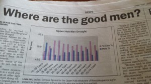
As the graph clearly indicates, women outnumber men hugely in the 25-35 age range, and (of course) at the oldest ages. The problem is, the y-axis starts at 45%. For lines or points that’s fine, but for bar charts it isn’t — because the bars connect the points to the x-axis.

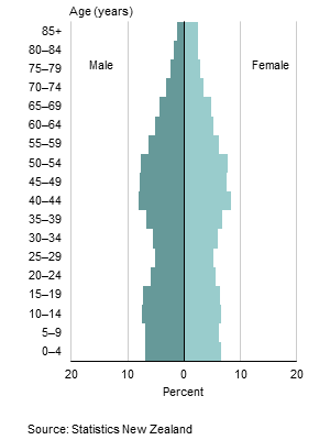
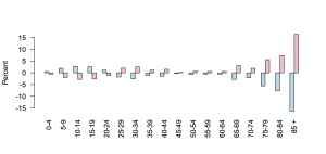
This is Stats New Zealand’s version of the graph, in standard ‘population pyramid’ form. It’s much less dramatic.

dbimages

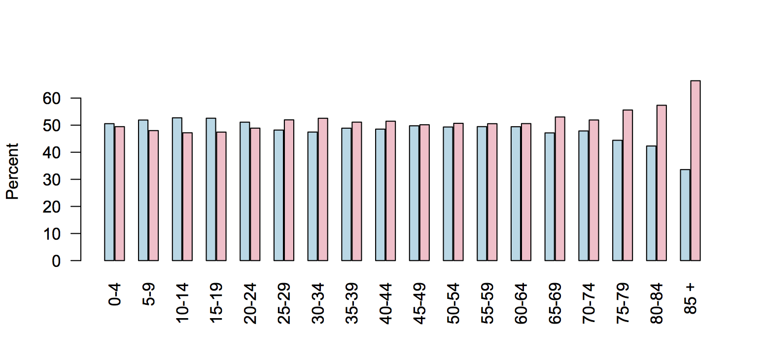
We could try a barchart with axis at zero

huttzero

It’s still much less dramatic — and you can see why the paper chopped the ages off at 75, since using the full range available in the data wouldn’t have fit on their axes.  The y-axis wasn’t just trimmed to fit the data; it was trimmed beyond the data.

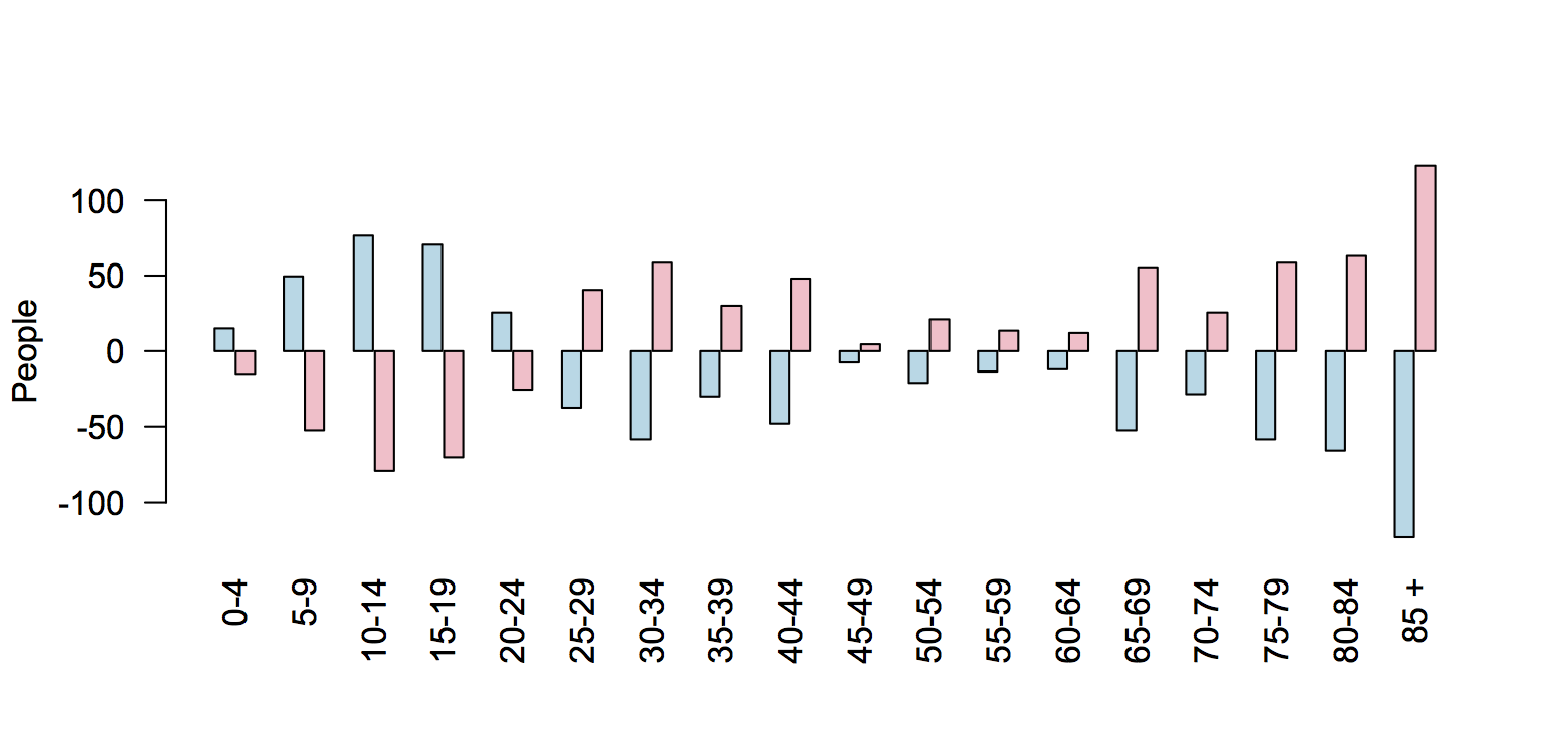
You could make a case that ‘zero’ in this example is actual 50%: we (well, not we, but journalists who have to fill space) care about the deficiency or surplus of members of the appropriate sex.

hutt50

Or, you could look at deficiency or surplus of individuals, rather than percentages

huttdiff

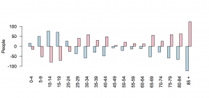
Using individuals makes the younger age groups look more important, which helps the story, but on the other hand shows that the scale of this natural disaster isn’t all that devastating.

That’s basically what the expert quoted in the story says. Prof Garth Fletcher, from VUW, says

“People in Upper Hutt or Lower Hutt, they go to parties, they go to bars, they go to places in the wider Wellington area.”

It was only when you started having a gap between men and women of more than 5 or 10 percent that there would be real world implications, he said.


[Update: My data and graphs are for Upper Hutt (city). That’s about 2/3 of the Rimutaka electorate, which is where the paper’s data are for]