Posts filed under Denominator? (88)

December 3, 2012

Stat of the Week Winner: November 24 – 30 2012

Congratulations to Eva Laurenson for her excellent nomination of the NZ Herald’s article entitled “Manukau ‘luckiest’ place for Lotto”:

What does ‘luckiest’ in this title mean? Well to the average person ( I asked a few) they interpreted that title as ” I would have a higher chance of winning Lotto if I bought my ticket from a Manukau store compared to another store from a different suburb in Auckland.” Is this really the case? I doubt it. The article ranks Manukau ‘luckiest’ because it is the suburb with the highest total paid out first division amount. However no where did they take into account the total sales of Lotto tickets in each suburb. I think if you took this into account you’d see that Manukau sells alot more tickets than some of these other suburbs in Auckland. So even though Manukau can boast 55 mil in first division prizes we have no idea whether that is 55 mil out of 100 mill worth of ticket sales or 55 mil out of 1 bill worth of ticket sales. Some of the other suburbs may have a lesser amount of first division payouts compared to Manuaku but could have a greater proportion of first division payouts compared to ticket sales. Hence if that was true, your chance of winning first division given that you bought your ticket in that other suburb would be greater than (the same probability measured for) Manukau. Therefore I think there isn’t sufficient information provided to make this claim.

What I think the article could say is ‘given I won first division, the chances that I bought my ticket in Manukau are ____ times the chance that I bought it somewhere else.’ Something to this effect could be derived from the information presented by the herald article and it makes a bit of sense. Is this what the article wrote though? Not at all. They summarised this finding into “Manukau is the luckiest Lotto suburb in Auckland.” Please! This screams misleading. As discussed above, there simply isn’t enough information to justify labelling Manukau the ‘luckiest’ suburb for Lotto. People have a clear idea of what it means to be lucky and that generally is that they have an increased chance of winning. This is not the conclusion you can draw from the information they provided and in this case I believe the herald got it wrong.

I also think, although probably not the authors intentions, labelling Manukau as the ‘luckiest’ suburb has the danger of enticing people to spend more on Lotto. This article published earlier in the year by the NZ herald noted that “Many South Auckland suburbs featured among those which gambled away the most money. Mangere Bridge, Flat Bush, Manukau and Manurewa were in the top dozen suburbs.”
Even though the article was talking about the pokies, Lotto is just another form of gambling. We shouldn’t be condemming one and sending a rosy message about another, especially to communities who are struggling as it is.

Overall I think this should be the Stat of the week because using ‘lucky’ was a nice little pun but in effect mislead people regarding their chances of winning first division depending on where they bought their ticket.

Secondly it seems wrong to label a suburb ‘luckiest’ and potentially encourage a community to spend more on Lotto there when it is known that it is a compartively poorer area than other Auckland suburbs and spends alot of money on gambling as it is.

Thomas expanded on this, saying:

This looks as if it’s claiming that tickets bought in Manukau have been more likely to win. If this was true, it would still be useless, because future lotto draws are independent of past ones.

It’s even more useless because there is no denominator: not tickets sold, not people in the suburb, not even number of Lotto outlets in the suburb.

What the statistic, and the accompanying infographic, really identifies is the suburbs that lose the most money on Lotto. That’s why Manukau and Otara are ‘lucky’ and Mt Eden and Remuera are ‘unlucky’, the sort of willfully perverse misrepresentation of the role of chance that you more usually see in right-wing US outlets.
November 29, 2012

Happy little tweeps

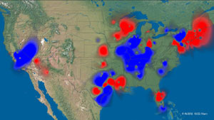
Via Stuff, Twitter heat maps composed by SGI, showing positive and negative sentiment on Twitter on particular topics.

This one is from the US election, and it shows the good and bad aspects of the heatmap.  Since the information is in the colour scale, you don’t have the problem we saw earlier this week


On the other hand, you do have the problem that high population density regions are the ones that show up — giving a perhaps-misleading impression in this image that there was overwhelmingly more positive sentiment than negative about the US election results.

[update: wrong map initially]

November 27, 2012

Do you feel lucky?

The Herald (as our Stat-of-the-Week nomination points out) is claiming

Manukau is the luckiest Lotto suburb in Auckland, the Herald can reveal.

This looks as if it’s claiming that tickets bought in Manukau have been more likely to win.  If this was true, it would still be useless, because future lotto draws are independent of past ones.

It’s even more useless because there is no denominator: not tickets sold, not people in the suburb, not even number of Lotto outlets in the suburb.

What the statistic, and the accompanying infographic, really identifies is the suburbs that lose the most money on Lotto.  That’s why Manukau and Otara are ‘lucky’ and Mt Eden and Remuera are ‘unlucky’, the sort of willfully perverse misrepresentation of the role of chance that you more usually see in right-wing US outlets.

November 25, 2012

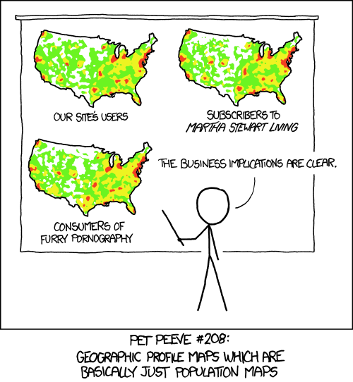
XKCD on denominators

XKCD on the data visualisation equivalent of forgetting that Auckland is larger than Wellington

I’m looking at you, Facebook

Some houses are more expensive than others

From the Herald

It’s almost as good as claiming Lotto’s first-division prize – the winners in Auckland’s frantic housing market are selling their properties for hundreds of thousands of dollars above their official valuations.

Statistics show that in the past six months there have been at least nine properties that sold for $500,000 or more above their CV

My first instinct is to look up the number of houses listed for sale in Auckland over the past six months, and point out that this is about 0.025% of listings, so it compares to winning the lottery on more than one dimension.

But more importantly, the council valuation is almost completely irrelevant to whether the seller has done well out of the deal.  The seller doesn’t pay the council valuation to anyone. The costs to the seller (after taking inflation into account) are the purchase price, interest, maintenance, improvements, and rates,  and only the last is affected even slightly by the new council valuations.

headline vs story

From Stuff: the headline figure is a 3-year total

Judges’ partners claim $500k

but then the story does the arithmetic

There are about 170 judges in New Zealand, meaning the annual amount claimed by partners averaged less than $1000 per judge.

 They could also have noted it was a bit under 3% of the total claims for judges expenses.
November 16, 2012

Consider vs actually do

Stuff reports on an Ipsos poll saying that about 1 in 3 people across many countries would consider travelling for medical treatment (and 18% “definitely would consider”).  For the USA, specifically, the figure was 38%.

The story also reports estimates of the actual number of people each year who travel from the USA for health reasons: 60 000 to 750 000. That sounds like a lot, but it’s actually 0.02%-0.25% of the US population, a bit of context that would have be useful in the story.

October 22, 2012

Drivers fined $3 per month

The AA is shocked (shocked!) to find that traffic and parking fines in Auckland add up to a lot of money.  The Herald did a good job on basic arithmetic, in converting traffic-fine totals of $36 million over 12 months and $20 million over eight months into the much less dramatic $3 million/month and $2.54 million per month.

One further piece of arithmetic would be to divide the $3 million per month by the 1 million registered vehicles in Auckland (table 36).  Is $3/month a surprising average?

For comparison, the Dominion Post reported total fines of “more than $12 million” in Wellington for the 2008-2009 financial year, on 283000 registered vehicles, giving a per-vehicle average of $3.5/month (before the GST increase).

Perhaps, as the AA’s Simon Lambourne believes, this indicates not enough effort put into education of drivers. Perhaps the idea of fining  people who don’t pay for parking  is “not being realistic about the importance of the car to mobility in Auckland.”  But the country’s primary motoring organisation can’t really get away with pretending surprise.

October 15, 2012

Think of a number, then add 50%

The Herald tells us:

More than 700 drivers have been nabbed for drug-driving since a new law came into effect.

Figures released under the Official Information Act show 575 motorists were charged with drug-driving from when new legislation was introduced on November 1, 2009 to July this year.

During the same period, another 134 motorists were charged under older legislation.

That’s a 20-month period, which, as usual, makes no particular sense.  We heard about  429 of the 575 motorists charged under the new law back in February.  If that was for the first year (which makes sense given the lag in the current figures), the rate is going down.  In fact, even if the 429 were through the end of January, which would be very fast data collection, the rate is still down, though not statistically significantly.

September 23, 2012

Rates and counts

From the Stuff story you could be forgiven for thinking heart disease in women is getting worse

Women have overtaken men in dying from heart disease, and the situation is forecast to get worse…

Ministry of Health figures show 5038 women died of cardiovascular disease in 2009, compared with 4712 men, and are projected to increase as the effects of diabetes and obesity worsen.

 Both those statements are true, but the implication is false.  The only thing you can reasonably talk about in health terms (as opposed to economics) is age-specific death rates.  That is, we want to correct for two trends that are not really ‘health’ changes.  The first is population size.  There are more people in New Zealand now than in the past, so there will be more deaths.  The second is age: your chance and my chance of dying of cardiovascular disease next year is higher than it was last year because we’re a year older.  We want to look at rates (fractions) rather than counts, and compare people of the same age.

Age-specific death rates from heart disease are still falling in New Zealand, as they are essentially everywhere in the Western world, and have been for my entire lifetime. That is, a 70-year old woman is less likely to die of heart disease this year than a 70-year old woman was to die of heart disease in, say, 2001, or 1980.

The improvements have been driven by a range of factors including reductions in smoking, introduction of treatments for high blood pressure and high cholesterol, and better heart-attack care. The  fall has been faster in men, who are now catching up to women.   The fall is showing signs of levelling off now for both men and women, and there are reasonable concerns that the trend might reverse in the not-too-distant future.

Since heart disease is a major cause of death for women, and this isn’t as widely appreciated by the public, an increase in targeted health promotion would probably be a good thing.  But that doesn’t mean we should regret the falls in heart disease deaths among men: a better phrasing would be “Men have caught up to women in dying of heart disease, but the situation, for both sexes, is forecast to stop improving.”