Posts filed under Environment (58)

January 9, 2013

3-d graphics

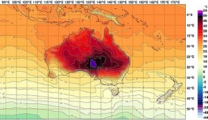
Most ‘3-dimensional’ graphics that you see are using fake perspective and don’t actually provide much additional information. The Australian Bureau of Meteorology maximum temperature forecasts are a genuine 3-d data display, illustrating that you really, really don’t want to be in eastern central Australia this week.  Notice how the coolest parts of Australia are the same temperature as here.

It's too darn hot.


The purple colour at the top of the scale doesn’t fit in well with the rest of the spectrum, and stands out on the map. Normally this would a bad thing, but 50C deserves to stand out.

December 5, 2012

If you’re 27 or younger, you’ve never experienced a colder-than-average month

The United States National Oceanic and Atmospheric Administration (NOAA) released a usual monthly State of the Climate Global Analysis in October 2012 which was anything but usual. Buried in the report was this astounding factoid: “This is the 332nd consecutive month with an above-average temperature”. What that means is, if you’re 27 or younger, you’ve never experienced a colder-than-average month. I find that phenomenal, a trend which if it continues might allow many to become ‘old timers’ who can “recollect the ‘good old days’ when a monthly temperature could be below average” (i.e. prior to March 1985).

This statement is certainly headline-grabbing, although there is some devil in the detail. Specifically, what is the ‘average’ which the NOAA benchmark against? A bit of research reveals that the NOAA use a reasonably robust 3-decade (1981-2010) average for their graphics, but the phrasing of the paragraph in question suggests that in this case they are comparing to the 20th century average. If it was the 3-decade dataset then the months Jan 1981 – Feb 1985 would have had to have been exceptionally cold to skew the average so low that it could be exceeded 332 times consecutively.

The field of time series and calculating moving averages (and variabilities) is fascinating, and no doubt with sufficient data-mining, as in any field (imagine sporting statistics), a number of other shocking statistics could be extracted. Nonetheless a 332 month run is still impressive (or incredibly concerning). Interpretation of climate change will more and more require punters to be comfortable with interpreting both running averages and changing variabilities. We can have extremely cold snaps in a month (variability) while still having an above average month for temperature.

November 29, 2012

Congratulations Dr James Russell: 2012 Prime Minister’s MacDiarmid Emerging Scientist Prize

James Russell with Prime Minister John Key

A huge congratulations to our staff member, Dr James Russell who has been awarded the 2012 Prime Minister’s MacDiarmid Emerging Scientist Prize for his internationally-recognised conservation work.

Dr Russell uses an innovative combination of ecology, statistics and genetics to study how rats and other mammalian pests invade predator-free islands and how to prevent this from happening. His work is helping to protect endangered native species and to maintain New Zealand’s reputation as a world leader in island conservation. With more than 80 per cent of the world’s island groups infested with rats, his expertise is also sought internationally to help eradicate and manage pest species.

His doctoral research examined how far rats could travel to predator-free islands and how they spread once they arrive. It led to greater understanding of how pest invasions occur and to new pest management techniques. Dr Russell is now focusing on the interactions between climate change, native and invasive species and ecosystem linkages, to help conserve native species.

He will spend several months in France next year working on conservation projects, and is involved with the Department of Conservation and philanthropist Gareth Morgan on the “Million Dollar Mouse” eradication project on the Antipodes Islands.

Read more about the awards »

October 2, 2012

Fishy journalism

By comparison with NZ, the UK media are a target-rich environment for statistical and scientific criticism.  The Telegraph ran a headline “Just 100 cod left in North Sea”, and similar stories popped up across the political spectrum from the Sun to the Socialist Worker.

The North Sea, for those of you who haven’t seen it, is quite big. It’s about three times the size of New Zealand.  You’d have a really hard time distinguishing 100 cod in the North Sea from no cod.  An additional sign that something might be wrong comes later on in the Telegraph story, where they say

Scientists have appealed for a reduction in the cod quote from the North Sea down to 25,600 tons next year.

If there are only 100 cod, they must be pretty big to add up to 25,600 tons of catch. They’re not only rarer than whales, they are much bigger.

It turns out (explains the BBC news magazine) that the figure of 100 was for cod over 13 years old. The papers assumed that 13 was some basic adult age, but they should have been thinking in dog years rather than human years.  A 13-year old cod isn’t listening to boy bands, it’s getting free public transport and looking forward to a telegram from the Queen.

The government department responsible for the original figures issued an update, clarifying that the number of adult cod in the North Sea was actually about 21 million.

September 15, 2012

Made in New Zealand

I don’t know for sure (though I have my suspicions) whether it’s possible to rigorously demonstrate a temperature trend using data just from New Zealand.  I’m sure it’s not possible to demostrate that mammograms save lives using data just from New Zealand.  Fortunately, there’s no real need to do so in either case.

We’ve mentioned the Berkeley Earth Surface Temperature project before.  The project is run by a physicist and former climate-change skeptic, Richard Muller, and has statistical leadership from the eminent David Brillinger.  They have taken a slightly different approach to temperature analyses: they use all available temperature records and weight them for internal consistency rather than selecting a high-quality subset, and their analyses of relationships between temperature and other factors are purely statistical, not based on climate models.  It makes astonishingly little difference (except that they can get better estimates of statistical uncertainty).

Here are two graphs from their results summary page. (more…)

September 9, 2012

Weather forecasting

Nate Silver, baseball statistician and election polling expert, has an article in the New York Times about weather forecasting and how it has improved much more than almost any other area of prediction:

In 1972, the service’s high-temperature forecast missed by an average of six degrees when made three days in advance. Now it’s down to three degrees. More stunning, in 1940, the chance of an American being killed by lightning was about 1 in 400,000. Today it’s 1 in 11 million. This is partly because of changes in living patterns (more of our work is done indoors), but it’s also because better weather forecasts have helped us prepare.

Perhaps the most impressive gains have been in hurricane forecasting. Just 25 years ago, when the National Hurricane Center tried to predict where a hurricane would hit three days in advance of landfall, it missed by an average of 350 miles. … Now the average miss is only about 100 miles.

The reasons are important in the light of today’s Big Data hype: meterologists have benefited from better input data, but more importantly from better models.  Today’s computers can run more accurate approximations to the fluid dynamics equations that really describe the weather. Blind data mining couldn’t have done nearly as well.     (via)

August 3, 2012

Air pollution and amnesia

From Sam Judd, in today’s Herald:

In 2009, Auckland had 23 micrograms of PM10 (airborne particles smaller than 10 micrometres) per cubic metre of air as an annual average – 3 above the WHO guidelines of 20. …

The much smaller Hamilton is one behind at 22 (which is our national average), wind doesn’t seem to help Wellington which is at 21 and the notoriously smoggy Christchurch (who has been banning woodfire use periodically since 2010) sits at 20.

Most embarrassingly, despite the fact that their cities are far bigger and more concentrated than ours, Australians enjoy air at 13 PM10 and the bustling metropolis of Syndey sits at only 12.

From the Herald, last September 28

WHO’s air quality guidelines recommend a maximum of 20 micrograms of PM10 per cubic metre of air on average but Auckland with 23, Hamilton on 22 and Wellington on 21 all exceeded that.

but the following day

The data has been replaced by 2010 numbers which showed all New Zealand main centres within the WHO safety guidelines of no more than 20 micrograms of PM10 particles per cubic metre of air with the exception of Dunedin which had been the only compliant New Zealand city according to the previous figures.

The World Health Organisation has removed data from its website that suggested New Zealand cities’ air quality was poorer than any major city in Australia

The actual figures were: 15μg/m3 for Auckland, 13 for Hamilton, 11 for Wellington.    It just doesn’t make sense that traffic-related air pollution would be much higher in Wellington than in Melbourne or Sydney, which are much larger, also choked with traffic, and less windy.   If it sounds too good to be true, it’s probably worth checking.

If you want to worry about actual air pollution in New Zealand, it’s the south-east that’s the place: Timaru is the worst (32 μg/m3), and some Otago towns and cities are also bad.  It’s not primarily traffic that’s the problem, but wood smoke.  Christchurch used to be fairly high, but has improved a lot.

June 28, 2012

Alpine fault: can we panic now?

The Herald has a good report of research to be published in Science tomorrow, studying earthquakes on the Alpine fault.  By looking at a river site where quakes disrupted water flow, interrupting peat deposition with a layer of sediment, the researchers could get a history of large quakes going back 8000 years. They don’t know exactly how big any of the quakes were, but they were big enough to rupture the surface and affect water flow, so at the least they would mess up roads and bridges, and disrupt tourism.

Based on this 8000-year history, it seems that the Alpine fault is relatively regular in how often it has earthquakes: more so than the San Andreas Fault in California, for example.  Since the fault has major earthquakes about every 330 years, and the most recent one was 295 years ago, it’s likely to go off soon.  Of course, ‘soon’ here doesn’t mean “before the Super 15 final”; the time scales are a bit longer than that.

We can look at some graphs to get a rough idea of the risk over different time scales.  I’m going to roughly approximate the distribution of the times between earthquakes by a log-normal distribution, that is, the logarithm of the times has a Normal distribution.
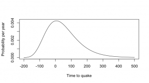
This is a simple and reasonable model for time intervals, and it also has the virtue of giving the same answers that the researchers gave to the press.  Using the estimates of mean and variation in the paper, the distribution of times to the next big quake looks like the first graph.  The quake is relatively predictable, but “relatively” in this sense means “give or take a century”.
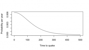
Now, by definition, the next big quake hasn’t happened yet, so we can throw away the part of this distribution that’s less than zero, and rescale the distribution so it still adds up to 1, getting the second graph.  The chance of a big quake is a bit less than 1% per year — not very high, but certainly worth doing something about.  For comparison, it’s about 2-3 times the risk per year of being diagnosed with breast cancer for middle-aged women.
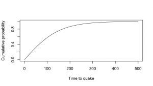
The Herald article (and the press release) quote a 30% chance over 50 years, which matches this lognormal model.  At 80 years there’s a roughly 50:50 chance, and if we wait long enough the quake has to happen eventually.

The risk of a major quake in any given year isn’t all that high, but the problem isn’t going away and the quake is going to make a serious mess when it happens.


[Update: Stuff also has an article. They quote me  (via the Science Media Centre) , but I’m just describing one of the graphs in the paper: Figure 3B, if you want to go and check that I can do simple arithmetic]
June 8, 2012

How dare you measure our air pollution!

For some time, the US Embassy in Beijing has been sending out measurements of local air pollution on Twitter.  These have not always been entirely in agreement with the official readings.  Subsequently, the  Guangzhou and Shanghai consulates have done the same thing.

The government of the People’s Republic of China has formally objected.  They claim that readings from just a few locations are too unreliable to report (a problem that doesn’t seem to affect other nations), and “not only doesn’t abide by the spirits of the Vienna Convention on Diplomatic Relations and Vienna Convention on Consular Relations, but also violates relevant provisions of environmental protection.” 

(via)

April 30, 2012

Marti Anderson interview: Statistics and diving

Statistician and marine biologist Marti Anderson from Massey University talked to Kim Hill on Radio New Zealand National about studying complex biological systems of species. The 18 minute long MP3 recording of the interview is now available online here, or listen below:

Marti was a part of the Department of Statistics at the University of Auckland for many years.