Posts filed under Graphics (394)

November 1, 2013

Inflow and outflow

From a UK real estate ‘insight’ paper, via Twitter, the age distribution of London immigration and emigration

londonage


As a technical quibble, this is the sort of graph that shouldn’t be in JPEG format. It should be in PNG or GIF — you can easily the see artifacts produced by JPEG compression.

October 30, 2013

Evils of axis

From NPR News, a story on the rise of electric bikes. With some unfortunate graphs.

bikeebike


Or, on the same axes

bikes

October 29, 2013

Pie chart of the week

whitepieFrom “Great Schools”, a US website with information about schools, via wtfviz.net

October 24, 2013

Burning issue

I’m in Sydney at the moment, so this is topical, as well as being an illustration of maps, infographics, and internet fact-checking.

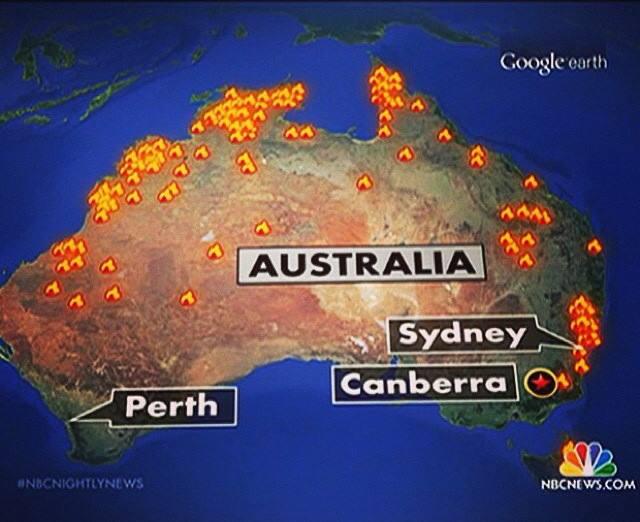
From Paul Rosenzweig on Twitter, allegedly a map of the bushfires shown on NBC News in the US

attributed to NBC News

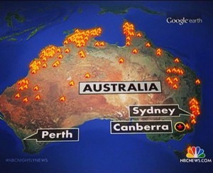
People in Australia think this map is hilarious/outrageous depending on personality — the current emergency was just in New South Wales.  That was my reaction too. But the NBC News blog gets this right, which is a bit confusing

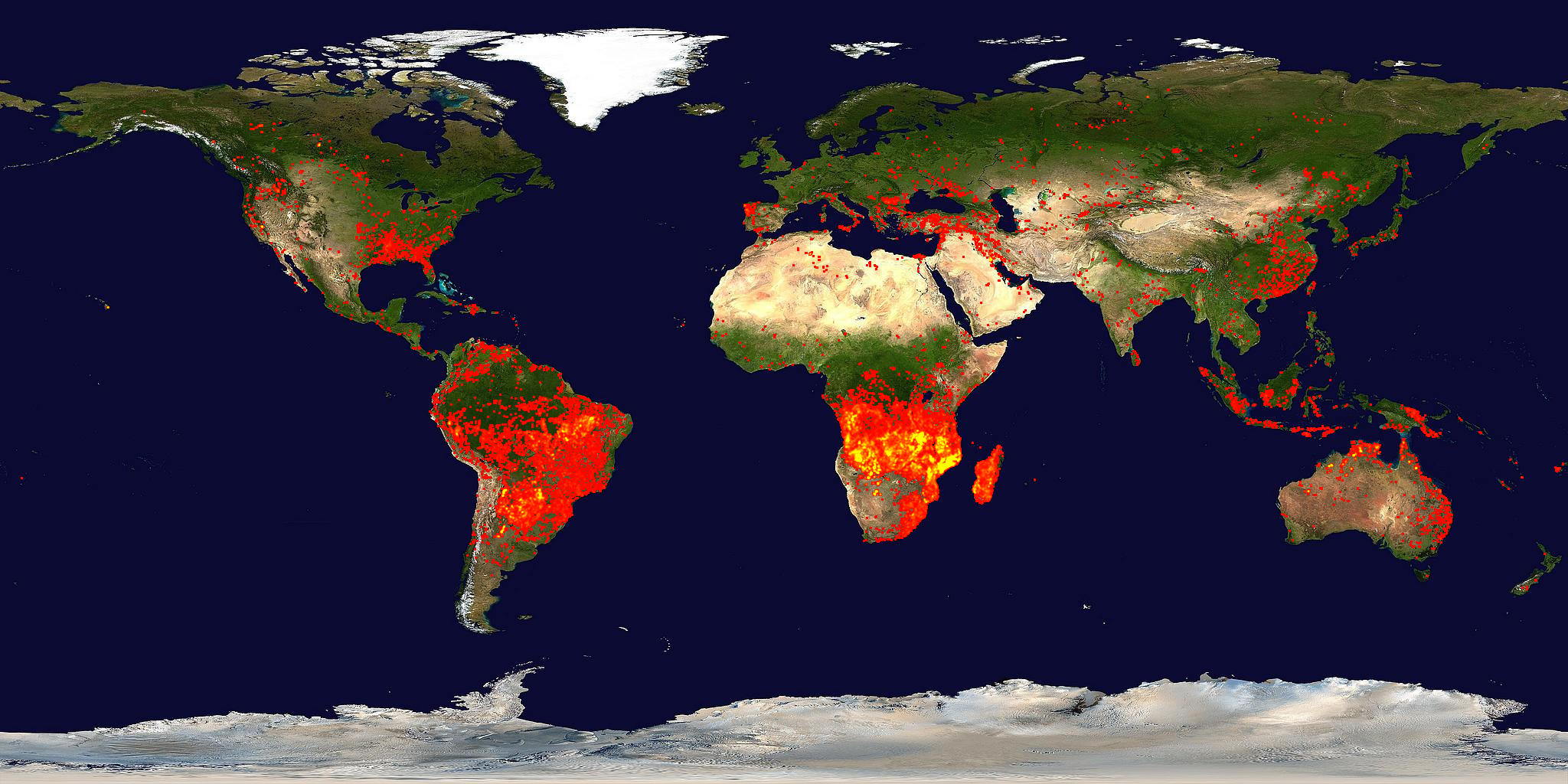
However, @Aus_ScienceWeek, the people who run National Science Week, point out that the map looks rather like the appropriate subsection of NASA’s satellite-based fire map from mid-September

firemap.2013251-2013260.2048x1024


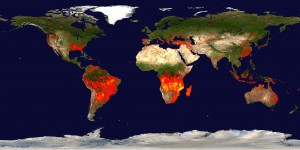
so it might well be correct in the sense that there actually fires in those places, though still wrong as a description of the emergency.


October 22, 2013

Historical infographics

A detailed map of the entire internet, the year I was born

BXIPZhIIAAIG0gM


And now

(via Michael MacAskill)

October 20, 2013

Infographics old and new

  • Abraham Lincoln’s “slave map”, via the New Yorker
  • The UK Data Explorer. Interactive graphics for UK official data, by James Trimble, who is a computing science student at Glasgow University
  • GED VIZ, from the Global Economic Dynamics project in Germany.
October 14, 2013

Briefly

October 9, 2013

Evils of axis

From the US shutdown, via @juhasaarinen: Senator Reid posted this chart showing how the Democrats have been willing to compromise

The axes are a problem, but not in the way you might initially think.  As a standard bar chart, this is missing the bottom 80% of the graph, but the point is to use the budget proposals from President Obama and Representative (and unsuccessful vice-presidential candidate) Paul Ryan as endpoints and illustrate how subsequent proposals have moved.  That is, the problem with the chart is that the Ryan budget should be all the way at the bottom.

Something that might display the message better (at least if redrawn by someone with a modest level of graphic design competence) is

compromise


explicitly using the two proposals as endpoints and showing the movement of the Democrats’ proposal.

October 7, 2013

Caricatures in language space

There’s an interesting (and open-access) paper in the journal PLoS One that I would have expected to attract more media attention both for its results and for its visualisations.

The researchers looked at words that distinguished people by age and gender (or, to be precise, what they had told Facebook were their age and gender). Here’s the female half of the graphic showing male/female distinguishing words (the full image, here, ‘contains language’)

facebook-gender


The clump in the middle are the words that are the most effective evidence that the writer is female. That doesn’t mean these words are especially frequent in women’s Facebook posts, just that they are much less frequent in men’s posts. The green clumps are the most-distinguishing topics, as identified statistically, with the words that define those topics.

Analyses like this are bound to come up with results that look like a caricature, since they are obtained in much the same way that a caricature is drawn, by finding and highlighting the most extreme and distinctive aspects.

October 4, 2013

Tall infographics

More brilliance from XKCD: