September 15, 2013
Briefly
- ChCh Press has a sensible story explaining that apparent clustering of murders is probably just chance variation
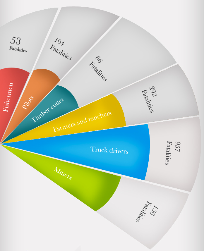
- Just when you thought I was getting tired of pie charts, here’s a beauty from a company that does exhibits for court trials
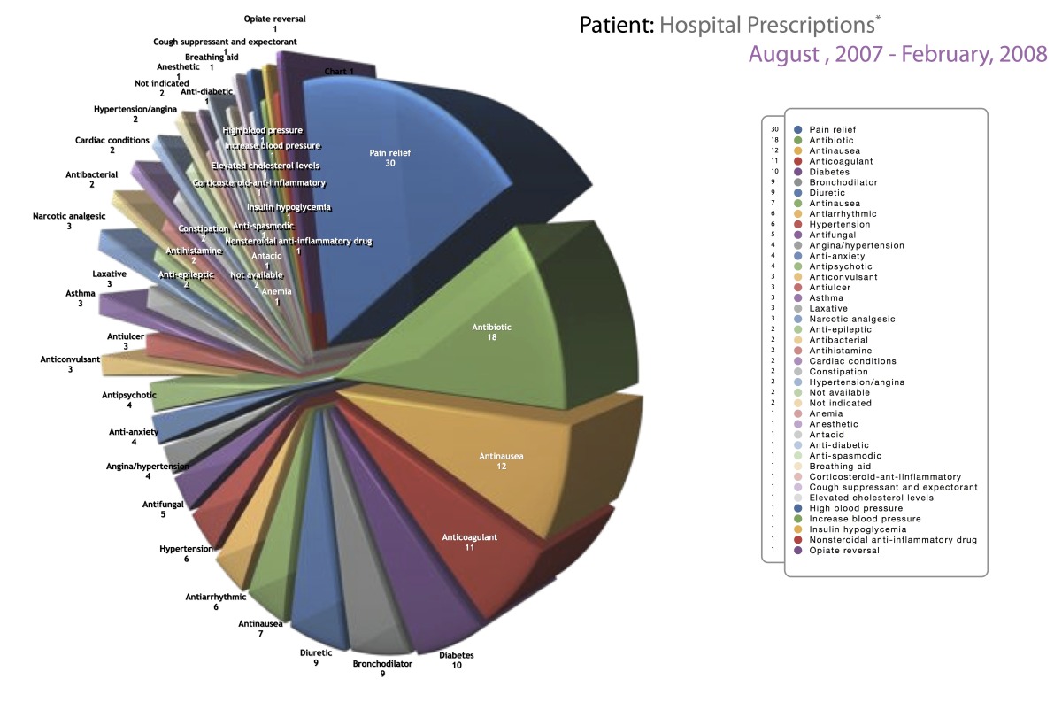
To be fair, the purpose of the chart probably is just to look ugly and complicated, not to convey quantitative information
- A fascinating statistic: 1/3 of emergency calls (111 number) are due to pocket dialing from mobile phones. Since nearly 50% are real, that means Kiwi butts are responsible for twice as many calls as pranks and cranks.