Posts filed under Just look it up (285)

August 13, 2012

Cybercrime misrepresentation soars

From a story in Stuff

The amount of money Kiwis lost to online dating scams has doubled in the past year and now makes up almost two-thirds of all reported online fraud losses.

which then goes on to say

NetSafe operates a website, theorb.org.nz, in partnership with the police, the Consumer Affairs Ministry and other government agencies which lets people report frauds by clicking on an “online reporting button”.

So it’s not a doubling of cybercrime, it’s a doubling of cyberreporting. A bogus poll, in other words.

We then read

The charity claimed in June that cyber-crime cost the country “as much as $625 million” in financial losses once the time and expense in sorting issues, such as removing malware, was included.

If we simultaneously believed the $625 million and believed that the ‘two-thirds’ from online dating scams was meaningful, that would be $400 million per year from online dating scams, which is ludicrous.  So at least one of these figures is bogus.

In fact, they both probably are. The story goes on to say

The estimate was extrapolated from international surveys carried out by Symantec, which sells security software.

NetSafe consultant Chris Hails acknowledged Symantec’s figures had been questioned and said there was no single source of reliable figures.

The journalist is to be commended for at least forcing this admission.  The figures from people selling computer security products are notoriously inflated; there’s a good description of attempts to track down the sources of these numbers from a recent ProPublica article.

It’s hard to visualise big numbers, so it may not be obvious how extreme the $625 million number is.  For example, it’s more than the total profit from NZ beef exports ($2 billion gross, about 25% profit (p22)) , and it’s more than ACC spends on medical treatment each year.
August 6, 2012

Incompetent Australians?

Stuff reports

Lost receipts are costing Australian taxpayers about A$7.3 billion (NZ$9.4b) in total, or about A$1,000 each, according to a Commonwealth Bank survey.

The story in The Australian goes on to mention that Commonwealth Bank is introducing a product to help, so this is basically an advertising press release.  I can’t find out whether the survey is a real survey or some sort of bogus poll (there’s nothing on the Commonwealth Bank media releases page, for example), but there’s clearly something strange about the figures.  If you divde $7.3 billion by $1000, you get 7.3 million.  If you do the same calculations for the time spent looking for receipts, you get about the same figure.  But there are about 12 million Australians who lodge individual tax returns (14.6 million tax returns, 84.7% for individuals), so these figures don’t seem to add up.

[Update (28/8): the media release is up now, but it doesn’t clarify much.  The description suggests this is a bogus poll with reweighting to Census totals, but that doesn’t explain the discrepancy with actual tax returns]

August 5, 2012

One-third of who?

The lead in an otherwise reasonable story about a large employee survey in the Herald today is

Just one-third of New Zealand employees are currently working to their full potential.

If you go and look at the report (the first PDF link on this page), you find that the survey says it’s a stratified random sample, matched on organisation size, and then goes on to say that 93% of respondents “were from private organisations employing 50 or more people”.  At little work with StatsNZ’s business demography tables shows that about 57% of NZ employees work for organisations employing 50 or more people, and when you remove the public-sector employees from the numerator you get down to 42%.  The survey must have specifically targeted people working for large private organisations. Which is fine, as long as you know that and don’t just say “NZ employees”.

Also, the link between “working to their full potential” and what was actually measured is not all that tight.  The 33% is the proportion of respondents who are “engaged”, which means responding in the top two categories of a five-point scale on all eight questions targeting “job engagement” and “organisational engagement”.

Although it’s harder to interpret actual numerical values, since the company seems to use consistent methodology, changes since the last survey really are interpretable (bearing in mind a margin of error for change of around 3%).  And if you bear in mind that the survey was done by people who are trying to sell managers their services, and read the report with an skeptical eye to what was actually measured, it might even be useful.


August 3, 2012

Air pollution and amnesia

From Sam Judd, in today’s Herald:

In 2009, Auckland had 23 micrograms of PM10 (airborne particles smaller than 10 micrometres) per cubic metre of air as an annual average – 3 above the WHO guidelines of 20. …

The much smaller Hamilton is one behind at 22 (which is our national average), wind doesn’t seem to help Wellington which is at 21 and the notoriously smoggy Christchurch (who has been banning woodfire use periodically since 2010) sits at 20.

Most embarrassingly, despite the fact that their cities are far bigger and more concentrated than ours, Australians enjoy air at 13 PM10 and the bustling metropolis of Syndey sits at only 12.

From the Herald, last September 28

WHO’s air quality guidelines recommend a maximum of 20 micrograms of PM10 per cubic metre of air on average but Auckland with 23, Hamilton on 22 and Wellington on 21 all exceeded that.

but the following day

The data has been replaced by 2010 numbers which showed all New Zealand main centres within the WHO safety guidelines of no more than 20 micrograms of PM10 particles per cubic metre of air with the exception of Dunedin which had been the only compliant New Zealand city according to the previous figures.

The World Health Organisation has removed data from its website that suggested New Zealand cities’ air quality was poorer than any major city in Australia

The actual figures were: 15μg/m3 for Auckland, 13 for Hamilton, 11 for Wellington.    It just doesn’t make sense that traffic-related air pollution would be much higher in Wellington than in Melbourne or Sydney, which are much larger, also choked with traffic, and less windy.   If it sounds too good to be true, it’s probably worth checking.

If you want to worry about actual air pollution in New Zealand, it’s the south-east that’s the place: Timaru is the worst (32 μg/m3), and some Otago towns and cities are also bad.  It’s not primarily traffic that’s the problem, but wood smoke.  Christchurch used to be fairly high, but has improved a lot.

July 21, 2012

One of these countries is different

You will have heard about the terrible shootings in Colorado.

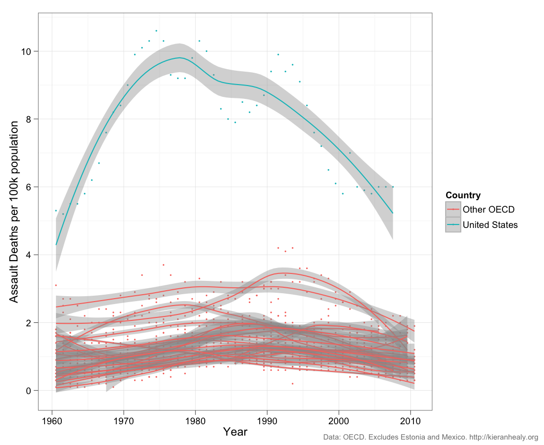
From a post by Kieran Healy, at Crooked Timber, responding to the tragedy: death rates from assault, per 100,000 population per year, for the US and 19 other OECD countries.  New Zealand is roughly in the middle (his post gives separate plots for each country).  Dots are the data for individual years, the curves are smoothed trends with margin of error.

The much higher rate in the US is obvious, but so is the decline.


Part of the decline is attributable to better medical treatment, so that assault victims are less likely to die, but far from all of it.  The rate of reports of aggravated assault is also down over the same time period.  Similarly, simple explanations like gun availability probably contribute but can’t explain the whole pattern.

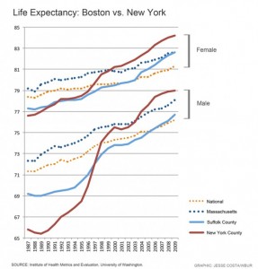
The decline in violent deaths is so large that it shows up in life expectancy comparisons.  New York, and especially Manhattan, used to have noticeably worse life expectancy than Boston, but the falling rate of violent deaths and the improvements in HIV treatment now put Manhattan, and the rest of New York City, at the top of US life expectancy

July 18, 2012

Global Innovation Barchart

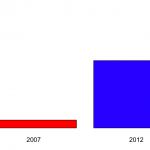
So.  The 2012 Global Innovation Index is out and NZ looks quite good.  Our only Prime Minister has a graph on his Facebook page that looks basically like this.


The graph shows that NZ was at rank 28 in 2007 and is now at rank 13.

A bar chart for two data points is a bit weird, though not nearly as bad as the Romney campaign’s efforts at Venn diagrams in the US.

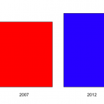
The scaling is also a bit strange.  The y-axis runs from 1 to 30, but there’s nothing special about rank 30 on this index. If we run the y-axis all the way down to 141 (Sudan), we get the second graph on the right, which shows that New Zealand, compared to countries across the world, has always been doing pretty well.


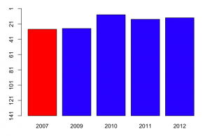
Now, there are some years missing on the plot, and the Global Innovation Index was reported for most of them.  Using the complete data, we get a graph like

So, in fact, NZ was doing even better on this index in 2010, and we get some idea of the year-to-year fluctuations.   Now, a barchart is an inefficient way to display data with just one short time series like this: a table would be better.

More important, though, what is this index measuring.  Mr Key’s Facebook page doesn’t say. Some of the commenters do say, but incorrectly (for example, one says that it’s based on current government policies).  In fact, the  exact things that go into the index change every year.  For example, the 2012 index includes Wikipedia edits and Youtube uploads,  in early years internet access and telephone access were included.  There are also changes in definitions: in early years, values were measured in US$, now they are in purchasing-power parity adjusted dollars.

Some of the items (such as internet and telephone access) are definitely good, others (such as number of researchers and research expenditure) are good all things being equal, and for others (eg, cost of redundancy dismissal in weeks of pay, liberalised foreign investment laws) it’s definitely a matter of opinion.Some of the items are under the immediate control of the government (eg public education expenditure per pupil, tariffs), some can be influenced directly by government (eg, gross R&D funding, quality of trade and transport infrastructure), and some are really hard for governments to improve  in the short term (rule of law, GMAT mean test score, high-tech exports, Gini index).

Since the content and weighting varies each year, it’s hard to make good comparisons. On the plus side, the weighting clearly isn’t rigged to make National look good — the people who come up with the index couldn’t care less about New Zealand — but the same irrelevance will also tend to make the results for New Zealand more variable.   Some of the items in the index will have been affected by the global financial crisis and the Eurozone problems. New Zealand will look relatively better on these items, for reasons that are not primarily the responsibility of the current governments even in those countries, let alone here.

I’d hoped to track down why New Zealand had moved up in the rankings, to see if it was on indicators that the current administration could reasonably take credit for, but the variability in definitions makes it very hard to compare.

Repopulating Canterbury?

Stuff has a story about twins in Canterbury, which is driven by two general human tendencies shared even by statisticians: thinking babies are cute, and overestimating the strangeness of coincidences.  We hear that

Canterbury mums have given birth to 21 sets of twins in the past six weeks.

and

 10 years ago the average would have been about six to eight sets a month.

Using the StatsNZ Infoshare tool (go to Population | Births -VSB | Single and multiple confinements by DHB) we find about 100 sets of multiple births per year in Canterbury DHB and a further dozen or so in South Canterbury DHB, without much change for the past ten years.  That means about nine or so multiple births per month on average.  If you use the average twin rate for all of NZ  (2.7%) and the number of births in the Canterbury region, you get a slightly lower 7.7 sets of twins per month on average.

If there are, on average, 9 multiple births per month, how long would you have to wait for a six-week period with 21?  Because the possible six-week periods overlap, it’s hard to do this calculation analytically, but we can simulate it: 9 per month is 108 per year, which is 108/52 per week.  We simulate a long string of one-week counts from a Poisson distribution with mean 108/52, and see how long we have to  wait between six-week totals of at least 21.  The average waiting time is about two years.  (you have to be a bit careful: the proportion of six-week intervals over 21 is a lot more than one in two years, because of the overlap between six-week intervals)

So, this is a once in two years coincidence if we just look at Canterbury.  It’s much more likely if twin stories from other regions might also end up as news — the probability is hard to estimate, because twins in Canterbury really are more newsworthy than in, say, Waikato.

July 17, 2012

Margin of error yet again

In my last post I more-or-less assumed that the design of the opinion polls was handed down on tablets of stone.  Of course, if you really need more accuracy for month-to-month differences, you can get it.   The Household Labour Force Survey gives us the official estimates of unemployment rate.  We need to be able to measure changes in unemployment that are much smaller than a few percentage points, so StatsNZ doesn’t just use independent random samples of 1000 people.

The HLFS sample contains about 15,000 private households and about 30,000 individuals each quarter. We sample households on a statistically representative basis from areas throughout New Zealand, and obtain information for each member of the household. The sample is stratified by geographic region, urban and rural areas, ethnic density, and socio-economic characteristics. 

Households stay in the survey for two years. Each quarter, one-eighth of the households in the sample are rotated out and replaced by a new set of households. Therefore, up to seven-eighths of the same people are surveyed in adjacent quarters. This overlap improves the reliability of quarterly change estimates.

That is, StatsNZ uses a much larger sample, which reduces the sampling error at any single time point, and samples the same households more than once, which reduces the sampling error when estimating changes over time.   The example they give on that web page shows that the margin of error  for annual change in the employment rate is on the order of 1 percentage point.  StatsNZ calculates sampling errors for all the employment numbers they publish, but I can’t find where they publish the sampling errors.

[Update: as has just been pointed out to me, StatsNZ publish the sampling errors at the bottom of each column of the Excel version of their table,  for all the tables that aren’t seasonally adjusted]

July 9, 2012

Earthquake maps

Stuff is linking to a map of earthquakes by John Nelson of IDV Solutions.  Long-term readers may recall my earthquake map, which uses just the earthquakes since 1973, where the data is more complete.   John Nelson’s map is certainly prettier, but I think mine is clearer.

Kiwi workers say “don’t know” to more migrants?

Or perhaps not. It’s hard to tell.

The Herald’s headline is “Kiwi workers say ‘no’ to more migrants”, with the reported data apparently being on ethnic diversity in the workplace, rather than migration

  • 27% want more
  • 33% want less
  • 40% not sure

Now, the difference between 27% and 33% is smaller than the margin of sampling error based on 200 NZ respondents (and much smaller than the usual ‘maximum margin of error’ calculation), but that’s not the main issue.

Another problem is that “More migrants” is not the same as “more ethnic diversity”, and it’s certainly not the same as “more non-English-speaking background”, which the story also mentions.  (I’m a migrant, I’m from an English-speaking background, and I don’t think preferring Aussie Rules to rugby is the sort of ethnic diversity they had in mind).

More important, though, is the question of whether this is a real survey or a bogus poll.   The story doesn’t say.  If you ask the Google, it points you to a webpage where you can participate in the survey,

In order to continue to provide the most current insights into our modern workplace we need your valuable input.

which is certainly an indicator of bogosity.

On the other hand, Leadership Management Australasia, who run the survey, also give some summary reports.  One report says

The survey design and implementation is overseen by an experienced, independent research practitioner and the systems and process used to conduct the survey ensure valid, reliable and representative samples.

which seems to argue for a real survey (though not as convincingly as if they’d actually named the independent research practitioner).   So perhaps the self-selected part of the sample isn’t all of it, and perhaps they do some sensible reweighting?

If you look at the demographic profile of the survey, though, at least two-thirds of the participants are male, even at the non-managerial level.  Now, in both NZ and Australia, male employment is higher than female, but it’s not twice as high.  The gender profiles are definitely not representative.  So even if the survey is making some efforts to be a representative sample, it isn’t succeeding.


[Updated to add: in case it’s not clear, in the last paragraph, I’m talking about the summary report for second quarter 2011]