Posts filed under Just look it up (285)

April 30, 2012

Drinking age and suicide?

The Herald says “Lower drinking age blamed for high rate of youth deaths” and quotes a University of Auckland researcher, Dr Anne Beautrais,

“Addressing alcohol use and binge drinking in young people in New Zealand is one of the most obvious avenues to reducing both suicide and traffic mortality.”

Dr Beautrais points out that the high suicide rate in NZ can’t just be attributed to better reporting than in other countries. The overall youth death rate is high in NZ, and while diagnosis of suicide might be variable, diagnosis of death is pretty reliable.   That all makes sense.   Road deaths are an important component, and there you’d expect lowering the drinking age to have some effect.

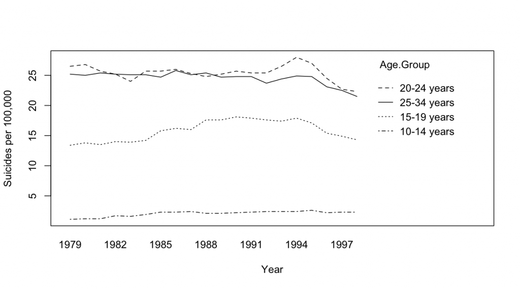
I’m less convinced by the drinking-age argument  for suicide.  One reason is the US experience, where the Reagan administration raised the drinking age to 21 in 1984.  The graph below (data from CDC) shows US male suicide rates by age group across time, and there’s really no sign of a decrease in 1984

April 28, 2012

Malignant iPhones?

The Herald has a headline “Scientists call for urgency on cancer-phone link”.  The actual content is ok, but the story does give the impression that it’s scientific consensus vs evil cellphone companies, which is not remotely true.  There’s a more balanced story in the Daily Mail (and that’s not a sentence you want to find yourself writing too often).

The facts:  there has been an increase in frontal lobe and temporal lobe brain tumours in the UK over the past decade, though not in total brain tumours.   If you lump together the two regions of the brain with increases and exclude all the ones with  decreases, you get about a 50% increase in rates, which comes to a bit less than one extra case per 100,000 people per year.   For context, that’s a bit less than the estimates of numbers of deaths due to phone use while driving.    There was a Danish study last year that did not find any differences between cell phone users and non-users, or differences in side of the head for users, but that doesn’t quite contradict the British results, for two reasons.  Firstly, there’s quite a bit of uncertainty in both sets of estimates, and they are just about compatible with, say, a 25% increase.  Secondly, the Danish study was mostly of non-malignant tumours, which are the most common ones, and the British statistics are for malignant tumours, so it’s possible the effect could be different, though there’s no known reason that it should be.

The increase could be chance (it’s statistically significant, but still), or an increase in diagnosis, or be due to something else entirely.  Or it could, perhaps, be due to cellphones.  In order to be confident it is cellphones we’d need much better evidence, especially as there isn’t really a convincing story yet of how cellphones could promote tumour growth.

The obvious textbook example of time trends revealing a cancer cause is smoking and lung cancer: smoking took off during World War I and lung cancer rates followed. Except that really isn’t the story.  When Richard Doll and Austin Bradford Hill set out to do their pioneering case-control study of lung cancer in London they were both smokers.  They were expecting the increases in lung cancer to be something to do with the dramatic increase in cars and bitumen roads — perhaps car exhaust, or perhaps some of the pollutants that evaporate off as roads are laid.  The real explanation was enough of a surprise that they were planning to extend the study to four additional cities as confirmation before publishing (until confirmation came instead from a parallel US study).   In that case the relative risk was 20 rather than 1.5, and the absolute lifetime risk increase was about 15% rather than about 0.05%, so it was a lot easier (and much more important) to find the real cause.

 The anti-cellphone scientists argue that it’s worth taking steps to reduce cellphone exposure even though the evidence is pretty weak, and they have a point.  The main step they propose is using a headset, preferably wired.  Lots of people are already doing that — if your phone is also your music player,  then headphones are an obvious necessity even if they don’t provide any protection from brain cancer.
 

April 18, 2012

Counting domestic violence

Stuff is reporting on the police decision not to release domestic violence statistics this year, because they are in the middle of a change to a new system.

The police point of view seems sensible here: the only urgent use for the statistics would be to look at short-term trends, and this is meaningless if the definitions are changing.   The real question is whether the change in definitions is an improvement or not.

Domestic violence statistics are more complicated than many crime statistics because the legal system tends to organize statistics by which crime was committed.  Domestic violence isn’t a single crime — it’s a subset of a range of crimes — so it can’t be worked out retrospectively from other crime statistics, and it doesn’t have a unique legal definition.  The police say that they current change is to adopt a more similar definition to Australia.

April 13, 2012

What’s wrong with this picture?

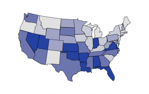
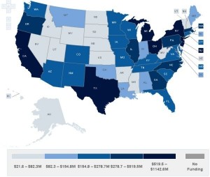
It’s not just the NZ media that has problems with denominators.  This graph from the Washington Post shows where US Federal health reform money is being spent.  And, surprise, surprise, there’s more money being spent in states with large populations.

The map is actually from the Kaiser Family Foundation, and they even have a cute interactive version that lets you look at different subcategories of funding.  What they don’t let you do is standardize by any useful denominator: population, health care expenditure,…   They do let you look at the map both in dollars and in fraction of the total, but, not surprisingly, it looks exactly the same on both scales.

Fortunately it isn’t hard to find the populations of US states, and R lets us draw pretty maps.  Below is the same map coloured according to per-capita Federal health reform funding, which looks almost completely different.

March 30, 2012

Powerball and the Kelly criterion

A popular decision rule for investment and other forms of gambling is the Kelly criterion, named after mathematician (and successful investor) John Kelly.  In the long run, following this rule will maximise long-run expected wealth.

If we assume that the story in Stuff about Wairarapa bettors having had a 2:1 return in the past year can be applied to tomorrow’s Powerball (which it can’t), we can look at what that would imply about rational betting.

The Kelly criterion specifies what fraction of your total wealth you should spend on an investment opportunity.  The fraction is always less than your probability of winning.  With 2:1 expected payoff and large odds, the recommended fraction is about half the probability of winning

The chance of the top Powerball prize (since this isn’t a ‘must win’ week) is 1 in 38 million for a $1 bet, so you should bet less than 1 dollar for each 76 million dollars of your current disposable wealth.   For most of us, that’s less than one dollar.

It’s worth noting that while not everyone supports the Kelly criterion, most of the critics suggest that you should bet less than the criterion recommends, not more.

(via a commenter at Cornell physics blog The Virtuosi)

March 27, 2012

Better than nothing

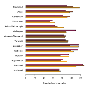
Our helpful commenters provided alternative suggestions on how the intersection car crash rates could have been standardised, instead of using population of each region

Number of registered vehicles is a bit of a pain, because it is reported for postal districts, not for regions.  I assumed that postal districts are a partition of regions (I couldn’t confirm or deny this immediately), and did a bit of Wikipedia. Presumably an NZ journalist could do this quicker than me, and would already know, for example, that the Canterbury:Otago border passes between Timaru and Oamaru.

It doesn’t matter a lot which standardisation you use.  The graph below (click to embiggen) shows all three, scaled so NZ as a whole is 100.  The orange bars are by population, the brown bars by km, and the maroon bars by registered vehicles.  The most striking difference is probably for Wellington, where the rate per registered vehicle is high: there are fewer registered vehicles per capita than in the rest of the country.

All three versions confirm that there is much less variation than the Herald story would suggest, and that  urbanisation is likely responsible.  Error bars would be nice, but I don’t know what the uncertainties in the NZTA denominators are like.

March 26, 2012

Student drinking

A story in Stuff about student drinking at Otago illustrates an important problem with surveys.  According to the story, the students drank on average two nights a week, and consumed 7.2 drinks per night of drinking.  That gives an average of about two drinks per day, which is about the same as average for the whole country based on total alcohol sales.

I don’t know about you, but I find this a little hard to believe. The newspapers should find it even harder to believe, since it contradicts their usual line about Otago students.

My guess is that Otago students do drink a bit more than the average Kiwi, but that asking people to report their drinking leads to underreporting compared to looking at total sales.  There could be several reasons.  One is that people might not want to admit how much they drink, another is that there may be difficulties in converting actual glass sizes into standard doses, and a third is that people’s “average week” is usually different from their actual week.  Perhaps you `usually’ drink less, but this week was Sam’s birthday and you drank more.  And last week was the keg party. And before that was the start of semester. And so on.

That’s not the point of the story, though.  The point is that new research finds heavy drinking can make you feel unwell and have difficulty concentrating even the next day;  the effects seem to hang over and affect your daily activities. Perhaps someone could come up with a catchy name for this phenomenon…

March 18, 2012

The Demon Drink

On 3 News last night, we got a tour of South Auckland, just missing various drunken disturbances.   The video starts “3News has uncovered some shocking figures about the amount of alcohol some offenders are drinking” , and the webpage story says  “new research has revealed the alarming impact alcohol is having on crime“.

That’s approximately truish.  The `new research’ is a report dated December 2010 by the New Zealand Drug Use Monitoring (NZ‐ADUM) research programme at Massey University.  They surveyed 800 arrestees in Whangarei, Auckland Central, Wellington Central, and Christchurch Central, asking them about their drug and alchol use.   And there was a lot of drug and alcohol use — evidently, police arrests are selecting for people who are insufficiently risk-averse in all sorts of ways.  The figures possibly qualify as ‘shocking’, with arrestees reporting an average of 12 standard drinks both on typical days when they drink, and on the day they were arrested.  Some people reported much higher consumption, and some reported none.

3News compares this to “The average New Zealander drinks around two standard drinks a day”, which looks like this StatsNZ figure on total alcohol sales.  In addition to the problems of comparing self-reported drinking with sales data, the national average is over all days and the arrestee average is over days when they drank.  Since the arrestees reported drinking an average of about 1 day in 3, the correct comparison to 2 drinks/day is 12/3=4 drinks per day, about twice the NZ average.    The arrestees also consumed more tobacco, more cannabis, more P, more opioids, more ecstasy, and more of everything else than the average Kiwi; in fact, as far as I can tell alcohol showed a smaller difference than any of the other drugs — mostly because the average for all New Zealanders is fairly high.

The other notable statistic about drinking is that the average drinks per day that they drank was the same as the average drinks on the day they were arrested.  That is, although many of the arrestees were drunk when they were arrested, they were no drunker than they usually are on about one day in three.   The relative risk of arrest given their heavy drinking for these arrestees is thus about 3, which is a lot smaller than I would expect even without the headlines.  If you read the report, while alcohol is unquestionably a problem, it is far from the only problem that the arrestees have.


March 7, 2012

Smoking wrecks the economy

Our Stat-of-the-Summer was a miscalculation of the individual costs of smoking.  A correspondent has pointed me to an international correlation on the same topic.  Economists at ConvergEx have found a strongish correlation across countries between debt:GFP ratio and smoking.  The economists went as far as saying

“The relationship is strong enough that counting the cigarette butts in the ashtrays of street-side cafes around the world could be safely called `sovereign credit research’,” said Nicholas Colas, chief market strategist at ConvergEx.

That’s clearly nuts, but is the correlation telling us something useful or even interesting?  Could it really be true, as the correlation would suggest, that sovereign debt is the biggest factor affecting smoking rates (or, almost equally plausibly, vice versa)?

One empirical indication that ashtrays are not the best place to find national debt data comes from looking at changes over time.  Public debt is a cumulative process, so even more than usual we can quote the biologist D’Arcy ThompsonEverything is the way it is because it got that way”.

Over time, in the US, Britain, Australia, New Zealand, and many other countries, smoking reached a maximum among people born at the start of the twentieth century and has now been decreasing in popularity (because it, you know, kills you and stuff).  The pattern of public debt in those countries has been quite variable.  In Australia, debt ballooned and has now shrunk again.  In NZ, debt is increasing.  In the USA then debt:GDP ratio went down to a post-war minimum in the Clinton years and has been increasing again.  Also, the reasons for the changes are different in different countries — US debt is up largely because of tax cuts, but Australian debt is down in part because of better commodity prices.

So, over time, there is no consistent correlation between smoking and sovereign debt:GDP.  That being the case, it’s hard to see how the correlation across countries right now could be anything other than a coincidence.

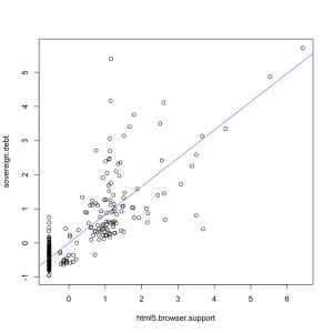
If you ask Google Correlate what is correlated with “sovereign debt” as a web search term, you find out that “html 5 browser support”, rather than “smoking” has the strongest correlation (0.82) among terms that aren’t specifically debt-related, as in the graph on the left.  That makes about as much sense.


February 19, 2012

Dog bites man

The NZ Herald is reporting that more people died in NZ last year than in any previous year. Since

  • the population is expanding
  • the average age of the population is increasing

we’d expect record numbers of deaths to be the rule rather than the exception.  And that’s what Statistics New Zealand shows us: