Posts filed under Just look it up (285)

February 13, 2012

Tip of the icecube

The Dominion-Post is reporting ‘hundreds of unfit teachers in class’.  They haven’t made any attempt to scale this by the number of teachers, or compare it to other professions, or basically anything that would make the number interpretable.

The number of teachers employed at State or State Integrated schools in NZ as at April 2011 was 52460. This misses out the non-integrated private schools, but they are a small fraction (4% of students).   With 664 complaints over two years, that is a rate of 1 complaint per 158 teachers per year.  About half the complaints are dismissed.

For comparison we need other professions where the public can make complaints to independent adjudicators.

  • As of June 2008 there were 8230 sworn members of the police force in NZ. In the most recent single year where data are available (2010/11), there were 2052 complaints to the Independent Police Conduct Authority, that is, 1 complaint per 4 police per year.  Half the complaints were Category 5, ie, minor, too late, or otherwise not worth proceeding with.
  • As of the last Census, there were 4284 people in NZ employed as reporters, editors, or sub-editors.  This probably overstates the number of journalists relevant to the Press Council, since it includes technical editors, book editors and so on.  The Press Council received 149 complaints in 2010, the last year for which they have published a report. In that year, 65 complaints went to adjudication (1 complaint per 66 journalists per year), and about half of these were upheld.

In all three professions roughly half the formal complaints that make it to the independent adjudicators are upheld and half are dismissed, but journalists are twice as likely as teachers to receive formal complaints, and police are about forty times more likely.

It’s quite likely that the headline is literally true: there probably are hundreds of unfit teachers, but that’s likely under 1% of all teachers.  It’s worth trying to weed them out, but not without considering the costs.  In any case, the amount of fainting and clutching of pearls the situations warrants is pretty limited.
 

February 10, 2012

Not incoherent, just wrong.

NZ Herald yesterday

Since Queen’s Birthday weekend 2010, the tolerance has been lowered for speeding drivers to only 4km/h for public holidays, which police say has led to a drop in fatal crashes during these periods.A police spokesperson told the Dominion Post crashes during holiday periods had been cut by 46 per cent.

 Clive Matthew-Wilson, editor of the Dog and Lemon Guide, … accused the police of “massaging the statistics to suit their argument”. “When the road toll goes down over a holiday weekend, the police claim credit. When it rises by nearly 50 per cent, as it did last Christmas, they blame the drivers. They can’t have it both ways.”

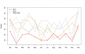
In fact, it’s not at all impossible that the reduction in deaths was due to the lower speeding tolerance, and that the increase over last Christmas was due to unusually bad driving.  The police argument is not logically incoherent.  It is, however, somewhat implausible.  And not really consistent with the data.


monthly road deaths since 2006If the reduction during holiday periods since the Queen’s Birthday 2010 was down to the lowered tolerance for speeding, you would expect the reduction to be confined to holiday periods, or at least to have been greater in holiday periods.  In fact, there was a large and consistent decrease in road deaths over the whole year. The new pattern didn’t start in June 2010: July, October, and November 2010 had death tolls well inside the historical range.

The real reason for the reduction is deaths is a bit of a mystery.  There isn’t a shortage of possible explanations, but it’s hard to find one that predicts this dramatic decrease, and only for last year.  If it’s police activities, why didn’t the police campaigns in previous years work?  If it’s the recession, why did it kick in so late, and why is it so much more dramatic than previous recessions or the current recession in other countries?  The Automobile Association would probably like to say it’s due to better driving, but that’s a tautology, not an explanation, unless they can say why driving has improved.

February 1, 2012

More potential StatsChat readers!

The Auckland population is predicted to hit 1.5 million this week, and we actually have an example of good reporting of statistics to commemorate the occasion.

Of course, I did find one point to nitpick: the Stats NZ expert quoted by the Herald,  Andrea Blackburn, says

“The 1.5 millionth person could be a migrant coming from overseas, or from within New Zealand, but it is most likely to be a baby, because births add more than net migration to Auckland’s population growth.”

Surely in this context it’s gross rather than net migration that counts.  Suppose net migration were zero — that wouldn’t mean that the 1.5 millionth person was certain to be a baby rather than an immigrant. And what if net migration were negative?

There don’t seem to be figures for gross immigration rather than births, but if we ignore migration within NZ and conservatively guess that Auckland gets about 1/3 of the country’s immigrants, that would mean about 28000 permanent and long-term arrivals per year, compared to about 23000 births.  The 1.5 millionth Aucklander has about an even chance of being a migrant or being a cute little baby.

[Update: as commenter Andrew points out, the Mayor has annointed his own cute little 1.5Mbaby.   Also, a lot of the media seem to think citizenship and residence are the same: Auckland has 1.5m residents, not citizens.  And the mayor of Invercargill thinks moving to Auckland is unfair and should be stopped].

January 30, 2012

Global temperatures for 2011

NASA’s annual summary of global temperatures is out.  2011 was not the warmest year on record, it was only ninth, a whole eighth of a degree cooler than last year.  One of the years that beat 2011 wasn’t even in the twenty-first century. [It was 1998.]

January 26, 2012

Unfaithful to the data, too.

When I were young, the Serious News Outlets  probably wouldn’t have admitted the existence of extra-marital affairs by non-celebrities, let alone written an article that’s basically advertising from an infidelity website press release.

In some ways the data are better-quality than most advertorials, because the website has complete data on its NZ members.  They have even gone as far as using population sizes for NZ cities to estimate their, um, market penetration, which varied across the five main cities by as much as 0.06%.  No, that doesn’t exceed the margin of error.

The Herald’s article starts off

If your partner supports National, has a PC, drinks Coke, eats meat, has a tattoo, smokes and is a Christian, be warned – they could be a cheater.

Leaving aside the gaping logical chasm in identifying website members as representative of all ‘cheaters’, what the data actually say is that more members support National, not that more National supporters are members.   As you may recall, we determined not so long ago that more New Zealanders of all descriptions support National than any other party, so that’s what you would expect for members of the website.   The proportion of National supporters in the election was 47%, among website members it’s 33%, so National supporters are substantially less likely to be members of the website than supporters of other parties. The proportion identifying as Christian among website members is very similar to the proportion in the 2006 census.   79% of website users are on PC (vs Mac).  Again that’s a lower proportion of PCs than in the population of NZ computers (the Herald said 10% were Macs in July 2010, and for Aus+NZ combined, IDC now says 15%) but one explanation is that Macs have more of the home market than the business market.  More members drinking Coke vs Pepsi is also not surprising — I couldn’t find population figures, but Coke dominates the NZ cola market.

The story doesn’t say, but we can also be pretty confident that the website members are more likely to be Pakeha than Maori, more likely to be accountants than statisticians, and more likely to have a pet cat than a pet camel.


January 16, 2012

Midas in Hollywood

Today’s topic is not precisely statistics, but the ability to do simple arithmetic and look up facts online are useful statistical skills.

At the Golden Globes awards, the dessert at dinner was sprinkled with edible gold flakes “at US$135 per gram”. This led to descriptions like “untrammeled excess” and “a dessert that is literally as difficult to acquire as gold dust”. Journalists don’t seem to have enquired as to how difficult or expensive it is to acquire gold dust. Obviously they don’t remember Goldschlager — the vile cinnamon schnapps with gold flakes popular in the 1990s — which is quite possible, given its after-effects.

One of the distinguishing features of gold is its ability to be hammered very, very thin.  A gram of gold can make a square metre of gold leaf. So, at gold-bullion prices, a 10cm x 10cm sheet of gold leaf, to cover an entire plate, would cost less than a couple of dollars. A 1cm x 1cm piece, enough to make some impressive gold flakes, would be a couple of cents. And in fact, culinary gold leaf is available at close to bullion prices: Amazon.com is out of stock at the moment, I found a British supplier that sells 8cm x 8cm leaves for 66p each (in packs of 25). Culinary gold is cheaper per serving than, say, saffron, which wouldn’t have excited any comment.

The gold flakes would be cheap compared to the ‘fresh berries’ (in mid-winter) in the dessert and not even a rounding error compared to the vintage champagne (Moet & Chandon 2002) served with it.

I’m sure there are better uses for the money spent on the Golden Globe awards, but the cost of gold flakes is just so not the issue.  The campaigners and reporters are making the same mistake that the TV ads for investment gold want you to make: to forget, like King Midas, that gold is just another  commodity metal.

January 12, 2012

Who you gonna call?

Keith Humphreys, an addiction researcher at Stanford, writes The newest Behavioral Risk Factors Surveillance System survey by the US CDC shows a substantially higher rate of binge drinking than in past surveys.  BRFSS is the world’s largest telephone survey, and in 2009 they started calling cellphones for the first time.

Cellphone users, and especially those who don’t have any landline phone, are a lot younger on average than the rest of the population.  That in itself need not be disastrous for surveys, since we know what proportion of the population is in each age group, and can rescale the numbers to remove the bias.  The problem is that cellphone users also are different in other ways that are harder to measure, as the CDC’s experience shows.

January 9, 2012

Bad Aussies! No beer!

Stuff.co.nz is reporting that twice as many Australians were arrested overseas last year as ten years ago.  A couple of minutes searching finds an Australian Social Trends report, from the Australian Bureau of Statistics, showing that, yes, trips overseas by Australians also doubled from 2000 to 2010.

Even better would be data on total time spent overseas by Aussies.  That must be available — they collect it when you re-enter the country — but I don’t want to spend more than ten minutes on this. It’s not my day job.

January 3, 2012

Overgeneralising again.

The NZ Herald online has had two stories in two days on a survey by Southern Cross Health Society.  The survey reported cancer as the number one health fear of Kiwis.  That would be the minority of Kiwis with private health insurance. Or, though the actual survey population isn’t stated anywhere, probably the smaller minority of Kiwis who are members of Southern Cross.

I don’t know whether the cancer fear finding generalises to the whole population, and neither do they, but I’m certain the screening results they report do not.  They say more than 80% of men aged 55-64, and 93% of men over 65 had a prostate cancer screening test within the past year.  Figures based on a national survey published in 2010 by the University of Otago, show that about 44% of men 60+ and 17% of men 40-60 had a PSA test in the the previous year (which includes diagnostic and post-treatment as well as screening tests).  Only 64% of men over 60 had ever had a PSA test of any sort and only 32% had ever had a screening PSA test as part of primary care.   It’s hardly surprising that people with private health insurance get more screening, though it’s still not completely clear to anyone except perhaps Paul Holmes whether the extra PSA screening is doing them any good.

The statistical message is simple: surveys only measure what they measure, not what you would like them to have measured. Get over it.

January 1, 2012

Deadliest jobs

Q: What proportion of fatal car crashes involve an alcohol-impaired driver

A: I can’t find the NZ figures, but according to the Centers for Disease Control and Prevention, in the US it’s about 1 in 3

Q: Since everyone involved is sober in 2/3 of crashes, does that mean it’s safer to drive drunk?

A: Why would you ask such a stupid question?

(more…)