Posts filed under Just look it up (285)

December 17, 2011

Seasonally-adjusted good news.

The Herald, along with many other sources, reports on US employment: “Far fewer Americans are seeking unemployment benefits than just three months ago – a sign that layoffs are falling sharply.”  By the standards of the US recession, this qualifies as good news, though the bar has to be set pretty low.  A fall in layoffs, on its own, just means that things aren’t getting worse as quickly, and the time limit on eligibility means that an increasing number  of  people are falling off the end of benefits.

Actual unemployment figures are also positive, but a bit less so.  The unemployment rate fell by 0.5%, but half of that was people who stopped looking for work.  Total employment is up, by an estimated 280,000 people, which is promising [the figure of 120,000 given by the Herald is ‘total non-farm payroll employment’].

The real problem in interpreting these numbers is that the increase in employment and the decrease in applications for benefits are both much smaller than the seasonal adjustment factor (as Brad DeLong points out).  Without seasonal adjustment, the total increase in jobs was only 80,000, more than three times smaller.

The basic idea of seasonal adjustment is uncontroversial  — there’s lots of variation over the year in employment in retail, construction, and  farming, and the education system releases a wave of new labour force members at the end of each academic year.  However, in a recession that’s unprecedented since good-quality records began, it’s hard to predict the seasonal variations exactly right.   A small error in the seasonal adjustment could wipe out the apparent gains entirely. And a while seasonally-adjusted employment is the right indicator for the economy as a whole, you can’t afford much Christmas cheer with only a seasonally-adjusted new income.

 

November 24, 2011

Interactive map of US road deaths

Zoom in anywhere in the US and see the locations, with icons indicating year and who died.

They also have a UK map, and are interested in expanding to other countries where the data are available.

November 23, 2011

Visualising money

Randall Monroe, at XKCD, has produced another of his amazing charts (click for the full-size version).

Money: a chart of (almost) all of it, where it is, and what it can do.

November 17, 2011

Blaming road deaths on mum

Over-protective mothers are now being blamed for road deaths among teenage boys.  I suppose it’s a change from saying that overprotective mothers make boys gay, as Freud famously imagined.

We’ve written before about the problem of seeing and trying to explain a trend when there’s really nothing there but random variation.  That isn’t what’s happening here.  In this case the trend is real. It’s just in the opposite direction to the explanation. (more…)

November 14, 2011

In real terms

Housing prices are in the news again, and I was curious to see how much of the change in prices is just ordinary inflation, and how much is real improvement. Over the past 45 years, housing prices have increased more than fifty-fold.  Barfoot & Thompson like to point this out, and they have a graph of Auckland prices that is designed to show the increase very dramatically.  But other things from apples to yachts are also more expensive than they were in the past. (more…)

October 30, 2011

New climate change datasets: boring but useful results. (updated)

The Berkeley Earth Surface Temperature project has just released its first data sets and analyses.  The aim of this project is to summarise all the temperature records around the world in a comprehensive and transparent way, both to get an estimate of changes in global temperature and to make it easy to see the impact of  data quality filters that have been applied by previous climate modelling projects.  So far, they have analysed all the land measurements; ocean measurements are coming next. You can download the data and code yourself, and check their findings or explore further (if you actually want 1.6 billion temperature measurements — don’t try this on a smartphone).

The main finding of the project won’t surprise most people: it’s getting hotter. More importantly, the estimates based on all available data agree almost perfectly with the previous estimates that were based on a small subset of ‘best’ weather stations.  Incorporating lower-quality stations doesn’t change the estimates. Even using just the low quality stations gives pretty much the same estimates. Other things that don’t affect the results include the urban heat island effect: cities are hotter than the countryside, but most of the world isn’t in a city. They’ve also made a neat movie of the climate since 1800: you can see the normal oscillations over time, and the heating trend that eventually swamps them.

Combining temperature records with varying quality, measurement frequency, and duration, is a major statistical task even without considering the volume of data involved. The statistical expertise on the Berkeley Earth team includes an Auckland Stats graduate (and Berkeley Stats PhD), Charlotte Wickham.

Updated to add: this is now in the Kiwi media: NZ Herald, Stuff, 3 News.

Poisson variation strikes again

What’s the best strategy if you want to have a perfect record betting on the rugby?  Just bet once: that gives you a 50:50 chance.

After national statistics on colorectal cancer were released in Britain, the charity Beating Bowel Cancer pointed out that there was a three-fold variation across local government areas in the death rate.  They claimed that over 5,000 lives per year could be saved, presumably by adopting whatever practices were responsible for the lowest rates. Unfortunately, as UK blogger ‘plumbum’ noticed, the only distinctive factor about the lowest rates is shared by most of the highest rates: a small population, leading to large random variation.

funnel plot of UK colorectal cancer His article was picked up by a number of other blogs interested in medicine and statistics, and Cambridge University professor David Speigelhalter suggested a funnel plot as a way of displaying the information.

A funnel plot has rates on the vertical axis and population size (or some other measure of information) on the horizontal axis, with the ‘funnel’ lines showing what level of variation would be expected just by chance.

The funnel plot (click to embiggen) makes clear what the tables and press releases do not: almost all districts fall inside the funnel, and vary only as much as would be expected by chance. There is just one clear exception: Glasgow City has a substantially higher rate, not explainable by chance.

Distinguishing random variation from real differences is critical if you want to understand cancer and alleviate the suffering it causes to victims and their families.  Looking at the districts with the lowest death rates isn’t going to help, because there is nothing very special about them, but understanding what is different about Glasgow could be valuable both to the Glaswegians and to everyone else in Britain and even in the rest of the world.

October 3, 2011

Emigration graphics

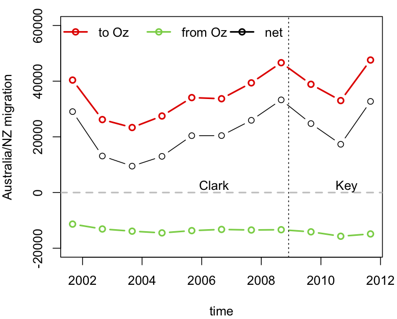
The big problem with our stat-of-the-week was the graphics.  While David Farrar’s redesign to add the early years of Helen Clark’s government provides some context, a cumulative graph is not a good way to see changes over time.   For anyone who actually wants to see the immigration/emigration rates over time, rather than just making a political point, here is a non-cumulative graph using data I downloaded from Stats New Zealand.  The dots are totals for the 12 months ending August each year (the most up-to-date values available).

Disaggregating immigration and emigration is helpful here: immigration from Australia has been roughly constant, but emigration to Australia fluctuates a lot, on top of a weak upwards trend.

Noted for the record

One of the reasons statistics is difficult is the ‘availability heuristic’. That is, we estimate probabilities based on things we can remember, and it’s a lot easier to remember dramatic events than boring ones.  It’s not just that correlation doesn’t imply causation; our perception of correlation doesn’t even imply correlation.

To help with availability, I’d like to make two boring and predictable observations about recent events.

1.  This winter, despite the Icy Polar Blast™, was slightly warmer than the historical average, as forecast.

2. There wasn’t a major earthquake in ChCh in the last week of September, despite the position of the moon or the alignment of Uranus (or anything else round and irrelevant).

September 21, 2011

Depressing news now more widely available

The Federal Reserve Bank of St Louis (part of the US Federal Reserve), who run the excellent FRED economic data website, have now released a free iPhone/iPad app that lets you download depressing economic statistics and graphics wherever you are.

There probably aren’t many people in New Zealand who would want this, but I bet they are over-represented among our readers.