Posts filed under Risk (222)

October 18, 2016

The lack of change is the real story

The Chief Coroner has released provisional suicide statistics for the year to June 2016.  As I wrote last year, the rate of suicide in New Zealand is basically not changing.  The Herald’s story, by Martin Johnston, quotes the Chief Coroner on this point

“Judge Marshall interpreted the suicide death rate as having remained consistent and said it showed New Zealand still had a long way to go in turning around the unacceptably high toll of suicide.”

The headline and graphs don’t make this clear

Here’s the graph from the Herald

suicide-herald

If you want a bar graph, it should go down to zero, and it would then show how little is changing

suicide-2

I’d prefer a line graph showing expected variation if there wasn’t any underlying change: the shading is one and two standard deviations around the average of the nine years’ rates

suicide-3

As Judge Marshall says, the suicide death rate has remained consistent. That’s our problem.  Focusing on the year to year variation misses the key point.

June 22, 2016

Making hospital data accessible

From the Guardian

The NHS is increasingly publishing statistics about the surgery it undertakes, following on from a movement kickstarted by the Bristol Inquiry in the late 1990s into deaths of children after heart surgery. Ever more health data is being collected, and more transparent and open sharing of hospital summary data and outcomes has the power to transform the quality of NHS services further, even beyond the great improvements that have already been made.

The problem is that most people don’t have the expertise to analyse the hospital outcome data, and that there are some easy mistakes to make (just as with school outcome data).

A group of statisticians and psychologists developed a website that tries to help, for the data on childhood heart surgery.  Comparisons between hospitals in survival rate are very tempting (and newsworthy) here, but misleading: there are many reasons children might need heart surgery, and the risk is not the same for all of them.

There are two, equally important, components to the new site. Underneath, invisible to the user, is a statistical model that predicts the surgery result for an average hospital, and the uncertainty around the prediction. On top is the display and explanation, helping the user to understand what the data are saying: is the survival rate at this hospital higher (or lower) than would be expected based on how difficult their operations are?

June 14, 2016

Why everyone trusts us

  • In the UK, there’s been a big increase in the use of National Health Service data to track illegal immigrants — this was previously just done for serious criminals. (Buzzfeed)
  • CHICAGO — In this city’s urgent push to rein in gun and gang violence, the Police Department is keeping a list. Derived from a computer algorithm that assigns scores based on arrests, shootings, affiliations with gang members and other variables, the list aims to predict who is most likely to be shot soon or to shoot someone. New York Times
  • There’s a new UK website that does detailed analysis of your social media to tell your landlord whether you’ll be able to pay your rent. “If you’re living a normal life,” Thornhill reassures me, “then, frankly, you have nothing to worry about.” (Washington Post)
  • “We don’t turn people away,” Might said, but the cable company’s technicians aren’t going to “spend 15 minutes setting up an iPhone app” for a customer who has a low FICO score.  (fiercecable, via mathbabe.org)
  • Another startupclaims it can “reveal” your personality “with a high level of accuracy” just by analyzing your face, be that facial image captured via photo, live-streamed video, or stored in a database. It then sorts people into categories; with some labels as potentially dangerous such as terrorist or pedophile,” (also via mathbabe.org)
June 13, 2016

Reasonable grounds

Mark Hanna submitted an OIA request about strip searches in NZ prisons, which carried out with ‘reasonable grounds to believe’ the prisoner has an unauthorised item.  You can see the full response at FYI. He commented that 99.3% of these searches find nothing.

Here’s the monthly data over time:

searches
The positive predictive value of having ‘reasonable grounds’  is increasing, and is up to about 1.5% now. That’s still pretty low. How ‘reasonable’ it is depends on what proportion of the time people who aren’t searched have unauthorised items: if that were, say, 1 in 1000, having ‘reasonable grounds’ would be increasing it 5-15-fold, which might conceivably count as reasonable.

We can look at the number of searches conducted, to see if that tells us anything about trends
conducted
Again, there’s a little good news: the number of strip searches has fallen over the the past couple of years. That’s a real rise and fall — the prison population has been much more stable. The trend looks very much like the first trend upside down.

Here’s the trend for number (not proportion) of searches finding something
finds
It’s pretty much constant over time.

Statistical models confirm what the pictures suggest: the number of successful searches is essentially uncorrelated with the total number of searches. This is also basically good news (for the future, if not the past): it suggests that a further reduction in strip searches may well be possible at no extra risk.

May 24, 2016

Knowing what you’re predicting: drug war edition

From Public Address,

The woman was evicted by Housing New Zealand months ago after “methamphetamine contamination” was detected at her home. The story says it’s “unclear” whether the contamination happened during her tenancy or is the fault of a previous tenant.

There’s no allegation of a meth lab being run; the claim is that methamphetamine contamination is the result of someone smoking meth in the house.

The vendors claim the technique has no false positives, but even if we assume they are right about this they mean no false positives in the assay sense; that there definitely is methamphetamine in the sample.  The assay doesn’t guarantee that the tenant ‘allowed’ meth to be smoked in her house. And in this case it doesn’t even seem to guarantee that the contamination happened during her tenancy.

It’s not just this case and this assay, though those are bad enough. If predictive models are going to be used more widely in New Zealand social policy, it’s important that the evaluation of accuracy for those models is broader than just ‘assay error’, and considers the consequences in actual use.

May 4, 2016

Should you have bet on Leicester City?

As you know, Leicester City won the English Premier League this week. At the start of the season, you could get 5000:1 odds on this happening. Twelve people did.

Now, most weeks someone wins NZ Lotto first division, which pays more than 5000:1 for a winning ticket, and where we know the odds are actually unfavourable to the punter. The 5000:1 odds on their own aren’t enough to conclude the bookies had it wrong.  Lotto is different because we have good reasons to know that the probabilities are very small, based on how the numbers are drawn. With soccer, we’re relying on much weaker evidence.

Here’s Tim Gowers explaining why 5000:1 should have been obviously too extreme

The argument that we know how things work from following the game for years or even decades is convincing if all you want to prove is that it is very unlikely that a team like Leicester will win. But here we want to prove that the odds are not just low, but one-in-five-thousand low.

Professor Gowers does leave half the question unexamined, though

I’m ignoring here the well-known question of whether it is sensible to take unlikely bets just because your expected gain is positive. I’m just wondering whether the expected gain was positive.


April 18, 2016

Being precise

regional1

There are stories in the Herald about home buyers being forced out of Auckland by house prices, and about the proportion of homes in other regions being sold to Aucklanders.  As we all know, Auckland house prices are a serious problem and might be hard to fix even if there weren’t motivations for so many people to oppose any solution.  I still think it’s useful to be cautious about the relevance of the numbers.

We don’t learn from the story how CoreLogic works out which home buyers in other regions are JAFAs — we should, but we don’t. My understanding is that they match names in the LINZ title registry.  That means the 19.5% of Auckland buyers in Tauranga last quarter is made up of three groups

  1. Auckland home owners moving to Tauranga
  2. Auckland home owners buying investment property in Tauranga
  3. Homeowners in Tauranga who have the same name as a homeowner in Auckland.

Only the first group is really relevant to the affordability story.  In fact, it’s worse than that. Some of the first group will be moving to Tauranga just because it’s a nice place to live (or so I’m told).  Conversely, as the story says, a lot of the people who are relevant to the affordability problem won’t be included precisely because they couldn’t afford a home in Auckland.

For data from recent years the problem could have been reduced a lot by some calibration to ground truth: contact people living at a random sample of the properties and find out if they had moved from Auckland and why.  You might even be able to find out from renters if their landlord was from Auckland, though that would be less reliable if a property management company had been involved.  You could do the same thing with a sample of homes owned by people without Auckland-sounding names to get information in the other direction.  With calibration, the complete name-linkage data could be very powerful, but on its own it will be pretty approximate.


April 17, 2016

Evil within?

The headlineSex and violence ‘normal’ for boys who kill women in video games: study. That’s a pretty strong statement, and the claim quotes imply we’re going to find out who made it. We don’t.

The (much-weaker) take-home message:

The researchers’ conclusion: Sexist games may shrink boys’ empathy for female victims.

The detail:

The researchers then showed each student a photo of a bruised girl who, they said, had been beaten by a boy. They asked: On a scale of one to seven, how much sympathy do you have for her?

The male students who had just played Grand Theft Auto – and also related to the protagonist – felt least bad for her. with an empathy mean score of 3. Those who had played the other games, however, exhibited more compassion. And female students who played the same rounds of Grand Theft Auto had a mean empathy score of 5.3.

The important part is between the dashes: male students who related more to the protagonist in Grand Theft Auto had less empathy for a female victim.  There’s no evidence given that this was a result of playing Grand Theft Auto, since the researchers (obviously) didn’t ask about how people who didn’t play that game related to its protagonist.

What I wanted to know was how the empathy scores compared by which game the students played, separately by gender. The research paper didn’t report the analysis I wanted, but thanks to the wonders of Open Science, their data are available.

If you just compare which game the students were assigned to (and their gender), here are the means; the intervals are set up so there’s a statistically significant difference between two groups when their intervals don’t overlap.

gtamean

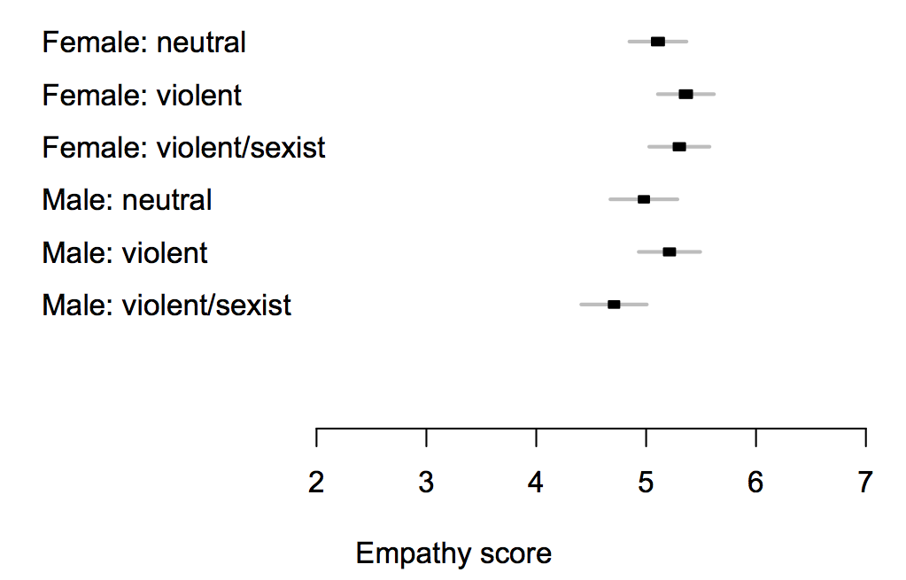
The difference between different games is too small to pick out reliably at this sample size, but is less than half a point on the scale — and while the ‘violent/sexist’ games might reduce empathy, there’s just as much evidence (ie, not very much) that the ‘violent’ ones increase it.

Here’s the complete data, because means can be misleading

gtaswarm

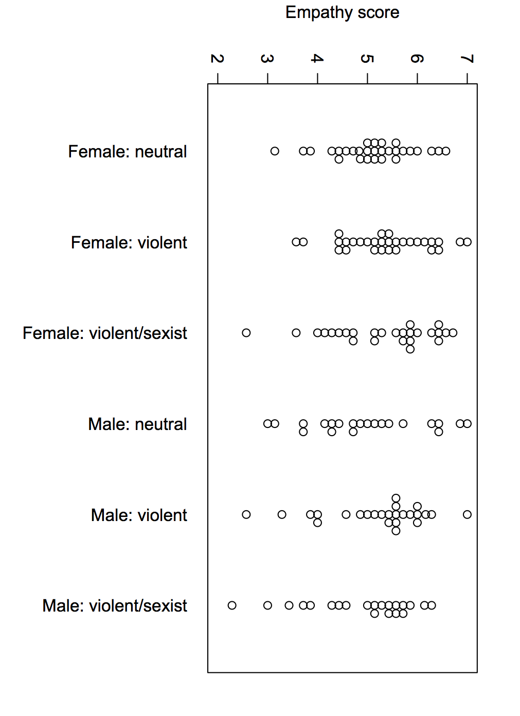
The data are consistent with a small overall impact of the game, or no real impact. They’re consistent with a moderately large impact on a subset of susceptible men, but equally consistent with some men just being horrible people.

If this is an issue you’ve considered in the past, this study shouldn’t be enough to alter your views much, and if it isn’t an issue you’ve considered in the past, it wouldn’t be the place to start.

April 11, 2016

Missing data

Sometimes…often…practically always… when you get a data set there are missing values. You need to decide what to do with them. There’s a mathematical result that basically says there’s no reliable strategy, but different approaches may still be less completely useless in different settings.

One tempting but usually bad approach is to replace them with the average — it’s especially bad with geographical data.  We’ve seen fivethirtyeight.com get this badly wrong with kidnappings in Nigeria, we’ve seen maps of vaccine-preventable illness at epidemic proportions in the west Australian desert, we’ve seen Kansas misidentified as the porn centre of the United States.

The data problem that attributed porn to Kansas has more serious consequences. There’s a farm not far from Wichita that, according to the major database providing this information, has 600 million IP addresses.  Now think of the reasons why someone might need to look up the physical location of an internet address. Kashmir Hill, at Fusion, looks at the consequences, and at how a better “don’t know” address is being chosen.

March 24, 2016

Two cheers for evidence-based policy

Daniel Davies has a post at the Long and Short and a follow-up post at Crooked Timber about the implications for evidence-based policy of non-replicability in science.

Two quotes:

 So the real ‘reproducibility crisis’ for evidence-based policy making would be: if you’re serious about basing policy on evidence, how much are you prepared to spend on research, and how long are you prepared to wait for the answers?

and

“We’ve got to do something“. Well, do we? And equally importantly, do we have to do something right now, rather than waiting quite a long time to get some reproducible evidence? I’ve written at length, several times, in the past, about the regrettable tendency of policymakers and their advisors to underestimate a number of costs; the physical deadweight cost of reorganisation, the stress placed on any organisation by radical change, and the option value of waiting.