Posts filed under Risk (222)

November 13, 2015

Blood pressure experiments

The two major US medical journals each published  a report this week about an experiment on healthy humans involving blood pressure.

One of these was a serious multi-year, multi-million-dollar clinical trial in over 9000 people, trying to refine the treatment of high blood pressure. The other looks like a borderline-ethical publicity stunt.  Guess which one ended up in Stuff.

In the experiment, 25 people were given an energy drink

We hypothesized that drinking a commercially available energy drink compared with a placebo drink increases blood pressure and heart rate in healthy adults at rest and in response to mental and physical stress (primary outcomes). Furthermore, we hypothesized that these hemodynamic changes are associated with sympathetic activation, which could predispose to increased cardiovascular risk (secondary outcomes).

The result was that consuming caffeine made blood pressure and heart rate go up for a short period,  and that levels of the hormone norepinephrine  in the blood also went up. Oh, and that consuming caffeine led to more caffeine in the bloodstream than consuming no caffeine.

The findings about blood pressure, heart rate, and norepinephrine are about as surprising as the finding about caffeine in the blood. If you do a Google search on “caffeine blood pressure”, the recommendation box at the top of the results is advice from the Mayo Clinic. It begins

Caffeine can cause a short, but dramatic increase in your blood pressure, even if you don’t have high blood pressure.

The Mayo Clinic, incidentally, is where the new experiment was done.

I looked at the PubMed research database for research on caffeine and blood pressure.  The oldest paper in English for which I could get full text was from 1981. It begins

Acute caffeine in subjects who do not normally ingest methylxanthines leads to increases in blood pressure, heart rate, plasma epinephrine, plasma norepinephrine, plasma renin activity, and urinary catecholamines.

This wasn’t news already in 1981.

Now, I don’t actually like energy drinks; I prefer my caffeine hot and bitter.  Since many energy drinks have as much caffeine as good coffee and some have almost as much sugar as apple juice, there’s probably some unsafe level of consumption, especially for kids.

What I don’t like is dressing this up as new science. The acute effects of caffeine on the cardiovascular system have been known for a long time. It seems strange to do a new human experiment just to demonstrate them again. In particular, it seems ethically dubious if you think these effects are dangerous enough to put out a press release about.


November 6, 2015

Failure to read small print

smallprint

This story/ad/column hybrid thing on the Herald site is making a good point, that people don’t read the detailed terms and conditions of things. Of course, reading the terms and conditions of things before you agree is often infeasible — I have read the Auckland Transport HOP card T&Cs, but I don’t reread them to make sure they haven’t changed every time I agree to them by getting on a bus, and it’s not as if I have much choice, anyway.  When the small print is about large sums of money, reading it is probably more important.

The StatsChat-relevant aspect, though is the figure of $1000 per year for failing to read financial small print, which seemed strange. The quote:

Money Advice Service, a government-backed financial help centre in the UK, claims failure to read the small print is costing consumers an average of £428 (NZ$978) a year. It surveyed 2,000 consumers and found that only 84 per cent bothered to read the terms and conditions and, of those that did, only 17 per cent understood what they had read.

Here’s the press release (PDF) from Money Advice Service.  It surveyed 3000 people, and found that 84 per cent claimed they didn’t read the terms and conditions.

The survey asked people how much they believed misunderstanding financial terms in the last year had cost them. The average cost was £427.90.

So the figure is a bit fuzzier: it’s the average of what people reported believing they lost, which actually makes it more surprising. If you actually believed you, personally, were losing nearly a thousand dollars a year from not reading terms and conditions, wouldn’t you do something about it?

More importantly, it’s not failure to read the small print, it’s failure to understand it. The story claims only 17% of those who claimed to read the T&Cs thought they understood them — though I couldn’t find this number in the press release or on the Money Advice site, it is in the Mirror and, unsourced, in the Guardian.  The survey claims about a third misunderstood what ‘interest’  meant and of the 15% who had taken out a payday loan, more than half couldn’t explain what a ‘loan’ was, and one in five didn’t realise loans needed to be paid back.

As further evidence that either the survey is unreliable or that it isn’t a simple failure to read that’s the problem, there was very little variation between regions of the UK in how many people said they read the small print, but huge variation (£128-£1014in how much they said it cost them.

I’m not convinced we can trust this survey, but it’s not news that some people make unfortunate financial choices.  What would be useful is some idea of how often it’s really careless failure to read, how often it’s lack of basic education, how often it’s gotchas in the small print, and how often it’s taking out a loan you know is bad because the alternatives are worse.

November 3, 2015

Dogs and asthma

One News saysThe family dog or growing up on a farm could be the keys to reducing the chances of a young person suffering from asthma.

This is pretty good research. It’s obviously not a randomised experiment, but it uses the population administrative and medical data of Sweden to get a reasonable estimate of associations, and it is consistent with other population studies and has a reasonable explanation in immunology. One News gave all the relevant numbers, and got Dr Collin Brooks from Massey in as an expert. So that’s all good.

But (you knew there was a ‘but’), the population impact is smaller than the news story suggests.  That has to be the case: New Zealand, with very high asthma rates by international standards, already has fairly high dog ownership rates.  In fact, as often happens, this new study has found less benefit than earlier, smaller studies.

At current NZ asthma rates, for every extra 100 little kids who live with dogs, the research would predict that you’d prevent one or two cases of asthma. And that’s without worrying about, say, reduced housing options for households with pets.


November 1, 2015

Communicating swimming pool risks

There’s a story in the Herald tending to imply that the government is planning to repeal the laws that require fences around swimming pools, and that this will cost about 70 lives over the next ten years, for a saving of $17 million in `compliance costs.’  The story doesn’t quite say this, but it’s certainly possible for intelligent people to read it that way. Some did.

On the other hand, the Treasury Regulatory Impact Statement estimates the changes will save about six lives over the next ten years. It’s possible that the Treasury is that badly wrong but if they are it would have been helpful to see details of how and why.

Everyone agrees that fencing swimming pools saves lives. I mean, not just the Government, the Treasury, and Water Safety New Zealand, but everyone, even the Freakonomics guys whose whole shtick is not agreeing with things.  The question is what the law changes  do to pool fencing.

To start with, these changes do repeal the Fencing of Swimming Pools Act 1987, but not in the sense of making the requirements go away. They’ve been relocated as amendments to the Buildings Act 2004, with details in the Building Code.

The plans are

  • inspections reduced from three years to five years, but councils will be required to perform them (some now don’t inspect at all)
  • spa pools allowed to have child-proof covers instead of fences
  • putting fencing requirements in the building code, so compliance is more likely to happen automatically
  • an infringement notice as first penalty for violating the code, rather than the theoretical ability to prosecute immediately.

Water Safety New Zealand has said in the past that they think spa-pool covers are effective; at that time they were concerned that the covers wouldn’t be inspected (as quoted by Treasury from public comments to the 2013 version of the proposal).

It looks like the main real concern is the reduction in inspections both for councils who current inspect every three years, and from the omission of spa pools.

Requiring councils to inspect spa pools would be expensive (they estimate $67 million more over ten years). Three-yearly instead of five-yearly required inspections of swimming pools is estimated to cost an extra $19 million over ten years.  Those, not $17 million for the whole package, are the relevant cost-benefit numbers, relative to how many lives you think would be saved.

I could see three-yearly inspections being worthwhile if the rate of, say, broken swimming-pool gates in otherwise compliant fencing was high enough. I’d be a bit more surprised for spa pools, but it’s not inconceivable.  The story doesn’t say anything that could help me make up my mind.

There are also areas where the government could have tightened up rules but didn’t. For example, the Regulatory Impact Statement considered the option of forcing existing pools to comply with some building code changes, but estimated the cost would be about $10 million per life saved.

You can find the various government documents here, and Water Safety NZ’s submission here.

The story is encouraging people to make public submissions on the Bill. As a general principle, this is a good idea. In New Zealand, public submissions on legislation are, at least sometimes,  taken seriously. The chances will presumably be higher if you’re relatively precise about what you think should be changed in the bill and why — it’s not an opinion poll, it’s crowd-sourced review and editing.

October 22, 2015

Early NZ data visualisation

From the National Library of New Zealand, via Jolisa Gracewood

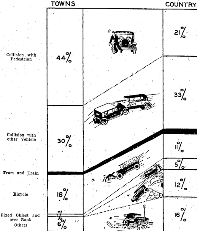
natlib.govt

Types of motor-vehicle accidents in rural areas vary considerably from those ocourrlng In urban areas, as shown in tho above chart. Tho percentages are based on figures of the Transport Department in respect of accidents causing’ fatalltles during the twelve months, April I, 1932, to March 31, 1933.

The text goes on to say “The black section representing collisions with tram and train forms only I per cent, of the whole, through this type of accident appeals to the popular Imagination’ from its spectacular nature.”  Some things don’t change.

October 9, 2015

Predictive analytics and the rise of the machines

Some cautionary tales

  • “I would like to challenge this picture, and ask you to imagine data not as a pristine resource, but as a waste product, a bunch of radioactive, toxic sludge that we don’t know how to handle.” A talk by Maciej Ceglowski
  • How do you measure whether automated decision making ends up discriminating by race, when it doesn’t explicitly use race as an input? Two posts by Cathy O’Neil
  • A computer program that was accidentally trained to discriminate by gender and ethnicity
  • Why modern predictive analytics doesn’t give ‘algorithms’ in the sense of ‘recipes’, by Suresh Venkat (via @ndiakopoulos)
September 18, 2015

Compared to what? (transport chaos edition)

A while back, it looked as though the negotiations between NZ Bus and its drivers would break down and we would have bus strikes in Auckland. I considered various contingency plans: working from home for all or part of  a day, taking a train to Newmarket or Britomart and walking to the University, cycling, or catching a ride with a colleague who lives nearby. Some of these were options because we would have a week or so of warning before the strike.

If public transport in Auckland became permanently bad — if it went back to its state 20 years ago — I would have different options. I probably wouldn’t live in a house in Onehunga; I’d live in an apartment near the city centre. Moving to the city centre wouldn’t be a sensible response to a single day’s stoppage, but it would be sensible if the lack of buses was permanent.

Transport Blog has a post about the congestion benefits of the Wellington rail system, based on the week in June 2013 that it was taken out by a storm. On weekdays during this period, about 4000 people who would normally take the train into Wellington couldn’t. The roads became much more congested, and these delays can be valued (using plausible-looking assumptions) as worth over $5 million. Scaling this up to a full working year, the benefit to drivers in reduced driving time is worth rather a lot more than the public subsidy to the entire Wellington public transit system.

There’s a problem with simply scaling up the costs. If the Hutt Valley train line didn’t exist, some of those 4000 people would either live somewhere else or work somewhere else. Driving for an extra two hours each way was a rational response by them to a short-term outage, but in the long term they would reorganise their lives to not do it.

Now, there’s obviously a cost to moving from the Hutt to Wellington for these people — otherwise they’d be living in Wellington already — but the cost is less than would be estimated from the travel time during the outage. It’s hard to tell how much less without a lot more data and modelling.

On the other hand, while the storm data almost certainly overestimate the congestion-cost benefits of the train line, the magnitude of the estimated benefit is so large that the conclusion could quite easily hold even with better estimates.

September 9, 2015

Assessing popular opinion

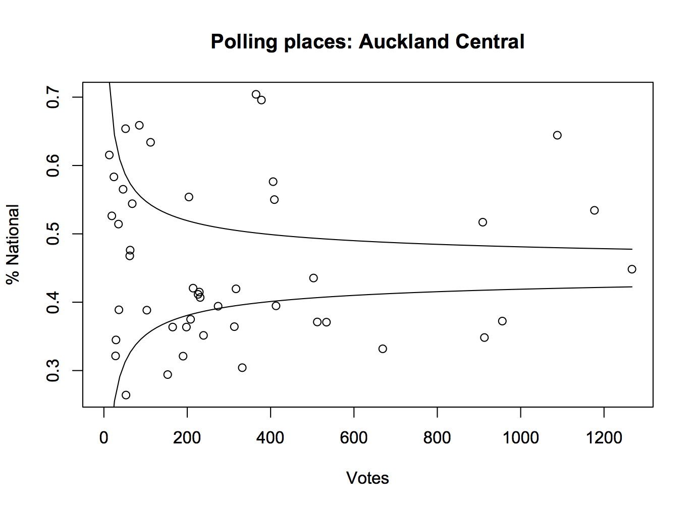
One of the important roles played by good-quality opinion polls before an election is getting people’s expectations right.  It’s easy to believe that the opinions you hear everyday are representative, but for a lot of people they won’t be.  For example, here are the percentages for the National Party for each polling place in Auckland Central in the 2014 election. The curves show the margin of error around the overall vote for the electorate, which in this case wasn’t far from the overall for the whole country.

kael

For lots of people in Auckland Central, their neighbours vote differently than the electorate as a whole.  You could do this for the whole country, especially if the data were in a more convenient form, and it would be more dramatic.

Pauline Kael, the famous New York movie critic, mentioned this issue in a talk to the Modern Languages Association

“I live in a rather special world. I only know one person who voted for Nixon. Where they are I don’t know. They’re outside my ken. But sometimes when I’m in a theater I can feel them.”

She’s usually misquoted in a way that reverses her meaning, but still illustrates the point.

It’s hard to get hold of popular opinion just from what you happen to come across in ordinary life, but there are some useful strategies. For example, on the flag question

  • How many people do you personally know in real life who had expressed a  preference for one of the Lockwood fern flags and now prefer Red Peak?
  • How many people do you follow on Twitter (or friend on Facebook, or whatever on WhatsApp) who had expressed a  preference for one of the Lockwood fern flags and now prefer Red Peak?

For me, the answer to both of these is “No-one”: the Red Peak enthusiasts that I know aren’t Lockwood converts. I know of some people who have changed their preferences that way — I heard because of my last StatsChat post — but I have no idea what the relevant denominator is.

The petition is currently just under 34,000 votes, having slowed down in the past day or so. I don’t see how Red Peak could have close to a million supporters.  More importantly, anyone who knows that it does must have important evidence they aren’t sharing. If the groundswell is genuinely this strong, it should be possible to come up with a few thousand dollars to get at least a cheap panel survey and demonstrate the level of support.

I don’t want to go too far in being negative. Enthusiasm for this option definitely goes beyond disaffected left-wing twitterati — it’s not just Red pique — but changing the final four at this point really should require some reason to believe the new flag could win. I don’t see it.

Opinion is still evolving, and maybe this time we’ll keep the Australia-lite flag and the country will support something I like next time.


August 30, 2015

Genetically targeted cancer treatment

Targeting cancer treatments to specific genetic variants has certainly had successes with common mutations — the most well known example must be Herceptin for an important subset of  breast cancer.  Reasonably affordable genetic sequencing has the potential for finding specific, uncommon mutations in cancers where there isn’t a standard, approved drug.

Most good ideas in medicine don’t work, of course, so it’s important to see if this genetic sequencing really helps, and how much it costs.  Ideally this would be in a randomised trial where patients are randomised to the best standard treatment or to genetically-targeted treatment. What we have so far is a comparison of disease progress for genetically-targeted treatment compared to a matched set of patients from the same clinic in previous years.  Here’s a press release, and two abstracts from a scientific conference.

In 72 out of 243 patients whose disease had progressed despite standard treatment, the researchers found a mutation that suggested the patient would benefit from some drug they wouldn’t normally have got. The median time until these patients starting getting worse again was 23 weeks; in the historical patients it was 12 weeks.

The Boston Globe has an interesting story talking to researchers and a patient (though it gets some of the details wrong).  The patient they interview had melanoma and got a drug approved for melanoma patients but only those with one specific mutation (since that’s where the drug was tested). Presumably, though the story doesn’t say, he had a different mutation in the same gene — that’s where the largest benefit of sequencing is likely to be.

An increase from 12 to 23 weeks isn’t terribly impressive, and it came at a cost of US$32000 — the abstract and press release say there wasn’t a cost increase, but that’s because they looked at cost per week, not total cost.  It’s not nothing, though; it’s probably large enough that a clinical trial makes sense and small enough that a trial is still ethical and feasible.

The Boston Globe story is one of the first products of their new health-and-medicine initiative, called “Stat“. That’s not short for “statistics;” it’s the medical slang meaning “right now”, from the Latin statum.

August 22, 2015

Changing who you count

The New York Times has a well-deserved reputation for data journalism, but anyone can have a bad day.  There’s a piece by Steven Johnson on the non-extinction of the music industry (which I think makes some good points), but which the Future of Music Coalition doesn’t like at all. And they also have some good points.

In particular, Johnson says

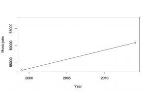
“According to the OES, in 1999 there were nearly 53,000 Americans who considered their primary occupation to be that of a musician, a music director or a composer; in 2014 more than 60,000 people were employed writing, singing, or playing music. That’s a rise of 15 percent.”


He’s right. This is a graph (not that you really need one)

twopoints

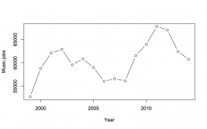
The Future of Music Coalition give the numbers for each year, and they’re interesting. Here’s a graph of the totals:

allpoints

There isn’t a simple increase; there’s a weird two-humped pattern. Why?

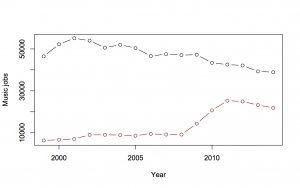
Well, if you look at the two categories, “Music Directors and Composers” and “Musicians and Singers”, making up the total, it’s quite revealing

twolines

The larger category, “Musicians and Singers”, has been declining.  The smaller category, “Music Directors and Composers” was going up slowly, then had a dramatic three-year, straight-line increase, then decreased a bit.

Going  into the Technical Notes for the estimates (eg, 2009), we see

May 2009 estimates are based on responses from six semiannual panels collected over a 3-year period

That means the three-year increase of 5000 jobs/year is probably a one-off increase of 15,000 jobs. Either the number of “Music Directors and Composers” more than doubled in 2009, or more likely there was a change in definitions or sampling approach.  The Future of Music Coalition point out that Bureau of Labor Statistics FAQs say this is a problem (though they’ve got the wrong link: it’s here, question F.1)

Challenges in using OES data as a time series include changes in the occupational, industrial, and geographical classification systems

In particular, the 2008 statistics estimate only 390 of these people as being employed in primary and secondary schools; the 2009 estimate is 6000, and the 2011 estimate is 16880. A lot of primary and secondary school teachers got reclassified into this group; it wasn’t a real increase.

When the school teachers are kept out of  “Music Directors and Composers”, to get better comparability across years, the change is from 53000 in 1999 to 47000 in 2014. That’s not a 15% increase; it’s an 11% decrease.

Official statistics agencies try not to change their definitions, precisely because of this problem, but they do have to keep up with a changing world. In the other direction, I wrote about a failure to change definitions that led the US Census Bureau to report four times as many pre-schoolers were cared for by fathers vs mothers.