May 6, 2015

All-Blacks birth month

This graphic and the accompanying story in the Herald produced a certain amount of skeptical discussion on Twitter today.

AB2

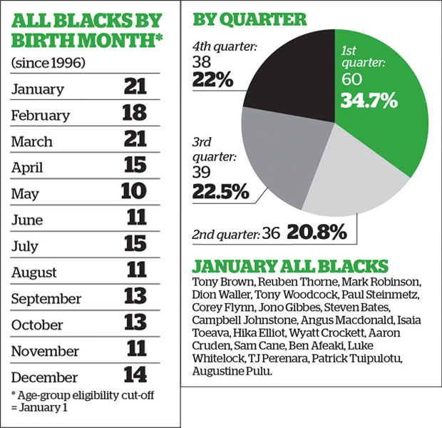
It looks a bit as though there is an effect of birth month, and the Herald backs this up with citations to Malcolm Gladwell on ice hockey.

The first question is whether there is any real evidence of a pattern. There is, though it’s not overwhelming. If you did this for random sets of 173 people, about 1 in 80 times there would be 60 or more in the same quarter (and yes, I did use actual birth frequencies rather than just treating all quarters as equal). The story also looks at the Black Caps, where evidence is a lot weaker because the numbers are smaller.

On the other hand, we are comparing to a pre-existing hypothesis here. If you asked whether the data were a better fit to equal distribution over quarters or to Gladwell’s ice-hockey statistic of a majority in the first quarter, they are a much better fit to equal distribution over quarters.

The next step is to go slightly further than Gladwell, who is not (to put it mildly) a primary source. The fact that he says there is a study showing X is good evidence that there is a study showing X, but it isn’t terribly good evidence that X is true. His books are written to communicate an idea, not to provide balanced reporting or scientific reference.  The hockey analysis he quotes was the first study of the topic, not the last word.

It turns out that even for ice-hockey things are more complicated

Using publically available data of hockey players from 2000–2009, we find that the relative age effect, as described by Nolan and Howell (2010) and Gladwell (2008), is moderate for the average Canadian National Hockey League player and reverses when examining the most elite professional players (i.e. All-Star and Olympic Team rosters).

So, if you expect the ice-hockey phenomenon to show up in New Zealand, the ‘most elite professional players’, the All Blacks might be the wrong place to look.

On the other hand Rugby League in the UK does show very strong relative age effects even into the national teams — more like the 50% in first quarter that Gladwell quotes for ice hockey. Further evidence that things are more complicated comes from soccer. A paper (PDF) looking at junior and professional soccer found imbalances in date of birth, again getting weaker at higher levels. They also had an interesting natural experiment when the eligibility date changed in Australia, from January 1 to August 1.

soccer

As the graph shows, the change in eligibility date was followed by a change in birth-date distribution, but not how you might expect. An August 1 cutoff saw a stronger first-quarter peak than the January 1 cutoff.

Overall, it really does seem to be true that relative age effects have an impact on junior sports participation, and possibly even high-level professional acheivement. You still might not expect the ‘majority born in the first quarter’ effect to translate from the NHL as a whole to the All Blacks, and the data suggest it doesn’t.

Rather more important, however, are relative age effects in education. After all, there’s a roughly 99.9% chance that your child isn’t going to be an All Black, but education is pretty much inevitable. There’s similar evidence that the school-age cutoff has an effect on educational attainment, which is weaker than the sports effects, but impacts a lot more people. In Britain, where the school cutoff is September 1:

Analysis shows that approximately 6% fewer August-born children reached the expected level of attainment in the 3 core subjects at GCSE (English, mathematics and science) relative to September-born children (August born girls 55%; boys 44%; September born girls 61% boys 50%)

In New Zealand, with a March 1 cutoff, you’d expect worse average school performance for kids born on the dates the Herald story is recommending.

As with future All Blacks, the real issue here isn’t when to conceive. The real issue is that the system isn’t working as well for some people. The All Blacks (or more likely the Blues) might play better if they weren’t missing key players born in the wrong month. The education system, at least in the UK, would work better if it taught all children as well as it teaches those born in autumn.  One of these matters.


May 5, 2015

Civil unions down: not just same-sex

The StatsNZ press release on marriages, civil unions, and divorces to December 2014 points out the dramatic fall in same-sex civil unions with 2014 being the first full year of marriage equality. Interestingly, if you look at the detailed data, opposite-sex civil unions have also fallen by about 50%, from a low but previously stable level.

union

May 4, 2015

On algorithmic transparency

An important emerging area of statistics is algorithmic transparency: what information is your black-box analytics system really relying on, and should it?

From Matt Levine

The materiality standard that controls so much of securities law comes from an earlier, simpler time; a time when reasonable people could look at a piece of information and say “oh, yes, of course that will move the stock up” (or down), and if they couldn’t then they wouldn’t bother with it. Modern financial markets are not so intuitive: Algorithms are interested in information that reasonable humans cannot process, with the result that reasonable humans can’t always predict how significant any piece of information is. That’s a world that is more complicated for investors, but it also seems to me to be more complicated for insider trading regulation. And I’m not sure that regulation has really kept up.


US racial disparity: how do we compare?

There’s a depressing chart at Fusion, originally from the Economist, that shows international comparisons for infant mortality, homicide, life expectancy, and imprisonment, with White America and Black America broken out as if they were separate countries.

Originally, I was just going to link to the chart, but I thought I should look at how Māori/Pākehā  disparities compare. European-ancestry New Zealanders and Māori make up roughly the same proportions of the NZ population as self-identified White and Black do in the US. The comparison is depressing, but also interesting: showing how ratios and differences give you different results.

First, infant mortality.  Felix Salmon writes

A look at infant mortality, a key indicator of development, is just as grim. Iceland has 1.6 deaths per 1,000 births; South Korea has 3.2. “White America” is pretty bad — by developed-country standards — with 5.1 deaths per 1,000 births. But “Black America,” again, is much, much worse: at 11.2 deaths per 1,000 births, it’s worse than Romania or China.

According to the Ministry of Health,  Māori infant mortality was 7.7/1000 in 2011 compared to 3.7/1000 for non-Māori, non-Pacific. According to StatsNZ, the rate for Māori was lower in 2012 (the numbers don’t quite match: different definitions or provisional data).  So, the Māori/Pakeha ratio is similar to the Black/White ratio in the US, but the difference is quite a bit smaller here.

Incarceration rates show a similar pattern. In the US, the rate is 2207/100k for Blacks and 380/100k for Whites.  In New Zealand, the rates are (about) 700/100k for Māori and 100/100k for European-ancestry. The NZ figures include people on remand; I don’t know if the US figures do. The ratio is a bit lower in New Zealand, but the difference is dramatically lower.

Homicide rates are harder to compare, because New Zealand only started collecting ethnicity of victims last year, and because NZ.Stat will only show you one month of data at a time. However, it looks as though the ratio is a lot less than the nearly 9 in the US. More importantly, the overall rate is much lower here: our rate is 0.9 per 100k, the overall US rate is 4.5 per 100k.

If the Māori/Pākehā disparities are slightly less serious than US Black/White disparities as ratios but much less serious as differences, which comparison is the right one? To some extent this depends on the question: risk ratios may be more relevant as indicators of structural problems, but risk differences are what actually matter to individuals.

Briefly

  • From the Guardian, in an otherwise-sensible piece talking about decreases in infant mortality “So things are getting better. The small wrinkly proto-Royal that just emerged from the national womb will have thrice the chance of surviving that her father and I did, just through the privilege of being born in 2015.” It’s pretty obvious this is wrong.  If you use the numbers in the previous paragraph, the change is from 98.9% to 99.6%, which isn’t a threefold increase.
  • From Mashable: “Facebook turns the London Eye into big UK election pie chart”. Not only is it a pie chart, it’s a pie chart of Facebook mentions, positive or negative, for each party

facebook-election

  •  Terry Burnham writes about a neat cognitive hack: using fonts that are too small, in order to make people concentrate and learn more. There’s even evidence that it works; it’s just there’s a whole lot more evidence that it doesn’t. Dramatic small-sample experimental findings really can be misleading, it isn’t just statisticians being gratuitously cynical
    png_base64db8e9525745b448


Stat of the Week Competition: May 2 – 8 2015

Each week, we would like to invite readers of Stats Chat to submit nominations for our Stat of the Week competition and be in with the chance to win an iTunes voucher.

Here’s how it works:

  • Anyone may add a comment on this post to nominate their Stat of the Week candidate before midday Friday May 8 2015.
  • Statistics can be bad, exemplary or fascinating.
  • The statistic must be in the NZ media during the period of May 2 – 8 2015 inclusive.
  • Quote the statistic, when and where it was published and tell us why it should be our Stat of the Week.

Next Monday at midday we’ll announce the winner of this week’s Stat of the Week competition, and start a new one.

(more…)

May 1, 2015

If it seems too good to be true

This one is originally from the Telegraph, but it’s one where you might expect the local editors to exercise a little caution in reposting it

A test that can predict with 100 per cent accuracy whether someone will develop cancer up to 13 years in the future has been devised by scientists.

It’s very unlikely that the accuracy could be 100%. Even it is was,  it’s very unlikely that the scientists could know it was 100% accurate by the time they first published results.

One doesn’t need to go as far as the open-access research paper to confirm one’s suspicions. The press release from Northwestern University doesn’t have anything like the 100% claim in it; there are no accuracy claims made at all.

If you do go to the research paper, just looking at the pictures helps. In this graph (figure 1), the red dots are people who ended up with a cancer diagnosis; the blue dots are those who didn’t. There’s a difference between the two groups, but nothing like the complete separation you’d see with 100% accuracy.

1-s2.0-S2352396415001024-gr1

Reading the Discussion section, where the researchers tend to be at least somewhat honest about limitations of their research

Our study participants were all male and mostly Caucasian, thus studies of females and non-Caucasians are warranted to confirm our findings more broadly. Our sample size limited our ability to analyze specific cancer subtypes other than prostate cancer. Thus, caution should be exercised in interpreting our results as different cancer subtypes have different biological mechanisms, and our low sample size increases the possibility of our findings being due to random chance and/or our measures of association being artificially high.

Often, exaggerated claims in the media can be traced to press releases or to comments by researchers. In this case it’s hard to see the scientists being at fault; it looks as if it’s the Telegraph that has come up with the “100% accuracy” claim and the consequent fears for the future of the insurance industry.


(Thanks to Mark Hanna for pointing this one out on Twitter)


Have your say on the 2018 census


StatsNZ has a discussion forum on the 2018 Census

census

They say

The discussion on Loomio will be open from 30 Apr to 10 Jun 2015.

Your discussions will be considered as an input to final decision making.

Your best opportunity to influence census content is to make a submission. Statistics NZ will use this 2018 Census content determination framework to make final decisions on content. The formal submission period will be open from 18 May until 30 Jun 2015 via www.stats.govt.nz.

So, if you have views on what should be asked and how it should be asked, join in the discussion and/or make a submission


April 30, 2015

Half the median

From the Herald, under the headline “First-home buyers nab new home subsidies”

The AMP 360 First Home Buyer Affordability Report, published yesterday, shows housing remains “affordable” in all regions except Auckland and Queenstown.

The index tracked the lower-quartile (halfway between zero and the median) selling prices of houses and the median after-tax income of typical first-home buyers (a working couple both aged 25 to 29).

The lower quartile is not “halfway between zero and the median”. The lower quartile is the price that 25% of sales are below and 75% are above.

What’s more, the interpretation is obviously wrong. If you take the first Google link, at interest.co.nz, there’s a table by region, and it lists the lower quartile price for Auckland metro as $587000 and Auckland City as $681000. The Herald reports the median price often enough that they must know it isn’t over a million dollars.

While I’m complaining: the data table at interest.co.nz is in a state of sin. It’s not actually a data table; it’s a picture of a data table, a GIF image.

April 29, 2015

NRL Predictions for Round 9

Team Ratings for Round 9

The basic method is described on my Department home page.

Here are the team ratings prior to this week’s games, along with the ratings at the start of the season.

Current Rating Rating at Season Start Difference
Roosters 7.59 9.09 -1.50
Cowboys 7.39 9.52 -2.10
Rabbitohs 6.39 13.06 -6.70
Broncos 4.48 4.03 0.40
Storm 4.19 4.36 -0.20
Dragons 1.27 -1.74 3.00
Warriors 0.70 3.07 -2.40
Panthers 0.64 3.69 -3.10
Knights -1.91 -0.28 -1.60
Sea Eagles -1.94 2.68 -4.60
Bulldogs -2.06 0.21 -2.30
Raiders -3.64 -7.09 3.40
Titans -4.31 -8.20 3.90
Wests Tigers -5.64 -13.13 7.50
Sharks -5.72 -10.76 5.00
Eels -6.09 -7.19 1.10


Performance So Far

So far there have been 64 matches played, 30 of which were correctly predicted, a success rate of 46.9%.

Here are the predictions for last week’s games.

Game Date Score Prediction Correct
1 Bulldogs vs. Wests Tigers Apr 24 14 – 38 11.30 FALSE
2 Broncos vs. Eels Apr 25 28 – 16 13.90 TRUE
3 Knights vs. Cowboys Apr 25 24 – 26 -7.00 TRUE
4 Roosters vs. Dragons Apr 25 12 – 14 11.20 FALSE
5 Storm vs. Sea Eagles Apr 25 10 – 12 11.00 FALSE
6 Warriors vs. Titans Apr 25 28 – 32 11.10 FALSE
7 Panthers vs. Sharks Apr 26 26 – 18 9.60 TRUE
8 Rabbitohs vs. Raiders Apr 26 22 – 30 16.40 FALSE


Predictions for Round 9

Here are the predictions for Round 9. The prediction is my estimated expected points difference with a positive margin being a win to the home team, and a negative margin a win to the away team.

Game Date Winner Prediction
1 Broncos vs. Panthers May 08 Broncos 6.80
2 Roosters vs. Wests Tigers May 08 Roosters 16.20
3 Cowboys vs. Bulldogs May 09 Cowboys 12.40
4 Raiders vs. Titans May 09 Raiders 3.70
5 Sharks vs. Warriors May 09 Warriors -2.40
6 Eels vs. Storm May 10 Storm -7.30
7 Sea Eagles vs. Knights May 10 Sea Eagles 3.00
8 Rabbitohs vs. Dragons May 11 Rabbitohs 8.10