March 25, 2015

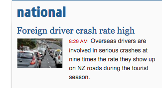
Foreign drivers, yet again

From the Stuff front page

ninetimes

Now, no-one (maybe even literally no-one) is denying that foreign drivers are at higher risk on average. It’s just that some of us feel exaggerating the problem is unhelpful. The quoted sentence is true only if “the tourist season” is defined, a bit unconventionally, to mean “February”, and probably not even then.

When you click through to the story (from the ChCh Press), the first thing you see is this:

1427225389525

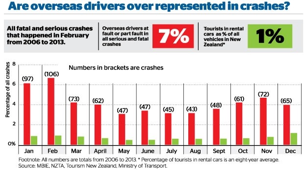
Notice how the graph appears to contradicts itself: the proportion of serious crashes contributed to by a foreign driver ranges from just over 3% in some months to just under 7% at the peak.  Obviously, 7% is an overstatement of the actual problem, and if you read sufficiently carefully, the graphs says so.  The average is actually 4.3%

The other number headlined here is 1%: cars rented by tourists as a fraction of all vehicles.  This is probably an underestimate, as the story itself admits (well, it doesn’t admit the direction of the bias). But the overall bias isn’t what’s most relevant here, if you look at how the calculation is done.

Visitor surveys show that about 1 million people visited Canterbury in 2013.

About 12.6 per cent of all tourists in 2013 drove rental cars, according to government visitor surveys. That means about 126,000 of those 1 million Canterbury visitors drove rental cars. About 10 per cent of international visitors come to New Zealand in January, which means there were about 12,600 tourists in rental cars on Canterbury roads in January.

This was then compared to the 500,000 vehicles on the Canterbury roads in 2013 – figures provided by the Ministry of Transport.

The rental cars aren’t actually counted, they are treated as a constant fraction of visitors. If visitors in summer are more likely to drive long distances, which seems plausible, the denominator will be relatively underestimated in summer and overestimated in winter, giving an exaggerated seasonal variation in risk.

That is, the explanation for more crashes involving foreign drivers in summer could be because summer tourists stay longer or drive more, rather than because summer tourists are intrinsically worse drivers than winter tourists.

All in all, “nine times higher” is a clear overstatement, even if you think crashes in February are somehow more worth preventing than crashes in other months.

Banning all foreign drivers from the roads every February would have prevented 106 fatal or serious injury crashes over the period 2006-2013, just over half a percent of the total.  Reducing foreign driver risk by 14%  over the whole year would have prevented 109 crashes. Reducing everyone’s risk by 0.6%  would have prevented about 107 crashes. Restricting attention to February, like restricting attention to foreign drivers, only makes sense to the extent that it’s easier or less expensive to reduce some people’s risk enormously than to reduce everyone’s risk a tiny amount.


Actually doing something about the problem requires numbers that say what the problem actually is, and strategies, with costs and benefits attached. How many tens of millions of dollars worth of tourists would go elsewhere if they weren’t allowed to drive in New Zealand? Is there a simple, quick test would separate safe from dangerous foreign drivers, that rental companies could administer? How could we show it works? Does the fact that rental companies are willing to discriminate against young drivers but not foreign drivers mean there’s something wrong with anti-discrimination law, or do they just have a better grip on the risks? Could things like rumble strips and median barriers help more for the same cost? How about more police presence?

From 2006 to 2013 NZ averaged about 6 crashes per day causing serious or fatal injury. On average, about one every four days involved a foreign driver. Both these numbers are too high.


NRL Predictions for Round 4

Team Ratings for Round 4

The basic method is described on my Department home page.

Here are the team ratings prior to this week’s games, along with the ratings at the start of the season.

Current Rating Rating at Season Start Difference
Rabbitohs 13.78 13.06 0.70
Roosters 10.81 9.09 1.70
Panthers 5.37 3.69 1.70
Cowboys 5.19 9.52 -4.30
Storm 4.43 4.36 0.10
Broncos 3.83 4.03 -0.20
Warriors 2.94 3.07 -0.10
Bulldogs 1.56 0.21 1.40
Knights 0.77 -0.28 1.00
Sea Eagles 0.01 2.68 -2.70
Dragons -3.71 -1.74 -2.00
Eels -5.62 -7.19 1.60
Raiders -7.45 -7.09 -0.40
Wests Tigers -9.74 -13.13 3.40
Titans -10.02 -8.20 -1.80
Sharks -10.80 -10.76 -0.00


Performance So Far

So far there have been 24 matches played, 16 of which were correctly predicted, a success rate of 66.7%.

Here are the predictions for last week’s games

Game Date Score Prediction Correct
1 Broncos vs. Cowboys Mar 20 44 – 22 -1.60 FALSE
2 Sea Eagles vs. Bulldogs Mar 20 12 – 16 2.40 FALSE
3 Raiders vs. Dragons Mar 21 20 – 22 -0.50 TRUE
4 Storm vs. Sharks Mar 21 36 – 18 18.30 TRUE
5 Warriors vs. Eels Mar 21 29 – 16 12.50 TRUE
6 Rabbitohs vs. Wests Tigers Mar 22 20 – 6 28.60 TRUE
7 Titans vs. Knights Mar 22 18 – 20 -8.80 TRUE
8 Roosters vs. Panthers Mar 23 20 – 12 8.50 TRUE


Predictions for Round 4

Here are the predictions for Round 4. The prediction is my estimated expected points difference with a positive margin being a win to the home team, and a negative margin a win to the away team.

Game Date Winner Prediction
1 Eels vs. Rabbitohs Mar 27 Rabbitohs -16.40
2 Wests Tigers vs. Bulldogs Mar 27 Bulldogs -8.30
3 Dragons vs. Sea Eagles Mar 28 Sea Eagles -0.70
4 Knights vs. Panthers Mar 28 Panthers -1.60
5 Sharks vs. Titans Mar 28 Sharks 2.20
6 Roosters vs. Raiders Mar 29 Roosters 21.30
7 Warriors vs. Broncos Mar 29 Warriors 3.10
8 Cowboys vs. Storm Mar 30 Cowboys 3.80


Super 15 Predictions for Round 7

Team Ratings for Round 7

The basic method is described on my Department home page.

Here are the team ratings prior to this week’s games, along with the ratings at the start of the season.

Current Rating Rating at Season Start Difference
Crusaders 9.22 10.42 -1.20
Waratahs 8.43 10.00 -1.60
Hurricanes 5.61 2.89 2.70
Brumbies 4.50 2.20 2.30
Chiefs 4.29 2.23 2.10
Stormers 2.70 1.68 1.00
Sharks 2.68 3.91 -1.20
Bulls 2.06 2.88 -0.80
Blues -0.07 1.44 -1.50
Highlanders -1.26 -2.54 1.30
Lions -3.93 -3.39 -0.50
Force -4.98 -4.67 -0.30
Rebels -7.07 -9.53 2.50
Cheetahs -7.48 -5.55 -1.90
Reds -7.72 -4.98 -2.70


Performance So Far

So far there have been 40 matches played, 26 of which were correctly predicted, a success rate of 65%.

Here are the predictions for last week’s games.

Game Date Score Prediction Correct
1 Highlanders vs. Hurricanes Mar 20 13 – 20 -2.20 TRUE
2 Rebels vs. Lions Mar 20 16 – 20 2.20 FALSE
3 Crusaders vs. Cheetahs Mar 21 57 – 14 18.50 TRUE
4 Bulls vs. Force Mar 21 25 – 24 13.00 TRUE
5 Sharks vs. Chiefs Mar 21 12 – 11 3.30 TRUE
6 Waratahs vs. Brumbies Mar 22 28 – 13 6.90 TRUE


Predictions for Round 7

Here are the predictions for Round 7. The prediction is my estimated expected points difference with a positive margin being a win to the home team, and a negative margin a win to the away team.

Game Date Winner Prediction
1 Hurricanes vs. Rebels Mar 27 Hurricanes 17.20
2 Reds vs. Lions Mar 27 Reds 0.70
3 Chiefs vs. Cheetahs Mar 28 Chiefs 16.30
4 Highlanders vs. Stormers Mar 28 Highlanders 0.50
5 Waratahs vs. Blues Mar 28 Waratahs 13.00
6 Sharks vs. Force Mar 28 Sharks 12.20
7 Bulls vs. Crusaders Mar 28 Crusaders -2.70


March 23, 2015

Cricket visualisations

Lascarides-Guptill

Population genetic history mapped

Most stories about population genetic ancestry tend to be based on pure male-line or pure female-line ancestry, which can be unrepresentative.  That’s especially true when you’re looking at invasions — invaders probably leave more Y-chromosomes behind than the rest of the genome.  There’s a new UK study that used data on the whole genome from a few thousand British people, chosen because all four of their grandparents lived close together.  The idea is that this will measure population structure at the start of the twentieth century, before people started moving around so much.

Here’s the map of ancestry clusters. As the story in the Guardian explains, one thing it shows that the Romans and Normans weren’t big contributors to population ancestry, despite their impact on culture.

0b02a9ee-3110-4323-8654-ee559ee03cc0-875x1020

Briefly

The “It’s not paranoia if..” issue

  • A new initiative, Data Justice, concerned with widespread commercial data collection and analysis as a threat to privacy and equality.
  • Trying to get “open” data in New Jersey: “initially refused to answer The Jersey Journal’s OPRA request because it didn’t make it on the agency’s standardized OPRA form, which wasn’t available on the NBHA website. Even after a reporter noted that in 2009 the state Supreme Court ruled standardized forms aren’t necessary, Earl wouldn’t accept a request on anything but the agency’s form.”

Stat of the Week Competition: March 21 – 27 2015

Each week, we would like to invite readers of Stats Chat to submit nominations for our Stat of the Week competition and be in with the chance to win an iTunes voucher.

Here’s how it works:

  • Anyone may add a comment on this post to nominate their Stat of the Week candidate before midday Friday March 27 2015.
  • Statistics can be bad, exemplary or fascinating.
  • The statistic must be in the NZ media during the period of March 21 – 27 2015 inclusive.
  • Quote the statistic, when and where it was published and tell us why it should be our Stat of the Week.

Next Monday at midday we’ll announce the winner of this week’s Stat of the Week competition, and start a new one.

(more…)

March 20, 2015

Ideas that didn’t pan out

One way medical statisticians are trained into skepticism over their careers is seeing all the exciting ideas from excited scientists and clinicians that don’t turn out to work. Looking at old hypotheses is a good way to start. This graph is from a 1986 paper in the journal Medical Hypotheses, and the authors are suggesting pork consumption is important in multiple sclerosis, because there’s a strong correlation between rates of multiple sclerosis and pork consumption across countries:

pork

This wasn’t a completely silly idea, but it was never anything but suggestive, for two main reasons. First, it’s just a correlation. Second, it’s not even a correlation at the level of individual people — the graph is just as strong support for the idea that having neighbours who eat pork causes multiple sclerosis. Still, dietary correlations across countries have been useful in research.

If you wanted to push this idea today, as a Twitter account claiming to be from a US medical practice did, you’d want to look carefully at the graph rather than just repeating the correlation. There are some countries missing, and other countries that might have changed over the past three decades.

In particular, the graph does not have data for Korea, Taiwan, or China. These have high per-capita pork consumption, and very low rates of multiple sclerosis — and that’s even more true of Hong Kong, and specifically of Chinese people in Hong Kong.  In the other direction, the hypothesis would imply very low levels of multiple sclerosis among US and European Jews. I don’t have data there, but in people born in Israel the rate of multiple sclerosis is moderate among those of Ashkenazi heritage and low in others, which would also mess up the correlations.

You might also notice that the journal is (or was) a little non-standard, or as it said  “intended as a forum for unconventional ideas without the traditional filter of scientific peer review”.

Most of this information doesn’t even need a university’s access to scientific journals — it’s just out on the web.  It’s a nice example of how an interesting and apparently strong correlation can break down completely with a bit more data.

March 19, 2015

More on petrol prices

I posted a version of this graph with ten years of weekly data, and Mark Stockdale pointed out there are quarterly data back to 1983 (isn’t official data wonderful?). You’ll need to click the graph to embiggen for easy viewing.

petrol-long


The horizontal axis is the import cost plus freight and insurance (with CPI adjustments to 2013 NZ dollars), and the vertical axis is the importer margin, which covers transport and sale costs within New Zealand, and profit. The idea is that local costs are typically slowly varying, so that short-term variation in margin tracks short-term variation in profit. The label for each year is on the data point for June.

The import cost plummeted in the early 1980s, soon followed by a drop in the importer margin. That’s presumably Rogernomics and its consequences. The cost stayed fairly stable and low in the 1990s and the margin drifted down.  Then the cost increased after 1999, with the margin staying stable. We’ve recently entered a new pattern, with margin drifting upwards.

A final note: the import cost is about the same as in 1983, and so is the retail price (in real terms). The reduction in importer margin since 1983 has been almost exactly matched by an increase in taxes, though the taxes would probably be higher under a realistic world carbon price.

Model organisms

The flame retardant chemicals in your phone made zebra fish “chubby”, says the caption on this photo at news.com.au. Zebra fish, as it explains, are a common model organism for medical research, so this could be relevant to people

591917-2a8735a0-cced-11e4-a716-dcac481e1bbe

On the other hand, as @LewSOS points out on Twitter, it doesn’t seem to be having the same effect on the model organisms in the photo.

What’s notable about the story is how much better it is than the press release, which starts out

Could your electronics be making you fat? According to University of Houston researchers, a common flame retardant used to keep electronics from overheating may be to blame.

The news.com.au story carefully avoids repeating this unsupported claim.  Also, the press release doesn’t link to the research paper, or even say where it was published (or even that it was published). That’s irritating in the media but unforgivable in a university press release.   When you read the paper it turns out the main research finding was that looking at fat accumulation in embryonic zebrafish (which is easy because they are transparent, one of their other advantages over mice) was a good indication of weight gain later in life, and might be a useful first step in deciding which chemicals were worth testing in mice.

So, given all that, does your phone or computer actually expose you to any meaningful amount of this stuff?

The compounds in question, Tetrabromobisphoneol A (TBBPA) and tetrachlorobisphenol A (TCBPA) can leach out of the devices and often end up settling on dust particles in the air we breathe, the study found.

That’s one of the few mistakes in the story: this isn’t what the study found, it’s part of the background information. In any case, the question is how much leaches out. Is it enough to matter?

The European Union doesn’t think so

The highest inhalation exposures to TBBP-A were found in the production (loading and mixing) of plastics, with 8-hour time-weighted-averages (TWAs) up to 12,216 μg/m3 . At the other end of the range, offices containing computers showed TBBP-A air concentrations of less than 0.001 μg/m3 . TBBP-A exposures at sites where computers were shredded, or where laminates were manufactured ranged from 0.1 to 75 μg/m3 .

You might worry about the exposures from plastics production, and about long-term environmental accumulations, but it looks like TBBP-A from being around a phone isn’t going to be a big contributor to obesity. That’s also what the international comparisons would suggest — South Korea and Singapore have quite a lot more smartphone ownership than Australia, and Norway and Sweden are comparable, all with much less obesity.