July 25, 2014
Briefly
Graphics edition
- An interactive tool to help select sets of colours in graphs
- Crowdsourcing colour palettes at Adobe Kuler
- Maps of which bits of London will be ‘cool’ next.
Graphics edition
An example from Stuff, this time
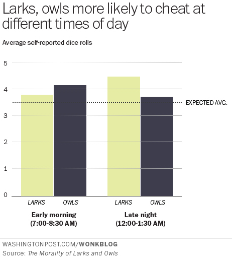
Sah and her colleagues found that this internal clock also affects our ability to behave ethically at different times of day. To make a long research paper short, when we’re tired we tend to fudge things and cut corners.
Sah measured this by finding out the chronotypes of 140 people via a standard self-assessment questionnaire, and then asking them to complete a task in which they rolled dice to win raffle tickets – higher rolls, more tickets.
Participants were randomly assigned to either early morning or late evening sessions. Crucially, the participants self-reported their dice rolls.
You’d expect the dice rolls to average out to around 3.5. So the extent to which a group’s average exceeds this number is a measure of their collective result-fudging.
“Morning people tended to report higher die-roll numbers in the evening than the morning, but evening people tended to report higher numbers in the morning than the evening,” Sah and her co-authors wrote.
The research paper is here. The Washington Post, where the story was taken from, has a graph of the results, and they match the story. Note that this is one of the very few cases where starting a bar chart at zero is a bad idea. It’s hard to roll zero on a standard die.
The research paper also has a graph of the results, which makes the effect look bigger, but in this case is defensible as 3.5 really is “zero” for the purposes of the effect they are studying
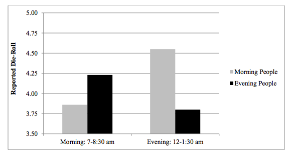
Unfortunately,neither graph has any indication of uncertainty. The evidence of an effect is not negligible, but it is fairly weak (p-value of 0.04 from 142 people). It’s easy to imagine someone might do an experiment like this and not publish it if they didn’t see the effect they expected, and it’s pretty certain that you wouldn’t be reading about the results if they didn’t see the effect they expected, so it makes sense to be a bit skeptical.
The story goes on to say
These findings have pretty big implications for the workplace. For one, they suggest that the one-size-fits-all 9-to-5 schedule is practically an invitation to ethical lapses.
Even assuming that the effect is real and that lying about a die roll in a psychological experiment translates into unethical behaviour in real life, the findings don’t say much about the ‘9-to-5’ schedule. For a start, none of the testing was conducted between 9am and 5pm.
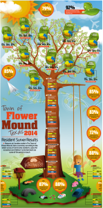
Alberto Cairo and wtfviz.net pointed me to the infographic on the left, a summary of a residents’ survey from the town of Flower Mound, Texas (near Dallas/Fort Worth airport). The highlight of the infographic is the 3-D piecharts nesting in the tree, ready to hatch out into full-fledged misinformation.
At least, they look like 3-D pie charts at first glance. When you look more closely, the data are three-year trends in approval ratings for a variety of topics, so pie charts would be even more inappropriate than usual as a display method. When you look even more closely, you see that that’s ok, because the 3-D ellipses are all just divided into three equal wedges — the data aren’t involved at all.
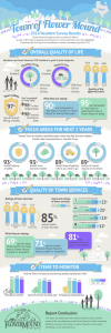
The infographic on the right comes from the town government. It’s much better, especially by the standards of infographics.
If you follow the link, you can read the full survey results, and see that the web page giving survey highlights actually describes how the survey was done — and it was done well. They sent questionnaires to a random sample of households, got a 35% response rate (not bad, for this sort of thing) and reweighted it based on age, gender, and housing tenure (ie rent, own, etc) to make it more representative. That’s a better description (and a better survey) than a lot of the ones reported in the NZ media.
[update: probably original, higher resolution version, via Dave Bremer.]
There’s a website, OnlyBoth.com, that, as it says
Discovers New Insights from Data.
Writes Them Up in Perfect English.
All Automated.
You can test this by asking it for ‘insights’ in some example areas. One area is baseball, so naturally I selected the Seattle Mariners, and 2009, when I still lived in Seattle. OnlyBoth returns several names where it found insights, and I chose ‘Matt Tuiasosopo’ — the most obvious thing about him is that he comes from a famous local football family, but I was interested in what new insight the data revealed.
Matt Tuiasosopo in 2009 was the 2nd-youngest (23 yrs) of the 25 hitters who were born in Washington and played for the Seattle Mariners.
outdone by Matt Tuiasosopo in 2008 (22 yrs).
I don’t think our students need to be too worried yet.
Two graphs from the NZ influenza surveillance weekly update (PDF, via Mark Hanna)
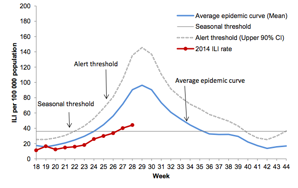
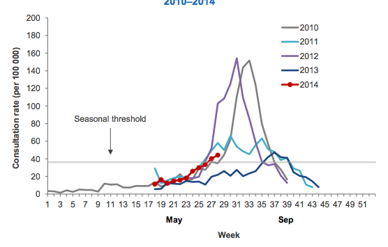
Both show that the seasonal epidemic has started. I think the second graph is more helpful in comparing this year to the past; showing the actual history for a range of years, rather than an average. This sort of graph could handle a larger number of past years if they were all or mostly in, eg, thin grey lines, perhaps with this year, last year, and the worst recent year in colour.
The other news in the surveillance update is that the flu viruses that have been examined have overwhelming been H1N1 or H3N2, and both these groups are covered in this year’s vaccine.
See anyone you know? (click to embiggen)

This is a screenshot from I know where your cat lives, a project at Florida State University that is intended to illustrate the amount of detailed information available from location-tagged online photographs, without being too creepy — just creepy enough.
(via Robert Kosara and Keith Ng)
The basic method is described on my Department home page. I have made some changes to the methodology this year, including shrinking the ratings between seasons.
Here are the team ratings prior to this week’s games, along with the ratings at the start of the season.
| Current Rating | Rating at Season Start | Difference | |
|---|---|---|---|
| Sea Eagles | 8.06 | 9.10 | -1.00 |
| Roosters | 8.02 | 12.35 | -4.30 |
| Rabbitohs | 6.67 | 5.82 | 0.90 |
| Warriors | 5.50 | -0.72 | 6.20 |
| Cowboys | 4.07 | 6.01 | -1.90 |
| Broncos | 3.33 | -4.69 | 8.00 |
| Panthers | 1.50 | -2.48 | 4.00 |
| Storm | 0.42 | 7.64 | -7.20 |
| Bulldogs | 0.06 | 2.46 | -2.40 |
| Knights | -2.24 | 5.23 | -7.50 |
| Titans | -3.51 | 1.45 | -5.00 |
| Dragons | -4.19 | -7.57 | 3.40 |
| Wests Tigers | -5.06 | -11.26 | 6.20 |
| Raiders | -5.42 | -8.99 | 3.60 |
| Sharks | -8.78 | 2.32 | -11.10 |
| Eels | -10.21 | -18.45 | 8.20 |
So far there have been 136 matches played, 78 of which were correctly predicted, a success rate of 57.4%.
Here are the predictions for last week’s games.
| Game | Date | Score | Prediction | Correct | |
|---|---|---|---|---|---|
| 1 | Sharks vs. Cowboys | Jul 18 | 18 – 36 | -6.10 | TRUE |
| 2 | Eels vs. Rabbitohs | Jul 18 | 12 – 32 | -10.60 | TRUE |
| 3 | Roosters vs. Panthers | Jul 19 | 32 – 12 | 8.90 | TRUE |
| 4 | Storm vs. Raiders | Jul 19 | 28 – 14 | 9.40 | TRUE |
| 5 | Broncos vs. Warriors | Jul 19 | 28 – 22 | 1.40 | TRUE |
| 6 | Knights vs. Titans | Jul 20 | 8 – 22 | 10.00 | FALSE |
| 7 | Wests Tigers vs. Bulldogs | Jul 20 | 46 – 18 | -6.40 | FALSE |
| 8 | Dragons vs. Sea Eagles | Jul 21 | 12 – 21 | -7.40 | TRUE |
Here are the predictions for Round 20. The prediction is my estimated expected points difference with a positive margin being a win to the home team, and a negative margin a win to the away team.
| Game | Date | Winner | Prediction | |
|---|---|---|---|---|
| 1 | Knights vs. Roosters | Jul 25 | Roosters | -5.80 |
| 2 | Broncos vs. Storm | Jul 25 | Broncos | 7.40 |
| 3 | Panthers vs. Sharks | Jul 26 | Panthers | 14.80 |
| 4 | Titans vs. Eels | Jul 26 | Titans | 11.20 |
| 5 | Bulldogs vs. Cowboys | Jul 26 | Bulldogs | 0.50 |
| 6 | Warriors vs. Sea Eagles | Jul 27 | Warriors | 1.90 |
| 7 | Wests Tigers vs. Dragons | Jul 27 | Wests Tigers | 3.60 |
| 8 | Raiders vs. Rabbitohs | Jul 28 | Rabbitohs | -7.60 |
The basic method is described on my Department home page. I have made some changes to the methodology this year, including shrinking the ratings between seasons.
Here are the team ratings prior to this week’s games, along with the ratings at the start of the season.
| Current Rating | Rating at Season Start | Difference | |
|---|---|---|---|
| Waratahs | 9.66 | 1.67 | 8.00 |
| Crusaders | 8.78 | 8.80 | -0.00 |
| Sharks | 5.34 | 4.57 | 0.80 |
| Hurricanes | 2.89 | -1.44 | 4.30 |
| Bulls | 2.88 | 4.87 | -2.00 |
| Brumbies | 2.76 | 4.12 | -1.40 |
| Chiefs | 2.23 | 4.38 | -2.10 |
| Stormers | 1.68 | 4.38 | -2.70 |
| Blues | 1.44 | -1.92 | 3.40 |
| Highlanders | -2.54 | -4.48 | 1.90 |
| Lions | -3.39 | -6.93 | 3.50 |
| Force | -4.67 | -5.37 | 0.70 |
| Reds | -4.98 | 0.58 | -5.60 |
| Cheetahs | -5.55 | 0.12 | -5.70 |
| Rebels | -9.53 | -6.36 | -3.20 |
So far there have been 122 matches played, 80 of which were correctly predicted, a success rate of 65.6%.
Here are the predictions for last week’s games.
| Game | Date | Score | Prediction | Correct | |
|---|---|---|---|---|---|
| 1 | Brumbies vs. Chiefs | Jul 19 | 32 – 30 | 5.00 | TRUE |
| 2 | Sharks vs. Highlanders | Jul 19 | 31 – 27 | 13.00 | TRUE |
Here are the predictions for the Semi-finals. The prediction is my estimated expected points difference with a positive margin being a win to the home team, and a negative margin a win to the away team.
| Game | Date | Winner | Prediction | |
|---|---|---|---|---|
| 1 | Crusaders vs. Sharks | Jul 26 | Crusaders | 7.40 |
| 2 | Waratahs vs. Brumbies | Jul 26 | Waratahs | 9.40 |
Thank you for your nominations in last week’s Stat of the Week competition.
We’ve chosen Nick Iversen’s nomination of the NZ Herald article about elephants facing extinction:
The article claims that 100 elephants are killed every day and that elephants will be extinct by 2025.
Over 11 years 100 per day means 400,000 elephants will be killed. I can think of many reasons why this doesn’t mean that elephants will become extinct.
1) the killing rate will drop as elephants become more scarce
2) there will always be protected populations that aren’t subject to the killing
3) elephants are giving birth to new elephants
According to the Wikipedia page on elephants an estimate is that there were 440,000 elephants in 2012. So now we know how the author of the article did the calculations – divided 400,000 by 100 elephants a day.
So let’s keep using Wikipedia numbers and see what we find. “…populations in eastern and southern Africa were increasing by an average annual rate of 4.0%.” Well there you go. Even with culls of 100 a day the population is still growing. So no extinction.
Let’s assume that the 4% is BEFORE the culling. That’s adding 17,600 animals each year and the cull is removing 100 a day so that extends the population out for 21 years. This won’t happen due to points 1 and 2 above.
Note that the 4% figure doesn’t apply to all populations. But my point is still valid. If some populations are increasing in size there will be no extinction.
Thanks Nick for the great explanation!
From the Herald
Labour’s support among men has fallen to just 23.9 per cent in the latest Herald-DigiPoll survey and leader David Cunliffe concedes it may have something to do with his “sorry for being a man” speech to a domestic violence symposium.
Presumably Mr Cunliffe did indeed concede it might have something to do with his statement; and there’s no way to actually rule that out as a contributing factor. However
Broken down into gender support, women’s support for Labour fell from 33.4 per cent last month to 29.1 per cent; and men’s support fell from 27.6 per cent last month to 23.9 per cent.
That is, women’s support for Labour fell by 4.2 percentage points (give or take about 4.2) and men’s by 3.7 percentage points (give or take about 4.2). This can’t really be considered evidence for a gender-specific Labour backlash. Correlations need not be causal, but here there isn’t even a correlation.
Recent comments