March 29, 2014

WiFi context

Age-adjusted brain cancer diagnoses and deaths in the US over time (SEER)

brain


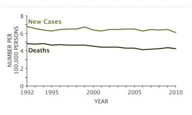
The IEEE 802.11a standard was published in 1999 and was first called WiFi in 2000.  WiFi exposure has increased dramatically since then. You can see what the trend in brain cancer has been.

The International Agency for Cancer Research (IARC) lists WiFi as a ‘possible’ human carcinogen. That doesn’t mean they think it’s actually causing cancer. That means there’s enough uncertainty that they can’t rule out the possibility that it would cause cancer at some dose.

A cancer ‘hazard’ is an agent that is capable of causing cancer under some circumstances, while a cancer ‘risk’ is an estimate of the carcinogenic effects expected from exposure to a cancer hazard. The Monographs are an exercise in evaluating cancer hazards, despite the historical presence of the word ‘risks’ in the title. The distinction between hazard and risk is important, and the Monographs identify cancer hazards even when risks are very low at current exposure levels, because new uses or unforeseen exposures could engender risks that are significantly higher.

It’s quite hard to rule this sort of thing out, which is why out of the 970 agents IARC has classified, only one has been labelled “probably not carcinogenic to humans”. That one wasn’t radiofrequency electromagnetic fields, but if you read the summary of the monograph (PDF) you find it’s cellphones held to the ear that are the possible risk they were concerned about.

This information may be helpful context if you read the Dominion Post.


Where do people come from?

An analysis of global migration flows,  published in Science, via Quartzvid_global_migration_datasheet_web-gimp3


The first thing that Kiwis will note is the graph says no-one migrates to New Zealand. That’s even though the proportion of foreign-born residents in New Zealand is almost twice that in the USA and more than twice that in the UK.

As usual, the issue is denominators: the graphic shows the largest migration flows, and in New Zealand the flow of migrants to Australia is about equal to all the inflows put together. None of the other flows of migrants are large enough to show up.

March 28, 2014

Briefly

Reader request edition

  • Margin of error. The Herald has a reasonable story on public opinion about Labour’s baby-bonus plan. It would have been good to say what the margin of error was for the difference between men and women, since that was the headline. If the gender split was about 50:50 the margin of error for that difference is going to be just over 7%, and the observed difference was 8%. The headline is ok, but that’s the sort of calculation someone should have done, and having done, should have reported. We already have doubts about this particular poll, though. (via @danylmc)


  • The New Republic thinks sunglasses make you less moral and advises against them, based on the fact that masks are used for anonymity and that undergraduates in a psych experiment gave away an average of 90c less when they were wearing sunglasses.  The data on benefits of sunglasses are somewhat better founded. (via @juha_saarinen)
March 27, 2014

NRL Predictions for Round 4

Team Ratings for Round 4

The basic method is described on my Department home page. I have made some changes to the methodology this year, including shrinking the ratings between seasons.

Here are the team ratings prior to this week’s games, along with the ratings at the start of the season.

Current Rating Rating at Season Start Difference
Roosters 11.68 12.35 -0.70
Storm 6.54 7.64 -1.10
Rabbitohs 6.24 5.82 0.40
Sea Eagles 5.81 9.10 -3.30
Bulldogs 3.68 2.46 1.20
Cowboys 2.39 6.01 -3.60
Knights 1.81 5.23 -3.40
Panthers 0.89 -2.48 3.40
Titans -0.35 1.45 -1.80
Broncos -1.76 -4.69 2.90
Sharks -2.48 2.32 -4.80
Dragons -3.31 -7.57 4.30
Warriors -4.17 -0.72 -3.50
Wests Tigers -6.50 -11.26 4.80
Raiders -7.00 -8.99 2.00
Eels -15.28 -18.45 3.20


Performance So Far

So far there have been 24 matches played, 10 of which were correctly predicted, a success rate of 41.7%.

Here are the predictions for last week’s games.

Game Date Score Prediction Correct
1 Wests Tigers vs. Rabbitohs Mar 21 25 – 16 -12.00 FALSE
2 Broncos vs. Roosters Mar 21 26 – 30 -10.20 TRUE
3 Panthers vs. Bulldogs Mar 22 18 – 16 1.60 TRUE
4 Sharks vs. Dragons Mar 22 12 – 14 7.10 FALSE
5 Cowboys vs. Warriors Mar 22 16 – 20 14.40 FALSE
6 Sea Eagles vs. Eels Mar 23 22 – 18 30.10 TRUE
7 Raiders vs. Titans Mar 23 12 – 24 0.10 FALSE
8 Storm vs. Knights Mar 24 28 – 24 10.50 TRUE


Predictions for Round 4

Here are the predictions for Round 4. The prediction is my estimated expected points difference with a positive margin being a win to the home team, and a negative margin a win to the away team.

Game Date Winner Prediction
1 Roosters vs. Sea Eagles Mar 28 Roosters 10.40
2 Dragons vs. Broncos Mar 28 Dragons 3.00
3 Warriors vs. Wests Tigers Mar 29 Warriors 6.80
4 Eels vs. Panthers Mar 29 Panthers -11.70
5 Bulldogs vs. Storm Mar 29 Bulldogs 1.60
6 Rabbitohs vs. Raiders Mar 30 Rabbitohs 17.70
7 Knights vs. Sharks Mar 30 Knights 8.80
8 Titans vs. Cowboys Mar 31 Titans 1.80


Super 15 Predictions for Round 7

Team Ratings for Round 7

The basic method is described on my Department home page. I have made some changes to the methodology this year, including shrinking the ratings between seasons.

Here are the team ratings prior to this week’s games, along with the ratings at the start of the season.

Current Rating Rating at Season Start Difference
Sharks 6.23 4.57 1.70
Crusaders 6.07 8.80 -2.70
Chiefs 4.72 4.38 0.30
Brumbies 4.45 4.12 0.30
Waratahs 4.38 1.67 2.70
Bulls 4.20 4.87 -0.70
Stormers 1.68 4.38 -2.70
Reds -0.48 0.58 -1.10
Hurricanes -0.57 -1.44 0.90
Blues -1.59 -1.92 0.30
Highlanders -3.50 -4.48 1.00
Cheetahs -3.66 0.12 -3.80
Lions -3.94 -6.93 3.00
Force -4.07 -5.37 1.30
Rebels -6.93 -6.36 -0.60


Performance So Far

So far there have been 36 matches played, 24 of which were correctly predicted, a success rate of 66.7%.

Here are the predictions for last week’s games.

Game Date Score Prediction Correct
1 Highlanders vs. Hurricanes Mar 21 35 – 31 -1.10 FALSE
2 Waratahs vs. Rebels Mar 21 32 – 8 12.40 TRUE
3 Blues vs. Cheetahs Mar 22 40 – 30 5.40 TRUE
4 Brumbies vs. Stormers Mar 22 25 – 15 6.20 TRUE
5 Force vs. Chiefs Mar 22 18 – 15 -5.90 FALSE
6 Lions vs. Reds Mar 22 23 – 20 0.10 TRUE
7 Bulls vs. Sharks Mar 22 23 – 19 -0.10 FALSE


Predictions for Round 7

Here are the predictions for Round 7. The prediction is my estimated expected points difference with a positive margin being a win to the home team, and a negative margin a win to the away team.

Game Date Winner Prediction
1 Crusaders vs. Hurricanes Mar 28 Crusaders 9.10
2 Rebels vs. Brumbies Mar 28 Brumbies -8.90
3 Blues vs. Highlanders Mar 29 Blues 4.40
4 Reds vs. Stormers Mar 29 Reds 1.80
5 Bulls vs. Chiefs Mar 29 Bulls 3.50
6 Sharks vs. Waratahs Mar 29 Sharks 5.90


Individual risk and population risk

The Herald and Stuff both have a story about the most dangerous intersections in the country, based on the Ministry of Transport press release. The Herald continues its encouraging new policy of providing the actual data, so we can look in more detail.

The first thing to note is that no intersection in the country appears to have had more than two fatal crashes in ten years, which is better than I would have expected. That’s why crashes involving even minor injuries need to be included in the ranking.

The second issue is the word ‘dangerous’. These 100 intersections are the ones that most need something done to them; they are where the most crashes happen. That’s not the same as the usual use of ‘most dangerous’ — these aren’t the intersections that pose the greatest risk to someone driving through them. The list is from a population or public health viewpoint: these intersections are more dangerous in the same way that dogs are more dangerous than sharks, or flu is more dangerous than meningitis.


March 26, 2014

Are web-based student drinking interventions worthwhile?

Heavy drinking and the societal harm it causes is a big issue and attracts a lot of media and scholarly attention (and Statschat’s, too). So we were interested to see today’s new release from the Journal of the American Medical Association. It describes a double-blind, parallel-group, individually-randomised trial that studied moderate to heavy student drinkers from seven of our eight universities to see if a web-based alcohol screening and intervention programme reduced their unhealthy drinking behaviour.

And the short answer? Not really. But if they identified as Māori, the answer was … yes, with a caveat. More on that in a moment.

Statistician Nicholas Horton and colleagues used an online questionnaire to identify students at Otago, Auckland, Canterbury, Victoria, Lincoln, Massey, and Waikato who had unhealthy drinking habits. Half the students were assigned at random to receive personalised feedback and the other students had no input. Five months later, researchers followed up with the students on certain aspects of their drinking.

The overall result? “The intervention group tended to have less drinking and fewer problems then the control group, but the effects were relatively modest,” says Professor Horton. The take-away message: A web-based alcohol screening and intervention program had little effect on unhealthy drinking among New Zealand uni students. Restrictions on alcohol availability and promotion are still needed if we really want to tackle alcohol abuse.

But among Māori students, who comprise 10% of our national uni population, those receiving intervention were found to drink 22% less alcohol and to experience 19% fewer alcohol-related academic problems at the five-month follow-up. The paper suggests that Māori students are possibly more heavily influenced by social-norm feedback than non-Māori students. “Māori students may have a stronger group identity, enhanced by being a small minority in the university setting.” But the paper warns that the difference could also be due to chance, “underscoring the need to undertake replication and further studies evaluating web-based alcohol screening and brief intervention in full-scale effectiveness trials.”

The paper is here. Read the JAMA editorial here.


Graphic lie factor: sports edition

via Alberto Cairo, this gem from Malaprensa, a Spanish mediawatch site, originally from Marca.

futbol


This isn’t actually a pie chart, it’s a bar chart that has been horribly warped around a circle.  It shows top transfer fees in football (ie, soccer). One Neymar da Silva Santos Júnior has allegedly ended up with a transfer fee estimated at 111 million euros, through complicated arrangements. This would be a record; the originally announced figure was a mere 57 million euros, which would put Neymar in tenth place alongside Hernan Crespo

Malaprensa points out that the figures aren’t inflation-adjusted, and that they aren’t including comparable sets of payments for all the players. They don’t point out how bad the display is: compare the heights for 57 and 111 million euro, and then think about what the area comparison would be.

I’ve redrawn the bars in a sensible coordinate system,  showing the apparent differences based on the height, area, nominal euro amount, and euro amount adjusted for inflation (the last is from Malaprensa), with Crespo’s transfer fee scaled to 1 in each case

adjusted-futbol

It’s much less impressive when it’s shown accurately.


March 25, 2014

An ounce of diagnosis

The Disease Prevention Illusion: a tragedy in five parts, by Hilda Bastian

“An ounce of prevention is worth a pound of cure.” We’ve recognized the false expectations we inflate with the fast and loose use of the word “cure” and usually speak of “treatment” instead. We need to be just as careful with the P-word.


Political polling code

The Research Association New Zealand  has put out a new code of practice for political polling (PDF) and a guide to the key elements of the code (PDF)

The code includes principles for performing a survey, reporting the results, and publishing the results, eg:

Conduct: If the political questions are part of a longer omnibus poll, they should be asked early on.

Reporting: The report must disclose if the questions were part of an omnibus survey.

Publishing: The story should disclose if the questions were part of an omnibus survey.

There is also some mostly good advice for journalists

  1. If possible, get a copy of the full poll  report and do not rely on a media release.
  2. The story should include the name of the company which conducted the poll, and the client the poll was done for, and the dates it was done.
  3.  The story should include, or make available, the sample size, sampling method, population sampled, if the sample is weighted, the maximum margin of error and the level of undecided voters.
  4. If you think any questions may have impacted the answers to the principal voting behaviour question, mention this in the story.
  5. Avoid reporting breakdown results from very small samples as they are unreliable.
  6. Try to focus on statistically significant changes, which may not just be from the last poll, but over a number of polls.
  7. Avoid the phrase “This party is below the margin of error” as results for low polling parties have a smaller margin of error than for higher polling parties.
  8.  It can be useful to report on what the electoral results of a poll would be, in terms of likely parliamentary blocs, as the highest polling party will not necessarily be the Government.
  9. In your online story, include a link to the full poll results provided by the polling company, or state when and where the report and methodology will be made available.
  10. Only use the term “poll” for scientific polls done in accordance with market research industry approved guidelines, and use “survey” for self-selecting surveys such as text or website surveys.

Some statisticians will disagree with the phrasing of point 6 in terms of statistical significance, but would probably agree with the basic principle of not ‘chasing the noise’

I’m not entirely happy with point 10, since outside politics and market research, “survey” is the usual word for scientific polls, eg, the New Zealand Income Survey, the Household Economic Survey, the General Social Survey, the National Health and Nutrition Examination Survey, the British Household Panel Survey, etc, etc.

As StatsChat readers know, I like the term “bogus poll” for the useless website clicky surveys. Serious Media Organisations who think this phrase is too frivolous could solve the problem by not wasting space on stories about bogus polls.