February 25, 2013
Economic data mining needs theory
Via the new Observational Epidemiology blog, it is possible to talk about stochastic complexity in reasonably plain English
Via the new Observational Epidemiology blog, it is possible to talk about stochastic complexity in reasonably plain English
Stuff says (complete with cute photo)
The birth of a rare Nepalese red panda baby, weighing not much more than a tomato, has thrilled Auckland Zoo keepers.
Hmm.

Especially given all the fuss last year about New Zealanders’ ignorance of vegetables, perhaps “weighing a bit less than an iPhone” would be more informative.
With the summer holiday season approaching we’ve had requests for a post on the relative safety of driving and flying.
To a large extent this depends on where you are going: if you’re heading from Auckland to the Coromandel then I’d recommend driving, but if you want to spend some time on a beach in the Cook Islands your chances of getting there safely by car are distressingly low.
Clearly we need to rephrase the question. Two possibilities are:
We should also think about what risks to include: for a long plane flight the chance of a pulmonary embolism is higher than a crash, possibly much higher depending on your other risk factors.
The risk of a `fatal incident’ on a flight is largely independent of the length of the flight, and based on US data is about eight deaths per hundred million flights. The risk is probably lower in NZ, since the figure includes the September 11 terrorist attacks.
The risk of death from car crash when driving in the US is about 4 per billion kilometers. I don’t have good figures for NZ, but it’s a bit higher here. On the other hand, there’s a lot of variation depending on how you drive.
So, for a trip of 500km (eg, Auckland-Wellington), we’re looking at an average figure of about eight deaths in crashes per hundred million flights and about 200 deaths in crashes per hundred million car trips. Flying wins by a huge margin
University of Otago research estimates the risk of pulmonary embolism at about 0.5 per million short flights and about 1.3 per million long flights. Estimates of the risk of death with pulmonary embolism in modern times seem to be around 10-20%, giving death rates of about 50-100 5-10 per hundred million short flights or 120-250 12-25 per hundred million long flights. Flying still wins for the Auckland-Wellington route, even if driving doesn’t increase pulmonary embolism risk at all (it probably increases it but by less than driving)
If you compare a 500km drive with a long-haul intercontinental flight the numbers get less clear. Flying to London could possibly be more dangerous than driving to Wellington, especially if you are a safe driver but at relatively high risk of blood clots.
After all these calculations it’s important to keep a sense of perspective. Driving is pretty safe. Flying is even safer.
Stuff and the Herald have the identical AP story, so you can read either one
Chimpanzees in a midlife crisis? It sounds like a setup for a joke. But there it is, in the title of a report published in a scientific journal: ‘Evidence for a midlife crisis in great apes.
The researchers asked handlers to estimate ‘well-being’ for 508 great apes: 172 orang-utans, the rest, chimpanzees. They fitted a statistical model to look for a decrease in mid-life followed by an increase, and got dramatic graphs
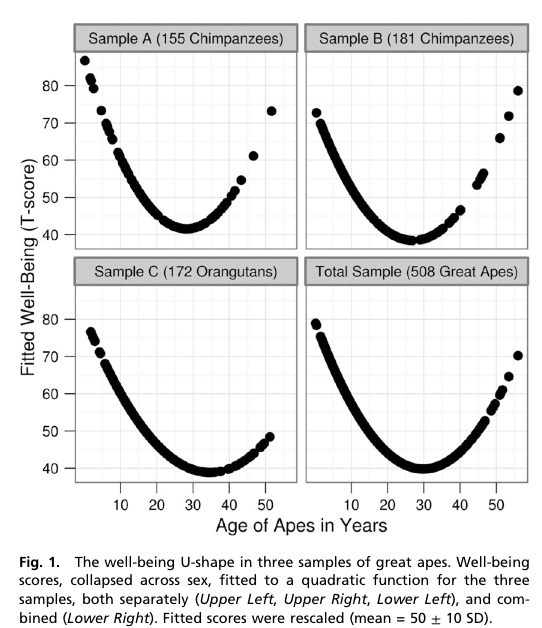
The x-axis is in years, showing the trough of despondency in the mid-thirties. The y-axis isn’t in anything — the curves were rescaled to look similar and the numbers are arbitrary.
The reason the curves look so dramatic is partly the higher-than-wide shape of the graph, but mostly the lack of any indication of uncertainty. The data are actually consistent with a wide range of flatter or steeper U-shapes and with the `mid-life’ crisis happening anywhere over quite a range of years. I can’t be more precise than that, because the researchers don’t even provide the necessary information to compute the uncertainty in the curve [they give uncertainties in regression coefficients, but not correlations between them].
However, they do have an appendix that looks at chopping up age into five-year bands and estimating the midlife crisis that way. They don’t give a graph, but they do give enough information to draw one. It’s not as impressive.

The U-shaped pattern does seem to probably be real (though the extent to which the so-called mid-life crisis is really the apes’ problem rather than than the handlers’ problem isn’t clear), but the graphs in the research paper are overselling it. Badly.
[Update: the intervals in the plot are +/- 1.4 standard errors for the coefficient. This should be in the ballpark for a 95% interval for the mean for that age group]
The Herald has an interesting story on the improvements in prediction displayed last week: predicting the US election results , but more importantly, predicting the path of Hurricane Sandy. They say
In just two weeks, computer models have displayed an impressive prediction prowess.
The math experts came out on top thanks to better and more accessible data and rapidly increasing computer power.
It’s true that increasing computer power has been important in both these examples, but it’s been important in two quite different ways. Weather prediction, use the most powerful computers that the metereologists can afford, and they are still nowhere near the point of diminishing returns. There aren’t many problems like this.
Election forecasting, on the other hand, uses simple models that could even be run on hand calculators, if you were sufficiently obsessive and knowledgeable about computational statistics and numerical approximations. The importance of increases in computer power is that anyone in the developed world has access to computing resources that make the actual calculations trivial. Ubiquitous computing, rather than supercomputers, are what has revolutionised statistics. If you combine the cheapest second-hand computer you can find with free software downloaded from the Internet, you have the sort of modelling resources that the top academic and industry research groups were just starting to get twenty years ago.
Cheap computing means that we can tackle problems that wouldn’t have been worthwhile before. For example, in a post about the lottery, I wanted to calculate the probability that distributing 104 wins over 12 months would give 15 or more wins in one of the months. I could probably work this out analytically, at least to a reasonable approximation, but it would be too slow and too boring to do for a blog post. In less than a minute I could write code to estimate the probabilities by simulation, and run 10,000 samples. If more accuracy was needed I could easily extend this to millions of samples. That particular calculation doesn’t really matter to anyone, but the same principles apply to real research problems.
I’ve just received a water bill which, among other information, estimates my average daily water use for November. That’s a pretty good trick for something that must have been mailed in the first few days of the month. They mean October, I assume.
Apart from their off-by-one labelling of months, Watercare are interesting because of their ‘estimated’ water usage. They recently changed to sending monthly bills, but they still only try to read the meter ever second month, and in my case have failed to find it twice. My first bill on moving in was for three months, and it was relatively high. I fixed the leaky seal in the toilet and expected the bills to go down. The following month, the meter wasn’t read but my estimated daily water use went up about 7%. The next month, again there was no meter reading, and the estimated daily use was another 10% higher. The next month the estimated daily use was down about 8%, again with no reading.
I can see why the estimated total usage would fluctuate based on the varying time between estimates, but it’s hard to see what basis Watercare had for estimating I was using more water in September (actually August) than in August (actually July) without any actual data. I wouldn’t have expected the average Aucklander to use more water in winter, and a research report from Branz confirms my expectation.
This month, now they have found the meter, the estimated use has fallen about 85%, catching up on three months of overbilling.
By comparison with NZ, the UK media are a target-rich environment for statistical and scientific criticism. The Telegraph ran a headline “Just 100 cod left in North Sea”, and similar stories popped up across the political spectrum from the Sun to the Socialist Worker.
The North Sea, for those of you who haven’t seen it, is quite big. It’s about three times the size of New Zealand. You’d have a really hard time distinguishing 100 cod in the North Sea from no cod. An additional sign that something might be wrong comes later on in the Telegraph story, where they say
Scientists have appealed for a reduction in the cod quote from the North Sea down to 25,600 tons next year.
If there are only 100 cod, they must be pretty big to add up to 25,600 tons of catch. They’re not only rarer than whales, they are much bigger.
It turns out (explains the BBC news magazine) that the figure of 100 was for cod over 13 years old. The papers assumed that 13 was some basic adult age, but they should have been thinking in dog years rather than human years. A 13-year old cod isn’t listening to boy bands, it’s getting free public transport and looking forward to a telegram from the Queen.
The government department responsible for the original figures issued an update, clarifying that the number of adult cod in the North Sea was actually about 21 million.
League tables work well in sports. The way the competition is defined means that ‘games won’ really is the dominant factor in ordering teams, it matters who is at the top, and people don’t try to use the table for inappropriate purposes such as deciding which team to support. For schools and hospitals, not so much.
The main problems with league tables for schools (as proposed in NZ) or hospitals (as implemented in the UK) are, first, that a ranking requires you to choose a way of collapsing multidimensional information into a rank, and second, that there is usually massive uncertainty in the ranking, which is hard to convey. There doesn’t have to be one school in NZ that is better than all the others, but there does have to be one school at the top of the table. None of this is new: we have looked at the problems of collapsing multidimensional information before, with rankings of US law schools, and the uncertainty problem with rates of bowel cancer across UK local government areas.
This isn’t to say that school performance data shouldn’t be used. Reporting back to schools how they are doing, and how it compares to other similar schools, is valuable. My first professional software development project (for my mother) was writing a program (in BASIC, driving an Epson dot-matrix printer) to automate the reports to hospitals from the Victorian Perinatal Data Collection Unit. The idea was to give each hospital the statewide box plots of risk factors (teenagers, no ante-natal care), adverse outcomes (deaths, preterm births, malformations), and interventions (induction of labor, caesarean section), with their own data highlighted by a line. Many of the adverse outcomes were not the hospital’s fault, and many of the interventions could be either positive or negative depending on the circumstances, so collapsing to a single ‘hospital quality’ score would be silly, but it was still useful for hospitals to know how they compare. In that case the data was sent only to the hospital, but for school data there’s a good argument for making it public.
While it’s easy to see why teachers might be suspicious of the government’s intentions, the rationale given by John Key for exploring some form of official league table is sensible. It’s definitely better not to have a simple ranking, and it might arguably be better not to have a set of official comparative reports, but the data are available under the Official Information Act. The media may currently be shocked and appalled at the idea of league tables, but does anyone really believe this would stop a plague of incomplete, badly-analyzed, sensationally-reported exposés of “New Zealand’s Worst Schools!!”? It would be much better for the Department of Education to produce useful summaries, preferably not including a league-table ranking, as a prophylactic measure.
The bus prediction system is potentially a very good idea — research in other cities has shown that it reduces actual waiting time, and reduces perceived waiting time even more.
Unfortunately, the illusory sense of control over one’s fate that the prediction system gives is easy to shatter. This morning it was a stealth bus: arriving when it was allegedly still ten minutes away. On other occasions the waiting time counts down steadily to DUE and then disappears, indicating that a ghost bus has gone by.
Bus prediction involves some hard engineering problems: the buses need to know where they are, they need to be able to tell the central office, and the central office needs to be able to get the information to transit users. Fortunately, the first problem is solved by GPS (and odometers), the second by packet radio, and the third by the internet (and text-message gateways).
What remains is mostly a statistical problem, and partly a problem in applied psychology. The data are fairly straightforward: the system knows approximately where the bus was every couple of minutes into the past, and this needs to be projected forward. The Seattle MyBus project did a good job of implementing a simple version about ten years ago: the prediction is a weighted average between where the bus would arrive at its current speed and when it should arrive by schedule, and the weights come from a large collection of actual bus trips. There’s actually a lot more information available — for example, it’s hard to predict from a bus’s performance along Manukau Rd how long it will take to get through Newmarket, but since there’s a bus along Broadway every few minutes the system potentially has up-to-date information on congestion and crowding.
My guess, based on the relatively high frequency of buses that apparently go backwards, is that the Auckland system is a bit over-optimistic about how fast a late bus can return to schedule, and isn’t using the congestion information. It also doesn’t seem to know which incoming bus will be running each route out of the city, so the city-center predictions can be a bit useless. The real problem, though, is how to incorporate this uncertainty when presenting the results. Even when you’re using all the available information there’s always prediction error, and sometimes a bus will stop transmitting information either for a few minutes or for its whole route. In that case, the system has to fall back on the timetable, but the Auckland system doesn’t tell you it’s done that.
OneBusAway, in Seattle, distinguishes clearly between real predictions and timetable predictions. It also does helpful things like indicating which buses have just left, and it doesn’t seem to have ghost buses or stealth buses. It’s also based on an open data stream that anyone can use — both the real-time bus location data and the predictions are accessible to anyone who wants to set up an improved system or just write a better app.
The post on road deaths sparked off a bit of discussion in comments about whether there should be a `tolerance’ for prosecution for speeding. Part of this is a statistical issue that’s even more important when it comes to setting environmental standards, but speeding is a familiar place to start.
A speed limit of 100km/h seems like a simple concept, but there are actually three numbers involved: the speed the car is actually going, the car’s speedometer reading, and a doppler radar reading in a speed camera or radar gun. If these numbers were all the same there would be no problem, but they aren’t. Worse still, the motorist knows the second number, the police know the third number, and no-one knows the actual speed.
So, what basis should the police use to prosecute a driver: