Posts filed under Graphics (394)

December 2, 2013

Good graph/bad graph

  • The Herald has a nice display of how the percentage of first-home buyers varies across Auckland. I think (though the text could be clearer) that this is data since the start of 2012. I don’t know exactly how they define first-home buyers: quite a few immigrants, like me, will have been home owners outside NZ before buying a home here.
  • From wtfiz.net, originally a section of an infographic from graphs.net pyramid

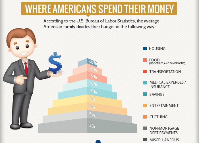
To start with, the noseless guy doesn’t cast a shadow, although the almighty dollar he is holding casts a shadow on the empty air. Perhaps he’s a vampire. Also, the colours in the legend don’t actually match the colours in the graph. And, the graph manages to misrepresent not only the magnitude of the numbers but even their ordering, with the largest layer of the pyramid representing the smallest category.  To top it all off, the numbers aren’t even right (or are seriously outdated) — for example, the US Bureau of Labor Statistics Consumer Expenditure Survey reports food expenditure between 12.5% and 13% of  household expenditure every year from 2006 to 2012, not the 15% in the graph

November 25, 2013

–ing Twitter map

Showing what can be done straightforwardly with online data, the site Fbomb.co (possibly NSFW) is a live map of tweets containing what the Broadcasting Standards Authority tells us is the 8th most unacceptable word for NZ.  Surprisingly, it was written by a Canadian.

fbomb


November 19, 2013

Briefly

  • Animated visualisation of motor vehicle accident rates over the year in Australia. Unfortunately it’s based on just one year of data, which isn’t really enough. And if you’re going the effort of the animation, it would have been nice to use it to illustrate uncertainty/variability in the data
  • Randomised trials outside medicine: the combined results of ten trials of restorative justice conferences. Reoffending over the next two years was reduced, and the victims were happier with the handling of the case. (via @hildabast)
  • How much do @nytimes tweets affect pageviews for their stories?

Live bitcoin map

Via Business Insider, a live map of which currencies are being spent on Bitcoins

bitcoin


The Business Insider post says

[I]n the time we’ve watched it, it becomes clear that China really is big into Bitcoin relative to the rest of the world.

Below is a brief snapshot of what we saw in which the transactions were dominated by Chinese trading (at other times it’s more even, with more US action).

A big reason for the variation would be time of day, but my map above ran for about 17 hours, and it shows much more US than Chinese bitcoin activity — and even more Australian than Chinese.  Longer sampling times are clearly needed to say anything definite.

The map website says “watch the world’s currencies flow into BTC in realtime”, which is the sort of exaggeration that’s unfortunately common with bitcoin enthusiasts. These are exchanges of bitcoin for other currencies: one person gets USD and gives up BTC, the other person gets BTC and gives up USD. The only net flow into (or out of) bitcoin comes from the seller’s profit (or loss) as bitcoin changes in price — and that can be much more easily and accurately estimated from the exchange rates, without needing to track individual transactions.


November 16, 2013

What people die of

The Institute for Health Metrics, at my previous university  in Seattle, has a new tool for visualising the causes of death and disability across the world with interactive graphics.

This pair of maps is for cancer in women.

cancer


The lower map is just cancer deaths per 100,000 women.  That’s the easiest sort of number to obtain, but the problem with it is obvious: the orange and red countries are mostly just the places where the female population is older than average.

The upper map is age-standardised deaths per 100,000 women. That is, you take the rate in your country for women of a particular age, say 72 years old , and multiply by the proportion of 72-year olds in the UN’s standard reference population. When you do this for each year of age and add up the results, you get an estimate of what the cancer rate differences really are like, averaged over ages.

The map looks completely different after standardising by age. In particular, there’s a lot less variation between countries. The lowest rate is in Saudi Arabia, which is wealthy enough to afford good medical care but still has low rates of many cancer risk factors in women. The highest rate is Papua New Guinea, which has very high rates of cervical cancer (affecting younger women than many cancers).

November 12, 2013

Memorable data visualisations

From phys.org

With Harvard students Azalea A. Vo and Shashank Sunkavalli, as well as MIT graduate students Zoya Bylinskii and Phillip Isola, the team designed a large-scale study—in the form of an online game—to rigorously measure the memorability of a wide variety of visualizations. They collected more than 5,000 charts and graphics from scientific papers, design blogs, newspapers, and government reports and manually categorized them by a wide range of attributes. Serving them up in brief glimpses—just one second each—to participants via Amazon Mechanical Turk, the researchers tested the influence of features like color, density, and content themes on users’ ability to recognize which ones they had seen before

The researchers talk about what features were present in the more-memorable graphs, which tended to be visually dense and not to be of standard forms.

It’s good to see empirical evaluation of theories about graphics. However, as they admit,  ‘memorable’ may not be the right criterion. Even if it isn’t ‘memorable’ in the eyeball-bleach sense, memorability may not be a good proxy for informativeness.

Screaming above our weight

Via @BenAtkinsonPhD: a map of heavy metal bands per capita

metal


We’re ahead of the US, though behind the Scandinavian countries, as usual.

(for foreigners: NZ political cliche)

November 4, 2013

Majorities in public and in politics

From Andrew Gelman, who is passing along research by some Columbia political scientists, the estimated support, by state, for the Employment Nondiscrimination Act, a gay rights bill that the US Senate will be voting on this Monday.

nondiscr


US Senators are elected by, and theoretically represent, their  state as a whole. The bill has majority support in every state, well over 60% in most states. It’s not clear whether it will pass.

Part of the problem is multilevel democracy: to be a Senator, you have to be selected as a candidate as well as winning the election. And the people who vote at the preselection stage (primary elections, in the US) average more extreme than those who vote in the election.  The more levels of selection you need, the worse the problem gets: Tim Gowers (prompted by the US government shutdown) does the mathematician thing and derives the extreme case. And the problem is exacerbated by the fact that politicians aren’t as knowledgeable about the views of their electorates as they think are.

November 3, 2013

Visualising 7 million

Syria has a million child refugees, a million adult refugees, and about 5 million ‘internally displaced persons’. What does that look like?

Al Jazeera News has an interactive map of the USA to demonstrate: click on a location and see an area around that point whose population is equal to the number of refugees. For example, Albuquerque, New Mexico, location of Breaking Bad, gives

refugee


In New Zealand, the 1 million child refugees corresponds to most of the population of urban Auckland. Adding the million adult refugees would expand to cover Northland and Waikato, and the total of seven million people corresponds to all of New Zealand, plus Samoa, Tonga, Fiji, the Solomon Islands, and more.

November 1, 2013

Global wine shortage?

The Herald has a story about a global wine shortage and its potential benefits for NZ producers. The story links to the Morgan Stanley report that it’s based on, and presents it well.

However (and you knew something like this was coming), Felix Salmon at Reuters has also written about the report, using more than just this one report as a source. Find out how the Organisation Internationale de la Vigne et du Vin numbers that show a modest and increasing surplus

turn into the Morgan Stanley numbers that show an increasing wine deficit

He also cites wine industry experts pointing out that the shortage story just doesn’t add up, and concludes

But never mind all that: the Morgan Stanley report has numbers and charts, and journalists are very bad at being skeptical when faced with such things. Even Finz’s Chronicle article, which sensibly poured cold water on the report, ends with a “Wine by the numbers” box which simply reproduces all of Morgan Stanley’s flawed figures. And besides, the debunkings are never going to go viral in the way that the original “wine shortage!” articles did.